
Storybook 8 Beta
Major compatibility & performance improvements

Storybook 8 is now available to try in beta! This latest release continues Storybook’s quest of giving you an instant-on, seamless environment for frontend development. Check out the release highlights and try the beta release today!
🚀 Major performance improvements
🆕 Visual tests workflow
📱 Polished mobile UI
🔬 Improved test utilities
⚛️ React Server Component support
👋 Adiós, React dependency
🧩 Ecosystem updates
💯 Hundreds of fixes
Major performance improvements
Storybook 8’s priority is improving Storybook’s compatibility and performance.
- We switched the default compiler for new projects from Babel to SWC (Speedy Web Compiler). SWC is dramatically faster than Babel, though we’ll continue to support Babel in any project currently using it.
- For React projects, we now auto-generate controls using
react-docgen. This reduces Storybook’s start times by up to 20%, even for small projects! - We added a new
--testflag for faster test builds, bypassing unnecessary processes like docs compilation. This triples the speed of static builds. Learn more.
Visual tests workflow
Storybook gives you the superpower of using stories as test cases. You can compare stories before and after code changes and flag differences for review without needing to push a commit.
To improve that process, we launched a visual testing platform called Chromatic in 2017, a cloud service that lets you automate visual tests by comparing snapshots of your stories before and after every change.
Storybook 8 closes the gap between Chromatic and Storybook with the Visual Tests addon, which lets you run visual regression tests of your stories on the fly without needing to commit your changes. Then, you can inspect the results in Storybook, or push the testcase to Chromatic for more debugging tools. You get up to 5,000 monthly snapshots for free, and you can get more usage by upgrading via Chromatic.
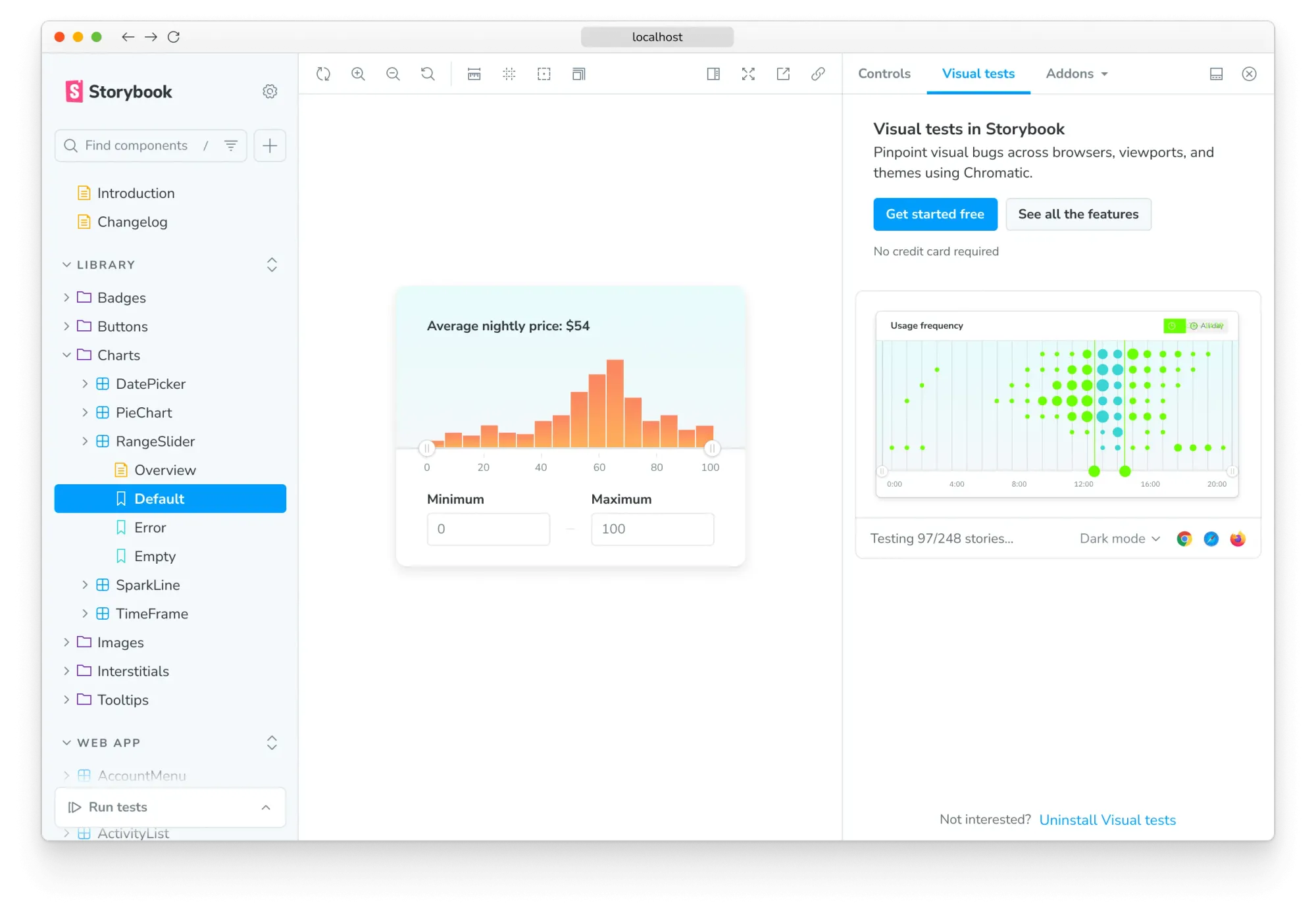
As part of today’s launch, @chromatic-com/storybook is now available in public beta. Try it today by heading to Chromatic’s docs.
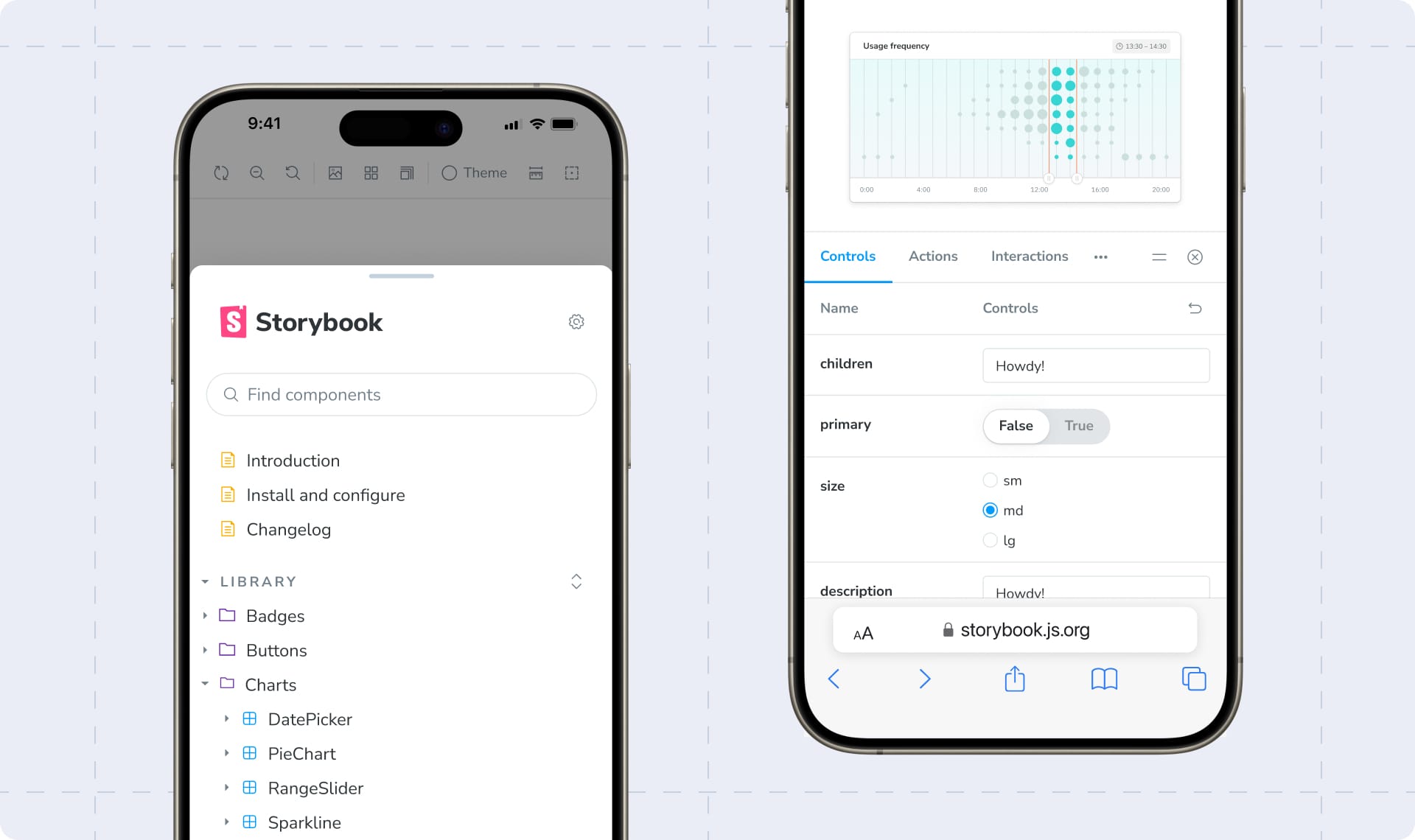
Polished mobile UI
Storybook 8 revamps Storybook’s mobile UI. On mobile devices, Storybook’s sidebar and addon panel now appear at the bottom of the screen. This prevents the canvas from shrinking and makes it easier to navigate with your thumb. We also fixed a long-standing, super annoying responsiveness bug, where UI state was lost when transitioning between desktop and mobile view.
Lastly, we just released a new version of React Native Storybook: RN Storybook 7. It brings major performance and compatibility improvements, including automatic story loading, improved error handling, stronger types, and much more.
Improved test utilities
Storybook 8 streamlines two existing test packages (@storybook/jest and @storybook/testing-library) into a single, more powerful testing library: @storybook/test. It’s based on Vitest spies and expect, which have a much smaller installation footprint in your project. Learn more.
React Server Components

Many people have asked when Storybook will support React Server Components. Storybook 8 is the answer, containing experimental RSC support that’s initially limited to Next.js projects.
Why experimental? We’re still figuring out the best practices for building RSC components and pages. We also need to prove that our approach works well with other RSC frameworks like Waku.
Learn more about RSC support in Storybook 8 and how to use Storybook 8 to build an RSC app in isolation.
Adiós, React dependency! 👋
In Storybook 7, we added a React peer dependency to make Storybook work with modern package managers like pnpm and Yarn PnP. We prioritized package manager compatibility, but frankly, this sucked for Vue, Angular, Web-components, and Svelte users. It clashed with one of our primary goals of making users of all frameworks feel at home in Storybook.
Storybook 8 removes the React dependency through smarter bundling. It provides the basis for a series of quality of life improvements for non-React users, which you can look forward to in Storybook 8 and beyond.
Hello, ecosystem!
Every major release is an opportunity for Storybook to keep up with the ecosystem.
Storybook 8 includes the following dependency changes:
- Bumps Node requirement to 18+
- Adds Vite 5 and Lit 3 support
- Upgrades MDX, prettier, eslint, and remark
- Drops support for Vue 2, Svelte 3, Angular 14, and Next <13.5
- Drops official Yarn 1 support (it still works, just unsupported)
In addition, we dropped support for Storyshots and provided an upgrade guide to transition to other options. We also dropped support for the legacy storiesOf story API.
Try Storybook 8 today
Upgrade to Storybook 8 beta today with the following command:
npx storybook@next upgrade
We’re still working on automating certain aspects of the upgrade. But in the meantime, we’ve provided a migration guide to help fill in the gaps.
Get involved
Ahead of the full launch, we’d love your help with battle-testing and QA'ing Storybook 8, to help us ship the best release possible.
If you’re interested in taking part in our open source project, we’d love your help with tackling some of the following issues on GitHub.
We’ll also be sharing more about how you can take part in community QA in the weeks ahead, so please keep an eye on our social media feeds on Twitter and LinkedIn.
Huge news: Storybook 8 is now in beta!
— Storybook (@storybookjs) February 6, 2024
🚀 Major performance improvements
🔬 storybook/test
⚛️ React Server Components support
🖼️ One-click visual tests
🚚 No more React peer dependency
📱 Revamped mobile UI
💯s of fixeshttps://t.co/BmLNkX4DMk
🧵🧵🧵