
React Native Storybook 7
Aligning React Native and core Storybook more closely than ever before

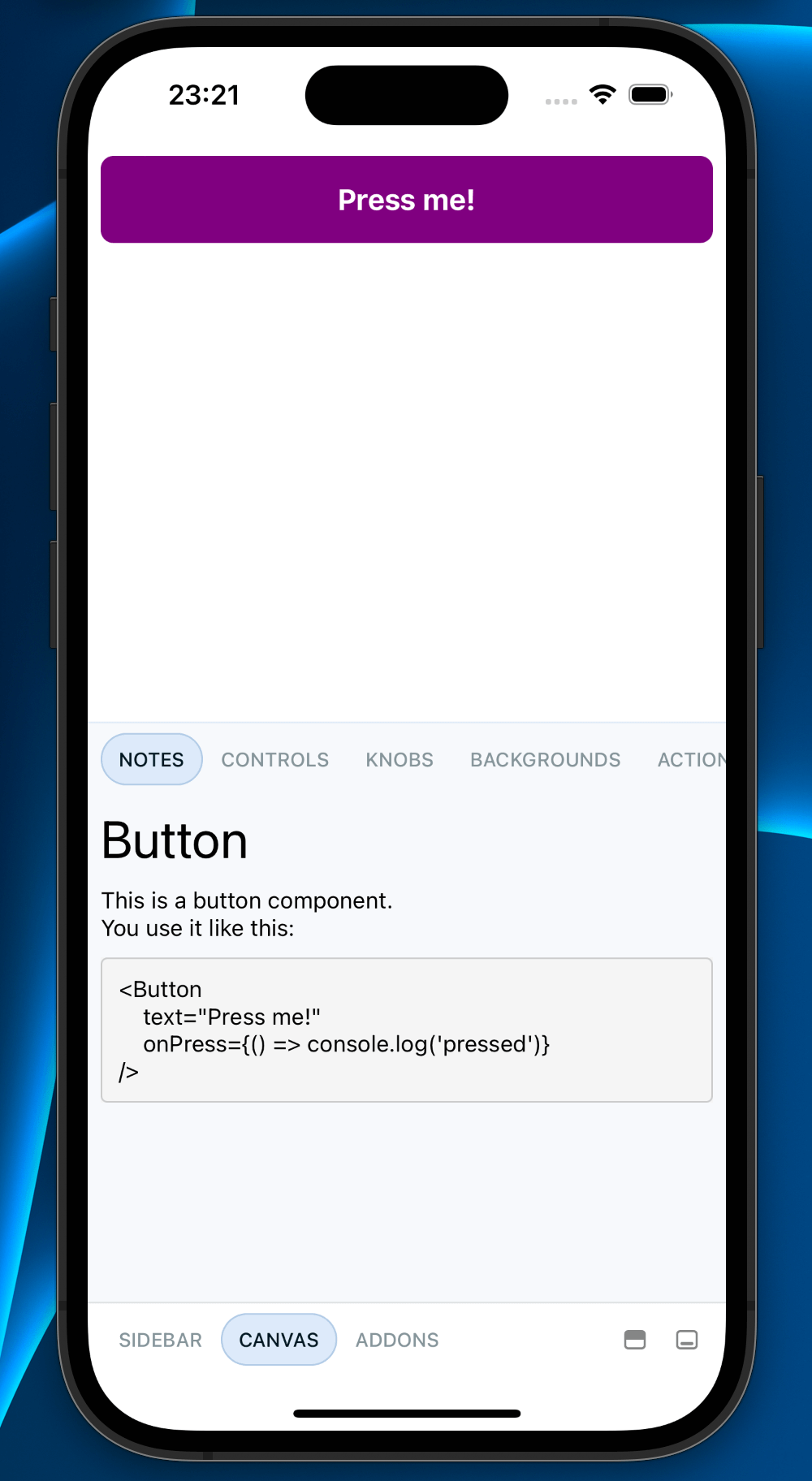
Storybook is an industry-leading, open source workshop for developing, documenting, and testing frontend applications in isolation. It helps you develop hard-to-reach states and edge cases without needing to run the whole app.
Today, we’re thrilled to announce our latest major release for React Native users: React Native Storybook 7! This aligns RN Storybook to core Storybook 7.6, enhances code re-use between @storybook/react and @storybook/react-native, and builds the foundations for more frequent and streamlined future releases.
📖 Storybook 7 compatibility
🧩 Improved support for Component Story Format 3
🔒 TypeScript-first
💨 Automatic story loading
🛡️ Improved error handling
📝 Enhanced markdown support
🎛️ Auto-generation for controls
Storybook 7 compatibility
Storybook 7 overhauled its core data structures to optimize bundling, which enabled code splitting and lazy compilation. It also made the code easier to reuse outside of a web context.
While RN Storybook 6.5 shared much of the same code with the core, RN Storybook 7 is based on the core entirely. This means that RN storybook will inherit core improvements as they become available, and makes it easier for RN Storybook to keep up with core in the future. Spoiler alert: Storybook 8 is coming very soon. Watch this space!
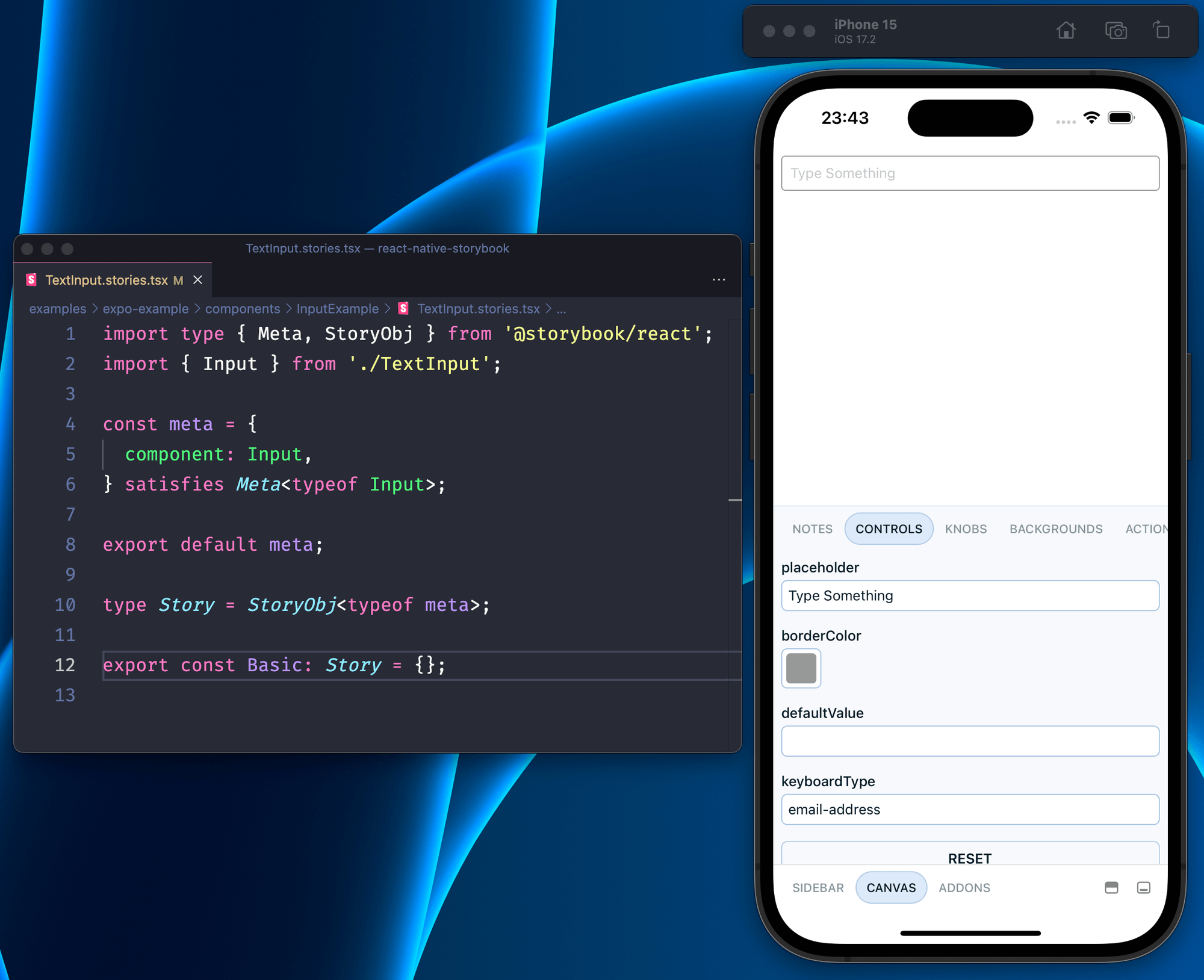
Improved support for Component Story Format 3
RN Storybook 7 stories now look exactly the same as Storybook core. Story types now derive directly from @storybook/react.
import type { Meta, StoryObj } from "@storybook/react"
import Button from "./Button"

const meta = {
  component: Button,
}

satisfies Meta<typeof Button>

export default meta;

type Story = StoryObj<typeof meta>;

export Basic: Story = {}
At the same time, you can use the same StoryObj and Meta types as core Storybook. This follows improved support for CSF3 and provides stronger type safety and autocompletion. Learn more.
TypeScript-first configuration
TypeScript has become the language of choice across Storybook users and the JS ecosystem. RN Storybook 7 follows suit by updating all config files and templates to be TypeScript-first.
RN Storybook 7’s main.ts:
// .storybook/main.ts
import { StorybookConfig } from '@storybook/react-native';

const main: StorybookConfig = {
  stories: [
    '../components/**/*.stories.?(ts|tsx|js|jsx)',
  ],

  addons: [
    '@storybook/addon-ondevice-notes',
    '@storybook/addon-ondevice-controls',
    '@storybook/addon-ondevice-backgrounds',
    '@storybook/addon-ondevice-actions',
  ],
};

export default main;
Automatic story loading
RN Storybook 7 capitalizes on Metro’s new support for require.context to automate story loading and dramatically reduce the steps needed to create stories.
In RN Storybook 6, you had to run storybook-generate each time you added a story. Now, with require.context, you only need to run generation when you update the stories field of main.ts. This is because require.context imports files dynamically based on a file glob (regex for file paths).
This feature was added in React Native 0.72. Use it by enabling transformer.unstable_useRequireContext in Metro:
// metro.config.js

const config = {
  transformer: {
    unstable_allowRequireContext: true,
  },
}
Read more about this on my Dev.To.
Significantly improved error handling
RN Storybook 7 fixes the issue of Storybook crashing upon story errors. Now, we wrap each story in an error boundary, which catches those errors instead. Note that you may still have to dismiss the RN Error LogBox.
Enhanced markdown support
In the past, the Notes addon broke text in the wrong places, and didn’t behave as you’d expect. RN Storybook 7 replaces the markdown renderer with a more battle-tested alternative, react-native-markdown-display, which works significantly better!
Auto-generation for controls
RN Storybook 7 now automatically generates controls from types using docgen analysis!
Configure auto-generated controls by adding babel-plugin-react-docgen-typescript to your Babel config:
Get started
Get started with RN Storybook 7 in an existing project with:
npx storybook@latest init
If you’re creating a fresh project, use the Storybook template:
# Expo
npx create-expo-app --template expo-template-storybook AwesomeStorybook

# React Native CLI
npx react-native init MyApp --template react-native-template-storybook
How to upgrade
There are some breaking changes in this release. Since there’s a lot to go through, please check out the full migration guide.
What’s next?
Work on RN Storybook 8 is already underway. The basics are functional, but we have plans for many more improvements in the months ahead. Here’s what you can look forward to:
- Redesigned UI
- Improved support for testing
- More control types to better match the web experience
- …and much more!
Bringing it all together
This release aligns RN Storybook with core Storybook and paves the way for many further improvements in our next major release.
There’s still a massive amount of potential with RN Storybook project and we’d love new contributors to help us get there. Find the project here and share your feedback, interest, or support.
You can find me on Twitter or GitHub. If you’d like to support my work, consider sponsoring me via GitHub sponsors.
Big news: React Native Storybook 7 is here!
— Storybook (@storybookjs) February 2, 2024
🤝 Storybook 7 compatibility
🧩 Improved CSF3 support
🔒 TypeScript-first
💨 Automatic story loading
🛡️ Stronger error handling
📝 Enhanced markdown
🎛️ Controls auto-generationhttps://t.co/3bwjr2wahr
🧵🧵🧵