Storybook 5.2
World-class design systems infrastructure

Storybook powers component development for design systems like Shopify Polaris, IBM Carbon, Salesforce Lightning, Auth0 Cosmos, Airbnb Lunar, and more than 25,000 public GitHub projects.
Storybook 5.2 streamlines component documentation for all Storybook users. Our goal is to make best practice documentation — like the kind found in the high profile design systems above — easy for all Storybook projects. Our first steps are:
📚 DocsPage: Zero-config component documentation
📝 MDX: Unifying stories and long-form documentation
📦 Component Story Format: Simple, portable component examples
🖼 Storybook Design System: Best practices put into practice
It also brings hundreds more improvements at every level, including new addon APIs, native TypeScript types, new presets, custom story sorting, first-class hooks support, performance wins & much more.
Read on for a tour of improvements, upgrade instructions, and a project update.
Design system docs, here we come
Earlier this year, we set an ambitious vision to radically improve component documentation.
“With Storybook Docs, you can quickly generate design system documentation, customize it to your liking, and share best practices to your team.”
5.2 introduces official support for Storybook Docs. Like the rest of Storybook, Docs supports every major framework including React, Vue, Angular, HTML Web Components, Svelte, and many more.
DocsPage
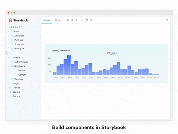
The centerpiece of 5.2 is DocsPage, a zero-config template for auto-generating best-practice component documentation from your existing stories.
Storybook’s value proposition is that it enables you to develop UI components in isolation. Developers build out stories (examples) to capture a component’s key states without having to worry about complex dependencies or flaky data APIs.
The key insight behind DocsPage is that these stories, which modern frontend teams already produce by the hundreds as a natural byproduct of development, can be used to generate amazing documentation. Unlike traditional docs, which go out of date the instant they’re published, stories are executable, testable, and always in sync with the production code.
DocsPage takes your stories, automagically combines them with code comments and component props tables, and generates beautiful pages that incorporate design systems best-practices … with no extra configuration required on your part!
Learn all about it in the DocsPage announcement post:

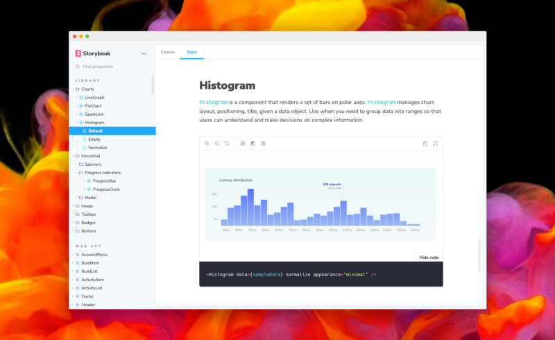
MDX
DocsPage is an amazing way to get great documentation for free. If you want more control, MDX is a way to flexibly author stories and long-form documentation side by side in the same file.
Here’s what it looks like to write stories in MDX. These stories are fully compatible with the entire Storybook ecosystem:
import { Meta, Story, Props } from '@storybook/addon-docs/blocks';
import { Badge } from './Badge';

<Meta title="Demo/Badge" component={Badge} />

# Badge

With `MDX` we write longform markdown documentation for our `Badge` component and embed Doc Blocks inline.

<Props of={Badge} />

<Story name="positive">
  <Badge status="positive">Positive</Badge>
</Story>MDX combines the convenience and brevity of markdown documentation with arbitrary JSX, meaning that you can configure your component docs with arbitrary content and layout. We also provide a rich library of “Doc Blocks” for common documentation tasks, such as displaying component props, color palettes, typography samples, and other design tokens.
MDX support is available today in 5.2, with the official release currently available in Storybook 5.3-rc. To learn more, see the Storybook MDX release post.
Component Story Format
To support MDX stories, we completely reinvented Storybook’s story format. Component Story Format (CSF) is a portable, open standard for authoring Storybook stories in pure ES6 modules.

If you’ve used earlier versions of Storybook, you’re probably familiar with the “classic” storiesOf API:
import { storiesOf } from '@storybook/react';

storiesOf('atoms/Button', module)
  .add('text', () => <Button>Hello</Button>)
  .add('emoji', () => <Button>😀😎👍💯</Button>);
In CSF, the same example looks like this:
export default { title: 'atoms/Button' };

export const text = () => <Button>Hello</Button>;
export const emoji = () => <Button>😀😎👍💯</Button>;
CSF supports every affordance of the storiesOf API, but it’s… SO. MUCH. BETTER. It’s a clean, standard format you already know and love. CSF stories have no Storybook-specific dependencies, meaning that these stories are portable to any environment that supports ES6. Imagine being able to reuse component examples seamlessly across the entire design/development stack: in your design tools, in your documentation, and even in your test suites! We’re actively working to make that happen.
As a purely declarative standard, higher level formats, such as MDX or Github-flavored Markdown (GFM), can be transparently compiled into CSF. This allows the Storybook community to experiment with alternative ways of authoring stories while retaining compatibility with the entire ecosystem.
CSF is the default in Storybook 5.2. When you add Storybook to a new project, it now generates template code in CSF instead of the old storiesOf format. Of course, with tens of thousands of projects relying on storiesOf, we will continue support for the foreseeable future.
To learn more, see the CSF announcement post:

Storybook design system
Tying all of this work together is Storybook Design System (SDS). Built to improve component reuse across three high-traffic Storybook websites, the Design System is also ground zero for consuming, dog-fooding, and ultimately demonstrating what’s possible with Storybook Docs.
SDS was born out of the need to unify disparate components from three different websites: Storybook’s website, Learn Storybook tutorial, and Chromatic (a visual testing service by Storybook maintainers).
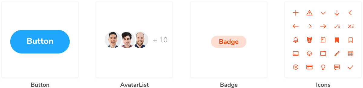
It encompasses 25 production-grade functional UI components and 95 stories, design tokens for the Storybook brand, and component/library documentation.
SDS will make it easier for the Storybook community to develop and maintain new marketing and documentation sites. But it also serves a secondary purpose: it’s also the design driver and public reference implementation for Storybook Docs itself! Look no further for best practices on how to develop your components stories, document them, test, and publish them.
To learn more, browse Storybook Design System or read the Design System announcement:

Easy documentation, at last!
Storybook is already the tool of choice for design systems engineering. With the addition of DocsPage, MDX, Component Story Format, and the new Design System, we’re transforming component documentation and bringing design systems best practices to all projects that use Storybook. Get started with these improvements today in 5.2, and stay tuned for more exciting updates across the board in the 5.3 release.

One (hundred) more thing(s)
The amazing thing about a thriving community project with 750+ contributors is that the system is continuously improving at every level.
Other highlights from 5.2 include:
✅ Addon APIs. Storybook is known for its rich addon ecosystem, and writing addons got a lot easier in 5.2 thanks to new hooks-based APIs by Norbert de Langen and Filipp Riabchun. The new APIs follow React hooks pattern, which makes state management & communication simpler and more concise. The improvements are documented here.
✅ TypeScript support. Typescript recently surpassed Javascript in Storybook’s codebase and 5.2 contains “native” Typescript types for most packages. We’ll do a proper announcement soon, but in the meantime you can move off DefinitelyTyped for most common cases. Kudos to Kai Röder, Gaëtan Maisse, Norbert de Langen and many more contributors who are actively working on the conversion.
✅ React hooks support. Storybook 5.2 contains first-class support for React hooks in stories thanks to small fixes by Michael Shilman and Atanas Stoyanov.
✅ Story sorting. By popular demand, Storybook now supports a story sorting function to control the order of stories in the navigation panel. Contributed by Robert Snow with help from Tom Coleman.
✅ Performance. Storybook story switching and search performance is for large storybooks has dramatically improved (~1000ms => ~50ms) thanks to a slowdown repro’d by Kevin Weber and optimized by Michael Shilman.
✅ Standalone mode. Storybook is still based on Webpack, but it’s now possible to connect the UI to an external server, thanks to RP Deshaies with help from Tom Coleman and Michael Shilman. We’ve prototyped an instance of Storybook running under the Parcel bundler in 5.2. This sets the stage for a lot of interesting things in the future. Storybook for Rails anybody?
✅ New presets. Storybook 5.1 introduced presets: one-line configurations for babel, webpack, and addons. Storybook 5.2 adds an SCSS preset by Igor Davydkin and a beta Create-React App preset by Brody McKee that greatly improves upon Storybook’s built-in CRA support.
Upgrade to Storybook 5.2
Storybook 5.2 is packed with new features, but doesn’t contain any breaking changes AFAIK. We’ve got a 5.0 upgrade guide if you’re coming from 3.x/4.x. If you’re already on 5.x, upgrading is ridiculously easy:
npx npm-check-updates '/storybook/' -u
npm install # or yarn
And if you’re new to Storybook, now’s the best time to get started. Check out the Storybook Tutorial for a step-by-step of React/Angular/Vue. Or jump right in:
cd my-project
npx -p @storybook/cli sb init
yarn storybook
Once you’re on 5.2, adding DocsPage to your project is a snap:
npm install @storybook/addon-docs --save-dev # or yarnThen add the following line to your .storybook/presets.js file:
module.exports = ['@storybook/addon-docs/react/preset'];Replace react with your framework of choice. For more information on configuring DocsPage, read the addon-docs installation instructions.
Get involved
Storybook’s backbone is its incredible community of developers and users. The project recently passed 41,000 Github stars, which puts us on a par with legendary projects like Rails and Bitcoin. Together, we’re building the future of component development.
We’d love to have you involved, regardless of your experience level. If Storybook makes your UI developer workflow easier, help Storybook get better. You can contribute a new feature, fix a bug, or improve the docs. Join us on Discord, support us on Open Collective, or just jump in on Github. Please 👏 applaud this post and share to help more people discover it.
Storybook 5.2 code contributors:
@8beeeaaat @adamdoyle @atanasster @autarc @baraalex @benoitdion @bqrichards @chaseadamsio @chris-dura @christianliebel @christoph-fricke @christophehurpeau @codebyalex @crimx@ctavan @danielduan @danrha @darondel-yoobic @debel27 @dogafincan @domyen @dylanpiercey @edumoreira1506 @elliotlarson @emilio-martinez @enagy27 @enuvid @ewgenius @expe-lbenychou @fabianmarinog-turner @fabiradi @forbeslindesay @gaetanmaisse @ghengeveld @gnujim @gongreg @graup @hipstersmoothie @hypnosphi @indigolain @jamesgeorge007 @jballin @jeffgukang @jendowns @jessica-koch @jimmydalecleveland @joeycozza @jounqin @jsomsanith-tlnd @juliamitchelmore @kaelig @kamahl19 @kroeder @leoyli @libetl @lonyele @lucasterra @mariocadenas @matt-tingen @matthewlehner @mrmckeb @ndelangen @ndom91 @nzacca @pascaliske @piperchester @pksunkara @pocka @rembrandtreyes @resource11 @richardtorres314 @robaxelsen @roydipti23 @rwoverdijk @sakito21 @shilman @simenb @smasontst @stephanemw @stereodenis @testerez @thebuilder @tylerlee @wa4-fearless-otter @xyshaokang @zkochan @zol