
Rich docs with Storybook MDX
Components & documentation in harmony at last

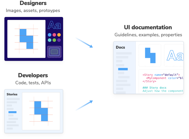
Storybook is the standard tool for UI component development. It’s used to build the most popular design systems on the web, including Shopify Polaris, IBM Carbon, Salesforce Lightning, Auth0 Cosmos, and Airbnb Lunar.
Quality documentation like this is crucial to help people re-use your UI components, but it’s also a huge pain to get right. In practice, you spend more time maintaining your documentation system than actually writing docs!
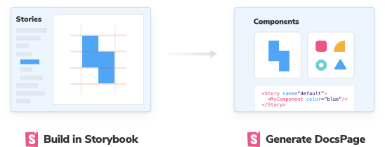
Which is why at Storybook, we’re hell-bent on making UI component docs fast and easy. Our first step was DocsPage, a tool to auto-generate best-practices documentation from your existing stories.
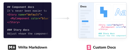
And today I’m excited to introduce fast, fully custom docs in Storybook, powered by MDX and available in Storybook 5.3! 🎉
MDX enables you to customize Storybook’s auto-generated documentation with your own components, mix & match DocBlocks, and loop in non-technical teammates. All from within the comfortable confines of Markdown.
- 🎨 Customizable docs: Fully custom documentation made simple.
- 📦 Ready-made building blocks: Reuse Storybook’s powerful DocBlocks.
- 🤝 Write docs together: Powerful for devs, easy for designers and PMs
- 🔌 100% compatible: Seamless Storybook integration that’s zero config

💡 What’s the big deal?
Earlier this year, the team outlined an ambitious vision to rethink component documentation. Our first milestone was Storybook 5.2 that introduced DocsPage to automatically generate best practice UI docs from your existing stories.
Storybook Docs took off like a rocket, becoming one of the most popular documentation tools (by npm downloads) in a matter of weeks! But even as teams embraced DocsPage, the desire to write fully custom documentation was clear.
Storybook MDX gives component authors an unparalleled balance of flexibility, cleanliness, and ease. MDX is an open, authorable format that fluidly interleaves Markdown and JSX components in the same file. It makes it easy to compose off the-shelf building blocks like color palettes, typography samples, and prop tables into long-form documentation.
What’s more, the straightforward MDX authoring experience means designers, PMs, and anyone familiar with Markdown can contribute to shared UI documentation. Intrepid pre-release users are already using Storybook as a single source of truth for their component libraries and design systems.
Storybook MDX is my dream documentation system. I retain the power and flexibility of Storybook’s beloved “Canvas”, but now have a fully-fledged way to write beautiful and portable long-form documentation that truly gets at the heart of our design system. — Vince Speelman, Front-end Engineer @ TEDtalks
📝 MDX simplifies writing docs
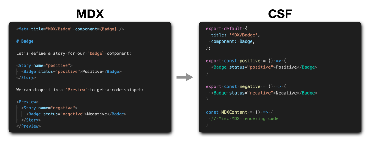
The key addition in Storybook 5.3 is MDX support. MDX (“markdown for the component era”) is a foundational project that fluidly mixes markdown with embedded JSX components. Here’s what an MDX story looks like:
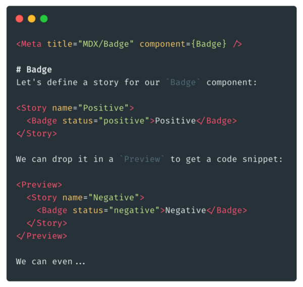
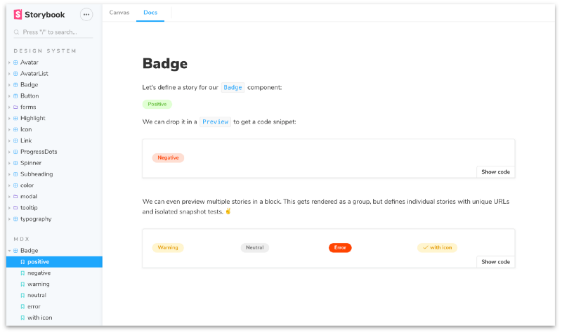
You probably recognize Markdown in blocks like # Badge, Let's define, and We can even. There are also a few JSX elements:
Metais an element that situates your component in Storybook.Storydefines a new story (or references an existing one).Previewframes one (or more stories) and displays their source code.
These DocBlocks form the basis of Storybook MDX. We’ll introduce a few more in the next section.
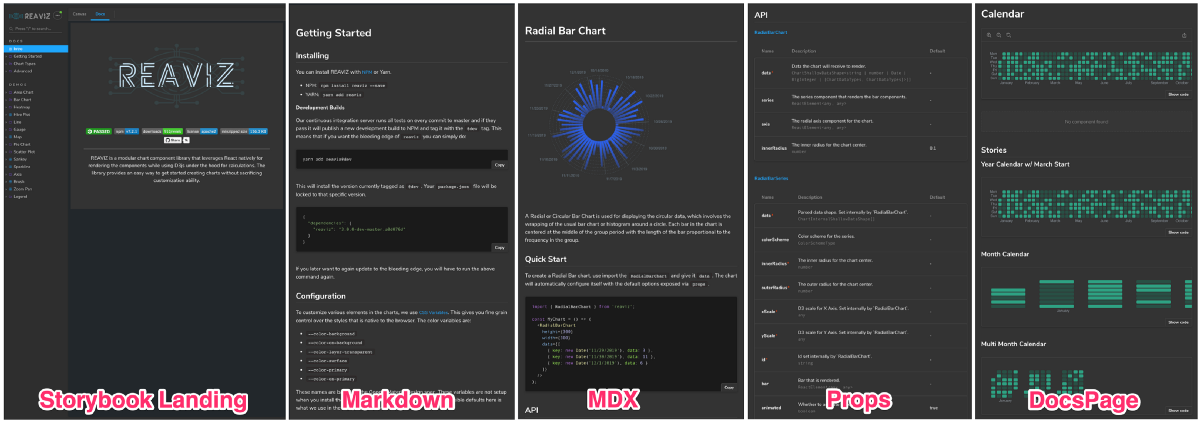
But before that, let’s jump ahead to full example: REAVIZ, a React visualization library built and documented in Storybook. It demonstrates theming, static markdown pages, custom MDX, and DocsPage in a single Storybook.
📦 Reuse Storybook’s readymade building blocks
In addition to rendering stories, it’s also useful to include other design system documentation, such as prop tables, color palettes, and typography.
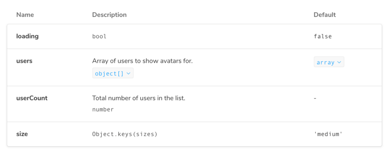
We’ve crafted a prop table DocBlock for a component’s API.
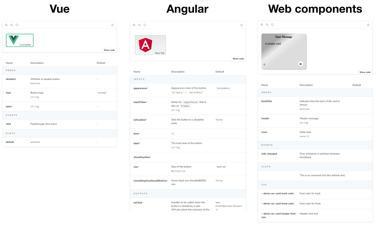
<Props of={AvatarList} />When applied to React components, it shows each prop’s name, description, type, and default value:
Patrick Lafrance & Francis Thibault sweated the details to get this right. When applied to other frameworks — such as Vue by Aaron Pool & Shota Fuji / Angular by Kai Röder / Web components by Thomas Allmer / Ember by Matthew Irish— the prop table gets divided into sections such as inputs, outputs, slots, events, etc. Details forthcoming in another post! 😘
It’s also easy to document your styling in Storybook MDX. Color palettes, iconography, and typography come out of the box. And in the future, you’ll get tighter integrations with different sources of design tokens, based on Philipp Siekmann’s fine work in storybook-design-token.
# Colors

<ColorPalette>
  <ColorItem
    title="theme.color.greyscale"
    subtitle="Some of the greys"
    colors={['#FFFFFF', '#F8F8F8', '#F3F3F3']}
  />
  ...
</ColorPalette>

# Icons

<IconGallery>
  <IconItem name="add"><ExampleIcon icon="add" /></IconItem>
  ...
</IconGallery>

# Typography

<Typeset fontSizes={['12px', '14px', ...]} sampleText="Heading" />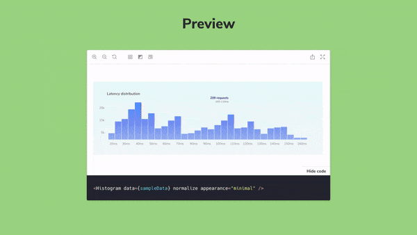
Storybook Docs provides human-readable documentation for all our components. MDX reduces complexity, and enables all parts of the organization to contribute to the conversation. — Sean Luo, Software Engineer @ Kickstarter
🤝 UI docs for your entire team
Storybook started as a development tool for organizing, developing, documenting, and testing components. As it grows in popularity, teams are starting to use their Storybook as shared resource for designers, PMs, and QA.
With MDX, non-technical team members can now help update shared UI docs. This gets your teammates engaged and reduces maintenance work for you. It’s a win-win that kicks off a new direction for Storybook to better support cross-functional collaboration.
🔌 Seamless integration with the ecosystem
Storybook MDX is 100% compatible with the rest of the Storybook ecosystem.
With all of the features Storybook MDX brings, you might guess that it would be a challenge integrating it with the rest of Storybook’s large ecosystem of prototyping, review, testing, documentation, and collaboration tools and services. Fortunately, you’d be wrong!
Earlier this year we introduced Component Story Format (CSF), an open standard for component examples based on ES6 module exports. CSF is the basis for Storybook. Under the hood, our MDX stories are transparently compiled into CSF. This means that anything can load CSF can also load Storybook MDX with no additional integration needed.
We’ve shown this with Storybook itself by adding a webpack loader, and with Jest by adding a jest transformer for Storyshots, our open-source DOM-snapshotting library. Cloud services like Chromatic also have full MDX support built in on day 1.
⚡️ 1 minute installation
Want it? First upgrade your project to Storybook 5.3:
npx npm-check-updates '/storybook/' -u
npm install # or yarn if you prefer
Then add docs to an existing project:
npm install @storybook/addon-docs --save-dev # or yarnFinally, add the following line to your .storybook/main.js file:
module.exports = {
  addons: ['@storybook/addon-docs'];
}
For more information on configuring MDX, read the installation instructions.
🚀 We need your help to make Docs great
The easiest thing you can do to help is install Storybook 5.3–rc in your project and ask questions and/or file bugs in our GitHub project. And if you see a bug you can fix, we welcome all contributions!
In addition, we have a lot of stuff in progress:
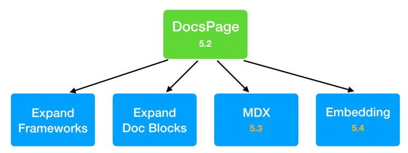
- We’re expanding the set of frameworks with enhanced docs support. React in 5.2, Vue/Angular/Web Components/Ember in 5.3. We’d love to add Svelte and other frameworks with your help.
- We’re creating a rich library of DocBlocks, for example avatars of GitHub collaborators for a component, component status badges, and so forth.
- Finally, we also want the ability to embed storybook docs in other documentation systems such as Gatsby.
If you’re interested in collaborating on any of this, or just want to stay on top of the latest, the project community mostly lives in the #docs-mode channel on our Discord.
🙏 Thanks to the community
Storybook Docs is being developed by Michael Shilman (me!), Atanas Stoyanov, Patrick Lafrance, Francis Thibault, Aaron Pool, Shota Fuji, Kai Röder, Tom Coleman, Norbert de Langen, Lionel Benychou, Matthew Irish, Thomas Allmer, and Igor Davydkin. Design and theming by Dominic Nguyen. Special thanks to MDX early adopters Austin McDaniel, Vince Speelman, Kevin Suttle, Alex Wilson, and Tom Speak. Huge 🙌 to Brad Frost for design systems project guidance.
If Storybook makes your UI developer workflow easier, help Storybook get better. You can contribute a new feature, fix a bug, or improve the docs. Join us on Discord, support us on Open Collective, or just jump in on GitHub.