
Testing composite components
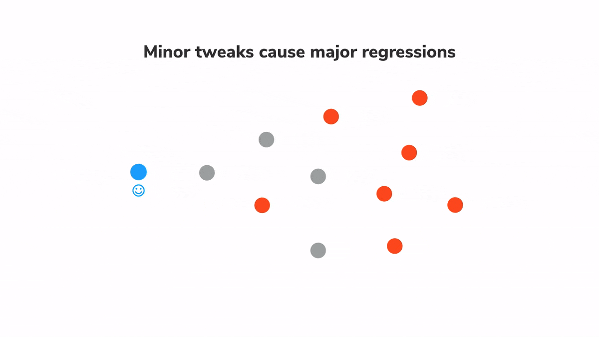
Prevent minor changes from turning into major regressions

Tesla just recalled 158,000 cars because one module—the display—malfunctioned. With a broken display console, you can’t access the backup camera, turn signals, or driver assistance. That significantly increases the risk of a crash.
One defective module escalated into a major failure.
UIs suffer from a similar challenge because apps, much like cars, are an interconnected network of parts. A bug in one component affects all others around it. Not to mention every part of the app where it’s used. Testing how UI components are composed helps you to prevent such bugs.
In the previous post, we learnt how to use Storybook to build components in isolation, write visual tests and use Chromatic to automatically catch regressions. However, testing the more complex parts of the UI is tricky. They are created by combining many simpler components and are also wired up to the application state.
This article teaches you how to isolate and apply visual testing to composite components. Along the way, you'll learn about mocking data and simulating application logic. And ways to test component integration.
Small bugs end up breaking apps
Applications are built by plugging components into each other. This means a bug in one element can impact its neighbours. For example, renaming a prop can disrupt data flow from parent to child components. Or incorrect CSS in a UI element often leads to broken layouts.

Consider the Button component from Storybook's design system. It is used countless times across multiple pages. A bug in Button will inadvertently lead to bugs in all those pages. In other words, one failure can compound exponentially. As you move up the component hierarchy towards the level of pages, the impact of these bugs increases. Therefore, we need a way to catch such cascading issues early and figure out the root cause.
Composition testing
Visual tests catch bugs by capturing and comparing image snapshots of stories—in a real browser. Which makes them ideal for spotting UI changes and identifying the root cause. Here's a quick reminder of the process:
- 🏷 Isolate components. Use Storybook to test one component at a time.
- ✍🏽 Write out the test cases. Each component state is reproduced using props.
- 🔍 Manually verify the appearance of each test case.
- 📸 Catch bugs automatically using visual regression tests.
Composition testing is all about running visual tests on “composite” components higher up in the tree that are made up of several simpler components. That way you can quantify the impact that any change might have on the entire application. And ensure that the system works as a whole.
That key difference is that composite components track application state and pass behaviours down the tree. You’ll have to account for those when writing the test cases.
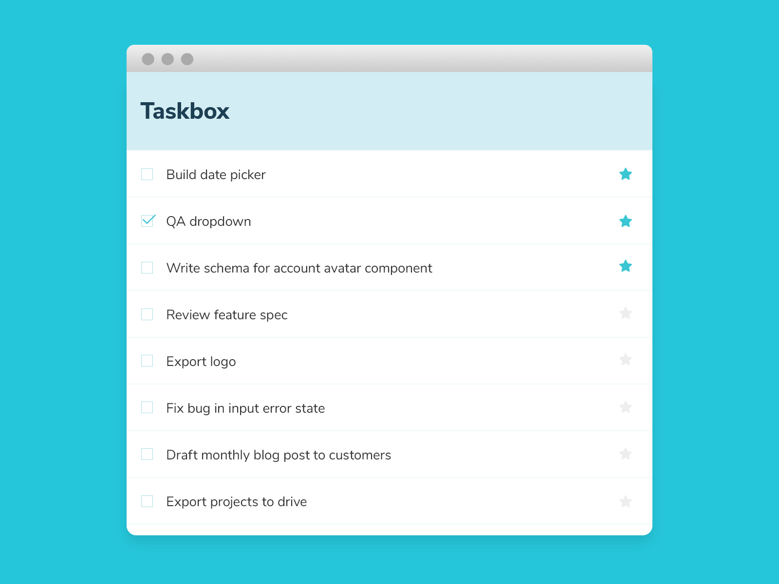
Let’s see this process in action. We’ll be using the Taskbox app I introduced in part 2. Grab the code and follow along. Our starting point is the visual-testing branch.
Tutorial
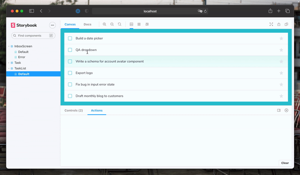
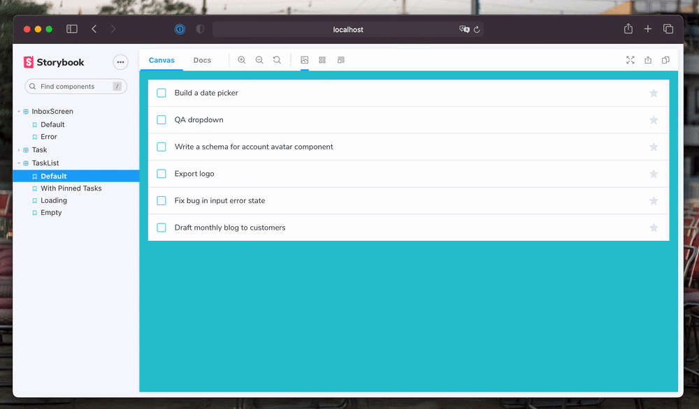
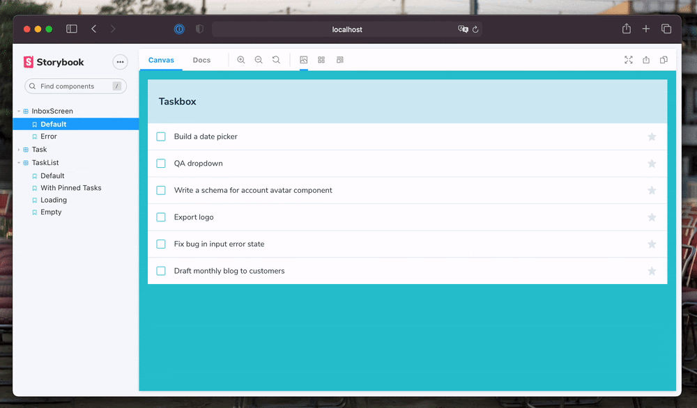
TaskList displays the full list of tasks belonging to the user. It moves pinned tasks to the top of the list. And has a loading and empty state. We’ll start by writing stories for all these scenarios.
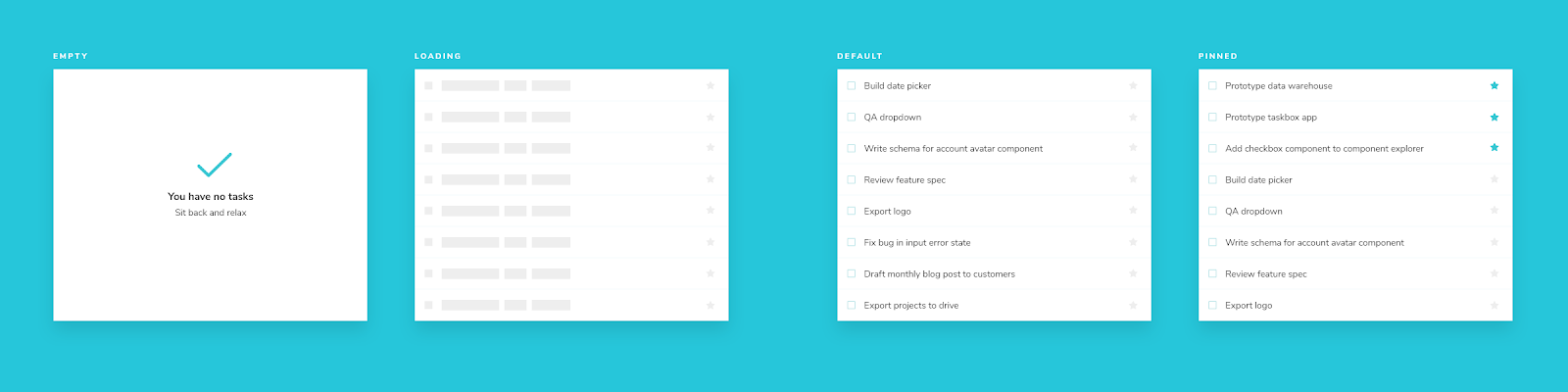
Create a story file, registering the TaskList component and add in a story for the default case.
// TaskList.stories.js

import React from 'react';
import { TaskList } from './TaskList';
import Task from './Task.stories';

export default {
  component: TaskList,
  title: 'TaskList',
  argTypes: {
    ...Task.argTypes,
  },
};
const Template = (args) => <TaskList {...args} />;

export const Default = Template.bind({});
Default.args = {
  tasks: [
    { id: '1', state: 'TASK_INBOX', title: 'Build a date picker' },
    { id: '2', state: 'TASK_INBOX', title: 'QA dropdown' },
    {
      id: '3',
      state: 'TASK_INBOX',
      title: 'Write a schema for account avatar component',
    },
    { id: '4', state: 'TASK_INBOX', title: 'Export logo' },
    { id: '5', state: 'TASK_INBOX', title: 'Fix bug in input error state' },
    { id: '6', state: 'TASK_INBOX', title: 'Draft monthly blog to customers' },
  ],
};
Notice the argTypes. Args are Storybook's mechanism for defining inputs to a story. Think of them as framework-agnostic props. Args defined at the component level are automatically passed down to each story. In our case, we have defined three event handlers using the Actions addon.
These simulated actions will show up in the addons panel as you interact with TaskList. Allowing you to verify that the components are wired correctly.
Composing args
The same way you combine components to create new UIs, you can combine args to create new stories. It’s typical that the args of a composite component will even combine args from its sub-components.
The event handler args are already defined in the Task stories file, which we can reuse. Similarly, we can also use args from the default story to create the pinned tasks story.
// TaskList.stories.js

import React from 'react';
import { TaskList } from './TaskList';
import Task from './Task.stories';

export default {
  component: TaskList,
  title: 'TaskList',
  argTypes: {
    ...Task.argTypes,
  },
};
const Template = (args) => <TaskList {...args} />;

export const Default = Template.bind({});
Default.args = {
  tasks: [
    { id: '1', state: 'TASK_INBOX', title: 'Build a date picker' },
    { id: '2', state: 'TASK_INBOX', title: 'QA dropdown' },
    {
      id: '3',
      state: 'TASK_INBOX',
      title: 'Write a schema for account avatar component',
    },
    { id: '4', state: 'TASK_INBOX', title: 'Export logo' },
    { id: '5', state: 'TASK_INBOX', title: 'Fix bug in input error state' },
    { id: '6', state: 'TASK_INBOX', title: 'Draft monthly blog to customers' },
  ],
};

export const WithPinnedTasks = Template.bind({});
WithPinnedTasks.args = {
  tasks: [
    { id: '6', title: 'Draft monthly blog to customers', state: 'TASK_PINNED' },
    ...Default.args.tasks.slice(0, 5),
  ],
};

export const Loading = Template.bind({});
Loading.args = {
  tasks: [],
  loading: true,
};

export const Empty = Template.bind({});
Empty.args = {
  ...Loading.args,
  loading: false,
};
Shaping stories through args composition is a powerful technique. It allows us to write stories without repeating the same props over and over again. And more importantly, it tests component integration. If you rename one of the Task component props, that will lead to failed test cases for TaskList.
So far, we’ve only dealt with components that accept data and callback via props. Things get trickier when your component is wired up to an API or has internal state. Next we'll look at how to isolate and test such connected components.
Stateful composite components
The InboxScreen uses a custom hook to fetch data from the Taskbox API and to manage application state. Much like unit tests, we want to detach components from the real backend and test the features in isolation.
That’s where Storybook addons come in. They allow you to mock API requests, state, context, providers and anything else that your component relies on. Teams at The Guardian and Sidewalk Labs (Google) use them to build entire pages in isolation.
For the InboxScreen, we are going to use Mock Service Worker (MSW) to intercept requests at the network level and return mocked responses.
Install msw & its storybook addon.
yarn add -D msw msw-storybook-addonThen, generate a new service worker in your public folder.
npx msw init public/Enable the MSW addon in Storybook by adding this to your ./storybook/preview.js file:
import { addDecorator } from '@storybook/react';
import { initialize, mswDecorator } from 'msw-storybook-addon';

initialize();
addDecorator(mswDecorator);
Lastly, restart the yarn storybook command. And we’re all set to mock API requests in stories.
InboxScreen calls the useTasks hook which in-turn fetches data from the /tasks endpoint. We can specify the mock responses using the msw parameter. Notice how you can return different responses for each story.
// InboxScreen.stories.js

import React from 'react';
import { rest } from 'msw';
import { InboxScreen } from './InboxScreen';
import { Default as TaskListDefault } from './components/TaskList.stories';

export default {
  component: InboxScreen,
  title: 'InboxScreen',
};

const Template = (args) => <InboxScreen {...args} />;

export const Default = Template.bind({});
Default.parameters = {
  msw: [
    rest.get('/tasks', (req, res, ctx) => {
      return res(ctx.json(TaskListDefault.args));
    }),
  ],
};

export const Error = Template.bind({});
Error.args = {
  error: 'Something',
};
Error.parameters = {
  msw: [
    rest.get('/tasks', (req, res, ctx) => {
      return res(ctx.json([]));
    }),
  ],
};
State has many different forms. Some applications track bits of state globally using libraries such as Redux and MobX. Or by making GraphQL queries. Or they might use container components. Storybook is flexible enough to support all these scenarios. For more on this, see: Storybook addons to manage data & state.
Building components in isolation curtails the complexity of development. You don't have to spin up the back-end, login as a user and click around the UI just to debug some CSS. You can set it all up as a story and get going. And you can even run automated regression tests on those stories.
Catch regressions
In my earlier visual testing article, we spent some time setting up Chromatic and going over the basic workflow. Chromatic captures a snapshot of each story and compares it against existing baselines. You are presented with a visual diff which you can either approve or reject.
Now that we have stories for all our composite components, we can execute the visual tests by running:
npx chromatic --project-token=<project-token>You should be presented with a diff that includes stories for TaskList and the InboxScreen.
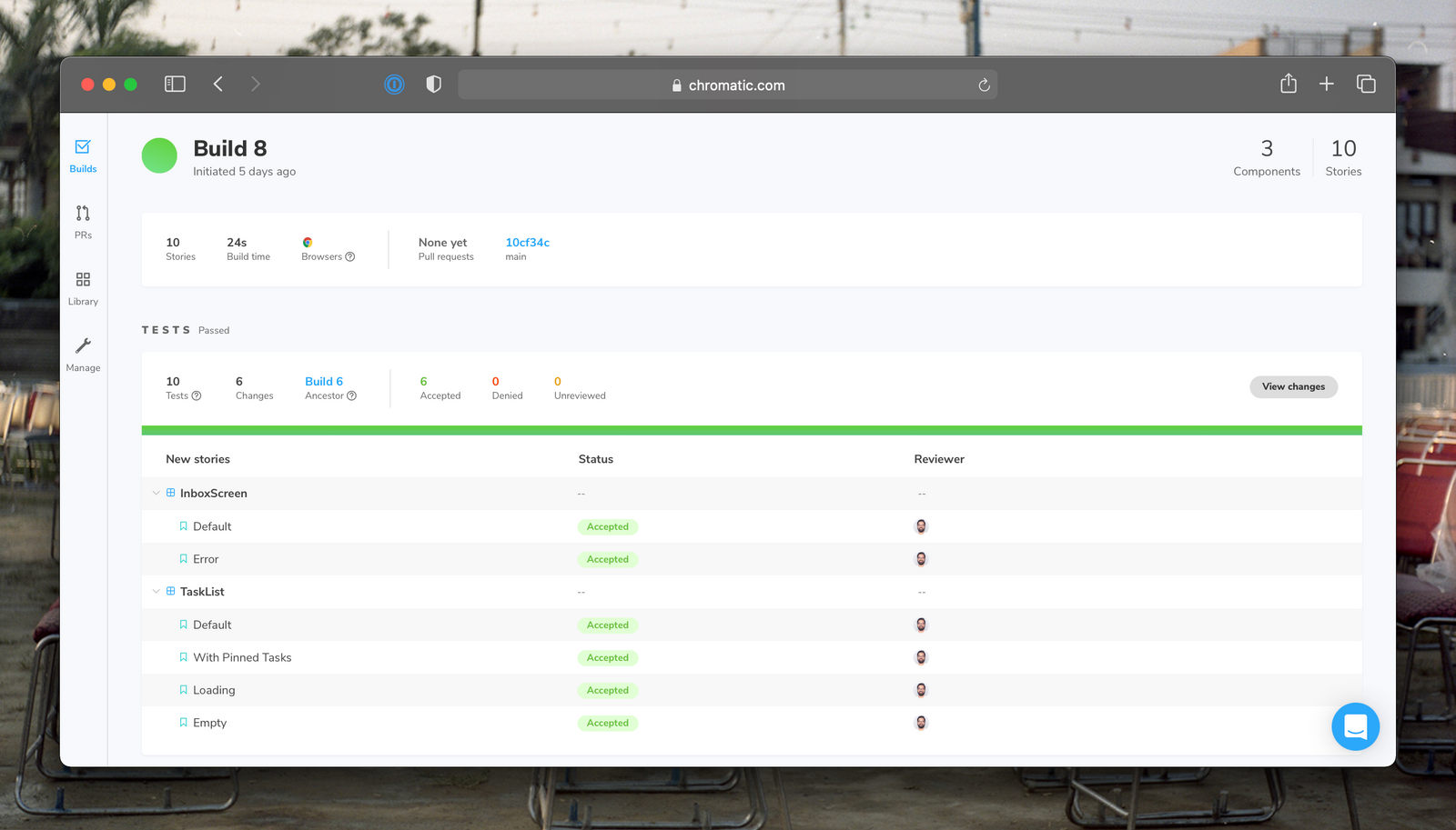
Now try changing something in the Task component, something like font size or background color. Then make a commit and rerun Chromatic.
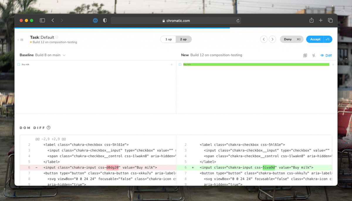
The tree-like nature of applications means that any tweak to the Task component will also be caught by tests for higher level components. Testing composite components allows you to catch bugs before you deploy to prod.
Conclusion
Given the scale of modern applications, developers can't be aware of all the different places that a component is being used. So you often end up shipping bugs accidentally. That bogs you down – it takes 5-10x longer to fix these bugs in production. Composition testing allows us to understand the potential impact of small changes on the larger system. You can catch bugs before they snowball into significant regressions.
Next up, we'll get into testing interactions. When the user checks off a task, how can you ensure that the suitable event was fired and that state updated correctly? Join the mailing list to get notified as more UI testing articles are published.
Stop the chain reaction of bugs!
— Storybook (@storybookjs) July 14, 2021
Apps are an interconnected tree of components. If one fails, the others around it break too.
Composition testing allows you to understand the impact of every little bug on the entire system. And nip it in the bud.https://t.co/bqMyQD8MNR pic.twitter.com/nrdjDWeNWw