
Zero-config Storybook
Simple setup, instant productivity

Storybook’s greatest strength is also its weakness.
Thousands of leading teams from Airbnb to BBC choose Storybook because it works with diverse frameworks and tech stacks. Unfortunately, the abundance of configuration options can make Storybook tough to set up.
As maintainers, our goal is to get you setup quickly while preserving robust config options for advanced teams. That’s why I’m excited to share new 6.0 features that are a giant leap forward towards zero config Storybook.
- 🧰 Built-in TypeScript support: Out of the box TS compatibility.
- 💎 Storybook Essentials: Best practice addons for every project.
- 🔌 Project Integrations: Presets for popular application frameworks.

🗡 Flexibility is a double-edged sword
Storybook can be configured to match any build setup. It has an expansive API and rich addon ecosystem to accommodate countless use cases.
Flexibility enables Storybook to adapt to varying needs of giant companies and ambitious startups alike. But Storybook’s initial setup can be daunting for new users.
Ideally, Storybook setup is zero-config yet fully adjustable for larger projects. Over the past year the team made huge strides toward zero-config.
- 5.1 added presets, configuration bundles for common setups like SCSS or Create React App.
- 5.3 introduced main.js, a single declarative config file to simplify customization.
Now in 6.0, it’s even easier to integrate Storybook.
🧰 Built-in TypeScript
Storybook 6.0’s supports TypeScript using Babel transpilation with optional asynchronous type checking using fork-ts-checker-webpack-plugin. It’s similar to what Create React App uses.
TypeScript continues to be adopted by popular tools including NextJS, React Native CLI, Expo, Yarn, Jest, Apollo, and Storybook itself. Creating a seamless TS experience is crucial to Storybook’s future success.
Now when you add Storybook to your TS project, it just works. See the documentation for more info and advanced options.
💎 Storybook Essentials
Storybook is fully customizable thanks to hundreds of third party addons that do everything from accessibility checks to design handoff.
Storybook Essentials is a curated collection of addons by the core team that are considered core to the out-of-the-box Storybook experience. They are tightly integrated and ship by default with new Storybook installations.
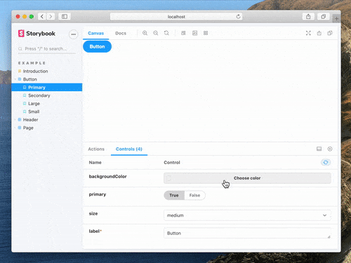

Essentials currently includes the following:
- Docs: Best practice auto-generated documentation using your stories
- Controls: Tinker with component properties to explore different states
- Actions: Log UI actions to verify your components’ interaction behavior
- Viewport: See responsive behavior against different device viewports
- Backgrounds: See your component against different colors and styles
- Toolbars: Custom toolbar UI for theming, i18n, and more
We’ll prioritize their maintenance, support, documentation, and interoperability for Essentials. We’ll also do our best to ensure they work smoothly with the hundreds of other Storybook addons and in hosted Storybook services like Chromatic.
Learn more about essentials in the documentation.
🔌 Project Integrations
A final way in which Storybook setup is getting easier is through integrations that preconfigure Storybook to work seamlessly with popular app frameworks.
We’re excited to see a wave of new third-party integrations (🔥) which are being developed, published, and maintained by the app framework communities themselves.
Here’s a list of integrations by framework:
- React: Create React App, Next 🔥, RedwoodJS 🔥
- Vue: Nuxt 🔥, Vue CLI, Vuetify 🔥
- Angular: Nx 🔥
- Web components: Open-WC 🔥
- Ember: Ember CLI
If you want to partner on a new integration, please DM me on Twitter!
⚡ 1 minute install
Try out Built-in Typescript and Essentials today in Storybook 6.0.
You can bootstrap Storybook into an existing app:
npx sb initIf it’s a Typescript app, it should work straight away with no extra configuration needed. Essentials also comes pre-installed.
Alternatively, to upgrade an existing Storybook:
npx sb upgradeTypescript is built in, so if you’ve configured your Storybook for typescript, you should remove that configuration.
Once you’ve upgraded, you can install Essentials with npm or yarn and update your .storybook/main.js
$ yarn add @storybook/addon-essentials --dev

// main.js
module.exports = {
  addons: ['@storybook/addon-essentials'],
};
Get involved
Typescript support was added by Brody McKee and Michael Shilman (me!). Essentials was developed by Michael Shilman, Zoltan Olah, Tom Coleman, and Clément Dungler.
Storybook is maintained by 1000+ open source contributors and guided by a steering committee of top maintainers. If you are interested in contributing, check out Storybook on GitHub, create an issue, or submit a pull request. Donate on Open Collective. Chat with us in Discord — a maintainer is usually online.