
Storybook Controls
Live edit UI components with no code

Storybook is the world’s most popular UI component workshop. It’s used by Airbnb, Slack, Lyft, IBM, and thousands of top teams across the industry.
Storybook helps you build UI components in isolation and save their states as stories. A story is a simple function that renders a component given a set of arguments (props, inputs, slots, etc.).
But components are complicated. It’s hard to predict how a component will react to different values and write stories for all meaningful combinations. So it’s super useful to be able to explore the state space interactively.
That’s why I’m excited to announce Controls, a new Storybook 6.0 addon that allows you to dynamically edit a component’s inputs without touching code. Controls are auto-generated UI for rapid component experimentation.
- ⚡ Live edit components. Dynamically tweak component arguments.
- 🐇 Instant setup. No setup cost. No maintenance as you modify APIs.
- 🎛 Automatic generation. No extra glue code needed.
- 🔑 No lock-in. No dependency on Storybook-specific APIs.
🤷♀️ Can’t I already do this?
Dynamically editing components is not a new concept. Component “playgrounds” have existed for years. Storybook’s own Knobs addon is downloaded over 1M times each week!
We researched how teams from Auth0, Shopify, and our vibrant community live edit their components. Sophisticated techniques require setup and ongoing maintenance. Simpler methods expect folks to know how to code.
Fortunately, trends in the JavaScript ecosystem work in our favor. As developers mass adopt type systems (e.g. TypeScript, Flow, propTypes), components get well-specified sets of arguments they accept. And those arguments are machine readable.
Controls uses types to generate graphical controls. It requires no extra work and is seamlessly integrated into the Storybook developer experience.
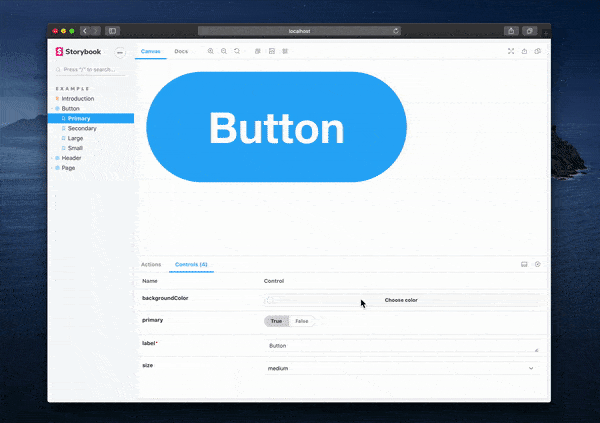
✨ Stories get Controls automatically
Controls are auto-generated from component arguments. Consider the following component that declares its interface in TypeScript:
interface ButtonProps { label?: string; }

const Button = ({ label='' }: ButtonProps) => (
  <button>{label}</button>
);
If you’re using React, Vue, Angular, or Web Components, Storybook analyzes your component arguments and automatically generates UI to edit these arguments.
This saves hundreds of lines of code in a component library that no longer need to be written and updated as your components change.
Storybook stories (component examples) are functions that return a rendered component. Control values are passed to your Story functions as arguments, and you can also declare the initial values succinctly:
export const Basic = (args) => <Button {...args} />;
Basic.args = { label: 'hello button' };
📚 Perfect for Storybook Docs
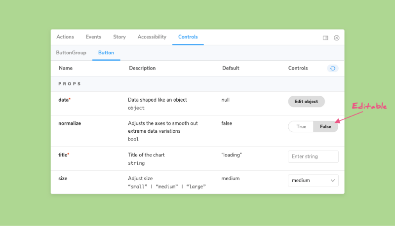
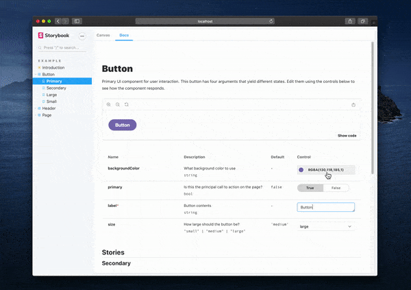
Controls works with Docs, Storybook’s automated documentation generator for UI components, including both DocsPage and MDX.
The generated “args table” includes controls for each component argument. That allows you to adjust the component examples while browsing the docs.
🚚 Write stories once and take anywhere
Stories written for Controls are portable to other testing libraries and tools.
They are based on Component Story Format, an open ES6 based standard for component examples. We’re working with a variety of design, dev, and testing tools to make sure Controls stories are supported in other contexts.
If you already use the Knobs addon, Controls provides a more ergonomic syntax. It replaces “side-loaded” data with standard functional code. Here’s how you’d instrument a component with Knobs:
import { text } from '@storybook/addon-knobs';

export const Basic = () => (
  <Button label={text('Label', 'hello')} />
);
See that pesky Storybook import? Recall the Controls syntax from above, which is completely free of proprietary dependencies:
export const Basic = (args) => <Button {...args} />;
Basic.args = { label: 'hello' };
When you write stories in this function style, it also helps you reduce story boilerplate, reuse fixture data across stories, and recycle stories more easily in other tools. These DX benefits are elaborated upon in the Storybook Args release post.
⚡ 1 minute install
Try out Controls today in Storybook 6.0:
npx sb upgradeOr bootstrap Storybook into an existing app:
npx sb initTo create your first Controls story, create a function that takes an Args object as its first input, and then annotate the function with the data you want to receive:
import { Button } from '@storybook/react/demo';

export default { title: 'Button/Controls', component: Button };

export const Basic = (args) => <Button {...args} />;
Basic.args = { children: 'hello' };
To get auto-generated controls for that story (available in React, Vue, Angular, and Web-components), follow the quick installation instructions in the docs.
Get involved
Controls was developed by Michael Shilman (me!) and Tom Coleman with inspiration from the addon-knobs/docs contributors including Norbert de Langen, Filipp Riabchun, Atanas Stoyanov, and Patrick Lafrance. Design and theming by Dominic Nguyen.
Storybook is maintained by 1000+ open source contributors and guided by a steering committee of top maintainers. If you are interested in contributing, check out Storybook on GitHub, create an issue, or submit a pull request. Donate on Open Collective. Chat with us in Discord — a maintainer is usually online.