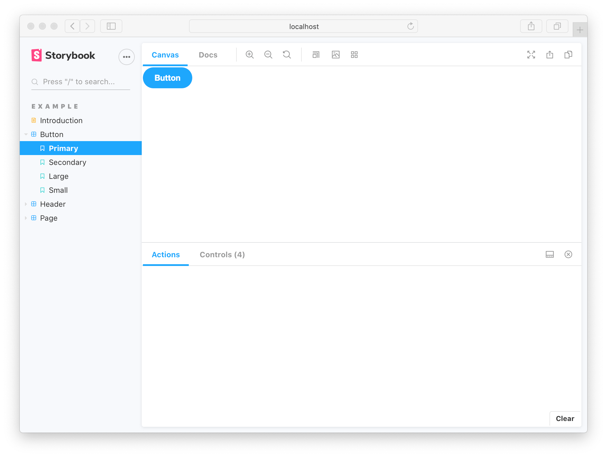
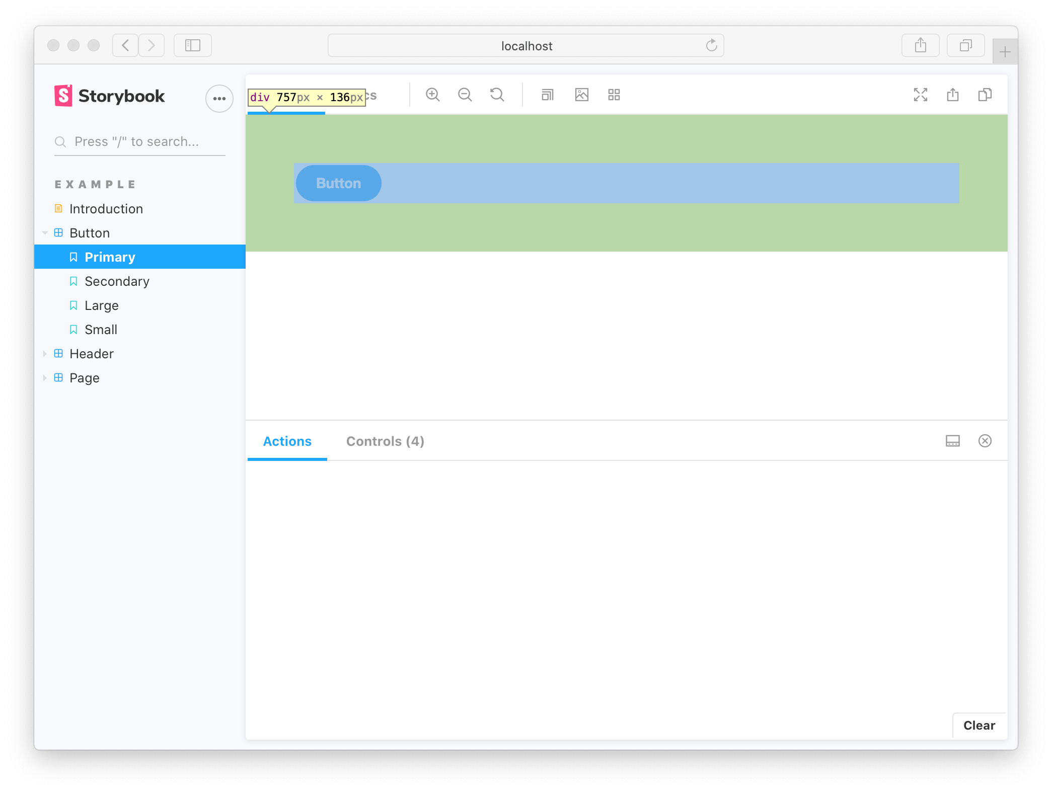
A decorator is a way to wrap a story in extra “rendering” functionality. Many addons define decorators in order to augment your stories with extra rendering or gather details about how your story is rendered.
When writing stories, decorators are typically used to wrap stories with extra markup or context mocking.
Wrap stories with extra markup
Some components require a “harness” to render in a useful way. For instance if a component runs right up to its edges, you might want to space it inside Storybook. Use a decorator to add spacing for all stories of the component.


“Context” for mocking
Some libraries require components higher up in the component hierarchy to render properly. For example in Styled Components, a ThemeProvider is required if your components make use of themes. Add a single global decorator that add this context to to all stories in .storybook/preview.js:
In the example above, the theme is hardcoded to a mock value of default but you may want to vary that value, either on a per-story basis (if it is data you are mocking that is relevant to the other args of the story) or in a user controlled way (for instance to provide a theme switcher).
The second argument to a decorator function is the story context which in particular contains the keys:
args- the story arguments. You can use some args in your decorators and drop them in the story implementation itself.globals- the Storybook-wide globals. In particular you can use the toolbars feature to allow you to change these values using Storybook’s UI.
Using decorators to provide data
If your components are “connected” and require side-loaded data to render, you can use decorators to provide that data in a mocked way, without having to refactor your components to take that data as an arg. There are several techniques to achieve this, depending on exactly how you are loading that data -- read more in the building pages in Storybook section.
Story decorators
To define a decorator for a single story, use the decorators key on a named export:
This is useful to ensure that the story remains a “pure” rendering of the component under test and any extra HTML or components you need to add don’t pollute that. In particular the Source docblock works best when you do this.
Component decorators
To define a decorator for all stories of a component, use the decorators key of the default CSF export:
Global decorators
We can also set a decorator for all stories via the decorators export of your .storybook/preview.js file (this is the file where you configure all stories):
Decorator inheritance
Like parameters, decorators can be defined globally, at the component level and for a single story (as we’ve seen).
All decorators, defined at all levels that apply to a story will run whenever that story is rendered, in the order:
- Global decorators, in the order they are defined
- Component decorators, in the order they are defined
- Story decorators, in the order they are defined.
