Sass tag components
61 tags are styled using Sass. A tag is a compact label that appears beside a primary interface area which is used to represent status or metadata for that area. Sass is a styling format that is compiled into CSS. It extends CSS with advanced features like scripting, mixins, and nesting. Sass is used to style 16 projects.
61components202storiesLast updated yesterday
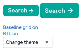
bpk-component-loading-button

bpk-component-badge

bpk-component-image
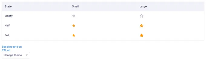
bpk-component-star-rating
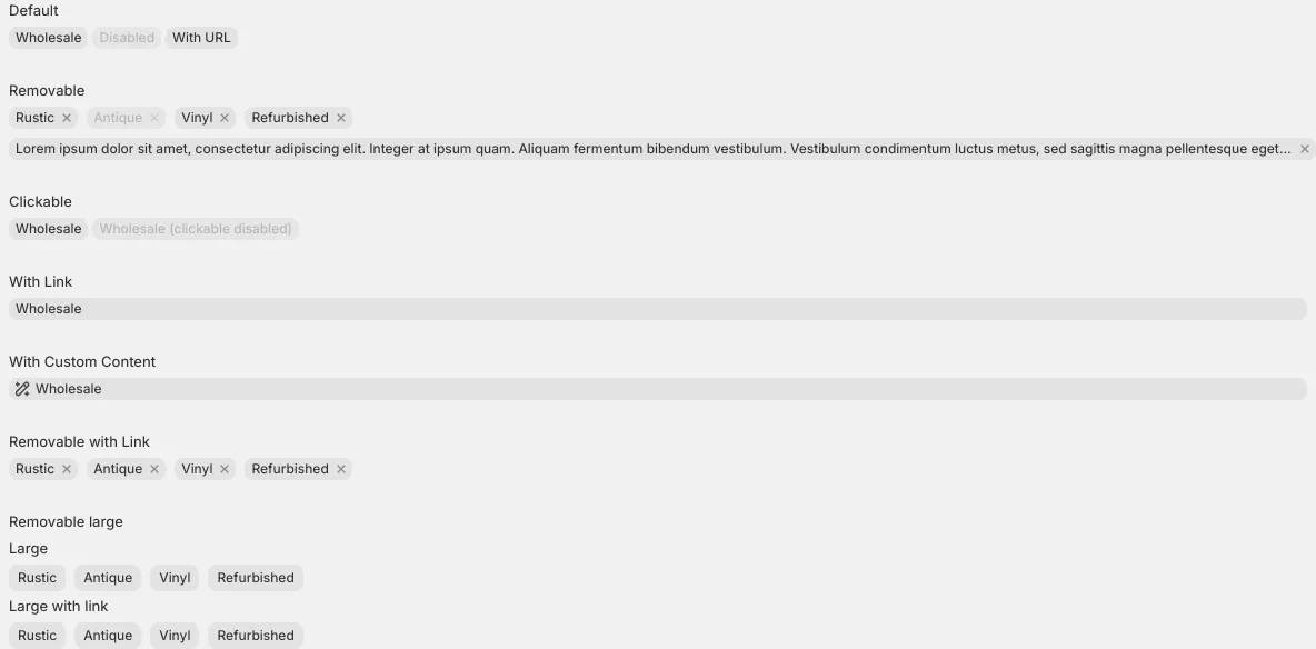
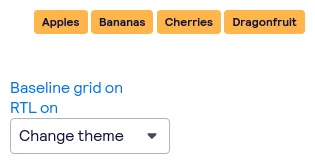
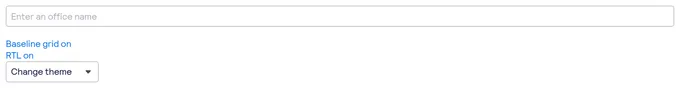
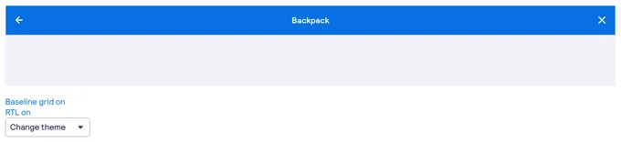
Tag


DateRangePicker (DRP)

bpk-component-autosuggest
bpk-component-navigation-bar
CloudStorageUploadItem

bpk-component-floating-notification
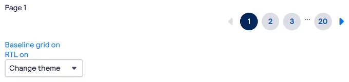
bpk-component-pagination
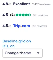
bpk-component-rating


CloudStorageFileTitle

unstable_ProgressBar
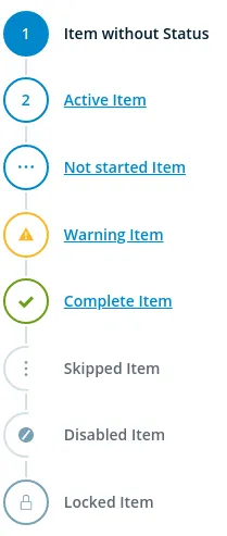
StepNavigation

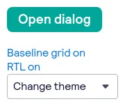
bpk-component-dialog
CloudStorageFileList

CloudStorageUploadTitle
Tag
