Assemble a composite component
Last chapter, we built our first component; this chapter extends what we learned to make TaskList, a list of Tasks. Let’s combine components together and see what happens when we introduce more complexity.
Tasklist
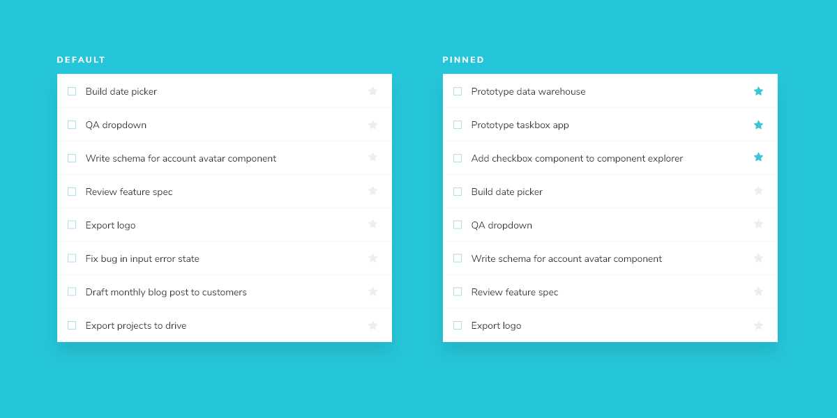
Taskbox emphasizes pinned tasks by positioning them above default tasks. It yields two variations of TaskList you need to create stories for: default and pinned items.
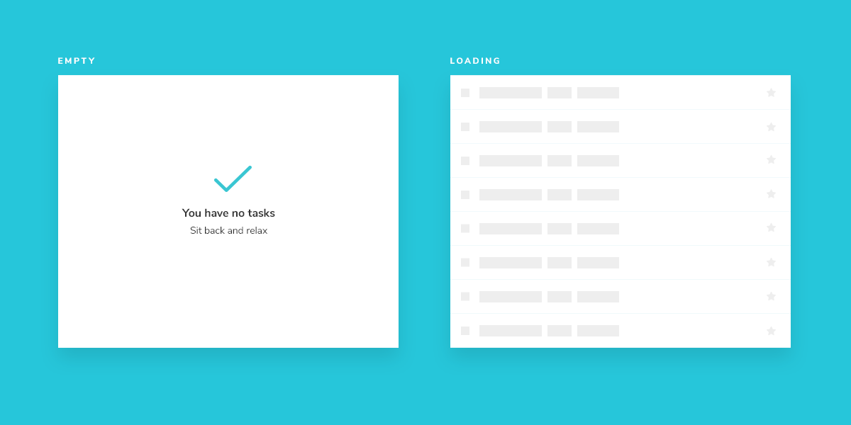
Since Task data can be sent asynchronously, we also need a loading state to render in the absence of a connection. In addition, we require an empty state for when there are no tasks.
Get set up
A composite component isn’t much different from the basic components it contains. Create a TaskList component and an accompanying story file: src/app/components/task-list.component.ts and src/app/components/task-list.stories.ts.
Start with a rough implementation of the TaskList. You’ll need to import the Task component from earlier and pass in the attributes and actions as inputs.
import type { TaskData } from '../types';

import { CommonModule } from '@angular/common';
import { Component, Input, Output, EventEmitter } from '@angular/core';

import { TaskComponent } from './task.component';

@Component({
  selector: 'app-task-list',
  standalone: true,
  imports: [CommonModule, TaskComponent],
  template: `
    <div class="list-items">
      <div *ngIf="loading">loading</div>
      <div *ngIf="!loading && tasks.length === 0">empty</div>
      <app-task
        *ngFor="let task of tasks"
        [task]="task"
        (onArchiveTask)="onArchiveTask.emit($event)"
        (onPinTask)="onPinTask.emit($event)"
      >
      </app-task>
    </div>
  `,
})

export class TaskListComponent {
  /**
   * The list of tasks
   */
  @Input() tasks: TaskData[] = [];

  /**
   * Checks if it's in loading state
   */
  @Input() loading = false;

  /**
   * Event to change the task to pinned
   */
  @Output()
  onPinTask = new EventEmitter<Event>();

  /**
   * Event to change the task to archived
   */
  @Output()
  onArchiveTask = new EventEmitter<Event>();
}
Next, create Tasklist’s test states in the story file.
import type { Meta, StoryObj } from '@storybook/angular';

import { componentWrapperDecorator } from '@storybook/angular';

import { TaskListComponent } from './task-list.component';

import * as TaskStories from './task.stories';

export const TaskListData = [
  { ...TaskStories.TaskData, id: '1', title: 'Task 1' },
  { ...TaskStories.TaskData, id: '2', title: 'Task 2' },
  { ...TaskStories.TaskData, id: '3', title: 'Task 3' },
  { ...TaskStories.TaskData, id: '4', title: 'Task 4' },
  { ...TaskStories.TaskData, id: '5', title: 'Task 5' },
  { ...TaskStories.TaskData, id: '6', title: 'Task 6' },
]

const meta: Meta<TaskListComponent> = {
  component: TaskListComponent,
  title: 'TaskList',
  tags: ['autodocs'],
  excludeStories: /.*Data$/,
  decorators: [
    //👇 Wraps our stories with a decorator
    componentWrapperDecorator(
      (story) => `<div style="margin: 3em">${story}</div>`
    ),
  ],
  args: {
    ...TaskStories.TaskData.events,
  },
};


export default meta;
type Story = StoryObj<TaskListComponent>;

export const Default: Story = {
  args: {
    tasks: TaskListData,
  },
}

export const WithPinnedTasks: Story = {
  args: {
    // Shaping the stories through args composition.
    // Inherited data coming from the Default story.
    tasks: [
      // Shaping the stories through args composition.
      // Inherited data coming from the Default story.
      ...(Default.args?.tasks?.slice(0, 5) || []),
      { id: '6', title: 'Task 6 (pinned)', state: 'TASK_PINNED' },
    ],
  },
}


export const Loading: Story = {
  args: {
    tasks: [],
    loading: true,
  },
}

export const Empty: Story = {
  args: {
    // Shaping the stories through args composition.
    // Inherited data coming from the Loading story.
    ...Loading.args,
    loading: false,
  },
}
💡Decorators are a way to provide arbitrary wrappers to stories. In this case, we use a decorator key on the default export to add styling around the rendered component. But they can also add other context to components, as we'll see later.
By importing TaskStories, we were able to compose the arguments (args for short) in our stories with minimal effort. That way, the data and actions (mocked callbacks) expected by both components are preserved.
Now check Storybook for the new TaskList stories.
Build out the states
Our component is still rough, but now we have an idea of the stories to work toward. You might be thinking that the .list-items wrapper is overly simplistic. You're right – in most cases, we wouldn’t create a new component just to add a wrapper. But the real complexity of the TaskList component is revealed in the edge cases withPinnedTasks, loading, and empty.
import type { TaskData } from '../types';

import { CommonModule } from '@angular/common';
import { Component, Input, Output, EventEmitter } from '@angular/core';

import { TaskComponent } from './task.component';

@Component({
  selector: 'app-task-list',
  standalone: true,
  imports: [CommonModule, TaskComponent],
  template: `
    <div class="list-items">
      <app-task
        *ngFor="let task of tasksInOrder"
        [task]="task"
        (onArchiveTask)="onArchiveTask.emit($event)"
        (onPinTask)="onPinTask.emit($event)"
      >
      </app-task>
      <div
        *ngIf="tasksInOrder.length === 0 && !loading"
        class="wrapper-message"
        data-testid="empty"
      >
        <span class="icon-check"></span>
        <p class="title-message">You have no tasks</p>
        <p class="subtitle-message">Sit back and relax</p>
      </div>
      <div *ngIf="loading">
        <div *ngFor="let i of [1, 2, 3, 4, 5, 6]" class="loading-item">
          <span class="glow-checkbox"></span>
          <span class="glow-text"> <span>Loading</span> <span>cool</span> <span>state</span> </span>
        </div>
      </div>
    </div>
  `,
})
export class TaskListComponent {
  /**
   * @ignore
   * Component property to define ordering of tasks
   */
  tasksInOrder: TaskData[] = [];

  /**
   * Checks if it's in loading state
   */
  @Input() loading = false;

  /**
   * Event to change the task to pinned
   */
  @Output()
  onPinTask = new EventEmitter<Event>();

  /**
   * Event to change the task to archived
   */
  @Output()
  onArchiveTask = new EventEmitter<Event>();

  /**
   * The list of tasks
   */
  @Input()
  set tasks(arr: TaskData[]) {
    const initialTasks = [
      ...arr.filter((t) => t.state === 'TASK_PINNED'),
      ...arr.filter((t) => t.state !== 'TASK_PINNED'),
    ];
    const filteredTasks = initialTasks.filter(
      (t) => t.state === 'TASK_INBOX' || t.state === 'TASK_PINNED'
    );
    this.tasksInOrder = filteredTasks.filter(
      (t) => t.state === 'TASK_INBOX' || t.state === 'TASK_PINNED'
    );
  }
}
The added markup results in the following UI:
Note the position of the pinned item in the list. We want the pinned item to render at the top of the list to make it a priority for our users.