Component explorers
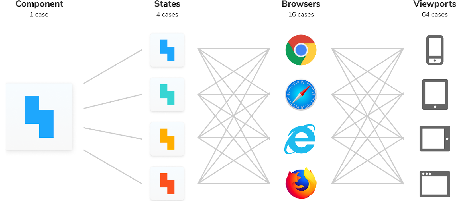
Modern UIs support countless permutations of state, language, device, browser, and user data. In the past, developing UI was cumbersome. You'd have to navigate to a given page on the right device with the proper settings. Then you'd click around to get the page into the right state so you could start coding.
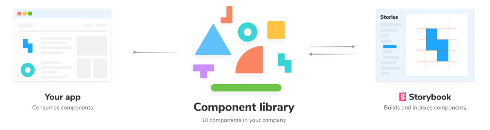
A component explorer isolates UI concerns from business logic and app context. You build UI components in isolation to focus on each component's supported variations. That allows you to gauge how inputs (props, state) affect the rendered UI and forms the basis of your visual test suite.
Storybook is the industry-standard component explorer that we'll use to demonstrate visual testing. It's adopted by Twitter, Slack, Airbnb, Shopify, Stripe, and thousands of other companies so you can apply the learnings in this guide wherever you end up working.
Why build UIs in isolation?
Fewer bugs
The more components and states you have, the harder it is to confirm that they all render correctly in users' devices and browsers.
Component explorers prevent inconsistency by showcasing the supported variations of a component. That enables developers to focus on each state independently. They can be tested in isolation, and you can use mocking to replicate complicated edge cases.
Faster development
Apps are never finished. You continuously iterate. Therefore, UI architectures must be adaptable to accommodate new features. The component model encourages interchangeability by separating the UI from application business logic and backend.
Component explorers make this separation evident by providing a sandbox to develop UI in isolation, away from the app. That means teams can work on different UI pieces simultaneously without distraction or state pollution from other parts of the app.
Easier collaboration
UIs are inherently visual. Code-only pull requests are an incomplete representation of the work. To truly unlock collaboration, stakeholders have to look at the UI.
Component explorers visualize UI components and all their variations. That makes it easy to get feedback on "does this look right?" from developers, designers, product managers, and QA.
Where does it fit into my tech stack?
A component explorer is packaged as a small standalone sandbox that lives alongside your app. It allows you to visualize component variations in isolation and contains the features below:
- 🧱 Sandbox for component isolation
- 🔭 Variation visualizer for component specification and properties
- 🧩 Save variations as "stories" to revisit during testing
- 📑 Documentation for component discovery and usage guidelines
Learn the workflow
Isolating your UI with a component explorer unlocks visual testing. The next chapter shows you how to remix Test-Driven Development for UI development.