Visual TDD
Now that the basics are covered let’s jump into the details. This example demonstrates building out a state of a CommentList component using Visual TDD with Storybook.
- Build visual test cases
- Check the tests in Storybook
- Build out the implementation
- Check the implementation against the design
- Iterate
What we're building
CommentList is part of a chat tool for galactic freedom fighters. Our designer has handed us a design for the various ways the list of comments should look based on the data and the app's state. Our job is to ensure the list renders correctly in terms of the exact text, images displayed, and visual treatment.
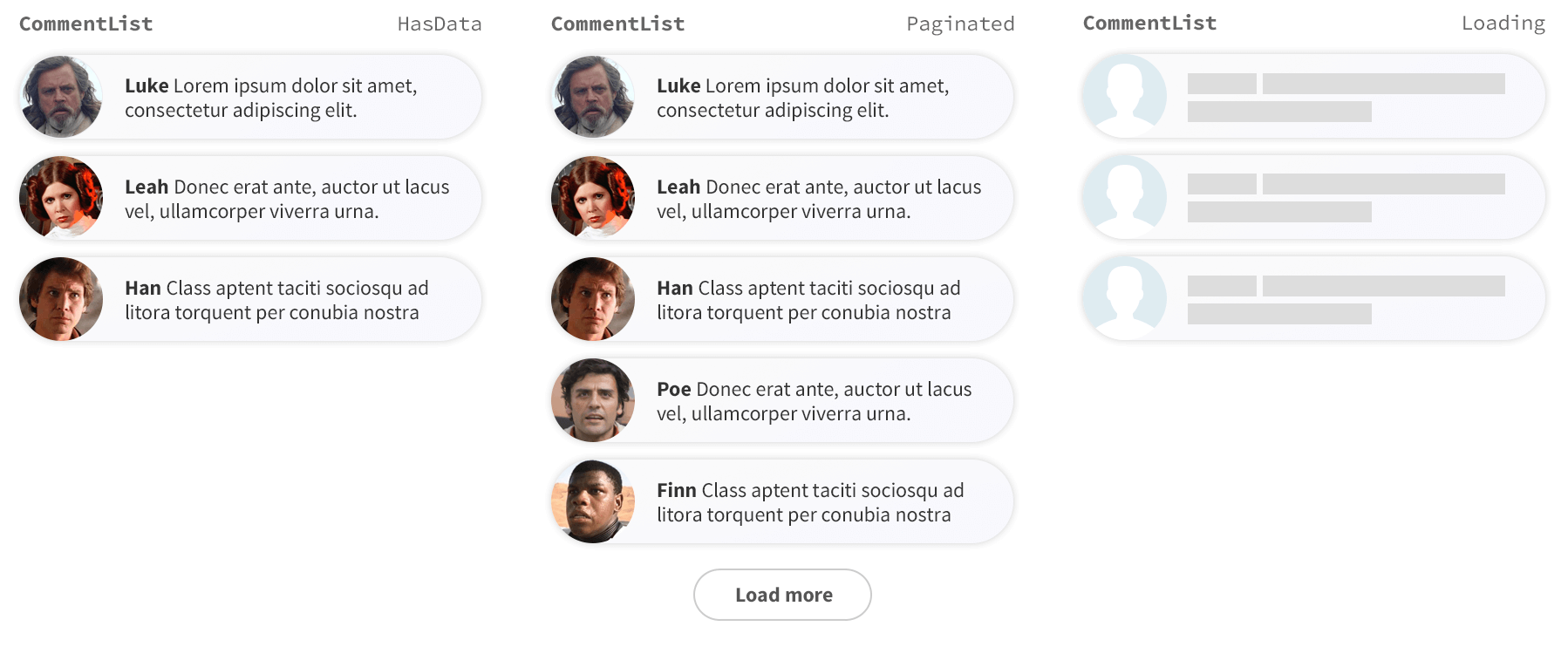
1. Build visual test cases
Start visual TDD by building test cases. We’ll create three cases that match the three images above. A strict TDD-er would say we need to develop and implement one test case at a time; it’s up to you if you think this helps your process.
Let's set up the example project using degit to download the necessary boilerplate templates (partially built applications with some default configuration). Run the following commands:
# Clone the template for this tutorial
npx degit chromaui/visual-testing-handbook-react-template commentlist

cd commentlist

# Install dependencies
yarn
Next, we’ll build the simplest-possible CommentList implementation so that we can ensure our tests are set up correctly.
Inside your src directory, create a new folder called components, then create a new file called CommentList.tsx with the following content:
interface Author {
  name: string;
  avatar: string;
}

interface Comment {
  text: string;
  author: Author;
}

export interface CommentListProps {
  /**
   * Is the component in the loading state
   */
  loading?: boolean;

  /**
   * Total number of comments
   */
  totalCount?: number;

  /**
   * List of comments
   */
  comments?: Comment[];
}

/**
* The Commentlist component should display the comments from the users.
*/
export default function CommentList({
  loading = false,
  comments = [],
  totalCount = 10,
}: CommentListProps) {
  if (loading) {
    return <div>loading</div>;
  }
  if (comments.length === 0) {
    return <div>empty</div>;
  }
  return (
    <div>
      {comments.length} of {totalCount}
    </div>
  );
}
Now that we have a basic implementation, we can build our test states. Storybook makes this quick and easy.
Create a new file called CommentList.stories.ts in src/components and add the following:
import type { Meta, StoryObj } from '@storybook/react-vite';

import CommentList from './CommentList';

const meta = {
  component: CommentList,
  title: 'CommentList',
} satisfies Meta<typeof CommentList>;

export default meta;
type Story = StoryObj<typeof meta>;

export const Paginated: Story = {
  args: {
    comments: [
      {
        text: 'Lorem ipsum dolor sit amet, consectetur adipisicing elit.',
        author: {
          name: 'Luke',
          avatar: 'luke.jpeg',
        },
      },
      {
        text: 'Ut enim ad minim veniam, quis nostrud exercitation ullamco.',
        author: {
          name: 'Leah',
          avatar: 'leah.jpeg',
        },
      },
      {
        text: 'Duis aute irure dolor in reprehenderit in voluptate.',
        author: {
          name: 'Han',
          avatar: 'han.jpeg',
        },
      },
      {
        text: 'Ut enim ad minim veniam, quis nostrud exercitation ullamco.',
        author: {
          name: 'Poe',
          avatar: 'poe.jpeg',
        },
      },
      {
        text: 'Duis aute irure dolor in reprehenderit in voluptate.',
        author: {
          name: 'Finn',
          avatar: 'finn.jpeg',
        },
      },
    ],
    totalCount: 10,
  },
};

export const HasData: Story = {
  args: {
    comments: [...(Paginated?.args?.comments?.slice(0, 3) || [])],
    totalCount: 3,
  },
};

export const Loading: Story = {
  args: {
    comments: [],
    loading: true,
  },
};

export const Empty: Story = {
  args: {
    ...Loading.args,
    loading: false,
  },
};
2. Check the tests in Storybook
Start Storybook to see the test cases. Our component implementation is bare bones, but it allows us to confirm our test cases render as intended.
yarn storybook
3. Build out the implementation
So far, we scaffolded a rudimentary implementation then set up Storybook to render our test cases. It’s time to start building an implementation of the HasData variation in isolation.
We use styled-components – a library that encapsulates CSS at the component level. Run the following command:
yarn add styled-components
Update your CommentList.tsx file to the following:
+ import styled, { createGlobalStyle } from 'styled-components';

interface Author {
  name: string;
  avatar: string;
}

interface Comment {
  text: string;
  author: Author;
}

export interface CommentListProps {
  /**
   * Is the component in the loading state
   */
  loading?: boolean;

  /**
   * Total number of comments
   */
  totalCount?: number;

  /**
   * List of comments
   */
  comments?: Comment[];
}

+ const CommentListWrapper = styled.div`
+   font-family: "Nunito Sans", "Helvetica Neue", Helvetica, Arial, sans-serif;
+   color: #333;
+   display: inline-block;
+   vertical-align: top;
+   width: 265px;
+ `;

+ const CommentItem = styled.div`
+   font-size: 12px;
+   line-height: 14px;
+   clear: both;
+   height: 48px;
+   margin-bottom: 10px;
+   box-shadow: rgba(0, 0, 0, 0.2) 0 0 10px 0;
+   background: linear-gradient(
+    120deg,
+    rgba(248, 248, 254, 0.95),
+    rgba(250, 250, 250, 0.95)
+   );
+   border-radius: 48px;
+ `;

+ const Avatar = styled.div`
+   float: left;
+   position: relative;
+   overflow: hidden;
+   height: 48px;
+   width: 48px;
+   margin-right: 14px;
+   background: #dfecf2;
+   border-radius: 48px;
+ `;

+ const AvatarImg = styled.img`
+   position: absolute;
+   height: 100%;
+   width: 100%;
+   left: 0;
+   top: 0;
+   z-index: 1;
+   background: #999;
+ `;

+ const Message = styled.div`
+   overflow: hidden;
+   padding-top: 10px;
+   padding-right: 20px;
+ `;

+ const Author = styled.span`
+   font-weight: bold;
+ `;

+ const CommentText = styled.span``;

+ const GlobalStyle = createGlobalStyle`
+   @import url('https://fonts.googleapis.com/css?family=Nunito+Sans:400,400i,800');
+ `;

/**
 * The Commentlist component should display the comments from the user.
*/
export default function CommentList({
  loading = false,
  comments = [],
  totalCount = 10,
}: CommentListProps) {
  if (loading) {
    return <div>loading</div>;
  }
  if (comments.length === 0) {
    return <div>empty</div>;
  }
  return (
+   <>
+     <GlobalStyle />
+     <CommentListWrapper>
+       {comments.map(({ text, author: { name, avatar } }) => (
+         <CommentItem key={`comment_${name}`}>
+           <Avatar>
+             <AvatarImg src={avatar} />
+           </Avatar>
+           <Message>
+             <Author>{name}</Author> <CommentText>{text}</CommentText>
+           </Message>
+         </CommentItem>
+       ))}
+     </CommentListWrapper>
+   </>
  );
}
4. Check the implementation against the design
Check how the component looks in Storybook. This example provided the CSS already, but in practice, we would tweak the styles and confirmed them in Storybook as we went along.
5. Iterate
If we're not satisfied with the implementation in step 4, we'd go back to step 3 and keep working on it. If the UI matches the spec, then we'll move on to building the next variation - perhaps by adding the “load more” button to the Paginated story.
As we iterate through this workflow, regularly check each story to ensure that the final implementation correctly handles each test state and not just the last one we worked on.
Learn how to automate visual testing
In the next chapter, we’ll see how we can automate the VTDD process with Chromatic, a free visual testing service made by the Storybook maintainers.