시각적 TDD
이제 기본기는 다 다뤘으니, 더 세부적인 이야기로 들어가 봅시다. 이 예시에서는 스토리북(Storybook)의 Visual TDD를 이용해 CommentList 하나의 컴포넌트 상태(state)를 만드는 과정을 보여드리겠습니다.
- 시각적 테스트 케이스 구축
- 스토리북 테스트 검토
- 구현 구축
- 디자인에 대한 구현 검토
- 반복
우리가 만들 것
CommentList는 galactic freedom fighters의 채팅 도구의 일부분입니다. 디자이너는 우리에게 데이터와 앱의 상태를 바탕으로 댓글 목록이 보여야 할 다양한 방법을 디자인해서 넘겨주었습니다. 우리가 할 일은 목록이 정확한 텍스트, 보여지는 이미지, 시각적인 처리 측면에서 올바르게 렌더링되도록 하는 것입니다.
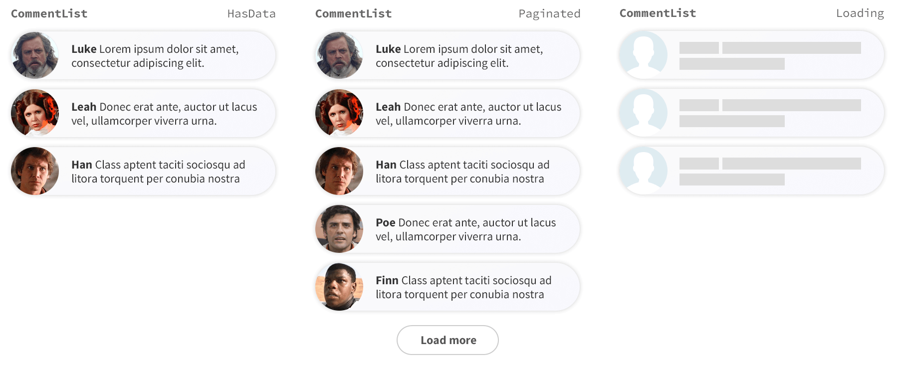
1. 시각적 테스트 케이스들 구축
테스트 케이스들을 만들면서 시각적 TDD를 시작해봅시다. 우리는 위의 세 이미지에 각각 대응하는 세 가지 케이스를 만들 것입니다. 엄격한 TDD 전문가는 한 번에 하나의 테스트 케이스를 개발하고 구현해야 한다고 말하겠지만 - 이게 여러분의 프로세스에 도움이 되는지는 스스로 생각하고 결정하면 됩니다.
예시 프로젝트를 degit을 이용해서 설정하고, 필요한 보일러 플레이트 템플릿(기본 설정을 가지고 일부만 만들어진 어플리케이션)을 다운로드 하겠습니다. 다음 명령어들을 실행해보세요. -
# Clone the template for this tutorial
npx degit chromaui/visual-testing-handbook-react-template commentlist

cd commentlist

# Install dependencies
yarn
다음으로, 우리는 가장 간단한 CommentList을 구현해서 테스트가 정확하게 설정되었는지 확인하겠습니다.
src 디렉토리 안에, components라는 새 폴더를 만듭니다, 그리고 CommentList.tsx라는 이름으로 새 파일을 하나 만들고 다음 내용을 적습니다. -
interface Author {
  name: string;
  avatar: string;
}

interface Comment {
  text: string;
  author: Author;
}

export interface CommentListProps {
  /**
   * Is the component in the loading state
   */
  loading?: boolean;

  /**
   * Total number of comments
   */
  totalCount?: number;

  /**
   * List of comments
   */
  comments?: Comment[];
}

/**
* The Commentlist component should display the comments from the users.
*/
export default function CommentList({
  loading = false,
  comments = [],
  totalCount = 10,
}: CommentListProps) {
  if (loading) {
    return <div>loading</div>;
  }
  if (comments.length === 0) {
    return <div>empty</div>;
  }
  return (
    <div>
      {comments.length} of {totalCount}
    </div>
  );
}
이제 기본적인 구현이 있으니, 테스트 상태를 만들 수 있습니다. 스토리북을 사용하면 이 일을 빠르고 쉽게 할 수 있습니다.
CommentList.stories.ts라는 파일을 src/components 폴더에 만들고 다음을 추가합니다.
import type { Meta, StoryObj } from '@storybook/react-vite';

import CommentList from './CommentList';

const meta = {
  component: CommentList,
  title: 'CommentList',
} satisfies Meta<typeof CommentList>;

export default meta;
type Story = StoryObj<typeof meta>;

export const Paginated: Story = {
  args: {
    comments: [
      {
        text: 'Lorem ipsum dolor sit amet, consectetur adipisicing elit.',
        author: {
          name: 'Luke',
          avatar: 'luke.jpeg',
        },
      },
      {
        text: 'Ut enim ad minim veniam, quis nostrud exercitation ullamco.',
        author: {
          name: 'Leah',
          avatar: 'leah.jpeg',
        },
      },
      {
        text: 'Duis aute irure dolor in reprehenderit in voluptate.',
        author: {
          name: 'Han',
          avatar: 'han.jpeg',
        },
      },
      {
        text: 'Ut enim ad minim veniam, quis nostrud exercitation ullamco.',
        author: {
          name: 'Poe',
          avatar: 'poe.jpeg',
        },
      },
      {
        text: 'Duis aute irure dolor in reprehenderit in voluptate.',
        author: {
          name: 'Finn',
          avatar: 'finn.jpeg',
        },
      },
    ],
    totalCount: 10,
  },
};

export const HasData: Story = {
  args: {
    comments: [...(Paginated?.args?.comments?.slice(0, 3) || [])],
    totalCount: 3,
  },
};

export const Loading: Story = {
  args: {
    comments: [],
    loading: true,
  },
};

export const Empty: Story = {
  args: {
    ...Loading.args,
    loading: false,
  },
};
2. Storybook에서 테스트를 확인하기
테스트 케이스를 보려면 Storybook을 시작하세요. 우리의 컴포넌트 구현은 뼈대 뿐이지만, 테스트 케이스가 의도대로 렌더링되는지 확인할 수는 있습니다.
yarn storybook
3. 구현을 구축하기
일단, 기본적인 구현의 비계(scaffolded)를 세웠고 테스트 케이스를 렌더링하도록 스토리북을 설정했습니다. 이제 HasData의 변화형(variation)의 구현을 독립적으로 만들어볼 시간입니다.
우리는 styled-components를 사용합니다. CSS를 컴포넌트 수준에서 캡슐화 시켜주는 라이브러리입니다. 다음 명령어를 실행합니다.
yarn add styled-components
CommentList.tsx 파일을 다음과 같이 수정하세요.
+ import styled, { createGlobalStyle } from 'styled-components';

interface Author {
  name: string;
  avatar: string;
}

interface Comment {
  text: string;
  author: Author;
}

export interface CommentListProps {
  /**
   * Is the component in the loading state
   */
  loading?: boolean;

  /**
   * Total number of comments
   */
  totalCount?: number;

  /**
   * List of comments
   */
  comments?: Comment[];
}

+ const CommentListWrapper = styled.div`
+   font-family: "Nunito Sans", "Helvetica Neue", Helvetica, Arial, sans-serif;
+   color: #333;
+   display: inline-block;
+   vertical-align: top;
+   width: 265px;
+ `;

+ const CommentItem = styled.div`
+   font-size: 12px;
+   line-height: 14px;
+   clear: both;
+   height: 48px;
+   margin-bottom: 10px;
+   box-shadow: rgba(0, 0, 0, 0.2) 0 0 10px 0;
+   background: linear-gradient(
+    120deg,
+    rgba(248, 248, 254, 0.95),
+    rgba(250, 250, 250, 0.95)
+   );
+   border-radius: 48px;
+ `;

+ const Avatar = styled.div`
+   float: left;
+   position: relative;
+   overflow: hidden;
+   height: 48px;
+   width: 48px;
+   margin-right: 14px;
+   background: #dfecf2;
+   border-radius: 48px;
+ `;

+ const AvatarImg = styled.img`
+   position: absolute;
+   height: 100%;
+   width: 100%;
+   left: 0;
+   top: 0;
+   z-index: 1;
+   background: #999;
+ `;

+ const Message = styled.div`
+   overflow: hidden;
+   padding-top: 10px;
+   padding-right: 20px;
+ `;

+ const Author = styled.span`
+   font-weight: bold;
+ `;

+ const CommentText = styled.span``;

+ const GlobalStyle = createGlobalStyle`
+   @import url('https://fonts.googleapis.com/css?family=Nunito+Sans:400,400i,800');
+ `;

/**
 * The Commentlist component should display the comments from the user.
*/
export default function CommentList({
  loading = false,
  comments = [],
  totalCount = 10,
}: CommentListProps) {
  if (loading) {
    return <div>loading</div>;
  }
  if (comments.length === 0) {
    return <div>empty</div>;
  }
  return (
+   <>
+     <GlobalStyle />
+     <CommentListWrapper>
+       {comments.map(({ text, author: { name, avatar } }) => (
+         <CommentItem key={`comment_${name}`}>
+           <Avatar>
+             <AvatarImg src={avatar} />
+           </Avatar>
+           <Message>
+             <Author>{name}</Author> <CommentText>{text}</CommentText>
+           </Message>
+         </CommentItem>
+       ))}
+     </CommentListWrapper>
+   </>
  );
}
4. 디자인에 대한 구현 검토하기
컴포넌트가 스토리북에서 어떻게 보이는지 검토합시다. 이 예시에서는 CSS를 이미 제공했습니다, 하지만 실제로는 styles을 약간 바꿔보면서 스토리북에서 어떻게 보이는지 확인했습니다.
5. 반복
만약 step4에서 만든 구현에 만족하지 못한다면, step3로 돌아가서 계속 작업을 이어가면 됩니다. UI가 스펙과 일치한다면, 이제 다음 변화형(variation)을 만드는 걸로 넘어가서 - 'load more' 버튼을 Paginated 스토리에 추가할 겁니다.
우리가 이 작업 흐름(workflow)을 반복한다면, 정기적으로 각 스토리를 확인해서 마지막으로 작업한 부분만이 아니라 최종 구현 전체가 각 테스트 상태를 정확하게 다루는지 확인해야 합니다.
시각적 테스트 자동화하는 법을 배우기
다음 챕터에서는, VTDD 과정을 스토리북 메인테이너들이 만든 무료 시각적 테스팅 서비스인 Chromatic으로 어떻게 자동화할 수 있는지 보겠습니다.