Addon ecosystem 2.0
New addon catalog, tutorials, and docs

Storybook is the industry standard for UI component development.
One of the main reasons for Storybook’s popularity is customizability. With Storybook’s addon API, developers can add new features, automate workflows, and integrate with their favorite libraries. What’s more, they can share those addons with the community as reusable packages.
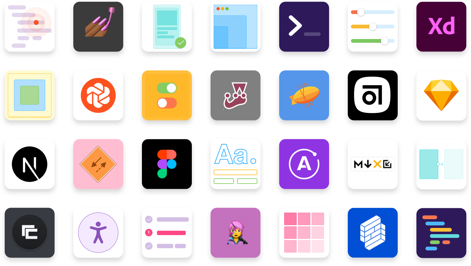
The community has already created over 200 public addons. This vibrant ecosystem makes Storybook more productive for everyone.
Now, we’re excited to take the Storybook addon ecosystem to the next level. Ecosystem 2.0 includes:
- 🧩 Centralized addon catalog
- 📕 In-depth tutorial
- 📐 Comprehensive documentation
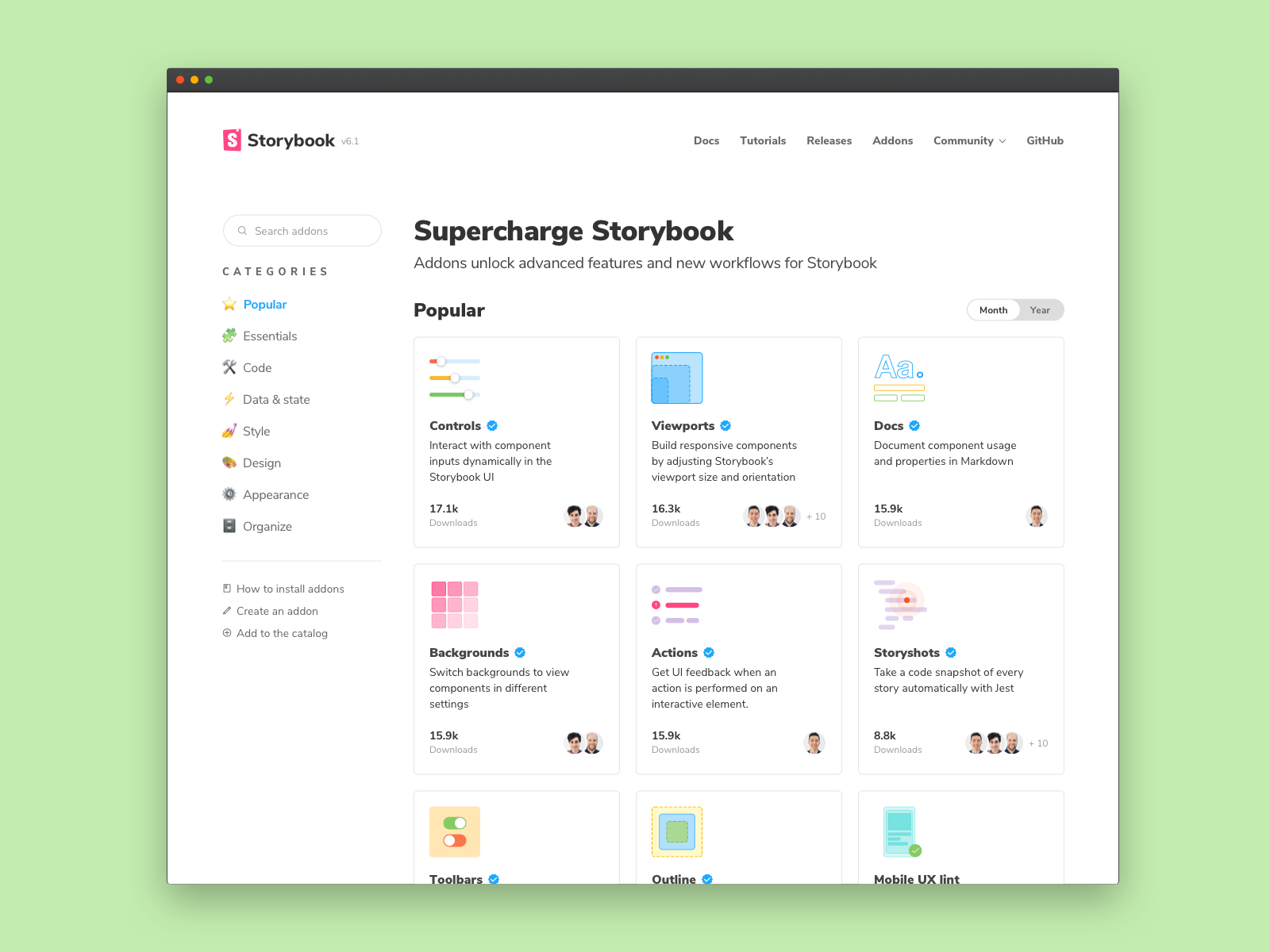
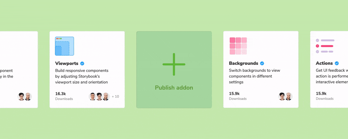
Addon catalog out of beta
With Storybook’s new addon catalog, finding the right addon for your project is simple.
The catalog automatically indexes all addons in one place. It highlights the most popular and trending addons. It also organizes addons by keyword and tag to help find useful tools for a specific task.
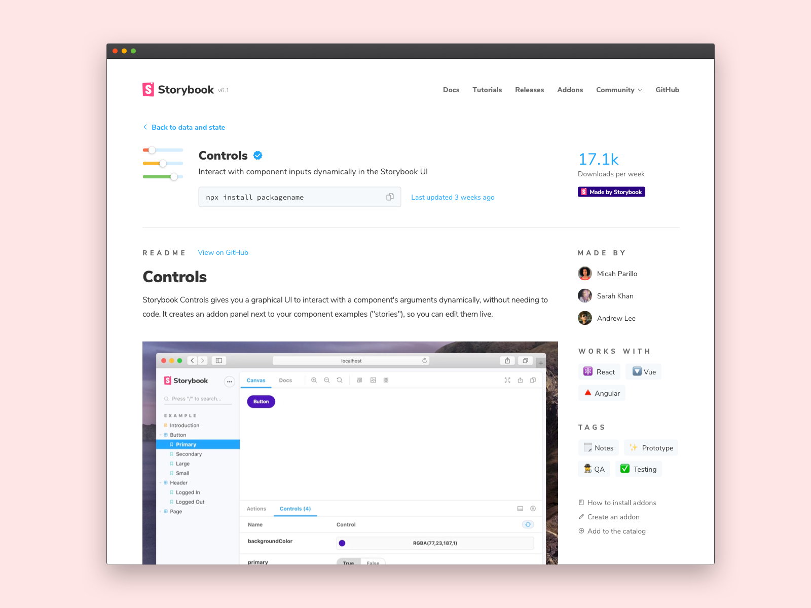
Click an addon to view its readme, install instructions, and relevant metadata. That gives you confidence in an addon’s quality before you add it to your Storybook.
Behind the scenes, we’re continuously crawling, indexing, and ranking addons based on maintenance metadata. This helps you find the latest and greatest from the community as soon as it becomes available.
There’s an addon for everything
Addons are a straightforward way to extend Storybook. The API handles the complexity so you can concentrate on your addon’s unique functionality. Typically, it takes about 2 hours to bootstrap a working addon.
For example, Alex Holachek rapidly prototyped a new Mobile UX linter. While Shota Fuji built the Figma addon in his spare time – it just topped 320k downloads a month. Alex Reardon invented a new way to evaluate component render performance.
The addon ecosystem is flourishing thanks to our community. Since the beta launched, we've seen one new addon created every week (avg) by global teams and solo developers alike. Even venture-backed companies like Contrast (YC18) are launching tools for Storybook .
To get a sense of what’s possible, let’s take a closer look at the most promising addons.
Mocking for apps
Developers build everything from components to pages in Storybook. In the past, getting your app UI into a certain state took a lot of effort. You’d have to seed a database, configure fake user accounts, run the entire app locally, and navigate to the relevant page.
With Storybook, you can develop app UIs in isolation without running the app at all. When you save a page permutation as a story it’s easy to jump back to that exact permutation at any time. The following addons help you mock data and state in your app UIs.
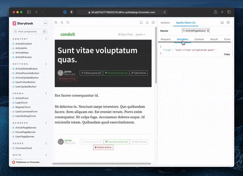
Apollo GraphQL is a widely used GraphQL library. The addon mocks GraphQL data at the page-level for testing. It was created to “see how feature changes impact pages and automate visual testing” with Chromatic.
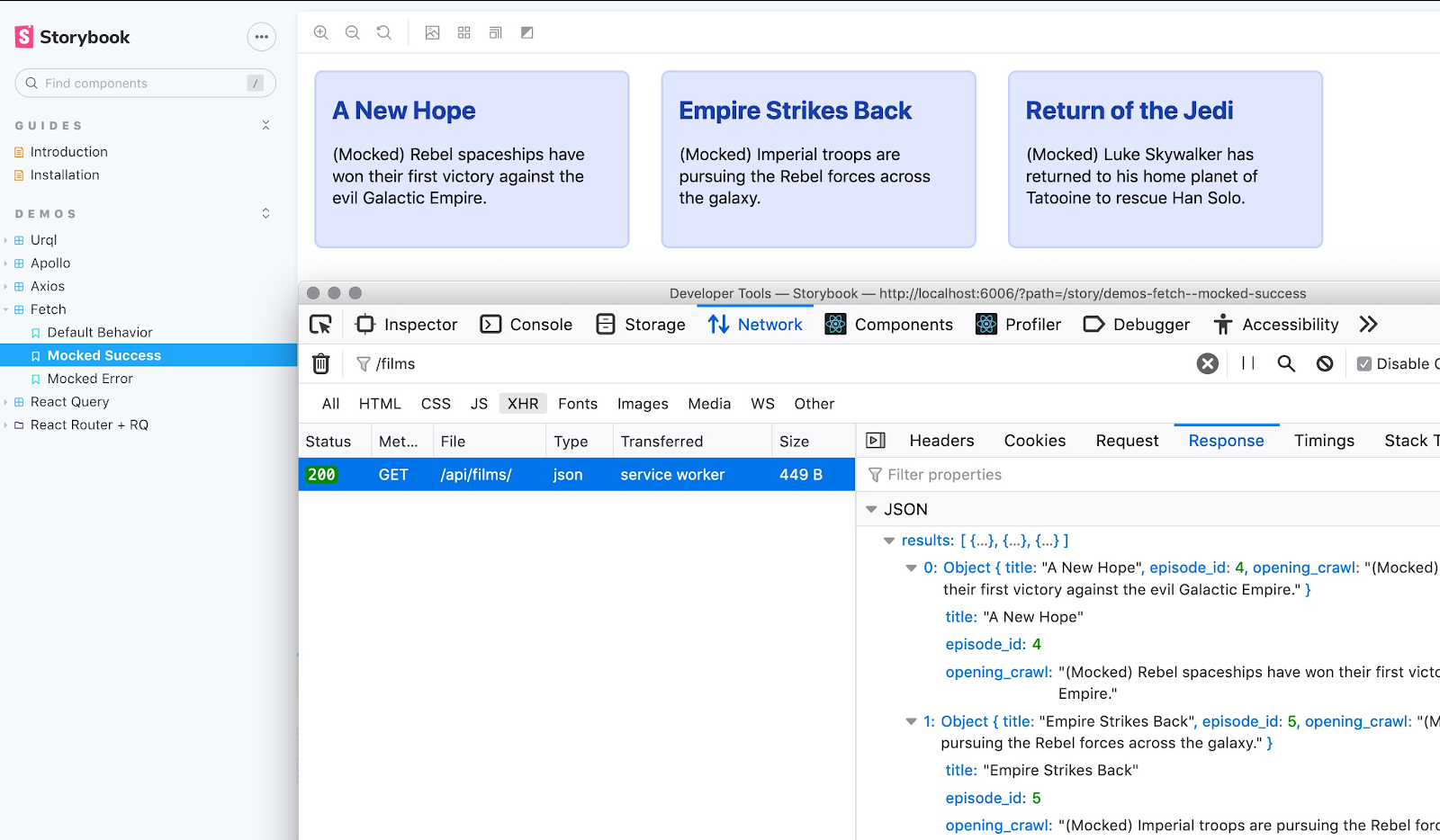
Mock Service Worker (MSW) uses service workers to mock API requests by intercepting requests on the network level and providing mocked data in the response. The addon simplifies mocking API requests in your stories.
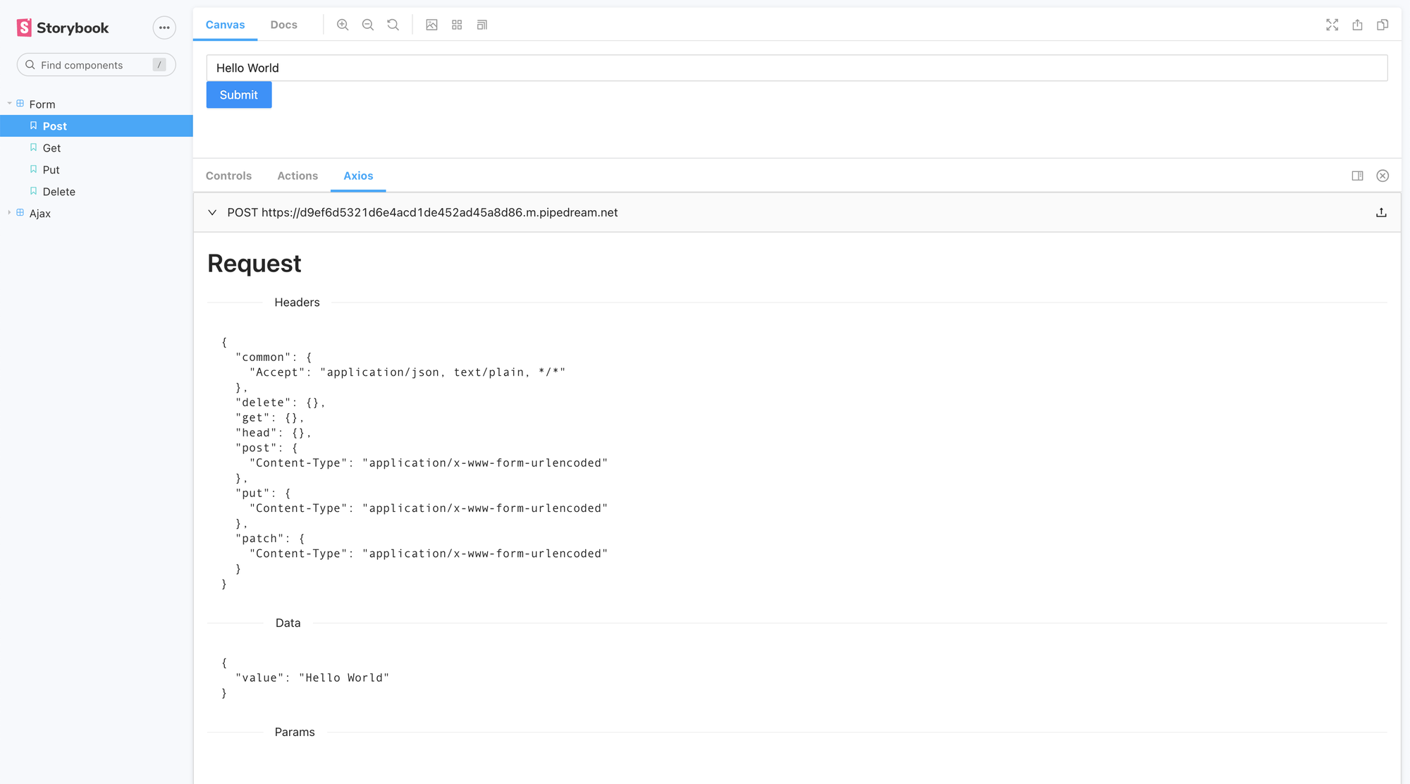
Axios is a ubiquitous HTTP request and response library. The addon visualizes the HTTP data being exchanged between your component and a backend or mocked API.
Testing UIs
Whenever you write stories you get tests for free. After all, stories capture the rendered state of a UI component given a fixed set of props and data. Storybook is the third most used testing tool according to the State of JavaScript 2020 survey.
The Component Story Format was created so that you could reuse your stories in tests. That unlocks more ways to test without any extra work on your part.
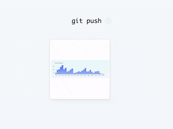
Chromatic is a visual testing service made by the Storybook team. The addon turns your stories into visual regression tests that are run whenever you push code. That helps you detect UI bugs during development.
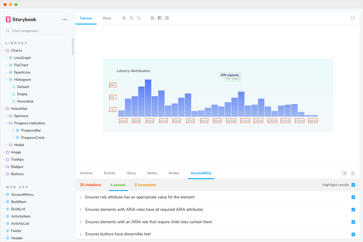
Accessibility addon validates your component’s compliance with accessibility standards. It helps you QA accessibility by highlighting areas of improvement as you develop.
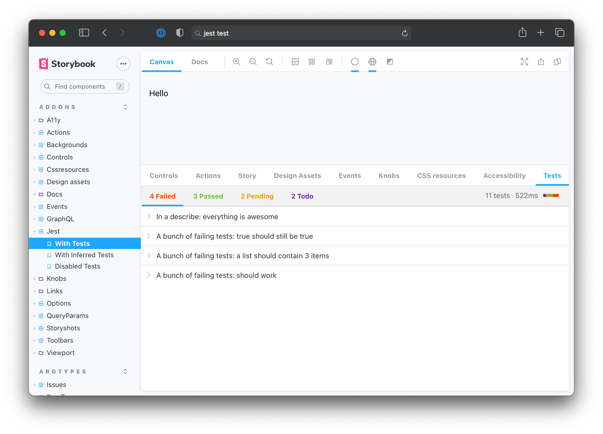
Jest addon shows the output of Jest unit tests in the Storybook panel. It’s a helpful way to get instant feedback on tests while you build UI components.

Design tools
Design addons streamline the development process by embedding the design artifacts in Storybook. They connect design deliverables to the bonafide UI implementation so that your team can build UIs faster.
The benefits to developers are immense. You save time because there’s no need to context switch from development to design tools and back again. You reduce ambiguity by keeping an ongoing record of what is designed versus what’s actually built.
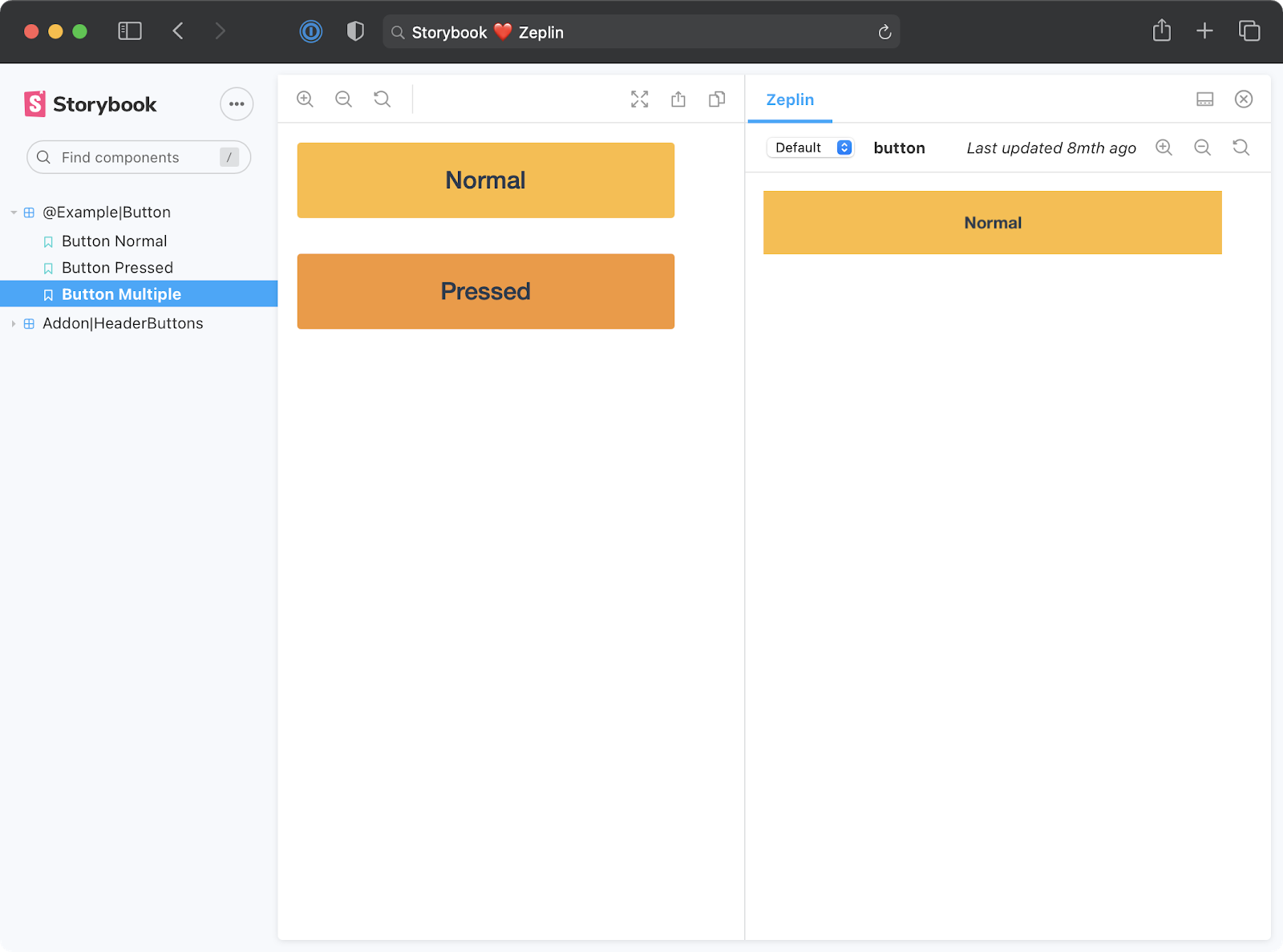
Zeplin is a design workspace to publish finalized designs. It extracts metadata like assets, colors, and measurements from Adobe XD, Figma & Sketch files to save you time. The addon shows the finalized design next to the live UI component for easy reference.

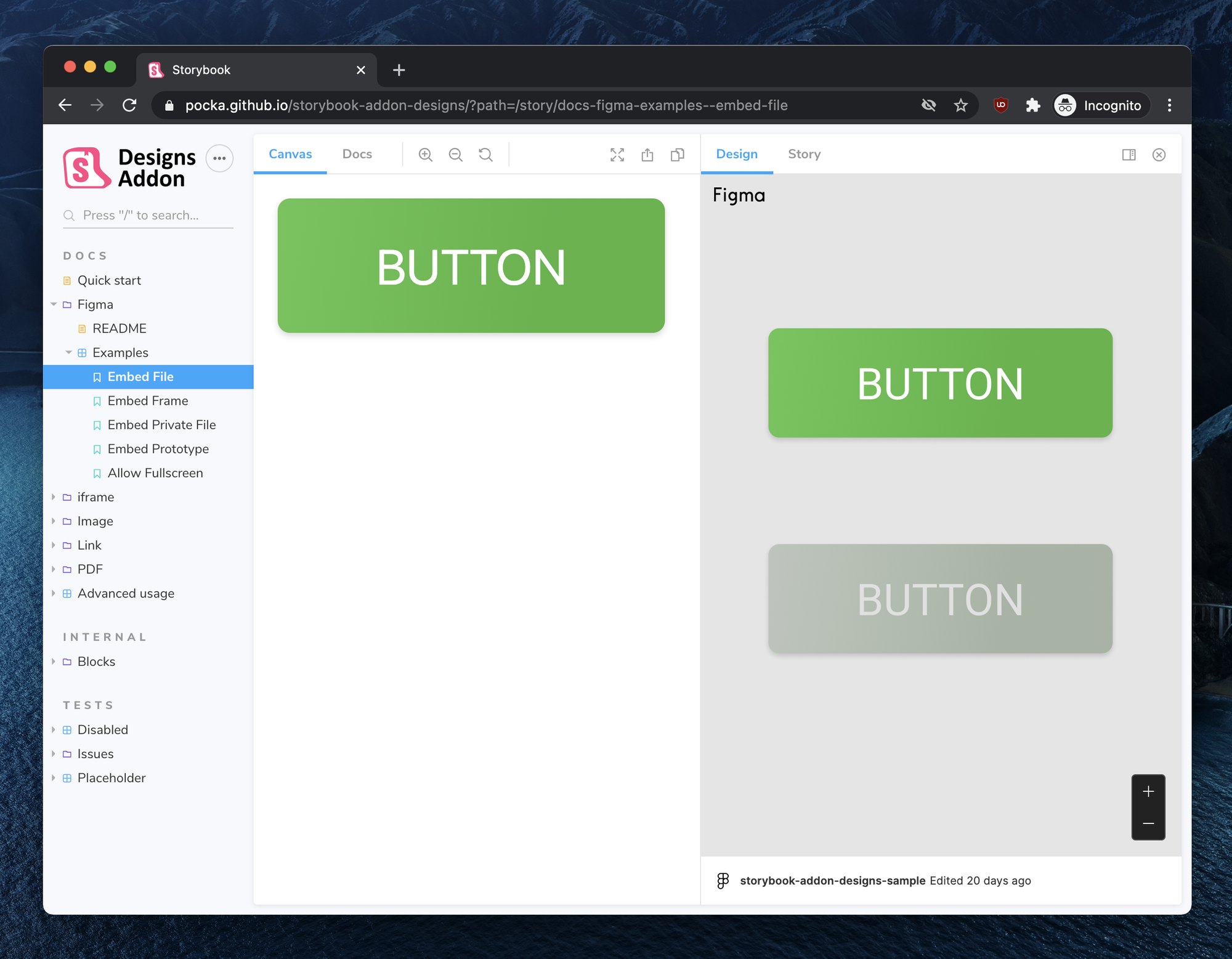
Figma is a collaborative UI design tool that enables multiple people to design simultaneously in the browser. The Figma addon depicts the component design next to the implementation. Design changes are instantly updated in Storybook.
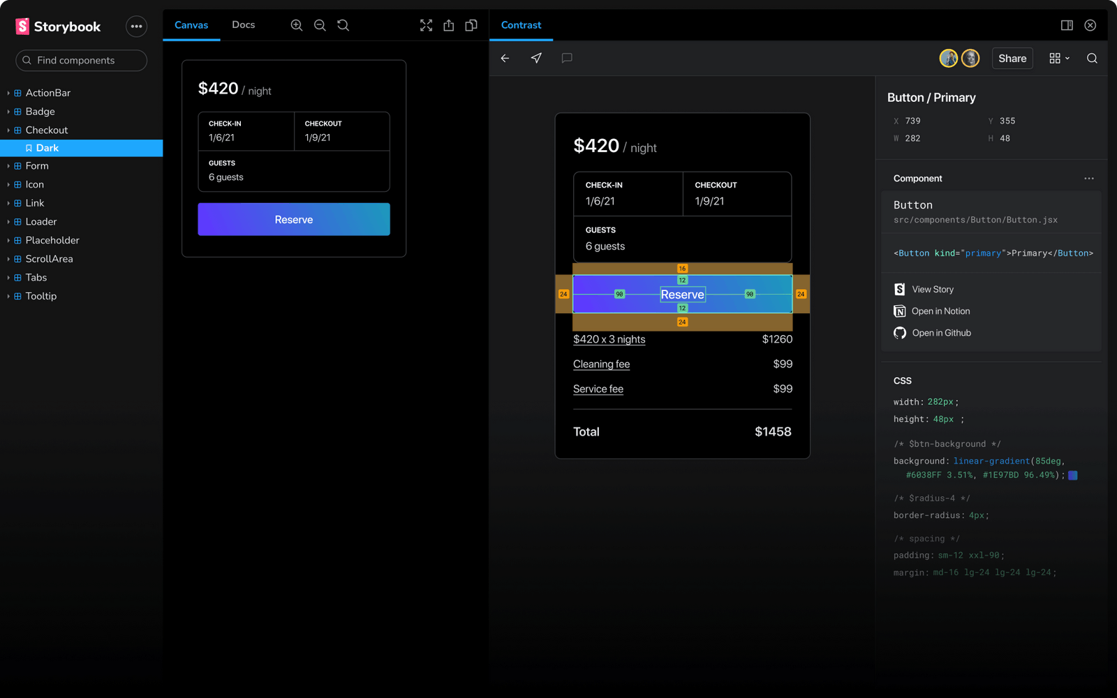
Contrast is a developer handoff tool - supercharged for Figma. The addon automatically tells you the difference between your code and the designs. It's like a spell-checker for UI.

Abstract is a version control tool for Sketch and Adobe XD files. Think Git, but for designers. The addon showcases designs from Sketch in the Storybook addon panel. Developers can measure distances, export images, and sample colors from the comfort of Storybook.

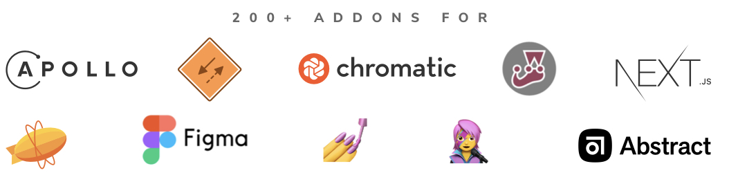
Integrations with popular libraries
Storybook’s flexibility makes it straightforward to use with popular libraries. While it’s possible to manually configure Storybook to fit any tech stack, addons streamline configuration by providing “best practice” integrations that work out of the box.
Next.js is a leading app framework for React. The Next Router addon allows you to use the Next router to simulate routes and pages in Storybook.
Formik is a popular form library. The Formik addon supplies Formik context to the rendered components and showcases the state of a form in the addon panel.
Emotion and styled-components allow you to write CSS in JavaScript. The styled-components addon and Emotion addon add theme pickers to Storybook’s UI so you can swap between the themes your company supports.
MDX combines Markdown and JSX. It simplifies writing developer documentation. With the MDX embed addon you can easily embed popular sites into your docs. It supports Youtube, CodePen, CodeSandbox, Egghead, GitHub, Twitter and more.

Build your own addon
Have an idea for an addon? Get started with our guides and API docs.
📖 Addon docs show you everything you need to write an addon from API to project setup.
🗺 “How to build a Storybook addon” walks through building an addon from scratch with code samples.
🗺 “How to publish an addon to the Catalog” shares how to list your addon in the catalog.
Conclusion
42% of JavaScript developers already use Storybook. The dynamic ecosystem is one of the top reasons why. When you adopt Storybook, you also get a vast network of addons that give you superpowers from integrating with frameworks to automating development workflows.
Addon ecosystem 2.0 was designed by Dominic Nguyen (me!). Varun Vachhar contributed the frontend and guides. João Cardoso wrote the docs. Michael Shilman specced the catalog and created its backend.
Check out the addon catalog now. Join the discussion on Twitter below.
Addon ecosystem 2.0 launched!
— Storybook (@storybookjs) January 19, 2021
Addons supercharge your workflow. They can self-configure integrations and automate UI testing. https://t.co/Ylbl5F0iqc
🧩 Browse 200+ addons in one place
🛠 Build your own in 2hrs
📕 In-depth tutorials
📐 Comprehensive docs pic.twitter.com/n6lFZrACep