Community Showcase #5
Recap of all the exciting recent updates. Plus, amazing new learning resources from the community!

March and April have been two landmark months for the Storybook community! We came together for Storybook Day, shipped our biggest release in 2 years (Storybook 7.0), and enjoyed a ton of new tools, content and updates from users.
Catch up on the best and latest news from Storybook land in this fifth community showcase.
🥳 Storybook 7.0 is here!
It’s the update you’d all been waiting for: Storybook 7.0 has arrived!
The latest Storybook packs changes that improve virtually every aspect of the Storybook developer experience, unlocking your potential for building and shipping more polished UIs than ever before. From a refreshed design to better testing and documentation, with improved and zero-config integrations with some of the most popular frameworks around, Storybook 7.0 is game-changing for frontend devs.

⏪ Rewind to Storybook Day
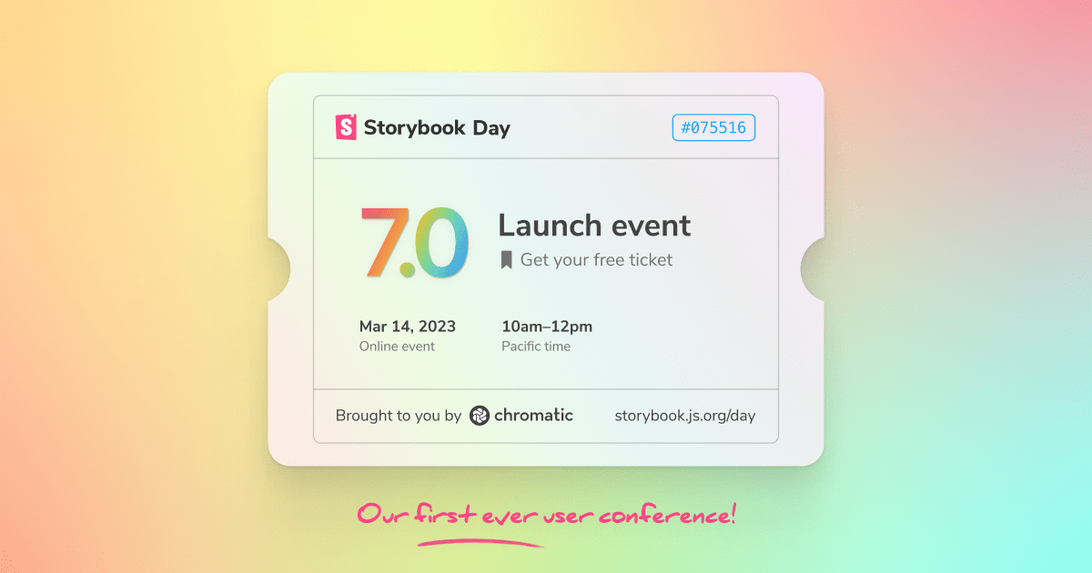
On March 14th, we came together for Storybook’s first-ever online conference: Storybook Day! World-class devs shared how they ship UIs with Storybook at organisations including the BBC, The Guardian, and Monday.com, while Storybook maintainers highlighted everything to get excited about in Storybook 7.0. Watch the full replay »

📱 Storybook React Native
Storybook 7.0 wasn’t the community’s only major launch last month. We also saw the arrival of Storybook React Native 6.5. This decisively closes the gap between the core version of Storybook and Storybook React Native, bringing to the table features like Component Story Format, introducing support of controls and args, and enhancing performance and ease of use on both desktop and device.
A major shoutout to Daniel Williams for bringing this to life.

🚀 Addons
Styling Addon
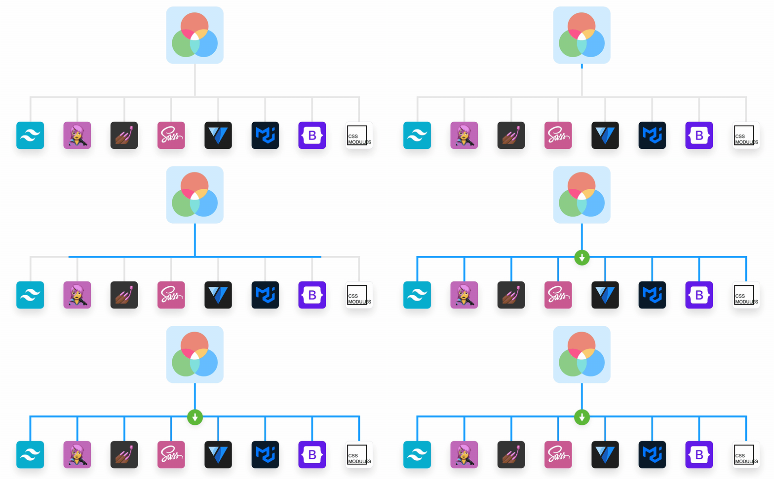
Setting up styling tools with Storybook has long presented a problem to developers. Ahead of the launch of Storybook 7.0, we shipped the solution: Storybook’s Styling Addon. It brings together configuration templates for the most popular styling tools—including Tailwind, Material UI, Chakra, SASS and PostCSS. Include themes in your Storybook, toggle between them, and use custom parameters to override them at the levels of components or stories.

Addon Kit — now updated for Storybook 7.0
Storybook sits at the heart of a flourishing addon ecosystem, which brings so much versatility and dynamism to your builds. This is only going to deepen through Storybook 7.0, and we’ve updated our Addon Kit to make that possible.
Check out the updated Addon Kit for Storybook 7.0.
🙌 Meetups
🇺🇸 Seattle, May 17th 2023
Calling all Storybook users in the Seattle area! We invite you to a networking event / happy hour for frontend developers and design systems enthusiasts on May 17th in Seattle, hosted by Chromatic and Friends of Figma.
Here is the event page with more details. Make sure to RSVP so we can add your name to the raffle!
🧑💻 Get involved
Storybook is an open source project and community, and there’re always ways that you can get involved with making a contribution!
If you’re eager to help but unsure where to begin, here are a few issues that we’d love your help with.
- GitHub Issue 22176 - help our maintainers add stricter typings to the Storybook monorepo
- Do you use Vue? Have you set up Vue and Pinia in Storybook or could you be interested in helping us learn how? If so, please reach out to us via the #contributing channel in the Storybook Discord server and mention that you’re interested in getting involved
- Check out the support queries shared in GitHub issues and Discord and see if you’re able to help out
Have a question about getting started as a contributor? Chat to the community in Discord.
📝 Resources
Storybook serves many different purposes for frontend devs. Learn about some of these usecases in this article by Heyjin Kim.
Want to learn more about using decorators but don’t know where to begin? Chantastic has you covered in our decorators crash course. Learn about how to write and compose decorators, and find out about the role they play within the wider system of component-driven design.
Storybook 7’s many new features are covered in fantastic depth by María Simo’s blog overview. Check it out in English or Spanish.
Accessibility testing is crucial for building apps that meet the needs of as many users as possible. Yann Braga introduces how you can do this through Storybook and Storybook’s a11y addon.
Looking to refresh your knowledge of Storybook? Get back to the basics with Niamh McCooey’s stellar presentation at JSWorld. Beginning with writing your own stories, Niamh shares how Storybook reduces blockers, improves collaboration, and enhances the quality of your builds.
Storybook and Figma combined underpins a powerful workflow with a virtuous single source of truth. Join Sophie Boulaaouli to learn about how the team at escape are utilizing this to develop their new design system.
In addition, bringing together Figma and Storybook massively reduces barriers between design and dev. Be inspired by Matthew Rea’s article exploring how you can combine the two tools with GitHub Actions to automate the generation of design tokens.

