
Material UI in Storybook
Three tips to get the most out of Material UI with Storybook

Material UI (MUI), based on Google’s Material Design language, provides a set of themeable components that you can use to begin building UI right away. You can get started even faster by developing your UI in isolation by building it in Storybook. Here’s how to configure Storybook to load Material UI components and dynamically interact with MUI’s API.
- 📦 Bundle your fonts for fast and consistent rendering
- 🎨 Load your custom theme and add a theme switcher
- ♻️ Reuse Material UI types to auto-generate story controls
Let’s get building
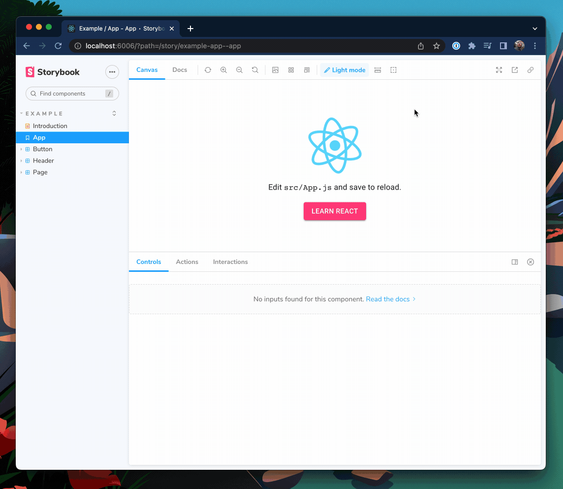
This recipe assumes that you already have a React app using the @mui/material package set up with Storybook 6.0 or newer. If you don’t have a project ready, clone my example repository to follow along.
Bundle fonts and icons for better perf
Material UI depends on two fonts to render as intended, Google’s Roboto and Material Icons. While you can load these fonts directly from the Google Fonts CDN, bundling fonts with Storybook is better for performance.
- 🏎️ Fonts load faster because they are coming from the same place as your app
- ✈️ Font will load offline so you can continue developing your stories anywhere
- 📸 No more inconsistent snapshot tests because fonts load instantly
To get started, install the fonts as dependencies:
yarn add @fontsource/roboto @fontsource/material-iconsThen import the CSS files into .storybook/preview.js, the entrypoint of your Storybook:
// .storybook/preview.js

import '@fontsource/roboto/300.css';
import '@fontsource/roboto/400.css';
import '@fontsource/roboto/500.css';
import '@fontsource/roboto/700.css';
import '@fontsource/material-icons';
Load custom themes and add a theme switcher
Material UI comes with a default theme out of the box, but you can also create and provide your own themes. Given the popularity of dark mode, you'll likely end with more than one custom theme. Let's look at how you can load custom themes and switch between them with just a click.
For example, take this custom dark mode theme:
// src/themes/dark.theme.js

import { createTheme } from "@mui/material";
import { blueGrey, cyan, pink } from "@mui/material/colors";

export const darkTheme = createTheme({
  palette: {
    mode: "dark",
    primary: {
      main: pink["A200"],
    },
    secondary: {
      main: cyan["A400"],
    },
    background: {
      default: blueGrey["800"],
      paper: blueGrey["700"],
    },
  },
});
To apply the custom theme to our stories, we’ll need to wrap them in Material UI’s ThemeProvider using a decorator:
// .storybook/preview.js

import { CssBaseline, ThemeProvider } from "@mui/material";
import { darkTheme } from "../src/themes/dark.theme";

/* snipped for brevity */

export const withMuiTheme = (Story) => (
  <ThemeProvider theme={darkTheme}>
    <CssBaseline />
    <Story />
  </ThemeProvider>
);

export const decorators = [withMuiTheme];
Awesome! Now when Storybook is reloaded, you'll see that our withMuiTheme decorator is providing our custom dark theme.
Use globalTypes to add a theme switcher
To take this decorator a step further, let’s add a way to toggle between multiple themes.
To do this, we can declare a global variable named theme in .storybook/preview.js and give it a list of supported themes to choose from.
// .storybook/preview.js

export const globalTypes = {
  theme: {
    name: "Theme",
    title: "Theme",
    description: "Theme for your components",
    defaultValue: "light",
    toolbar: {
      icon: "paintbrush",
      dynamicTitle: true,
      items: [
        { value: "light", left: "☀️", title: "Light mode" },
        { value: "dark", left: "🌙", title: "Dark mode" },
      ],
    },
  },
};
Now we can update our decorator to provide the theme selected in our new dropdown.
// .storybook/preview.js

import { useMemo } from "react";

/* Snipped for brevity */

// Add your theme configurations to an object that you can
// pull your desired theme from.
const THEMES = {
  light: lightTheme,
  dark: darkTheme,
};

export const withMuiTheme = (Story, context) => {
  // The theme global we just declared
  const { theme: themeKey } = context.globals;

  // only recompute the theme if the themeKey changes
  const theme = useMemo(() => THEMES[themeKey] || THEMES["light"], [themeKey]);

  return (
    <ThemeProvider theme={theme}>
      <CssBaseline />
      <Story />
    </ThemeProvider>
  );
};
Now we have a fully functioning theme switcher for our MaterialUI Storybook. If you want to learn more about switchers, check out Yann Braga’s article on adding a theme switcher.
Use Material UI prop types for better controls and docs
Storybook controls give you graphical controls to manipulate a component’s props. They’re handy for finding edge cases of a component and prototyping in the browser.
Usually, you have to manually configure controls. But if you’re using Typescript, you can reuse Material UI’s component prop types to auto generate story controls. As a bonus, this will also automatically populate the prop table in your documentation tab.
Let’s take the following Button component for example.
// button.component.tsx

import React from 'react';
import { Button as MuiButton } from '@mui/material';

export interface ButtonProps {
  label: string;
}

export const Button = ({ label, ...rest }: ButtonProps) => (
  <MuiButton {...rest}>{label}</MuiButton>
);
Here I’m using the label prop as the MuiButton’s child and passing all other props through. However, when we render this into Storybook, our controls panel only lets us change the label prop that we declared ourselves.
This is because Storybook only adds props to the controls table that are explicitly declared in the component’s prop types or in the Story Args. Let’s update Storybook’s Docgen configuration to bring Material UI‘s Button props into the controls table as well.
// .storybook/main.ts

module.exports = {
  stories: ["../src/**/*.stories.mdx", "../src/**/*.stories.@(js|jsx|ts|tsx)"],
  addons: [
    "@storybook/addon-links",
    "@storybook/addon-essentials",
    "@storybook/addon-interactions",
    "@storybook/preset-create-react-app",
  ],
  framework: "@storybook/react",
  core: {
    builder: "@storybook/builder-webpack5",
  },
  typescript: {
    check: false,
    checkOptions: {},
    reactDocgen: "react-docgen-typescript",
    reactDocgenTypescriptOptions: {
      // speeds up storybook build time
      allowSyntheticDefaultImports: false,
      // speeds up storybook build time
      esModuleInterop: false,
      // makes union prop types like variant and size appear as select controls
      shouldExtractLiteralValuesFromEnum: true,
      // makes string and boolean types that can be undefined appear as inputs and switches
      shouldRemoveUndefinedFromOptional: true,
      // Filter out third-party props from node_modules except @mui packages
      propFilter: (prop) =>
        prop.parent
          ? !/node_modules\/(?!@mui)/.test(prop.parent.fileName)
          : true,
    },
  },
};
We also want to update the parameters in .storybook/preview.js to show the description and default columns for the controls table.
// .storybook/preview.js

export const parameters = {
  actions: { argTypesRegex: "^on[A-Z].*" },
  controls: {
    expanded: true, // Adds the description and default columns
    matchers: {
      color: /(background|color)$/i,
      date: /Date$/,
    },
  },
}
Lastly, update the ButtonProps type to extend from Material UI’s Button props to add all of these props to the controls.
// button.component.tsx
import React from "react";
import {
Button as MuiButton,
ButtonProps as MuiButtonProps,
} from "@mui/material";
export interface ButtonProps extends MuiButtonProps {
label: string;
}
export const Button = ({ label, ...rest }: ButtonProps) => (
<MuiButton {...rest}>{label}</MuiButton>
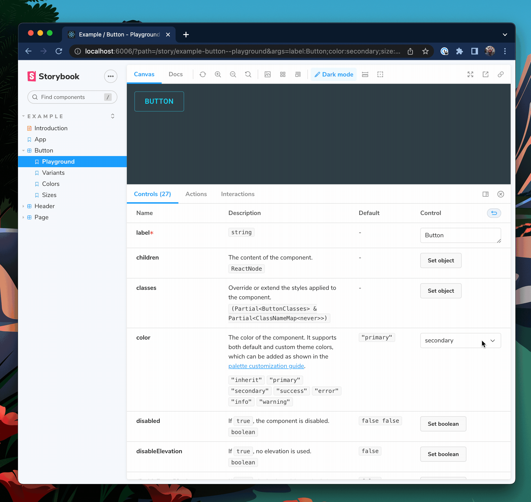
);Restart your Storybook server so that these config changes take effect. You should now see that Button has controls for all of MuiButton's props as well.
Choose which controls are visible
Our button now has 27 props, which is perhaps a little much for your use case. To control which props are visible we can use TypeScript’s Pick<type, keys> and Omit<type, keys> utilities.
// button.component.tsx

import React from "react";
import {
  Button as MuiButton,
  ButtonProps as MuiButtonProps,
} from "@mui/material";

// Only include variant, size, and color
type ButtonBaseProps = Pick<MuiButtonProps, "variant" | "size" | "color">;

// Use all except disableRipple
// type ButtonBaseProps = Omit<MuiButtonProps, "disableRipple">;

export interface ButtonProps extends ButtonBaseProps {
  label: string;
}

export const Button = ({ label, ...rest }: ButtonProps) => (
  <MuiButton {...rest}>{label}</MuiButton>
);
And now our Button will only take the variant, size, and color props from MuiButton.
📣 Shout out to Eric Mudrak’s awesome Storybook with React & TypeScript article that inspired this tip.
Wrapping up
Material UI has a lot to offer—a wide array of components, a powerful theming engine and an icon system. Instead of reinventing the wheel, you can use these building blocks to get going quickly. With a few configuration tweaks, your Storybook can unlock the full potential of Material UI.
Custom Material UI themes can be provided using a Storybook decorator and with an added toolbar item, you can toggle between multiple themes. This makes it easy to switch themes and verify the look and feel of the UI while building the app. Additionally, reuse Material UIs Typescript types to generate dynamic controls and documentation for your stories for free.
If you’re looking for a code example of what I covered here, check out my storybook-mui-example repo on GitHub. If you’re looking for a Storybook addon to handle themes for you, check out the React Theming Addon by awesome community members, Usulpro and Smartlight.
What do you want to see next?
We want to hear from you!
Did you enjoy this recipe? Are there other Storybook integrations that you want to see recipes for?
Tweet at @storybookjs or reach out on the Storybook Discord Server! We can't wait to meet you 🤩
📦 Bundle fonts and icons for better perf. Why?
— Storybook (@storybookjs) October 6, 2022
🏎️ Fonts load faster because they are coming from the same place as your app
✈️ Font will load offline so you can continue developing your stories anywhere
📸 No more inconsistent snapshot tests because fonts load instantly
2/ pic.twitter.com/gPuXx8q4Vt