
Code panel
Code Panel is a replacement for the Storysource addon, which was discontinued in Storybook 9.
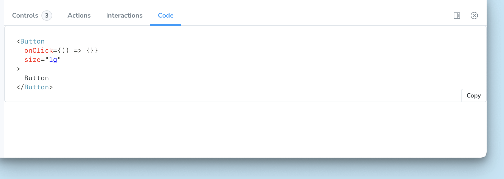
The Code panel renders a story’s source code when viewing that story in the canvas. Any args defined in the story are replaced with their values in the output.
Usage
The Code panel is enabled by default when @storybook/addon-docs is installed. To disable it for all stories, set parameters.docs.codePanel to false in .storybook/preview.*.
.storybook/preview.ts|tsx
// Replace your-framework with the framework you are using (e.g., react-vite, vue3-vite, angular, etc.)
import type { Preview } from '@storybook/your-framework';

const preview: Preview = {
  parameters: {
    docs: {
      codePanel: false,
    },
  },
};

export default preview;
You can override this setting at the component or story level. Set it to true to enable the panel or false to disable it:
Button.stories.ts|tsx
import type { Meta, StoryObj } from '@storybook/react-vite';

import { Button } from './Button';

const meta = {
  component: Button,
  parameters: {
    docs: {
      // 👇 Enable Code panel for all stories in this file
      codePanel: true,
    },
  },
} satisfies Meta<typeof Button>;
export default meta;

type Story = StoryObj<typeof meta>;

// 👇 This story will display the Code panel
export const Primary: Story = {
  args: {
    children: 'Button',
  },
};

export const Secondary: Story = {
  args: {
    children: 'Button',
    variant: 'secondary',
  },
  parameters: {
    docs: {
      // 👇 Disable Code panel for this specific story
      codePanel: false,
    },
  },
};
Configuration
Code panel renders the same snippet as the Source docs block, which is also used in Autodocs pages. The snippet is customizable and reuses the Source configuration parameters.