Build a simple component
We’ll build our UI following a Component-Driven Development (CDD) methodology. It’s a process that builds UIs from the “bottom-up”, starting with components and ending with screens. CDD helps you scale the amount of complexity you’re faced with as you build out the UI.
Task
Task is the core component of our app. Each task displays slightly differently depending on exactly what state it’s in. We display a checked (or unchecked) checkbox, some information about the task, and a “pin” button, allowing us to move tasks up and down the list. Putting this together, we’ll need these props:
title– a string describing the taskstate- which list is the task currently in, and is it checked off?
As we start to build Task, we first write our test states that correspond to the different types of tasks sketched above. Then we use Storybook to build the component in isolation using mocked data. We’ll “visual test” the component’s appearance given each state as we go.
Get set up
First, let’s create the task component and its accompanying story file: src/lib/components/Task.svelte and src/lib/components/Task.stories.svelte.
We’ll begin with a baseline implementation of the Task, simply taking in the attributes we know we’ll need and the two actions you can take on a task (to move it between lists):
<script lang="ts">
  type TaskData = {
    id?: string;
    title?: string;
    state: 'TASK_ARCHIVED' | 'TASK_INBOX' | 'TASK_PINNED';
  };

  interface Props {
    task: TaskData;
    onArchiveTask: (id: string) => void;
    onPinTask: (id: string) => void;
  }

  const {
    task = {
      id: '',
      title: '',
      state: 'TASK_INBOX',
    },
    onArchiveTask,
    onPinTask,
  }: Props = $props();
</script>

<div class="list-item">
  <label for="title-{task.id}" aria-label={task.title}>
    <input
      type="text"
      value={task.title}
      readOnly
      name="title"
      id="title-{task.id}"
    />
  </label>
</div>
Above, we render straightforward markup for Task based on the existing HTML structure of the Todos app.
Below we build out Task’s three test states in the story file:
<script module>
  import { defineMeta } from '@storybook/addon-svelte-csf';

  import { fn } from 'storybook/test';

  import Task from './Task.svelte';

  export const TaskData = {
    id: '1',
    title: 'Test Task',
    state: 'TASK_INBOX',
    events: {
      onArchiveTask: fn(),
      onPinTask: fn(),
    },
  };

  const { Story } = defineMeta({
    component: Task,
    title: 'Task',
    tags: ['autodocs'],
    excludeStories: /.*Data$/,
    args: {
      ...TaskData.events,
    },
  });
</script>

<Story name="Default" args={{ task: TaskData }} />

<Story name="Pinned" args={{ task: { ...TaskData, state: 'TASK_PINNED' } }} />

<Story
  name="Archived"
  args={{ task: { ...TaskData, state: 'TASK_ARCHIVED' } }}
/>
💡 Actions help you verify interactions when building UI components in isolation. Oftentimes you won't have access to the functions and state you have in context of the app. Use fn() to stub them in.
There are two basic levels of organization in Storybook: the component and its child stories. Think of each story as a permutation of a component. You can have as many stories per component as you need.
- Component
- Story
- Story
- Story
To tell Storybook about the component we're testing, we'll use the defineMeta function from the community-driven Svelte CSF format, which allows us to define metadata for our component, including the following properties:
component-- the component itselftitle-- how to refer to the component in the Storybook sidebarexcludeStories-- information required by the story but should not be rendered by Storybooktags-- to automatically generate documentation for our componentsargs-- define the action args that the component expects to mock out the custom events
To define our stories, we'll use the Story component returned from the defineMeta function to build out each of our test cases.
Arguments or args for short, allow us to live-edit our components with the controls addon without restarting Storybook. Once an args value changes, so does the component.
fn() allows us to create a callback that appears in the Actions panel of the Storybook UI when clicked. So when we build a pin button, we’ll be able to determine if a button click is successful in the UI.
As we need to pass the same set of actions to all permutations of our component, it is convenient to bundle them up into a single TaskData variable and pass them into our story definition each time. Another nice thing about bundling the TaskData that a component needs is that you can export them and use them in stories for components that reuse this component, as we'll see later.
Config
We'll need to make a couple of changes to Storybook's configuration files so it notices our recently created stories and allows us to use the application's CSS file (located in src/index.css).
Start by changing your Storybook configuration file (.storybook/main.ts) to the following:
import type { StorybookConfig } from '@storybook/svelte-vite';

const config: StorybookConfig = {
- stories: [
-   '../src/**/*.stories.mdx',
-   '../src/**/*.stories.@(js|jsx|ts|tsx)'
- ],
+ stories: ['../src/lib/**/*.stories.@(js|ts|svelte)'],
  staticDirs: ['../public'],
  addons: [
    '@storybook/addon-svelte-csf',
    '@chromatic-com/storybook',
    '@storybook/addon-docs',
    '@storybook/addon-vitest',
  ],
  framework: {
    name: '@storybook/svelte-vite',
    options: {},
  },
};

export default config;
After completing the change above, inside the .storybook folder, change your preview.ts to the following:
import type { Preview } from '@storybook/svelte-vite';

+ import '../src/index.css';

const preview: Preview = {
  parameters: {
    controls: {
      matchers: {
        color: /(background|color)$/i,
        date: /Date$/i,
      },
    },
  },
};

export default preview;
parameters are typically used to control the behavior of Storybook's features and addons. In our case, we won't use them for that purpose. Instead, we will import our application's CSS file.
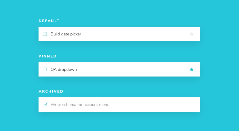
Once we’ve done this, restarting the Storybook server should yield test cases for the three Task states:
Build out the states
Now that we have Storybook set up, styles imported, and test cases built out, we can quickly start implementing the HTML of the component to match the design.
The component is still rudimentary at the moment. First, write the code that achieves the design without going into too much detail:
<script lang="ts">
  type TaskData = {
    id: string;
    title: string;
    state: 'TASK_ARCHIVED' | 'TASK_INBOX' | 'TASK_PINNED';
  };

  interface Props {
    /** Composition of the task */
    task: TaskData;
    /** Event to change the task to archived */
    onArchiveTask: (id: string) => void;
    /** Event to change the task to pinned */
    onPinTask: (id: string) => void;
  }

  const {
    task = {
      id: '',
      title: '',
      state: 'TASK_INBOX',
    },
    onArchiveTask,
    onPinTask,
  }: Props = $props();

  let isChecked = $derived(task.state === 'TASK_ARCHIVED');
</script>

<div class="list-item {task.state}">
  <label
    for="checked-{task.id}"
    class="checkbox"
    aria-label="archiveTask-{task.id}"
  >
    <input
      type="checkbox"
      checked={isChecked}
      disabled
      name="checked-{task.id}"
      id="archiveTask-{task.id}"
    />
    <span
      role="button"
      class="checkbox-custom"
      aria-label="archivedTask-{task.id}"
      onclick={() => onArchiveTask(task.id ?? "")}
      onkeydown={(e) => {
        if (e.key === "Enter" || e.key === " ") {
          e.preventDefault();
          onArchiveTask(task.id ?? "");
        }
      }}
      tabindex="-1"
    ></span>
  </label>
  <label for="title-{task.id}" aria-label={task.title} class="title">
    <input
      type="text"
      value={task.title}
      readonly
      name="title"
      id="title-{task.id}"
      placeholder="Input title"
    />
  </label>
  {#if task.state !== "TASK_ARCHIVED"}
    <button
      class="pin-button"
      onclick={(e) => {
        e.preventDefault();
        onPinTask(task.id ?? "");
      }}
      id="pinTask-{task.id}"
      aria-label="pinTask-{task.id}"
    >
      <span class="icon-star"></span>
    </button>
  {/if}
</div>
The additional markup from above combined with the CSS we imported earlier yields the following UI:
Specify data requirements
As we continue to build out our components, we can specify the shape of the data that the Task component expects by defining a TypeScript type. This way, we can catch errors early and ensure the component is used correctly when adding more complexity. Start by creating a types.ts file in the src folder and move our existing TaskData type there:
export type TaskData = {
  id: string;
  title: string;
  state: 'TASK_ARCHIVED' | 'TASK_INBOX' | 'TASK_PINNED';
};
Then, update the Task component to use our newly created type:
<script lang="ts">
  import type { TaskData } from '../../types';

  interface Props {
    /** Composition of the task */
    task: TaskData;
    /** Event to change the task to archived */
    onArchiveTask: (id: string) => void;
    /** Event to change the task to pinned */
    onPinTask: (id: string) => void;
  }

  const {
    task = {
      id: '',
      title: '',
      state: 'TASK_INBOX',
    },
    onArchiveTask,
    onPinTask,
  }: Props = $props();

  let isChecked = $derived(task.state === 'TASK_ARCHIVED');
</script>

<div class="list-item {task.state}">
  <label
    for="checked-{task.id}"
    class="checkbox"
    aria-label="archiveTask-{task.id}"
  >
    <input
      type="checkbox"
      checked={isChecked}
      disabled
      name="checked-{task.id}"
      id="archiveTask-{task.id}"
    />
    <span
      role="button"
      class="checkbox-custom"
      aria-label="archivedTask-{task.id}"
      onclick={() => onArchiveTask(task.id ?? "")}
      onkeydown={(e) => {
        if (e.key === "Enter" || e.key === " ") {
          e.preventDefault();
          onArchiveTask(task.id ?? "");
        }
      }}
      tabindex="-1"
    ></span>
  </label>
  <label for="title-{task.id}" aria-label={task.title} class="title">
    <input
      type="text"
      value={task.title}
      readonly
      name="title"
      id="title-{task.id}"
      placeholder="Input title"
    />
  </label>
  {#if task.state !== "TASK_ARCHIVED"}
    <button
      class="pin-button"
      onclick={(e) => {
        e.preventDefault();
        onPinTask(task.id ?? "");
      }}
      id="pinTask-{task.id}"
      aria-label="pinTask-{task.id}"
    >
      <span class="icon-star"></span>
    </button>
  {/if}
</div>
Now, an error in development will appear if the Task component is misused.
Component built!
We’ve now successfully built out a component without needing a server or running the entire frontend application. The next step is to build out the remaining Taskbox components one by one in a similar fashion.
As you can see, getting started building components in isolation is easy and fast. We can expect to produce a higher-quality UI with fewer bugs and more polish because it’s possible to dig in and test every possible state.