Visual Tests
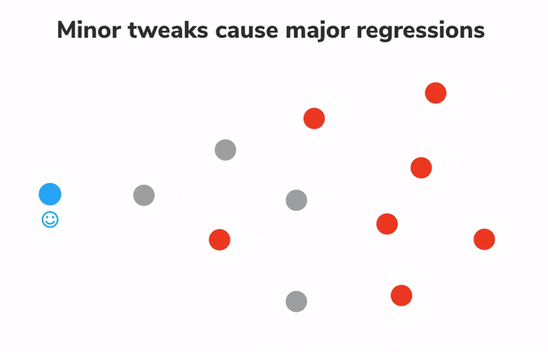
No Storybook tutorial would be complete without testing. Testing is essential to creating high-quality UIs. In modular systems, minuscule tweaks can result in major regressions. So far, we have encountered two types of tests:
- Component tests with Storybook and the Vitest integration help developers automate rendering and component behavior in a real browser environment.
- Interaction tests with the play function verify that the component behaves as expected when interacting with it. They're great for testing the behavior of a component when it's in use.
“But does it look right?”
Unfortunately, the aforementioned testing methods alone aren’t enough to prevent UI bugs. UIs are tricky to test because design is subjective and nuanced. Manual tests are, well, manual. Other UI tests, such as snapshot tests, trigger too many false positives, and pixel-level unit tests are poorly valued. A complete Storybook testing strategy also includes visual regression tests.
Visual testing with Storybook
Visual tests are designed to catch visual regressions and ensure consistent UI appearance. They work by capturing snapshots of every test and comparing them commit-to-commit to surface changes. It's perfect for verifying graphical elements like layout, color, size, and contrast.
Storybook is a fantastic tool for visual tests because every story is essentially a test specification. Each time we write or update a story, we get a spec for free!
There are several tools for visual testing. We recommend Chromatic, a free publishing service made by the Storybook maintainers that runs visual tests in a lightning-fast cloud browser environment. It also allows us to publish Storybook online, as we saw in the previous chapter.
Catch a UI change
Visual tests rely on comparing images of the newly rendered UI code to the baseline images. If a UI change is caught, we'll get notified.
Let's see how it works by tweaking the background of the Task component.
Start by creating a new branch for this change:
git checkout -b change-task-background
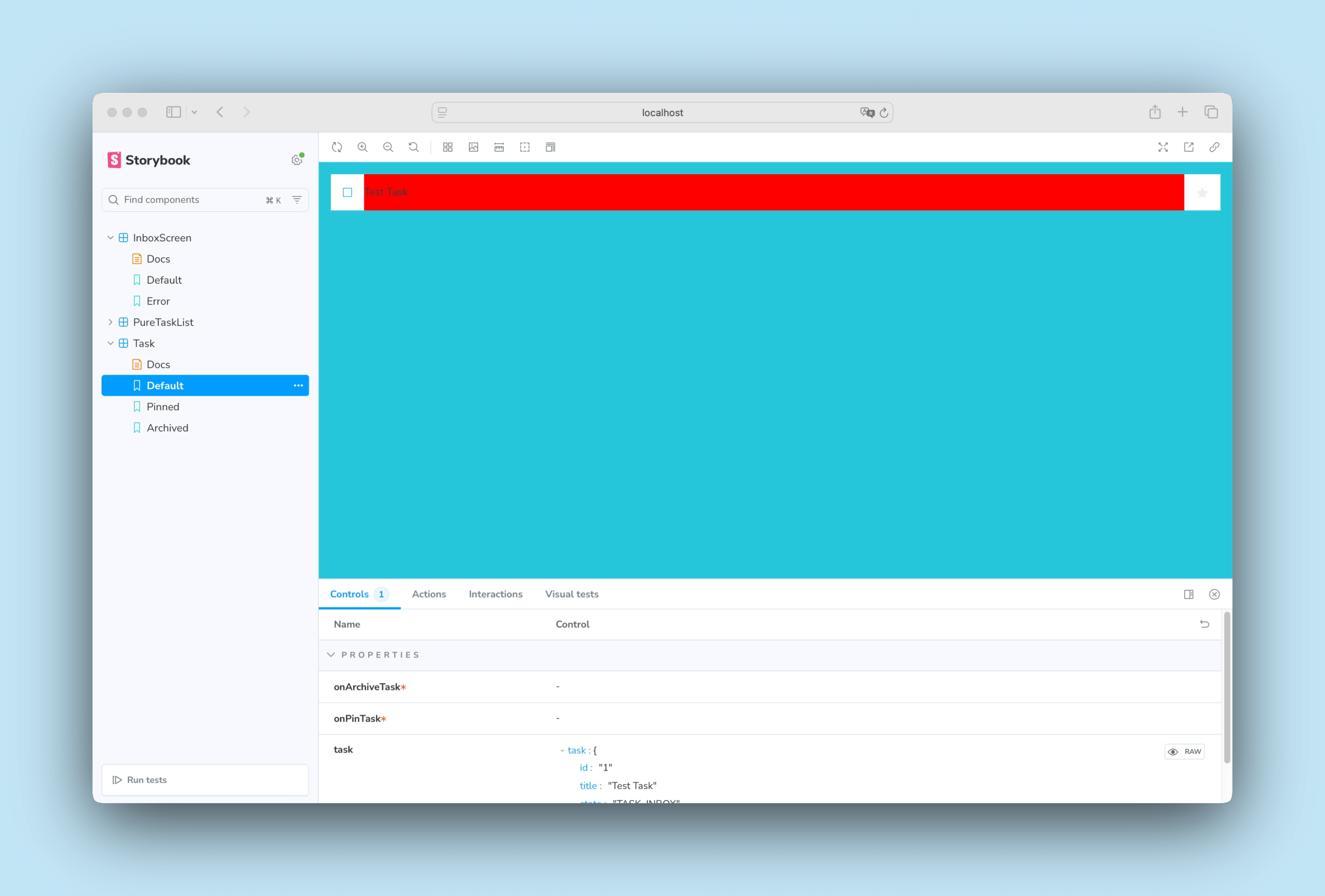
Change src/lib/components/Task.svelte to the following:
<script lang="ts">
  import type { TaskData } from '../../types';

  interface Props {
    /** Composition of the task */
    task: TaskData;
    /** Event to change the task to archived */
    onArchiveTask: (id: string) => void;
    /** Event to change the task to pinned */
    onPinTask: (id: string) => void;
  }

  const {
    task = {
      id: '',
      title: '',
      state: 'TASK_INBOX',
    },
    onArchiveTask,
    onPinTask,
  }: Props = $props();

  let isChecked = $derived(task.state === 'TASK_ARCHIVED');
</script>

<div class="list-item {task.state}">
  <label
    for="checked-{task.id}"
    class="checkbox"
    aria-label="archiveTask-{task.id}"
  >
    <input
      type="checkbox"
      checked={isChecked}
      disabled
      name="checked-{task.id}"
      id="archiveTask-{task.id}"
    />
    <span
      role="button"
      class="checkbox-custom"
      aria-label="archivedTask-{task.id}"
      onclick={() => onArchiveTask(task.id ?? "")}
      onkeydown={(e) => {
        if (e.key === "Enter" || e.key === " ") {
          e.preventDefault();
          onArchiveTask(task.id ?? "");
        }
      }}
      tabindex="-1"
    ></span>
  </label>
  <label for="title-{task.id}" aria-label={task.title} class="title">
    <input
      type="text"
      value={task.title}
      readonly
      name="title"
      id="title-{task.id}"
      placeholder="Input title"
+     style="background-color: red;"
    />
  </label>
  {#if task.state !== "TASK_ARCHIVED"}
    <button
      class="pin-button"
      onclick={(e) => {
        e.preventDefault();
        onPinTask(task.id ?? "");
      }}
      id="pinTask-{task.id}"
      aria-label="pinTask-{task.id}"
    >
      <span class="icon-star"></span>
    </button>
  {/if}
</div>
This yields a new background color for the item.
Add the file:
git add .
Commit it:
git commit -m "change task background to red"
And push the changes to the remote repo:
git push -u origin change-task-background
Finally, open your GitHub repository and open a pull request for the change-task-background branch.
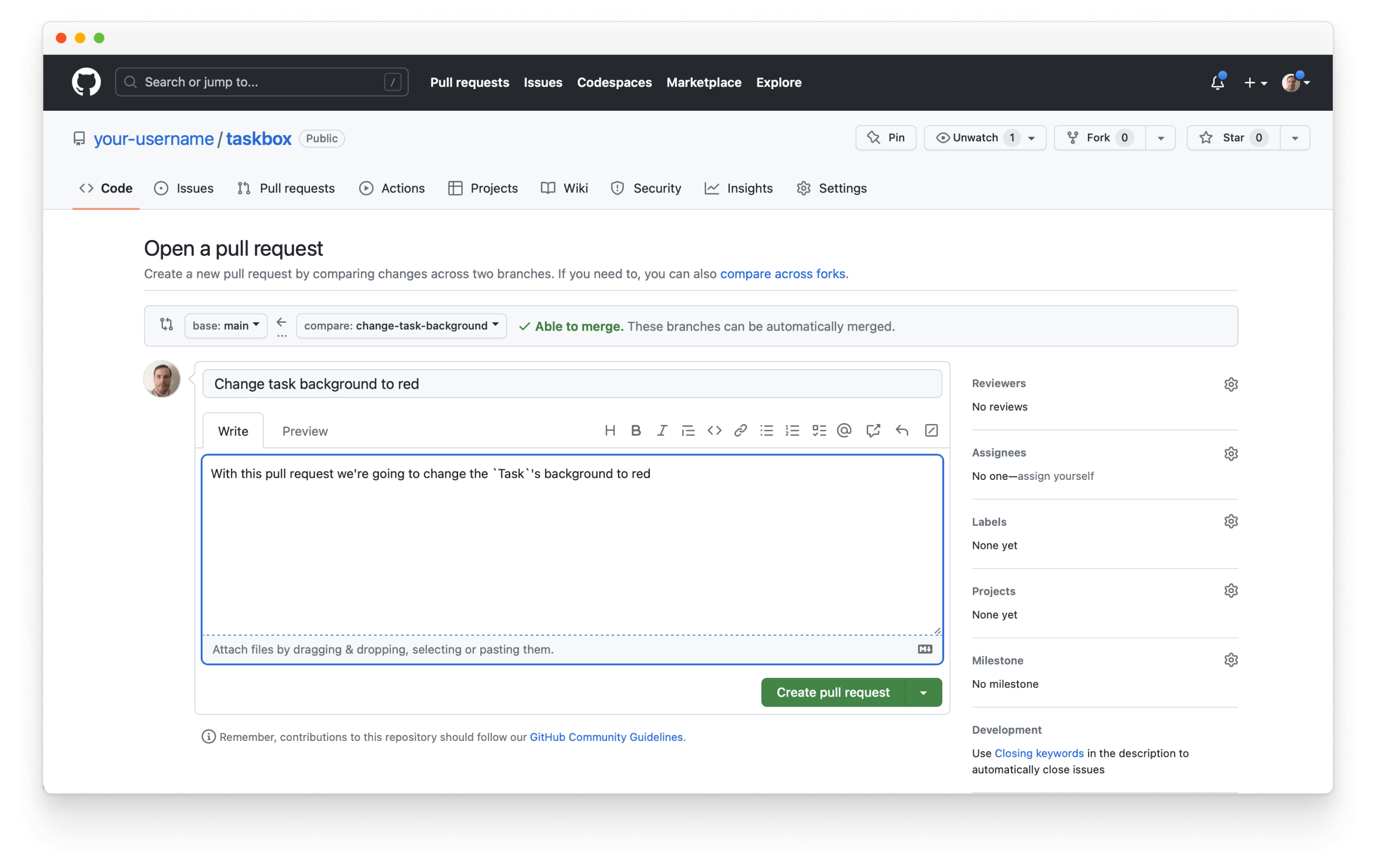
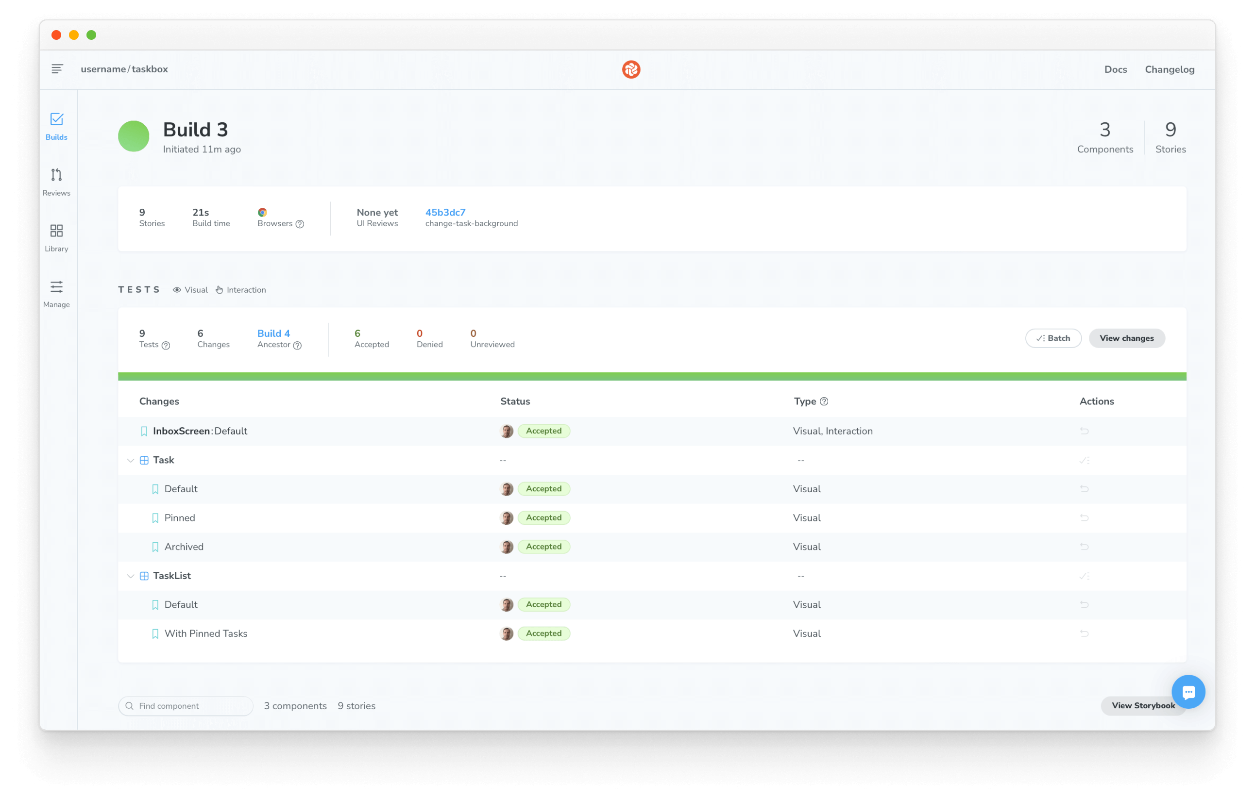
Add a descriptive text to your pull request and click Create pull request. Click on the "🟡 UI Tests" PR check at the bottom of the page.
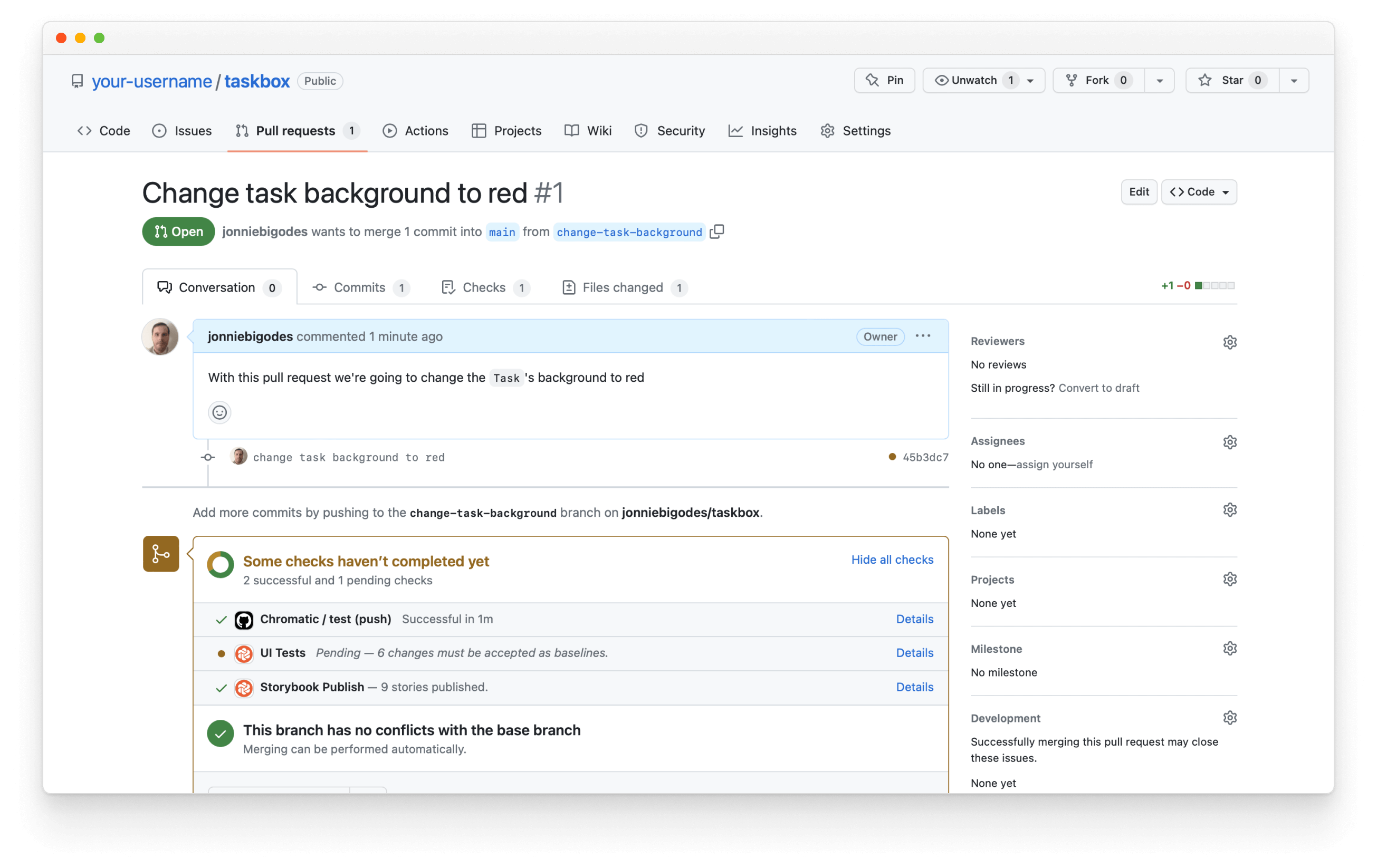
It will show you the UI changes caught by your commit.
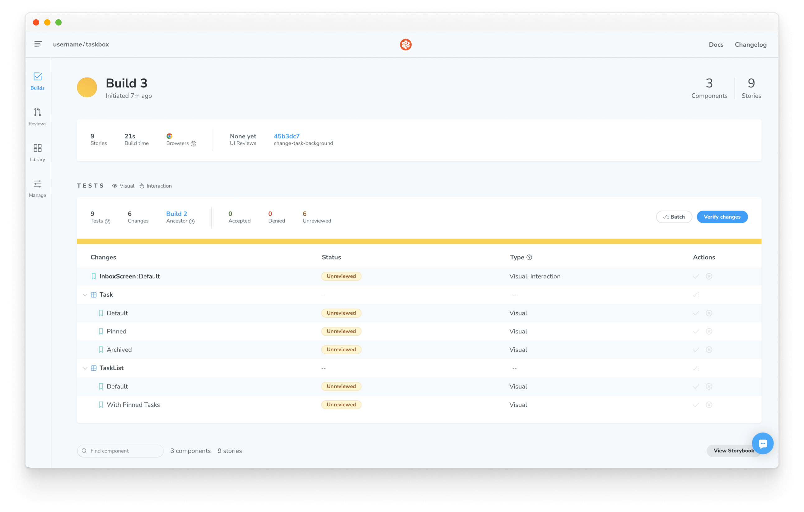
There are a lot of changes! The component hierarchy where Task is a child of PureTaskList and InboxScreen means one small tweak snowballs into major regressions. This circumstance is precisely why developers need visual tests and other testing methods.
Review changes
Visual tests ensure components don’t change by accident. But it’s still up to us to determine whether changes are intentional or not.
If a change is intentional, we'll need to update the baseline to compare future tests to the latest version of the story. If a change is unintentional, it needs to be fixed.
Since modern apps are constructed from components, it’s important that we test at the level of the component. Doing so helps us pinpoint the root cause of a change, the component, instead of reacting to symptoms of a change, the screens, and composite components.
Merge changes
When we’ve finished reviewing, we’re ready to merge UI changes with confidence--knowing that updates won’t accidentally introduce bugs. If you like the new red background, then accept the changes. If not, revert to the previous state.
Storybook helps us build components; testing helps us maintain them. So far, the two types of UI testing covered in this tutorial were manual and visual tests. Both can be automated in CI as we've just finished setting up, and it helps us ship components without worrying about stowaway bugs. However, these are not the only ways to test components. We'll need to ensure our components remain accessible to all users, including those with disabilities. This means incorporating accessibility testing into our workflow.