Construct a screen
We've concentrated on building UIs from the bottom up, starting small and adding complexity. Doing so has allowed us to develop each component in isolation, figure out its data needs, and play with it in Storybook. All without needing to stand up a server or build out screens!
In this chapter, we continue to increase the sophistication by combining components in a screen and developing that screen in Storybook.
Connected screens
As our application is straightforward, the screen we'll build is pretty trivial. It simply fetches data from a remote API, wraps the TaskList component (which supplies its own data via Pinia) in some layout, and pulls a top-level error field out of the store (let's assume we'll set that field if we have some problem connecting to our server).
We'll start by updating our store (in src/store.ts) to connect to a remote API and handle the various states for our application (i.e., error, succeeded):
import type { TaskData } from './types'

/* A simple Pinia store/actions implementation.
 * A true app would be more complex and separated into different files.
 */
import { defineStore } from 'pinia'

interface TaskBoxState {
  tasks: TaskData[]
  status: 'idle' | 'loading' | 'failed' | 'succeeded'
  error: string | null
}

/*
 * The store is created here.
 * You can read more about Pinia defineStore in the docs:
 * https://pinia.vuejs.org/core-concepts/
 */
export const useTaskStore = defineStore('taskbox', {
  state: (): TaskBoxState => ({
    tasks: [],
    status: 'idle',
    error: null,
  }),
  actions: {
    archiveTask(id: string) {
      const task = this.tasks.find((task) => task.id === id)
      if (task) {
        task.state = 'TASK_ARCHIVED'
      }
    },
    pinTask(id: string) {
      const task = this.tasks.find((task) => task.id === id)
      if (task) {
        task.state = 'TASK_PINNED'
      }
    },
    async fetchTasks() {
      this.status = 'loading'
      try {
        const response = await fetch('https://jsonplaceholder.typicode.com/todos?userId=1')
        const data = await response.json()
        const result = data
          .map((task: { id: number; title: string; completed: boolean }) => ({
            id: `${task.id}`,
            title: task.title,
            state: task.completed ? 'TASK_ARCHIVED' : 'TASK_INBOX',
          }))
          .filter((task: TaskData) => task.state === 'TASK_INBOX' || task.state === 'TASK_PINNED')
        this.tasks = result
        this.status = 'succeeded'
      } catch (error) {
        if (error && typeof error === 'object' && 'message' in error) {
          this.error = (error as Error).message
        } else {
          this.error = String(error)
        }
        this.status = 'failed'
      }
    },
  },
  getters: {
    getFilteredTasks: (state) => {
      const filteredTasks = state.tasks.filter(
        (t) => t.state === 'TASK_INBOX' || t.state === 'TASK_PINNED',
      )
      return filteredTasks
    },
  },
})
Now that we've updated our store to retrieve the data from a remote API endpoint and prepared it to handle the various states of our app, let's create our InboxScreen.vue in the src/components directory:
<template>
  <div>
    <div v-if="isError" class="page lists-show">
      <div class="wrapper-message">
        <span class="icon-face-sad" />
        <p class="title-message">Oh no!</p>
        <p class="subtitle-message">Something went wrong</p>
      </div>
    </div>
    <div v-else class="page lists-show">
      <nav>
        <h1 class="title-page">Taskbox</h1>
      </nav>
      <TaskList />
    </div>
  </div>
</template>
<script lang="ts" setup>
import { computed } from 'vue'

import { useTaskStore } from '../store'

import TaskList from './TaskList.vue'

//👇 Creates a store instance
const store = useTaskStore()
// 👇 Fetches tasks for the store
store.fetchTasks()

//👇 Retrieves the error from the store's state
const isError = computed(() => store.status === 'failed')
</script>
Next, we’ll need to update our app’s entry point (src/main.ts) so that we can wire the store into our component hierarchy reasonably quick:
import { createApp } from 'vue'
+ import { createPinia } from 'pinia'
- import './style.css'

import App from './App.vue'


- createApp(App).mount('#app')
+ createApp(App).use(createPinia()).mount('#app')
We also need to change the App component to render the InboxScreen (eventually, we would use a router to choose the correct screen, but let's not worry about that here):
<script setup lang="ts">
import InboxScreen from './components/InboxScreen.vue'
</script>

<template>
  <InboxScreen />
</template>
<style>
@import './index.css';
</style>
However, where things get interesting is in rendering the story in Storybook.
As we saw previously, the TaskList component is a container that renders the PureTaskList presentational component. By definition, container components cannot be rendered in isolation; they expect to be passed some context or connected to a service. What this means is that to render a container in Storybook, we must mock the context or service it requires.
When placing the TaskList into Storybook, we were able to dodge this issue by simply rendering the PureTaskList and avoiding the container. However, as our application grows, it quickly becomes unmanageable to keep the connected components out of Storybook and create presentational components for each. As our InboxScreen is a connected component, we'll need to provide a way to mock the store and the data it provides.
So when we set up our stories in InboxScreen.stories.ts:
import type { Meta, StoryObj } from '@storybook/vue3-vite'
import InboxScreen from './InboxScreen.vue'
const meta = {
component: InboxScreen,
title: 'InboxScreen',
tags: ['autodocs'],
} satisfies Meta<typeof InboxScreen>
export default meta
type Story = StoryObj<typeof meta>
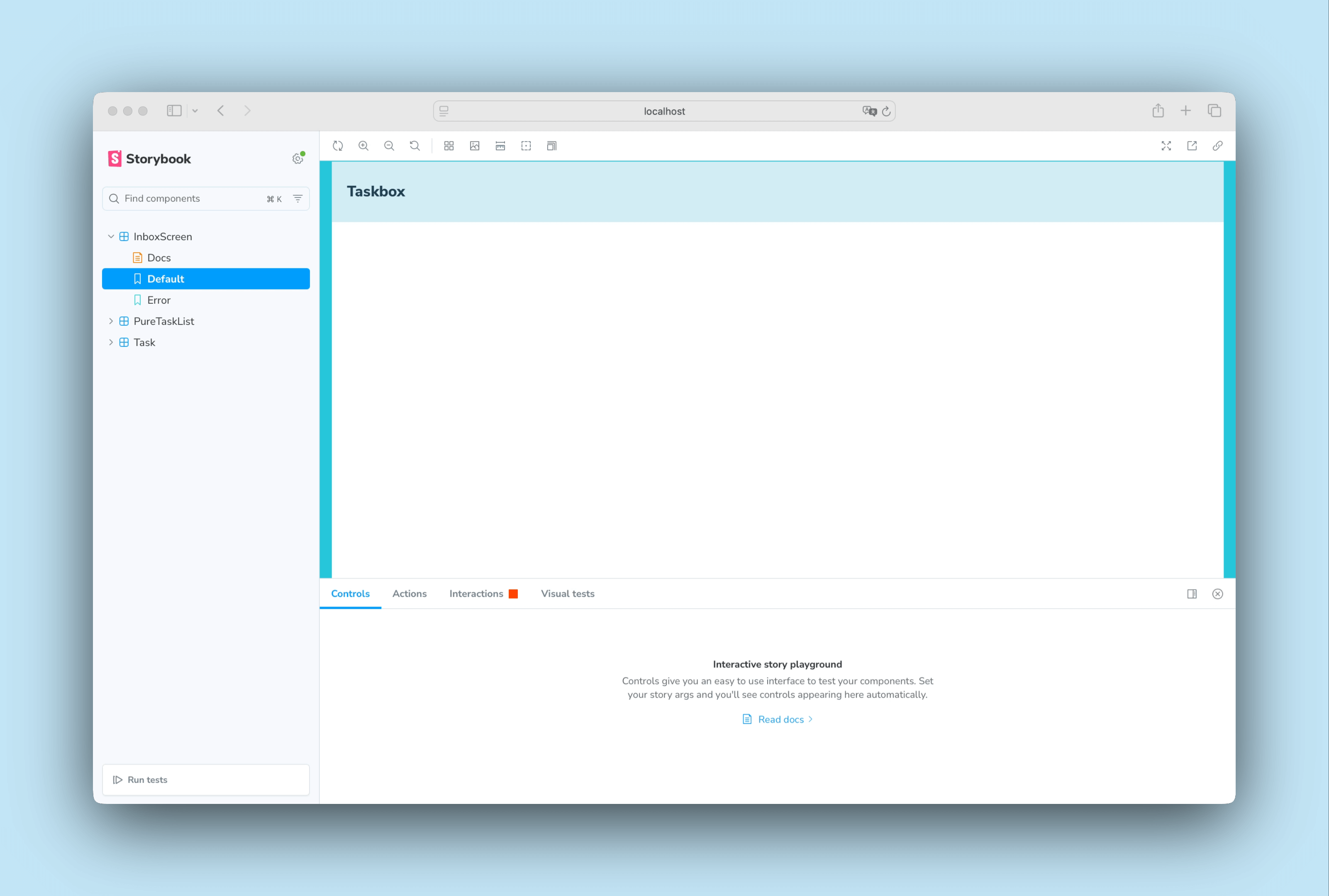
export const Default: Story = {}
export const Error: Story = {}
We can quickly spot an issue with our stories. Instead of displaying the right state, it shows an empty screen without tasks. We could easily apply the same approach as in the last chapter. We could create a PureInboxScreen presentational component that accepts the tasks and error state as props. However, as mentioned earlier, this approach quickly becomes unmanageable as the number of connected components increases. Let's see how we can solve this problem by providing the necessary context to our stories.
Supplying context to stories
To render the InboxScreen correctly, we need a way to provide our Pinia store with the right state and actions and reuse it across stories so that the InboxScreen can render correctly. We can do this by updating our .storybook/preview.ts and relying on Storybook's setup function to register our existing Pinia store:
import type { Preview } from '@storybook/vue3-vite'

+ import { setup } from '@storybook/vue3-vite'

+ import { createPinia } from 'pinia'

import '../src/index.css';

//👇 Registers a global Pinia instance inside Storybook to be consumed by existing stories
+ setup((app) => {
+   app.use(createPinia());
+ });

const preview: Preview = {
  parameters: {
    controls: {
      matchers: {
        color: /(background|color)$/i,
        date: /Date$/,
      },
    },
  },
}

export default preview;
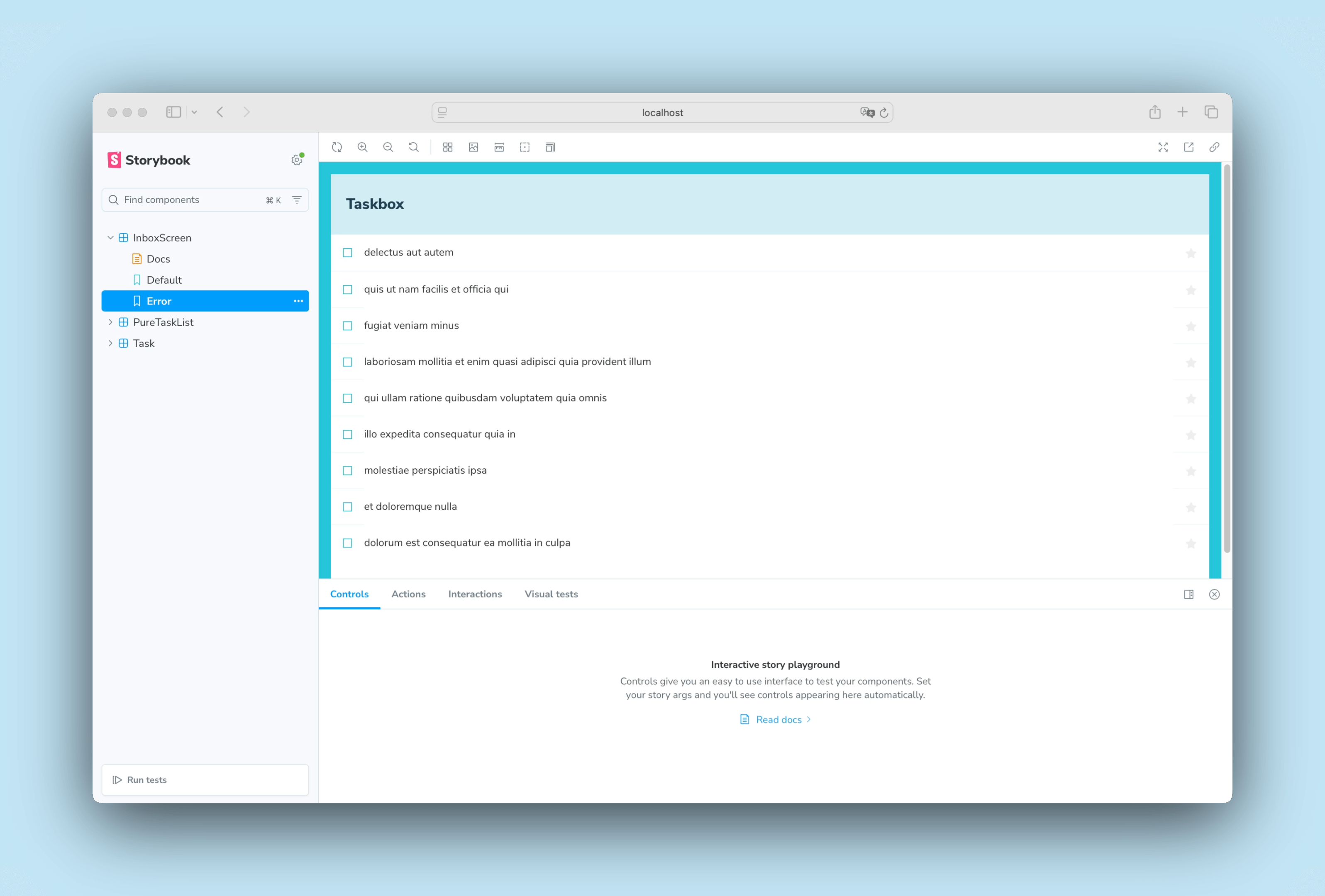
Now that we have our store registered, we can see that our InboxScreen story renders, but there's still an issue with the Error story. Instead of displaying the right state, it shows a list of tasks. To solve this problem, we could have taken various approaches to mock the store's state and actions. Instead, we'll use a well-known API mocking library alongside a Storybook addon to help us solve this issue.
Mocking API services
As our application is pretty straightforward and doesn't depend too much on remote API calls, we're going to use Mock Service Worker and Storybook's MSW addon. Mock Service Worker is an API mocking library. It relies on service workers to capture network requests and provides mocked data in responses.
When we set up our app in the Get started section both packages were also installed. All that remains is to configure them and update our stories to use them.
In your terminal, run the following command to generate a generic service worker inside your public folder:
yarn init-msw
Then, we'll need to update our .storybook/preview.ts and initialize them:
import type { Preview } from '@storybook/vue3-vite'

import { setup } from '@storybook/vue3-vite'

+ import { initialize, mswLoader } from 'msw-storybook-addon'

import { createPinia } from 'pinia'

import '../src/index.css'

//👇 Registers a global Pinia instance inside Storybook to be consumed by existing stories
setup((app) => {
  app.use(createPinia())
})

// Registers the msw addon
+ initialize()

const preview: Preview = {
  parameters: {
    controls: {
      matchers: {
        color: /(background|color)$/i,
        date: /Date$/,
      },
    },
  },
+ loaders: [mswLoader],
}

export default preview
Finally, update the InboxScreen stories and include a parameter that mocks the remote API calls:
import type { Meta, StoryObj } from '@storybook/vue3-vite'

+ import { http, HttpResponse } from 'msw'

import InboxScreen from './InboxScreen.vue'

+ import * as PureTaskListStories from './PureTaskList.stories.ts'

const meta = {
  component: InboxScreen,
  title: 'InboxScreen',
  tags: ['autodocs'],
} satisfies Meta<typeof InboxScreen>

export default meta
type Story = StoryObj<typeof meta>

export const Default: Story = {
+ parameters: {
+   msw: {
+     handlers: [
+       http.get('https://jsonplaceholder.typicode.com/todos?userId=1', () => {
+         return HttpResponse.json(PureTaskListStories.TaskListData);
+       }),
+     ],
+   },
+ },
};

export const Error: Story = {
+ parameters: {
+   msw: {
+     handlers: [
+       http.get('https://jsonplaceholder.typicode.com/todos?userId=1', () => {
+         return new HttpResponse(null, {
+           status: 403,
+         });
+       }),
+     ],
+   },
+ },
};
💡 As an aside, passing data down the hierarchy is a legitimate approach, especially when using GraphQL. It’s how we have built Chromatic alongside 800+ stories.
Check your Storybook, and you'll see that the Error story is now working as intended. MSW intercepted our remote API call and provided the appropriate response.
Interaction tests
So far, we've been able to build a fully functional application from the ground up, starting from a simple component up to a screen and continuously testing each change using our stories. But each new story also requires a manual check on all the other stories to ensure the UI doesn't break. That's a lot of extra work.
Can't we automate this workflow and test our component interactions automatically?
Write an interaction test using the play function
Storybook's play can help us with that. A play function includes small snippets of code that run after the story renders. It uses framework-agnostic DOM APIs, meaning we can write stories with the play function to interact with the UI and simulate human behavior, regardless of the frontend framework. We'll use them to verify that the UI behaves as expected when we update our tasks.
Update your newly created InboxScreen story, and set up component interactions by adding the following:
import type { Meta, StoryObj } from '@storybook/vue3-vite'

+ import { waitFor, waitForElementToBeRemoved } from 'storybook/test'

import { http, HttpResponse } from 'msw'

import InboxScreen from './InboxScreen.vue'

import * as PureTaskListStories from './PureTaskList.stories.ts'

const meta = {
  component: InboxScreen,
  title: 'InboxScreen',
  tags: ['autodocs'],
} satisfies Meta<typeof InboxScreen>

export default meta
type Story = StoryObj<typeof meta>

export const Default: Story = {
  parameters: {
    msw: {
      handlers: [
        http.get('https://jsonplaceholder.typicode.com/todos?userId=1', () => {
          return HttpResponse.json(PureTaskListStories.TaskListData);
        }),
      ],
    },
  },
+ play: async ({ canvas, userEvent }: any) => {
+   await waitForElementToBeRemoved(await canvas.findByTestId('empty'))
+   await waitFor(async () => {
+     await userEvent.click(canvas.getByLabelText('pinTask-1'))
+     await userEvent.click(canvas.getByLabelText('pinTask-3'))
+   })
+ },
};

export const Error: Story = {
  parameters: {
    msw: {
      handlers: [
        http.get('https://jsonplaceholder.typicode.com/todos?userId=1', () => {
          return new HttpResponse(null, {
            status: 403,
          });
        }),
      ],
    },
  },
};
💡 The Interactions panel helps us visualize our tests in Storybook, providing a step-by-step flow. It also offers a handy set of UI controls to pause, resume, rewind, and step through each interaction.
Check the Default story. Click the Interactions panel to see the list of interactions inside the story's play function.
Automate test with the Vitest addon
With the play function, we were able to quickly simulate user interactions with our component and verify how it behaves when we update our tasks—keeping the UI consistent. However, if we look into our Storybook, we can see that our interaction tests only run when viewing the story. This means that if we make a change, we still have to go through each story to run all checks manually. Couldn't we automate it?
We can! Storybook's Vitest addon allows us to run our interaction tests in a more automated way, leveraging the power of Vitest for a faster and more efficient testing experience. Let's see how it works!
With your Storybook running, click the "Run Tests" in the sidebar. This will run tests on our stories, how they render, their behavior, and the interactions defined in the play function, including the one we just added to the InboxScreen story.
💡 The Vitest addon can do much more than we've seen here, including other types of testing. We recommend reading the official documentation to learn more about it.
Now, we have a tool that helps us automate our UI testing without the need for manual checks. This is a great way to ensure that our UI remains consistent and functional as we continue to build out our application. What's more, if our tests fail, we'll be notified immediately, allowing us to fix any outstanding issues quickly and easily.
Component-Driven Development
We started from the bottom with Task, then progressed to TaskList, now we’re here with a whole screen UI. Our InboxScreen accommodates connected components and includes accompanying stories.
Component-Driven Development allows you to gradually expand complexity as you move up the component hierarchy. Among the benefits are a more focused development process and increased coverage of all possible UI permutations. In short, CDD helps you build higher-quality and more complex user interfaces.
We’re not done yet - the job doesn't end when the UI is built. We also need to ensure that it remains durable over time.