Unstyled
The Unstyled block is a special block that disables Storybook's default styling in MDX docs wherever it is added.
By default, most elements (like h1, p, etc.) in docs have a few default styles applied to ensure the docs look good. However, sometimes you might want some of your content to not have these styles applied. In those cases, wrap the content with the Unstyled block to remove the default styles.
import { Meta, Unstyled } from "@storybook/blocks";
import { Header } from "./Header.tsx";

<Meta title="Unstyled" />

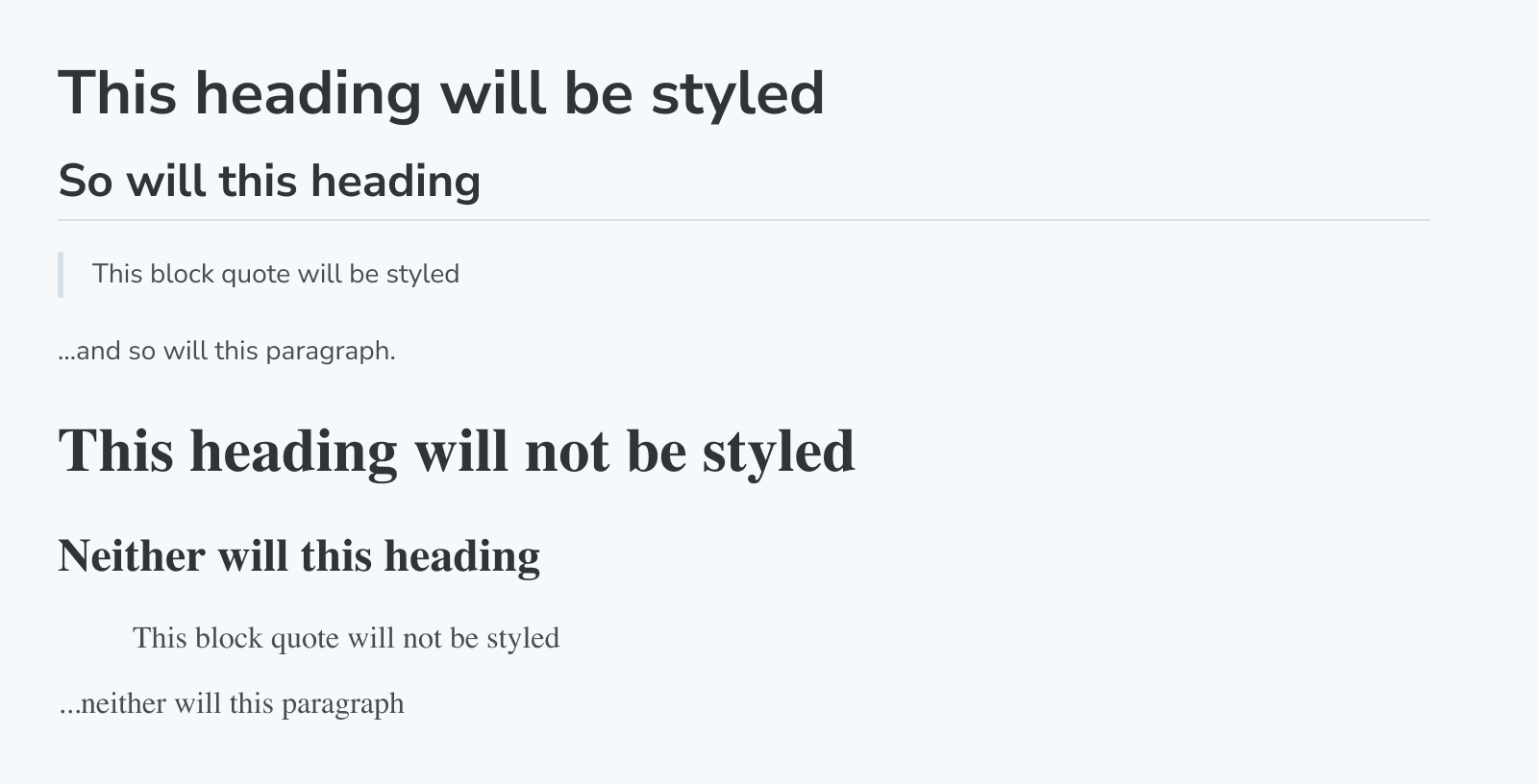
> This block quote will be styled

... and so will this paragraph.

<Unstyled>
  > This block quote will not be styled

  ... neither will this paragraph, nor the following component (which contains an \<h1\>):

  <Header />

</Unstyled>
Yields:

Due to how CSS inheritance works it’s best to always add the Unstyled block to the root of your MDX, and not nested into other elements. The following example will cause some Storybook styles like color to be inherited into CustomComponent because they are applied to the root div:
<div>
  <Unstyled>
    <CustomComponent/>
  </Unstyled>
</div>
Unstyled
import { Unstyled } from '@storybook/blocks';Unstyled is configured with the following props:
children
Type: React.ReactNode
Provides the content to which you do not want to apply default docs styles.
