Package Composition
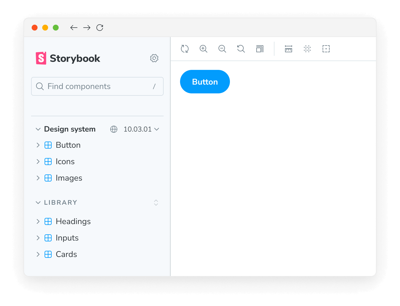
Storybook is widely used by component libraries and design systems. Design system authors can automatically compose their design systems inside their consumer’s Storybooks.
For example, if you use a design system package, its stories can appear alongside your own. That makes it convenient to cross reference usage documentation without leaving Storybook.
Composition via a package requires a secure integration between the service where you publish Storybook and Storybook’s own APIs. We recommend publishing Storybook to Chromatic for full support of these features.
For consumers
Composition happens automatically if the package supports it. When you install the package, Storybook will load its stories alongside your own.

Set up
If you want to configure how the composed Storybook behaves, you can disable the ref element in your .storybook/main.js
// Replace your-framework with the framework you are using (e.g., react-webpack5, vue3-vite)
import type { StorybookConfig } from '@storybook/your-framework';

const config: StorybookConfig = {
  framework: '@storybook/your-framework',
  stories: ['../src/**/*.mdx', '../src/**/*.stories.@(js|jsx|mjs|ts|tsx)'],
  refs: {
    'package-name': { disable: true },
  },
};

export default config;
Switching versions
Change the version of the composed Storybook to see how the library evolves. This requires configuration from the package author.

For authors
Component library authors can expand adoption by composing their components in their consumer’s Storybooks.
Add a storybook property in your published package.json that contains an object with a url field. Point the URL field to a published Storybook at the version you want.
{
  "storybook": {
    "url": "https://host.com/your-storybook-for-this-version"
  }
}
Automatic version selection
If you're using Chromatic, you can provide a single URL for your Storybook in the storybook.url field. You do not need to change the URL each time you publish a new version. Storybook will automatically find the correct URL for your package. For example:
{
  "storybook": {
    "url": "https://master--xyz123.chromatic.com"
  }
}
In this example xyz123 is your Chromatic project id. Storybook will automatically compose in the Storybook published to that project corresponding to the version the user has installed.
Show a version selector
If you're using Chromatic, you can provide a list of versions for the user to choose from to experiment with other versions of your package.
