
Highlight
Storybook's Highlight feature is a helpful tool for visually debugging your components. It allows you to highlight specific DOM nodes within your story when used directly or enhancing addons such as the Accessibility addon to inform you of accessibility issues within your components.
Highlighting DOM Elements
To highlight DOM elements with the feature, you'll need to emit the HIGHLIGHT event from within a story or an addon. The event payload must contain a selectors property assigned to an array of selectors matching the elements you want to highlight. For example:
// Replace your-framework with the framework you are using, e.g. react-vite, nextjs, nextjs-vite, etc.
import type { Meta, StoryObj } from '@storybook/your-framework';

import { useChannel } from 'storybook/preview-api';
import { HIGHLIGHT } from 'storybook/highlight';

import { MyComponent } from './MyComponent';

const meta = {
  component: MyComponent,
} satisfies Meta<typeof MyComponent>;

export default meta;
type Story = StoryObj<typeof meta>;

export const Highlighted: Story = {
  decorators: [
    (storyFn) => {
      const emit = useChannel({});
      emit(HIGHLIGHT, {
        selectors: ['h2', 'a', '.storybook-button'],
      });
      return storyFn();
    },
  ],
};We recommend choosing the most specific selector possible to avoid highlighting elements other addons use. This is because the feature tries to match selectors against the entire DOM tree.
Customize style
By default, highlighted elements contain a standard outline style applied to the selected elements. However, you can enable your custom style by extending the payload object with additional properties to customize the appearance of the highlighted elements. For example:
// Replace your-framework with the framework you are using, e.g. react-vite, nextjs, nextjs-vite, etc.
import type { Meta, StoryObj } from '@storybook/your-framework';

import { useChannel } from 'storybook/preview-api';
import { HIGHLIGHT } from 'storybook/highlight';

import { MyComponent } from './MyComponent';

const meta = {
  component: MyComponent,
} satisfies Meta<typeof MyComponent>;

export default meta;
type Story = StoryObj<typeof meta>;

export const StyledHighlight: Story = {
  decorators: [
    (storyFn) => {
      const emit = useChannel({});
      emit(HIGHLIGHT, {
        selectors: ['h2', 'a', '.storybook-button'],
        styles: {
          backgroundColor: `color-mix(in srgb, hotpink, transparent 90%)`,
          outline: '3px solid hotpink',
          animation: 'pulse 3s linear infinite',
          transition: 'outline-offset 0.2s ease-in-out',
        },
        hoverStyles: {
          outlineOffset: '3px',
        },
        focusStyles: {
          backgroundColor: 'transparent',
        },
        keyframes: `@keyframes pulse {
          0% { outline-color: rgba(255, 105, 180, 1); }
          50% { outline-color: rgba(255, 105, 180, 0.2); }
          100% { outline-color: rgba(255, 105, 180, 1); }
        }`,
      });
      return storyFn();
    },
  ],
};These properties are optional, and you can use them to customize the appearance of the highlighted elements. The hoverStyles and focusStyles properties are recommended for use with the menu property. Pseudo-classes and pseudo-elements are not supported.
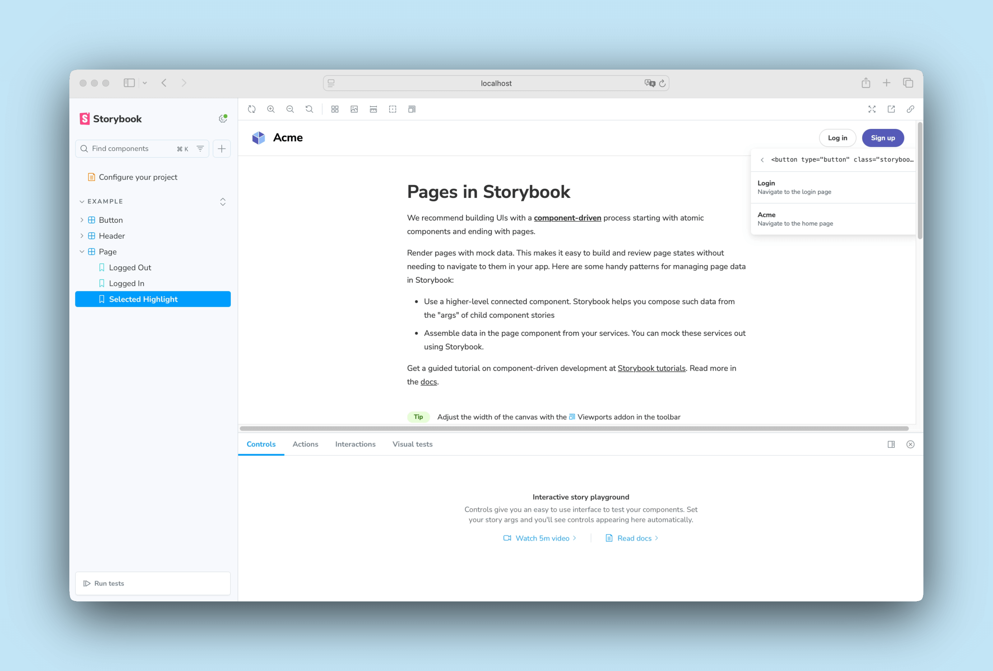
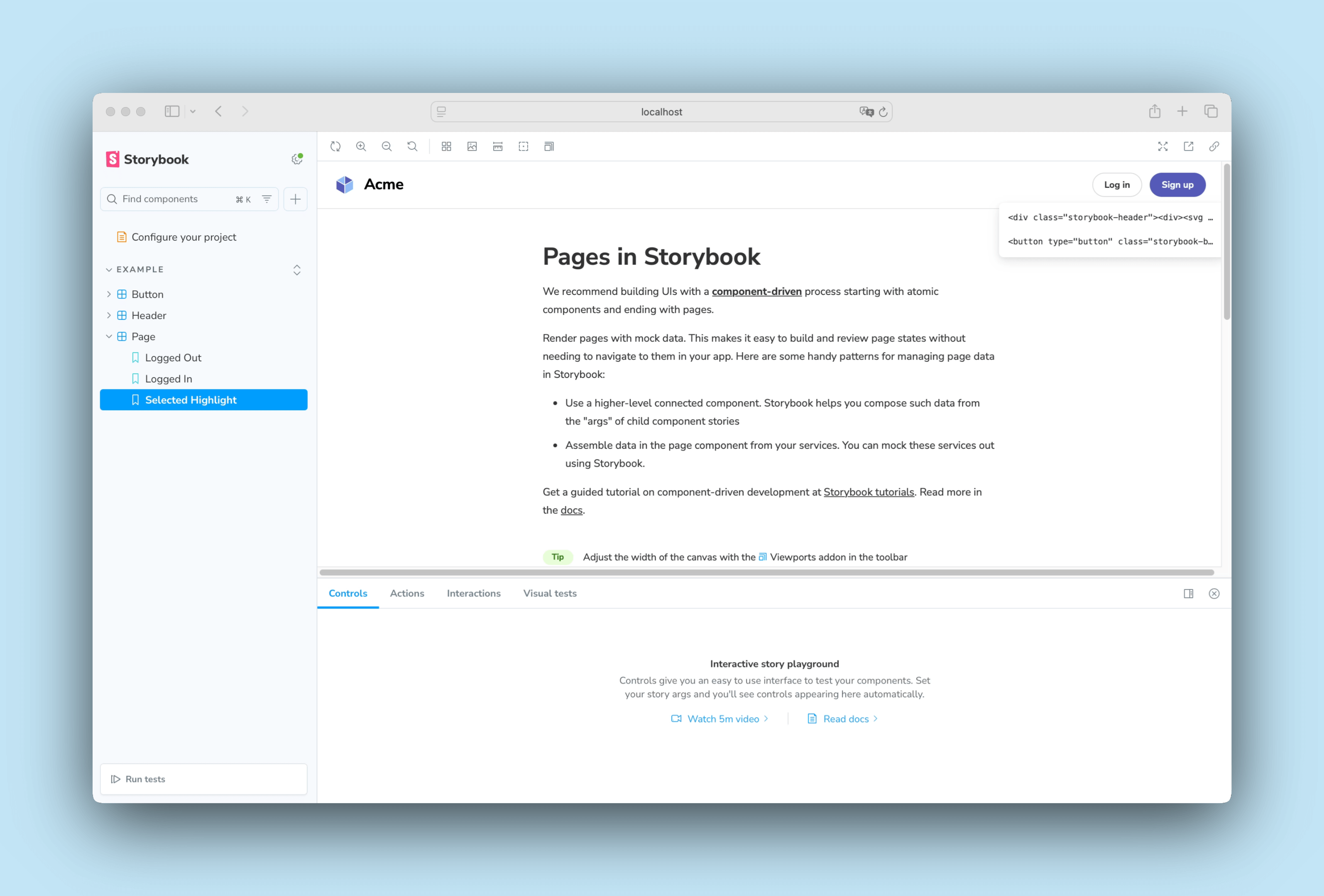
Highlight menu
The Highlight feature includes a built-in debugging option, allowing you to select the highlighted elements when you click them. This is particularly useful for inspecting the elements affected by the feature, as it lets you preview a list of elements matching the selector you provided. To enable it, add a menu property in the payload object containing additional information about the elements or trigger actions. Each item must include an id and a title, and you can also provide an optional selectors property to limit the menu item to specific highlighted elements.
// Replace your-framework with the framework you are using, e.g. react-vite, nextjs, nextjs-vite, etc.
import type { Meta, StoryObj } from '@storybook/your-framework';

import { useChannel } from 'storybook/preview-api';
import { HIGHLIGHT } from 'storybook/highlight';

import { MyComponent } from './MyComponent';

const meta = {
  component: MyComponent,
} satisfies Meta<typeof MyComponent>;

export default meta;
type Story = StoryObj<typeof meta>;

export const StyledHighlight: Story = {
  decorators: [
    (storyFn) => {
      const emit = useChannel({});
      emit(HIGHLIGHT, {
        selectors: ['h2', 'a', '.storybook-button'],
        menu: [
          [
            {
              id: 'button-name',
              title: 'Login',
              description: 'Navigate to the login page',
              clickEvent: 'my-menu-click-event',
            },
            {
              id: 'h2-home',
              title: 'Acme',
              description: 'Navigate to the home page',
            },
          ],
        ],
      });
      return storyFn();
    },
  ],
};
When enabled, the menu will be displayed when you click on the selected element matching your provided selectors. However, if you don't want to show any information, you can omit the items or set the menu property to an empty array to show the default menu.
Remove highlights
If you need to remove a highlight from a specific element, you can do so by emitting the REMOVE_HIGHLIGHT event and providing the id of the highlight you want to remove. For example:
// Replace your-framework with the framework you are using, e.g. react-vite, nextjs, nextjs-vite, etc.
import type { Meta, StoryObj } from '@storybook/your-framework';

import { useChannel } from 'storybook/preview-api';
import { HIGHLIGHT, REMOVE_HIGHLIGHT } from 'storybook/highlight';

import { MyComponent } from './MyComponent';

const meta = {
  component: MyComponent,
} satisfies Meta<typeof MyComponent>;

export default meta;
type Story = StoryObj<typeof meta>;

export const RemoveHighlight: Story = {
  decorators: [
    (storyFn) => {
      const emit = useChannel({});
      emit(HIGHLIGHT, {
        id: 'my-unique-id',
        selectors: ['header', 'section', 'footer'],
      });
      emit(REMOVE_HIGHLIGHT, 'my-unique-id');
      return storyFn();
    },
  ],
};The emit function derived from the useChannel API hook creates a communication channel in Storybook's UI to listen for events and update the UI accordingly. The Highlight feature uses this channel to listen to custom events and update the highlighted elements (if any) accordingly.
Reset highlighted elements
Out of the box, Storybook automatically removes highlighted elements when transitioning between stories. However, if you need to clear them manually, you can emit the RESET_HIGHLIGHT event from within a story or an addon. This removes all highlights, even ones created by other addons. For example:
// Replace your-framework with the framework you are using, e.g. react-vite, nextjs, nextjs-vite, etc.
import type { Meta, StoryObj } from '@storybook/your-framework';

import { useChannel } from 'storybook/preview-api';
import { HIGHLIGHT, RESET_HIGHLIGHT } from 'storybook/highlight';

import { MyComponent } from './MyComponent';

const meta = {
  component: MyComponent,
} satisfies Meta<typeof MyComponent>;

export default meta;
type Story = StoryObj<typeof meta>;

export const ResetHighlight: Story = {
  decorators: [
    (storyFn) => {
      const emit = useChannel({});
      emit(RESET_HIGHLIGHT); //👈 Remove previously highlighted elements
      emit(HIGHLIGHT, {
        selectors: ['header', 'section', 'footer'],
      });
      return storyFn();
    },
  ],
};
Scroll element into view
The Highlight feature allows you to scroll an element into view and highlight it. To enable it, emit the SCROLL_INTO_VIEW event from within a story or an addon. The event payload must contain a selector property to target the element you want to scroll into view. When the element is visible, it will be highlighted for a brief moment.
// Replace your-framework with the framework you are using, e.g. react-vite, nextjs, nextjs-vite, etc.
import type { Meta, StoryObj } from '@storybook/your-framework';

import { useChannel } from 'storybook/preview-api';
import { SCROLL_INTO_VIEW } from 'storybook/highlight';

import { MyComponent } from './MyComponent';

const meta = {
  component: MyComponent,
} satisfies Meta<typeof MyComponent>;

export default meta;
type Story = StoryObj<typeof meta>;

export const ScrollIntoView: Story = {
  decorators: [
    (storyFn) => {
      const emit = useChannel({});
      emit(SCROLL_INTO_VIEW, '#footer');
      return storyFn();
    },
  ],
};
API
Parameters
This feature contributes the following parameters to Storybook, under the highlight namespace:
disable
Type: boolean
Disable this feature's behavior. If you wish to turn off this feature for the entire Storybook, you should do so in your main configuration file.
This parameter is most useful to allow overriding at more specific levels. For example, if this parameter is set to true at the project level, it could be re-enabled by setting it to false at the meta (component) or story level.
Exports
This feature contributes the following exports to Storybook:
import { HIGHLIGHT, REMOVE_HIGHLIGHT, RESET_HIGHLIGHT, SCROLL_INTO_VIEW } from 'storybook/highlight';HIGHLIGHT
An event to highlight DOM elements. The event payload must contain a selectors property assigned to an array of selectors matching the elements you want to highlight. It can be extended with an optional object containing additional configuration options. See the usage example above.
import { HIGHLIGHT, type HighlightOptions } from 'storybook/highlight';

channel.emit(
  HIGHLIGHT,
  options // The available configuration options inheriting from the HighlightOptions API
);
The options object contains the following properties:
interface HighlightOptions {
  /** Unique identifier for the highlight, required if you want to remove the highlight later */
  id?: string;
  /** HTML selectors of the elements */
  selectors: string[];
  /** Priority of the highlight, higher takes precedence, defaults to 0 */
  priority?: number;
  /** CSS styles to apply to the highlight */
  styles?: Record<string, string>;
  /** CSS styles to apply to the highlight when it is hovered */
  hoverStyles?: Record<string, string>;
  /** CSS styles to apply to the highlight when it is focused or selected */
  focusStyles?: Record<string, string>;
  /** Keyframes required for animations */
  keyframes?: string;
  /** Groups of menu items to show when the highlight is selected */
  menu?: HighlightMenuItem[][];
}

interface HighlightMenuItem {
  /** Unique identifier for the menu item */
  id: string;
  /** Title of the menu item */
  title: string;
  /** Description of the menu item */
  description?: string;
  /** Icon for the menu item, left side */
  iconLeft?: "chevronLeft" | "chevronRight" | "info" | "shareAlt";
  /** Icon for the menu item, right side */
  iconRight?: "chevronLeft" | "chevronRight" | "info" | "shareAlt";
  /** Name for a channel event to trigger when the menu item is clicked */
  clickEvent?: string;
  /** HTML selectors for which this menu item should show (subset of HighlightOptions['selectors']) */
  selectors?: HighlightOptions['selectors'];
}
Menu items can specify a clickEvent to be emitted on the channel when the item is clicked. The channel event will receive two arguments: the menu item id and a ClickEventDetails object with the following properties:
interface ClickEventDetails {
  // Position and dimensions of the element on the page
  top: number;
  left: number;
  width: number;
  height: number;
  // Selector(s) which matched the element
  selectors: string[];
  // DOM element details
  element: {
    attributes: Record<string, string>;
    localName: string;
    tagName: string;
    outerHTML: string;
  };
}
To listen for this event (assuming clickEvent: 'MY_CLICK_EVENT'):
import type { ClickEventDetails } from 'storybook/highlight';

const handleClickEvent = (itemId: string, details: ClickEventDetails) => {
  // Handle the menu item click event
}

// When you have a channel instance:
channel.on('MY_CLICK_EVENT', handleClickEvent)

// Or from a decorator:
useChannel({
  MY_CLICK_EVENT: handleClickEvent,
}, [handleClickEvent])
REMOVE_HIGHLIGHT
An event that removes a previously created highlight. The event payload must contain an id property assigned to the id of the highlight you want to remove. See the usage example above.
import { REMOVE_HIGHLIGHT } from 'storybook/highlight';

channel.emit(
  REMOVE_HIGHLIGHT,
  id // The id of the previously created highlight to be removed
);
RESET_HIGHLIGHT
An event to clear all highlights from highlighted elements. See the usage example above.
import { RESET_HIGHLIGHT } from 'storybook/highlight';

channel.emit(RESET_HIGHLIGHT);
SCROLL_INTO_VIEW
An event to scroll a DOM element into view and briefly highlight it. The event payload must contain a selector property assigned to the selector of the element you want to scroll into view. Optionally, you can provide a options object to customize the scroll behavior. See the usage example above.
import { SCROLL_INTO_VIEW } from 'storybook/highlight';

channel.emit(
  SCROLL_INTO_VIEW,
  selector // Element selector to scroll into view
  options // An object inheriting from ScrollIntoViewOptions API to customize the scroll behavior
);