
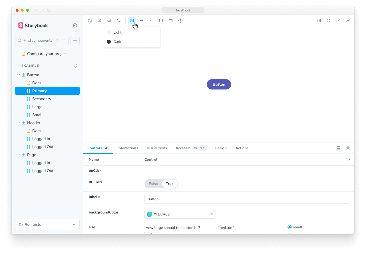
Backgrounds
The backgrounds feature allows you to set the background color on which the story renders in the UI:
Configuration
By default, the backgrounds feature includes a light and dark background.
But you're not restricted to these backgrounds. You can configure your own set of colors with the backgrounds parameter in your .storybook/preview.js|ts.
You can define the available background colors using the options property and set the initial background color using the initialGlobals property:
// Replace your-framework with the framework you are using, e.g. react-vite, nextjs, vue3-vite, etc.
import type { Preview } from '@storybook/your-framework';

const preview: Preview = {
  parameters: {
    backgrounds: {
      options: {
        // 👇 Default options
        dark: { name: 'Dark', value: '#333' },
        light: { name: 'Light', value: '#F7F9F2' },
        // 👇 Add your own
        maroon: { name: 'Maroon', value: '#400' },
      },
    },
  },
  initialGlobals: {
    // 👇 Set the initial background color
    backgrounds: { value: 'light' },
  },
};

export default preview;
Defining the background for a story
The backgrounds feature enables you to change the background color applied to a story by selecting from the list of predefined background colors in the toolbar. If needed, you can set a story to default to a specific background color, by using the globals option:
// Replace your-framework with the name of your framework (e.g., react-vite, vue3-vite, etc.)
import type { Meta, StoryObj } from '@storybook/your-framework';

import { Button } from './Button';

const meta = {
  component: Button,
  globals: {
    // 👇 Set background value for all component stories
    backgrounds: { value: 'gray', grid: false },
  },
} satisfies Meta<typeof Button>;

export default meta;
type Story = StoryObj<typeof meta>;

export const OnDark: Story = {
  globals: {
    // 👇 Override background value for this story
    backgrounds: { value: 'dark' },
  },
};When you specify a background color for a story (or a component's stories) using globals, the color is applied and cannot be changed using the toolbar. This is useful to ensure a story is always rendered on a specific background color.
Extending the configuration
You can also configure backgrounds on a per-component or per-story basis through parameter inheritance.
To set the available background colors, use the options property. In this example, we'll adjust the colors for all of the Button component's stories:
// Replace your-framework with the framework you are using, e.g. react-vite, nextjs, nextjs-vite, etc.
import type { Meta } from '@storybook/your-framework';

import { Button } from './Button';

const meta = {
  component: Button,
  parameters: {
    backgrounds: {
      options: {
        // 👇 Override the default `dark` option
        dark: { name: 'Dark', value: '#000' },
        // 👇 Add a new option
        gray: { name: 'Gray', value: '#CCC' },
      },
    },
  },
} satisfies Meta<typeof Button>;

export default meta;
Disable backgrounds
If you want to turn off backgrounds in a story, you can do so by configuring the backgrounds parameter like so:
// Replace your-framework with svelte-vite or sveltekit
import type { Meta, StoryObj } from '@storybook/your-framework';

import Button from './Button.svelte';

const meta = {
  component: Button,
} satisfies Meta<typeof Button>;

export default meta;
type Story = StoryObj<typeof meta>;

export const Large: Story = {
  parameters: {
    backgrounds: { disable: true },
  },
};
Grid
The backgrounds feature also includes a Grid selector, which allows you to quickly see if your components are aligned.
You don't need additional configuration to get started. But its properties are fully customizable; if you don't supply any value to any of its properties, they'll default to the following values:
// Replace your-framework with the framework you are using, e.g. react-vite, nextjs, vue3-vite, etc.
import type { Meta } from '@storybook/your-framework';

import { Button } from './Button';

// To apply a set of backgrounds to all stories of Button:
const meta = {
  component: Button,
  parameters: {
    backgrounds: {
      grid: {
        cellSize: 20,
        opacity: 0.5,
        cellAmount: 5,
        offsetX: 16, // Default is 0 if story has 'fullscreen' layout, 16 if layout is 'padded'
        offsetY: 16, // Default is 0 if story has 'fullscreen' layout, 16 if layout is 'padded'
      },
    },
  },
} satisfies Meta<typeof Button>;

export default meta;
API
Globals
This module contributes the following globals to Storybook, under the backgrounds namespace:
grid
Type: boolean
Whether the grid is displayed.
value
Type: string
When set, the background color is applied and cannot be changed using the toolbar. Must match the key of one of the available colors.
Parameters
This module contributes the following parameters to Storybook, under the backgrounds namespace:
disable
Type: boolean
Disable this feature's behavior. If you wish to disable this feature for the entire Storybook, you should do so in your main configuration file.
This parameter is most useful to allow overriding at more specific levels. For example, if this parameter is set to true at the project level, it could then be re-enabled by setting it to false at the meta (component) or story level.
grid
Type:
{
  cellAmount?: number;
  cellSize?: number;
  disable?: boolean;
  offsetX?: number;
  offsetY?: number;
  opacity?: number;
}
Configuration for the background grid.
grid.cellAmount
Type: number
Default: 5
Specify the size of the minor grid lines.
grid.cellSize
Type: number
Default: 20
Specify the size of the major grid lines.
grid.disable
Type: boolean
Turn off the grid.
grid.offsetX
Type: number
Default: 0 if story layout is 'fullscreen'; 16 if story layout is 'padded'
Horizontal offset of the grid.
grid.offsetY
Type: number
Default: 0 if story layout is 'fullscreen'; 16 if story layout is 'padded'
Vertical offset of the grid.
grid.opacity
Type: number
Default: 0.5
The opacity of the grid lines.
options
(Required, see description)
Type:
{
  [key: string]: {
    name: string;
    value: string;
  };
}
Available background colors. See above for a usage example.