
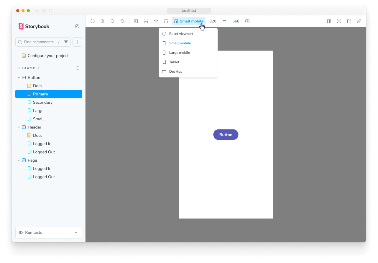
Viewport
The viewport feature allows you to adjust the dimensions of the iframe your story is rendered in. It makes it easy to develop responsive UIs.
Configuration
Out of the box, the viewport feature offers you a standard set of viewports that you can use. If you want to change the default set of viewports, you can configure your own viewports with the viewport parameter in your .storybook/preview.js|ts.
You can define the available viewports using the options property and set the initial viewport using the initialGlobals property:
// Replace your-framework with the framework you are using, e.g. react-vite, nextjs, vue3-vite, etc.
import type { Preview } from '@storybook/your-framework';

import { INITIAL_VIEWPORTS } from 'storybook/viewport';

const preview: Preview = {
  parameters: {
    viewport: {
      options: INITIAL_VIEWPORTS,
    },
  },
  initialGlobals: {
    viewport: { value: 'ipad', isRotated: false },
  },
};

export default preview;
Use a detailed set of devices
By default, the viewport feature will use a minimal set of viewports, which enables you to test your UI in common responsive scenarios. These are also available in the MINIMAL_VIEWPORTS export and include the following devices:
| Key | Description | Dimensions (w×h, px) |
|---|---|---|
mobile1 | Small mobile | 320 × 568 |
mobile2 | Large mobile | 414 × 896 |
tablet | Tablet | 834 × 1112 |
If you need a more detailed set of devices, you can use the INITIAL_VIEWPORTS export, which includes the following devices:
| Key | Description | Dimensions (w×h, px) |
|---|---|---|
iphone5 | iPhone 5 | 320 × 568 |
iphone6 | iPhone 6 | 375 × 667 |
iphone6p | iPhone 6 Plus | 414 × 736 |
iphone8p | iPhone 8 Plus | 414 × 736 |
iphonex | iPhone X | 375 × 812 |
iphonexr | iPhone XR | 414 × 896 |
iphonexsmax | iPhone XS Max | 414 × 896 |
iphonese2 | iPhone SE (2nd generation) | 375 × 667 |
iphone12mini | iPhone 12 mini | 375 × 812 |
iphone12 | iPhone 12 | 390 × 844 |
iphone12promax | iPhone 12 Pro Max | 428 × 926 |
iphoneSE3 | iPhone SE 3rd generation | 375 × 667 |
iphone13 | iPhone 13 | 390 × 844 |
iphone13pro | iPhone 13 Pro | 390 × 844 |
iphone13promax | iPhone 13 Pro Max | 428 × 926 |
iphone14 | iPhone 14 | 390 × 844 |
iphone14pro | iPhone 14 Pro | 393 × 852 |
iphone14promax | iPhone 14 Pro Max | 430 × 932 |
galaxys5 | Galaxy S5 | 360 × 640 |
galaxys9 | Galaxy S9 | 360 × 740 |
nexus5x | Nexus 5X | 412 × 668 |
nexus6p | Nexus 6P | 412 × 732 |
pixel | Pixel | 540 × 960 |
pixelxl | Pixel XL | 720 × 1280 |
mobile1 | Small mobile (also in MINIMAL_VIEWPORTS) | 320 × 568 |
mobile2 | Large mobile (also in MINIMAL_VIEWPORTS) | 414 × 896 |
ipad | iPad | 768 × 1024 |
ipad10p | iPad Pro 10.5-in | 834 × 112 |
ipad11p | iPad Pro 11-in | 834 × 1194 |
ipad12p | iPad Pro 12.9-in | 1024 × 1366 |
tablet | Tablet (also in MINIMAL_VIEWPORTS) | 834 × 1112 |
To use the detailed set of devices, you can adjust the options property in your configuration to include the INITIAL_VIEWPORTS export:
// Replace your-framework with the framework you are using, e.g. react-vite, nextjs, vue3-vite, etc.
import type { Preview } from '@storybook/your-framework';

import { INITIAL_VIEWPORTS } from 'storybook/viewport';

const preview: Preview = {
  parameters: {
    viewport: {
      options: INITIAL_VIEWPORTS,
    },
  },
  initialGlobals: {
    viewport: { value: 'ipad', isRotated: false },
  },
};

export default preview;
Add new devices
If the predefined viewports don't meet your needs, you can add new devices to the list of viewports. For example, let's add two Kindle devices to the default set of minimal viewports:
// Replace your-framework with the framework you are using, e.g. react-vite, nextjs, vue3-vite, etc.
import type { Preview } from '@storybook/your-framework';

import { MINIMAL_VIEWPORTS } from 'storybook/viewport';

const kindleViewports = {
  kindleFire2: {
    name: 'Kindle Fire 2',
    styles: {
      width: '600px',
      height: '963px',
    },
  },
  kindleFireHD: {
    name: 'Kindle Fire HD',
    styles: {
      width: '533px',
      height: '801px',
    },
  },
};

const preview: Preview = {
  parameters: {
    viewport: {
      options: {
        ...MINIMAL_VIEWPORTS,
        ...kindleViewports,
      },
    },
  },
};

export default preview;
Configuring per component or story
In some cases, it's not practical for you to use a specific visual viewport on a global scale, and you need to adjust it to an individual story or set of stories for a component.
Parameters can be applied at the project, component, and story levels, which allows you to specify the configuration where needed. For example, you can set the available viewports for all of the stories for a component like so:
// Replace your-framework with the framework you are using, e.g. react-vite, nextjs, nextjs-vite, etc.
import type { Meta, StoryObj } from '@storybook/your-framework';

import { INITIAL_VIEWPORTS } from 'storybook/viewport';

import { MyComponent } from './MyComponent';

const meta = {
  component: MyComponent,
  parameters: {
    viewport: {
      //👇 Set available viewports for every story in the file
      options: INITIAL_VIEWPORTS,
    },
  },
} satisfies Meta<typeof MyComponent>;

export default meta;
Defining the viewport for a story
The Viewport module enables you to change the viewport applied to a story by selecting from the list of predefined viewports in the toolbar. If needed, you can set a story to default to a specific viewport by using the globals option:
// Replace your-framework with the framework you are using, e.g. react-vite, nextjs, vue3-vite, etc.
import type { Meta, StoryObj } from '@storybook/your-framework';

import { Button } from './Button';

const meta = {
  component: Button,
  globals: {
    // 👇 Set viewport for all component stories
    viewport: { value: 'tablet', isRotated: false },
  },
} satisfies Meta<typeof Button>;

export default meta;
type Story = StoryObj<typeof meta>;

export const OnPhone: Story = {
  globals: {
    // 👇 Override viewport for this story
    viewport: { value: 'mobile1', isRotated: false },
  },
};When you specify a viewport for a story (or a component's stories) using globals, the viewport is applied and cannot be changed using the toolbar. This is useful to ensure a story is always rendered on a specific viewport.
API
Keyboard shortcuts
If you need, you can edit these on the shortcuts page.
- Next viewport: alt + v
- Previous viewport: alt + shift + v
- Reset viewport: alt + control + v
Globals
This module contributes the following globals to Storybook, under the viewport namespace:
value
Type: string
When set, the viewport is applied and cannot be changed using the toolbar. Must match the key of one of the available viewports.
isRotated
Type: boolean
When true, the viewport applied will be rotated 90°, e.g., from portrait to landscape orientation.
Parameters
This module contributes the following parameters to Storybook, under the viewport namespace:
disable
Type: boolean
Turn off this module's behavior. This parameter is most useful to allow overriding at more specific levels. For example, if this parameter is set to true at the project level, it could be re-enabled by setting it to false at the meta (component) or story level.
options
Type:
{
  [key: string]: {
    name: string;
    styles: { height: string, width: string };
    type: 'desktop' | 'mobile' | 'tablet' | 'other';
  };
}
Specify the available viewports. See usage example above. The width and height values must include the unit, e.g. '320px'.
Exports
This module contributes the following exports to Storybook:
import { INITIAL_VIEWPORTS, MINIMAL_VIEWPORTS } from 'storybook/viewport';INITIAL_VIEWPORTS
Type: object
The full set of initial viewports provided by the Viewport module listed above.
MINIMAL_VIEWPORTS
Type: object
A minimal set of viewports provided by the Viewport module listed above. These are used by default.