
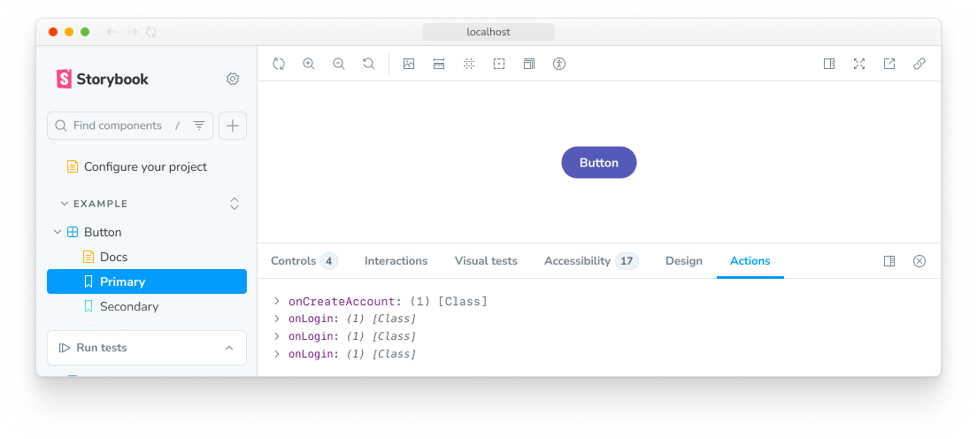
Actions
Actions are used to display data received by event handler (callback) arguments in your stories.
Action args
Actions work via supplying special Storybook-generated “action” arguments (referred to as "args" for short) to your stories. There are two ways to get an action arg:
Via storybook/test fn spy function
The recommended way to write actions is to use the fn utility from storybook/test to mock and spy args. This is very useful for writing interaction tests. You can mock your component's methods by assigning them to the fn() function:
// Replace your-framework with the framework you are using, e.g. react-vite, nextjs, vue3-vite, etc.
import type { Meta } from '@storybook/your-framework';

import { fn } from 'storybook/test';

import { Button } from './Button';

const meta = {
  component: Button,
  // 👇 Use `fn` to spy on the onClick arg, which will appear in the actions panel once invoked
  args: { onClick: fn() },
} satisfies Meta<typeof Button>;

export default meta;
If your component calls an arg (because of either the user's interaction or the play function) and that arg is spied on , the event will show up in the action panel:
Automatically matching args
Another option is to use a global parameter to match all argTypes that match a certain pattern. The following configuration automatically creates actions for each on argType (which you can either specify manually or can be inferred automatically).
This is quite useful when your component has dozens (or hundreds) of methods and you do not want to manually apply the fn utility for each of those methods. However, this is not the recommended way of writing actions. That's because automatically inferred args are not available as spies in your play function. If you use argTypesRegex and your stories have play functions, you will need to also define args with the fn utility to test them in your play function.
// Replace your-framework with the framework you are using, e.g. react-vite, nextjs, vue3-vite, etc.
import type { Preview } from '@storybook/your-framework';

const preview: Preview = {
  parameters: {
    actions: { argTypesRegex: '^on.*' },
  },
};

export default preview;
If you need more granular control over which argTypes are matched, you can adjust your stories and include the argTypesRegex parameter. For example:
// Replace your-framework with the framework you are using, e.g. react-vite, nextjs, vue3-vite, etc.
import type { Meta } from '@storybook/your-framework';

import { Button } from './Button';

const meta = {
  component: Button,
  parameters: { actions: { argTypesRegex: '^on.*' } },
} satisfies Meta<typeof Button>;

export default meta;
This will bind a standard HTML event handler to the outermost HTML element rendered by your component and trigger an action when the event is called for a given selector. The format is <eventname> <selector>. The selector is optional; it defaults to all elements.
API
Parameters
This contributes the following parameters to Storybook, under the actions namespace:
argTypesRegex
Type: string
Create actions for each arg that matches the regex. Please note the significant limitations of this approach, as described above.
disable
Type: boolean
Disable the action panel.
This parameter is most useful to allow overriding at more specific levels. For example, if this parameter is set to true at the project level, it could then be re-enabled by setting it to false at the meta (component) or story level.
Exports
import { action } from 'storybook/actions';action
Type: (name?: string) => void
Allows you to create an action that appears in the actions panel of the Storybook UI when clicked. The action function takes an optional name parameter, which is used to identify the action in the UI.
// Replace your-framework with the framework you are using, e.g. react-vite, nextjs, vue3-vite, etc.
import type { Meta } from '@storybook/your-framework';

import { action } from 'storybook/actions';

import Button from './Button';

const meta = {
  component: Button,
  args: {
    // 👇 Create an action that appears when the onClick event is fired
    onClick: action('on-click'),
  },
} satisfies Meta<typeof Button>;

export default meta;