Architecting systems
In chapter 2, we extract a design system from existing component libraries. Along the way, we determine which components belong in the design system and outline common challenges developers face getting started.
In large companies, this exercise is done in conjunction with design, engineering, and product teams. Chromatic (the company behind Storybook) and Storybook share a sprightly frontend infrastructure team that serves 1400+ open source contributors across 3+ properties, so we’re going to outline the process for you.
The challenge
If you work on a development team, you’ve probably noticed that bigger teams aren’t very efficient. Miscommunication is rampant as teams grow. Existing UI patterns go undocumented or are lost altogether. That means developers reinvent the wheel instead of building new features. Over time, projects are littered with one-off components.
We slammed into this predicament. Despite the best intentions of an experienced team, UI components were endlessly rebuilt or pasted into place. UI patterns that were supposed to be the same diverged in appearance and functionality. Each component was a unique snowflake which made it impossible for new developers to discern the source of truth, much less contribute.
Create a design system
A design system consolidates common UI components in a central well-maintained repository that gets distributed via a package manager. Developers import standardized UI components instead of pasting the same UI code in multiple projects.
Most design systems aren’t built from scratch. Instead, they’re assembled from tried-and-true UI components used across a company which are repackaged as a design system. Our project is no exception. We’ll cherry-pick components from existing production component libraries to save time and deliver our design system to stakeholders faster.
Where does the design system live?
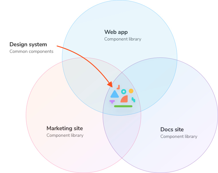
You can think of a design system as another component library, but it serves an entire organization instead of servicing one app. A design system focuses on UI primitives, while project-specific component libraries can contain anything from composite components to screens.
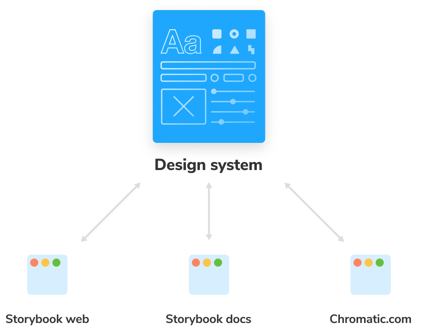
As such, our design system must be independent of any project and also a dependency of all projects. Changes propagate throughout the organization via a versioned package distributed by a package manager. Projects can reuse design system components and further customize if needed. These constraints give us the blueprint for organizing our frontend projects.
Set up a repository in GitHub
React is the most popular view layer according to the State of JS survey. An overwhelming number of Storybooks use React, so we’re using it in this tutorial to build our design system.
In your command line, run the following commands:
# Clone the files
npx degit chromaui/learnstorybook-design-system-template learnstorybook-design-system

cd learnstorybook-design-system

# Install the dependencies
yarn install
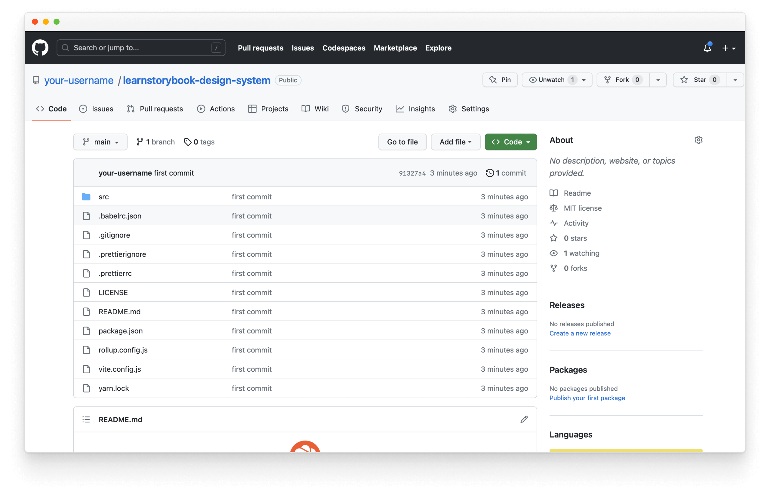
Once everything is installed, we can push it to GitHub (which we’ll use to host the code for our design system). Start by signing in and creating a new repository on GitHub.com:
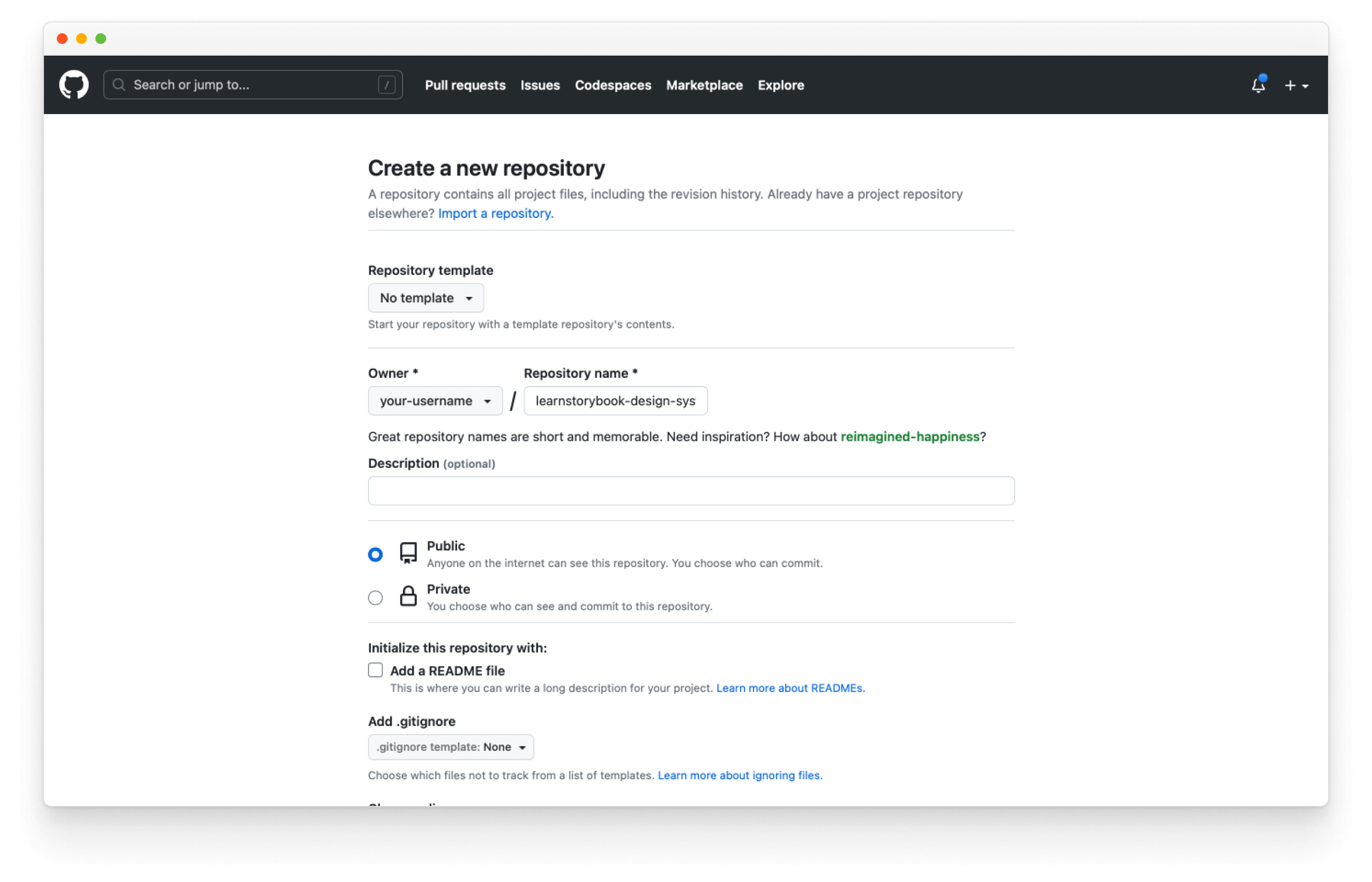
Then follow GitHub's instructions to create the (the so-far mostly empty) repository:
git init
git add .
git commit -m "first commit"
git branch -M main
git remote add origin https://github.com/your-username/learnstorybook-design-system.git
git push -u origin main
Be sure to replace your-username with your account name.
What belongs and what doesn’t
Design systems should only contain pure and presentational components. These components deal with how UI appears, respond exclusively to props, do not contain app-specific business logic, and are agnostic to how data loads. These properties are essential in allowing the component to be reusable.
Design systems aren’t the superset of every component library in an organization. That would be a headache to keep track of.
App-specific components that contain business logic should not be included because that hamstrings reuse by requiring consumer projects to have identical business constraints.
Omit one-offs that aren’t currently being reused. Even if you hope they become part of the design system one day, nimble teams avoid maintaining excess code when possible.
Create an inventory
The first task is creating an inventory of your components to identify the most used. It often involves manually cataloging screens in various websites or apps to discern common UI patterns. Designers like Brad Frost and Nathan Curtis have published handy methodologies for inventorying components so we won’t go into further detail in this tutorial.
Useful heuristics for developers:
- If a UI pattern is used more than three times, turn it into a reusable UI component.
- If a UI component is used in 3 or more projects/teams, put it in your design system.

Following this method, we end up with UI primitives: Avatar, Badge, Button, Checkbox, Input, Radio, Select, Textarea, Highlight (for code), Icon, Link, Tooltip, and more. These building blocks are configured in different ways to assemble countless unique features and layouts in our client apps.
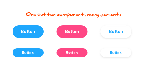
We’ve selected a subset of these components for this tutorial to make reasoning about the repository simpler. Some teams also include customized third-party components in their design systems for other components like Tables and Forms.
In addition to UI components, it makes sense to include styling constants for typography, colors, spacing, etc., that are reused across projects. In design system nomenclature global style variables are called “design tokens”. We won’t dive into the theory behind design tokens in this guide, but you can learn more online (here’s a good article).
Let’s start developing
We’ve defined what to build and how it fits together. Now it’s time to get to work. In chapter 3, we’ll scaffold the fundamental tooling for design systems. Our raw directory of UI components will be cataloged and viewable with help from Storybook.