Workflow for design systems
How frontend tools work together has a significant impact on the ultimate value design and development teams can realize. When done well, it should be seamless to develop and reuse UI components.
This chapter showcases the five-step workflow by introducing a new component AvatarList.
Build
AvatarList is a component that displays multiple avatars. Like the other design system components, AvatarList started off being pasted into many projects, and that’s why it warrants inclusion in the design system. Let’s assume that the component was developed in another project and jump straight to the finished code for this demo.
First, create a new branch where we’ll be tracking this work.
git checkout -b create-avatar-list-component
Download the AvatarList component and story to your machine and place them in the /src/AvatarList directory:
💡 Storybook is set up to automatically detect files ending in *.stories.js|jsx and show them in the UI.
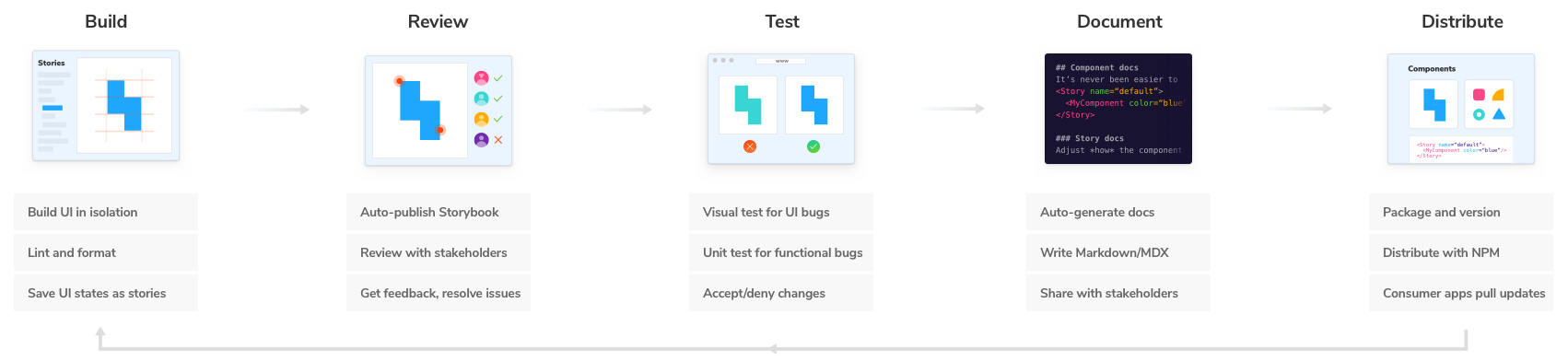
Nice! Now let’s articulate each UI state supported by AvatarList. At a glance, it’s clear that AvatarList supports some of Avatar’s properties like small and loading.
export const SmallSize = {
args: {
...Short.args,
size: 'small',
},
};
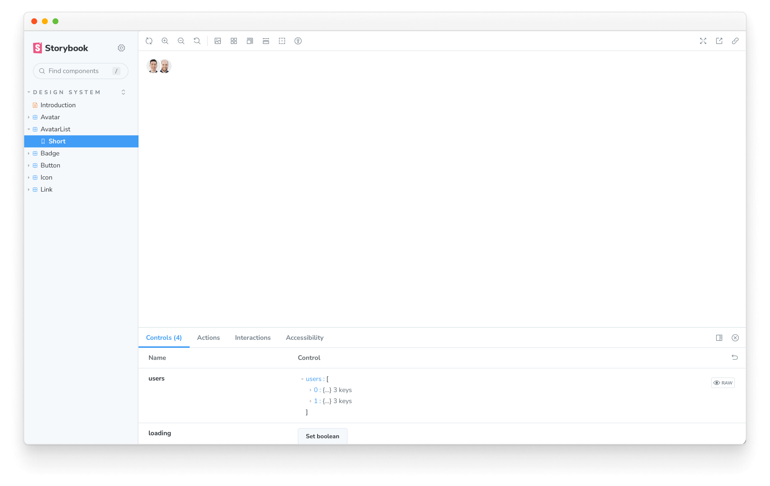
export const Loading = {
args: {
...Short.args,
loading: true,
},
};
Given that it’s a list, it should show many avatars. Let’s add stories that showcase what happens with numerous list items and with few list items.
export const Ellipsized = {
  args: {
    users: [
      ...Short.args.users,
      {
        id: '3',
        name: 'Zoltan Olah',
        avatarUrl: 'https://avatars0.githubusercontent.com/u/81672',
      },
      {
        id: '4',
        name: 'Tim Hingston',
        avatarUrl: 'https://avatars3.githubusercontent.com/u/1831709',
      },
    ],
  },
};

export const BigUserCount = {
  args: {
    users: Ellipsized.args.users,
    userCount: 100,
  },
};

export const Empty = {
  args: {
    users: [],
  },
};
Save your progress and commit.
git commit -am "Added AvatarList and stories"
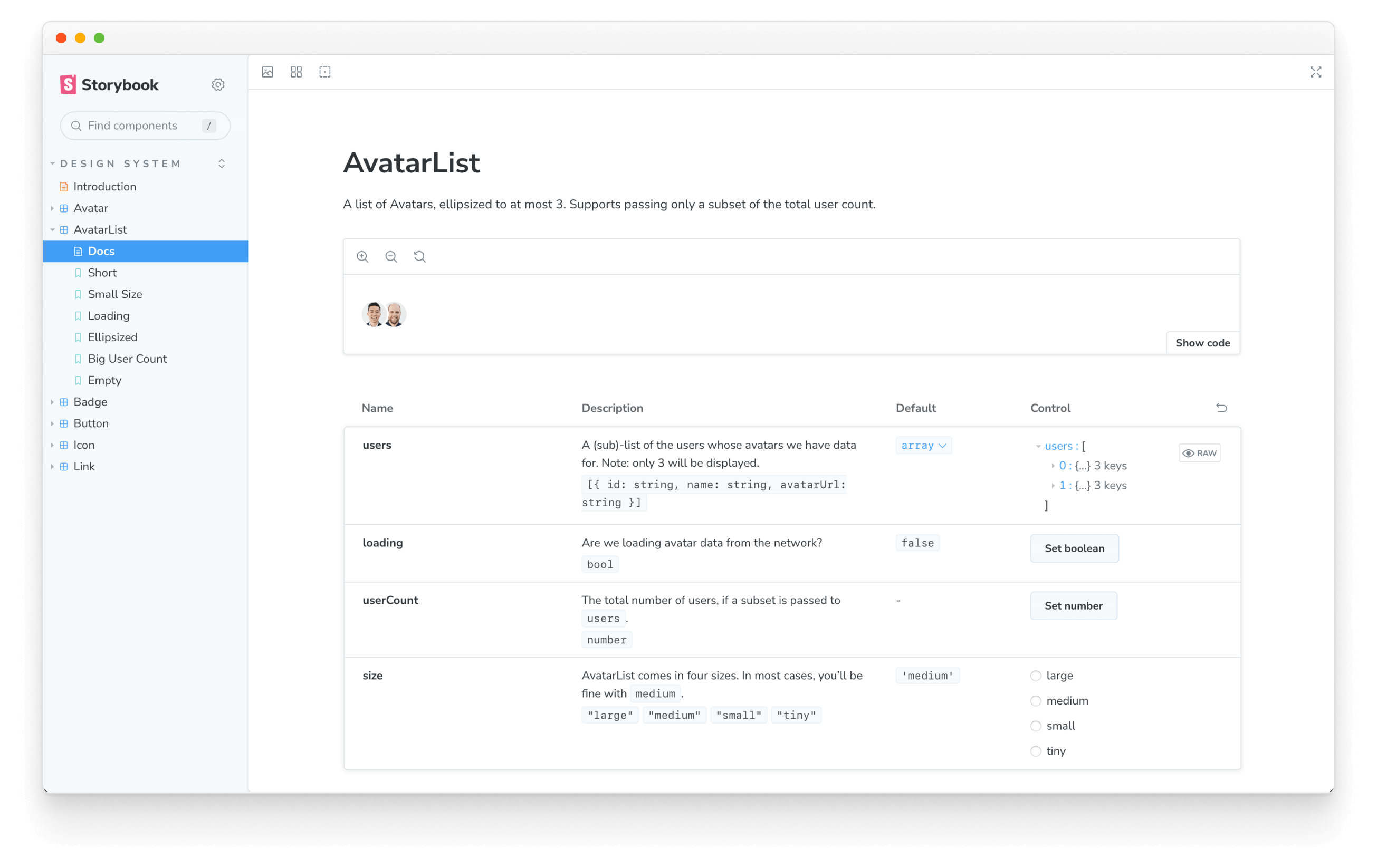
Document
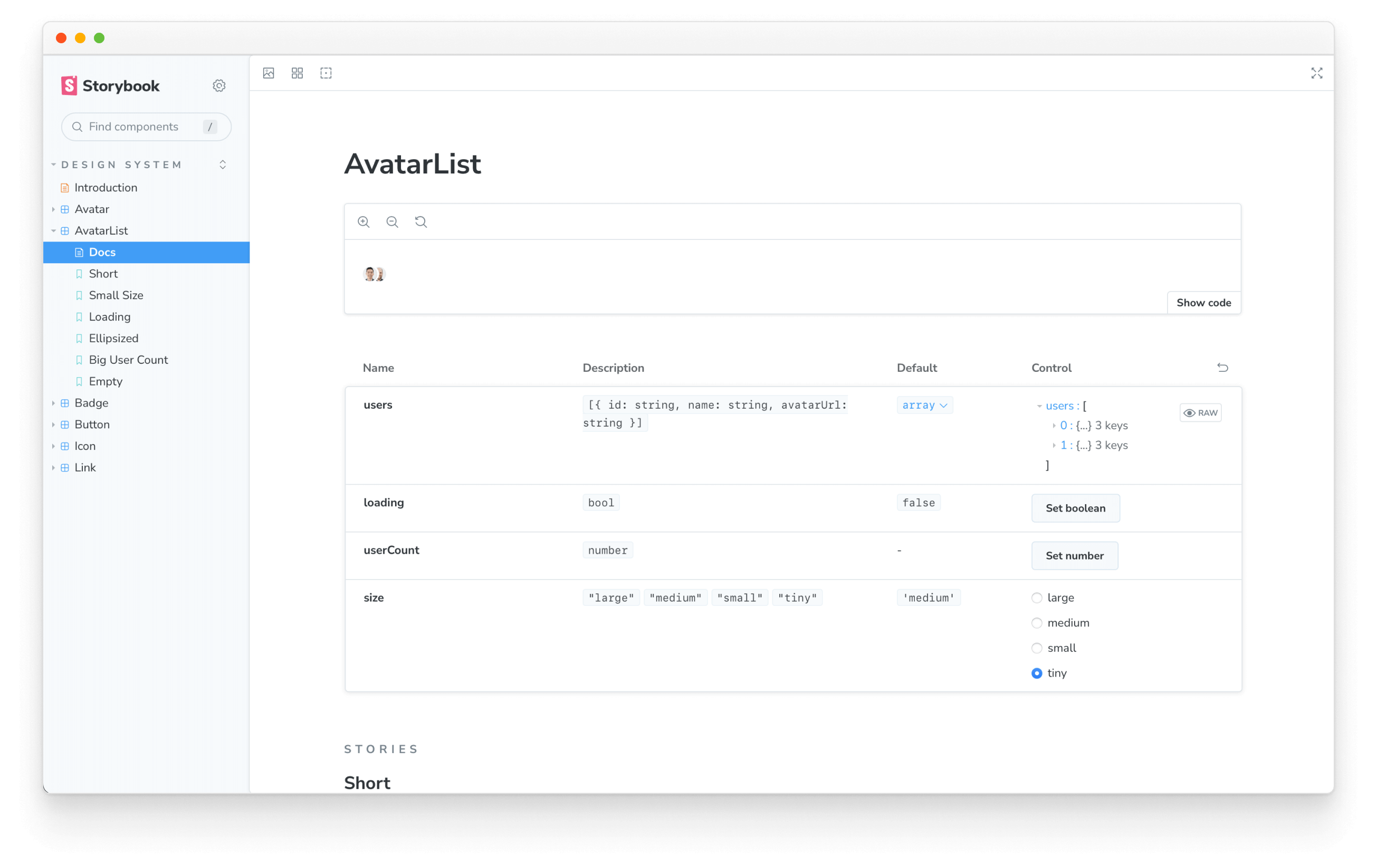
With the Storybook's auto-documentation feature, creating customizable documentation is effortless. This is beneficial for others who want to learn how to use AvatarList, as they can easily refer to the Docs entry in the Storybook UI.
Minimum viable docs! Let’s make AvatarList a bit more human by supplying additional context on how to use it.
/**
 * A list of Avatars, ellipsized to at most 3. Supports passing only a subset of the total user count.
 */
export function AvatarList({ loading, users, userCount, size, ...props }) {}
Sprinkle in some additional details about the supported props.
AvatarList.propTypes = {
  /**
   * Are we loading avatar data from the network?
   */
  loading: PropTypes.bool,
  /**
   * A (sub)-list of the users whose avatars we have data for. Note: only 3 will be displayed.
   */
  users: PropTypes.arrayOf(
    PropTypes.shape({
      id: PropTypes.string.isRequired,
      name: PropTypes.string,
      avatarUrl: PropTypes.string,
    })
  ),
  /**
   * The total number of users, if a subset is passed to `users`.
   */
  userCount: PropTypes.number,
  /**
   * AvatarList comes in four sizes. In most cases, you’ll be fine with `medium`.
   */
  size: PropTypes.oneOf(Object.keys(sizes)),
};
Easy as pie! This level of detail is sufficient for now-–we can always customize more using MDX later.
Documentation doesn’t have to be tiresome. With automated tooling, we removed the tedium to get straight to writing.
Commit the changes and push to GitHub.
git commit -am "Improved AvatarList docs"
Prepare for publishing
Before publishing our component to the design system, we must ensure it’s available once installed. Let’s add it to the design system’s index.js file.
import * as styles from './shared/styles';
import * as animation from './shared/animation';
import * as icons from './shared/icons';
import * as global from './shared/global';

export { styles, animation, icons, global };

export * from './Avatar';
+ export * from './AvatarList';
export * from './Badge';
export * from './Button';
export * from './Icon';
export * from './Link';
export * from './LinkWrapper';
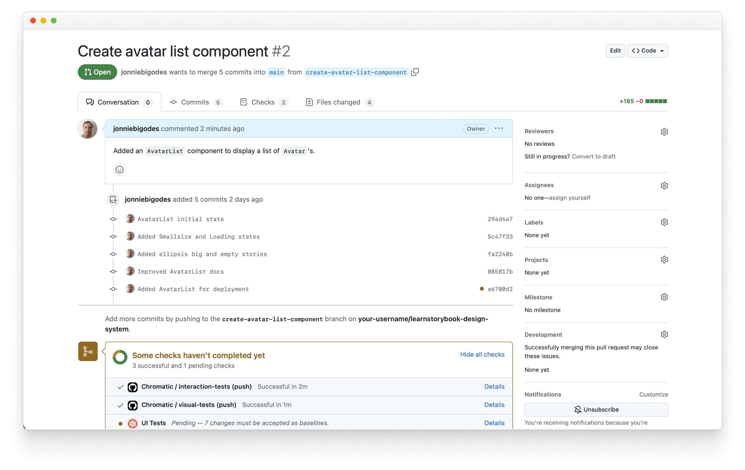
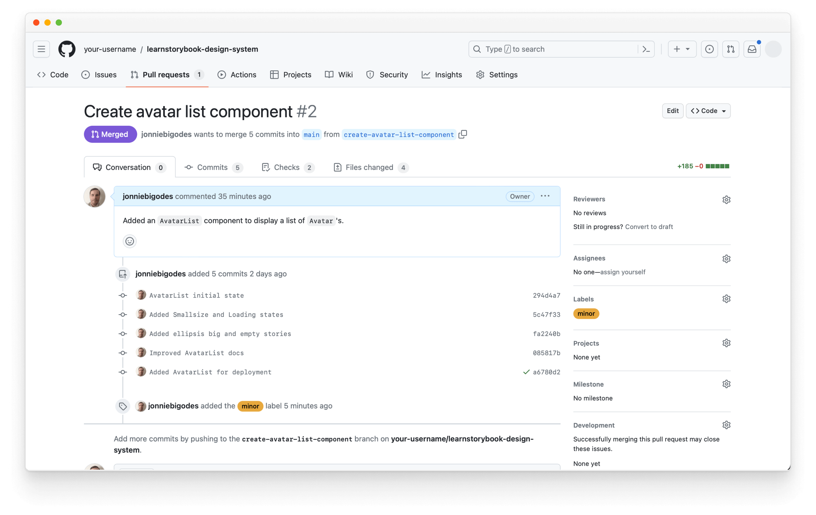
Create a Pull Request
Let’s push our AvatarList branch to GitHub and create a pull request:
git push -u origin create-avatar-list-component
Then navigate to GitHub and open a pull request.
Review
At this point, AvatarList is a candidate for design system inclusion. Stakeholders must review the component to see if it meets expectations for functionality and appearance.
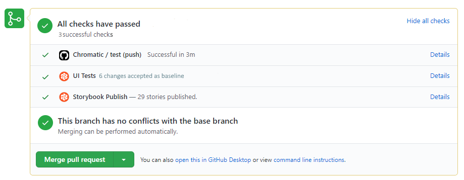
The design system’s Storybook is automatically published with each pull request to make review dead simple. Scroll down to the PR checks to find a link to the deployed Storybook.
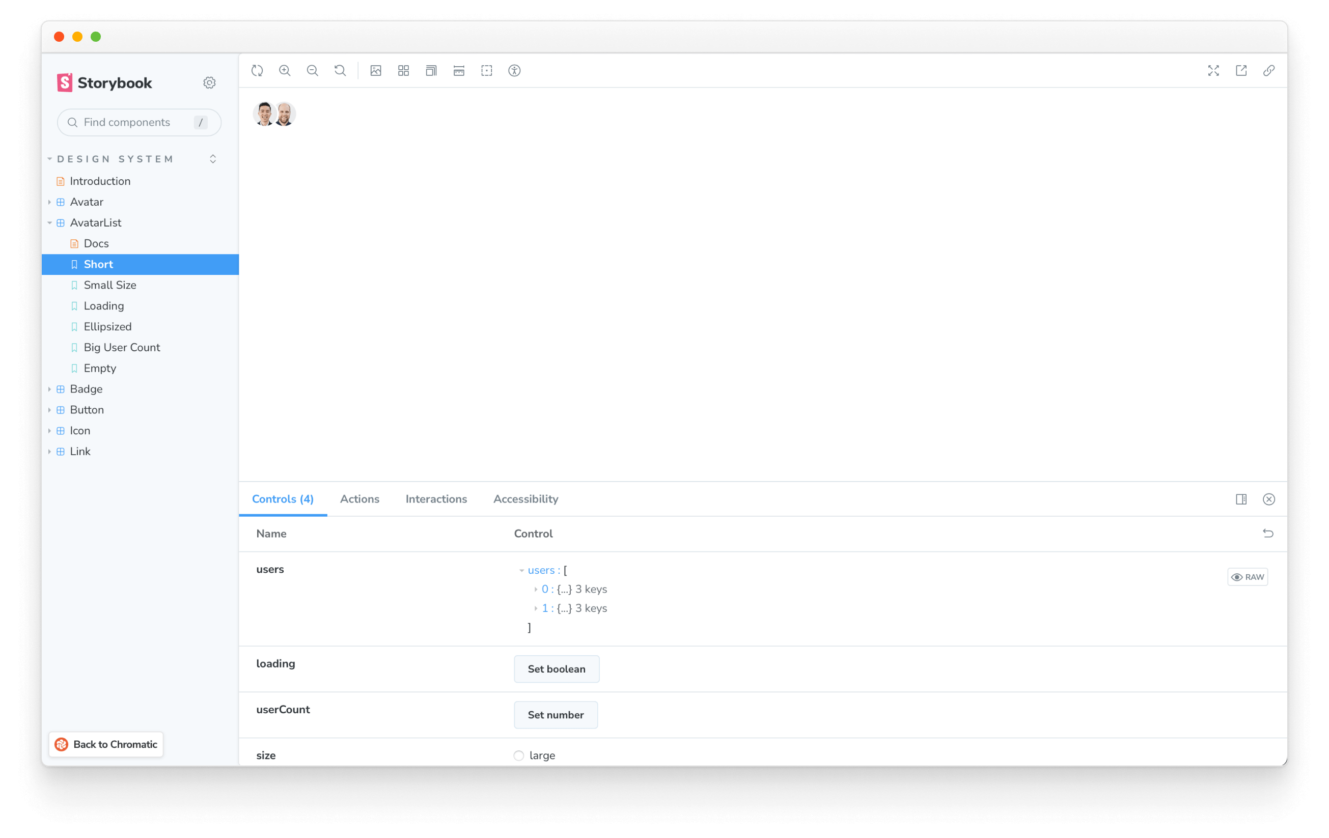
Find the AvatarList in your published Storybook. It should look identical to your local Storybook.
The published Storybook is a universal reference point for the team. Share the link to AvatarList with other stakeholders to get feedback faster. Your team will love you because they don’t have to deal with code or set up a development environment.
Reaching consensus with numerous teams often feels like an exercise in futility. Folks reference out-of-date code, don’t have a development environment or scatter feedback across multiple tools. Reviewing Storybook online makes it as simple as sharing a URL.
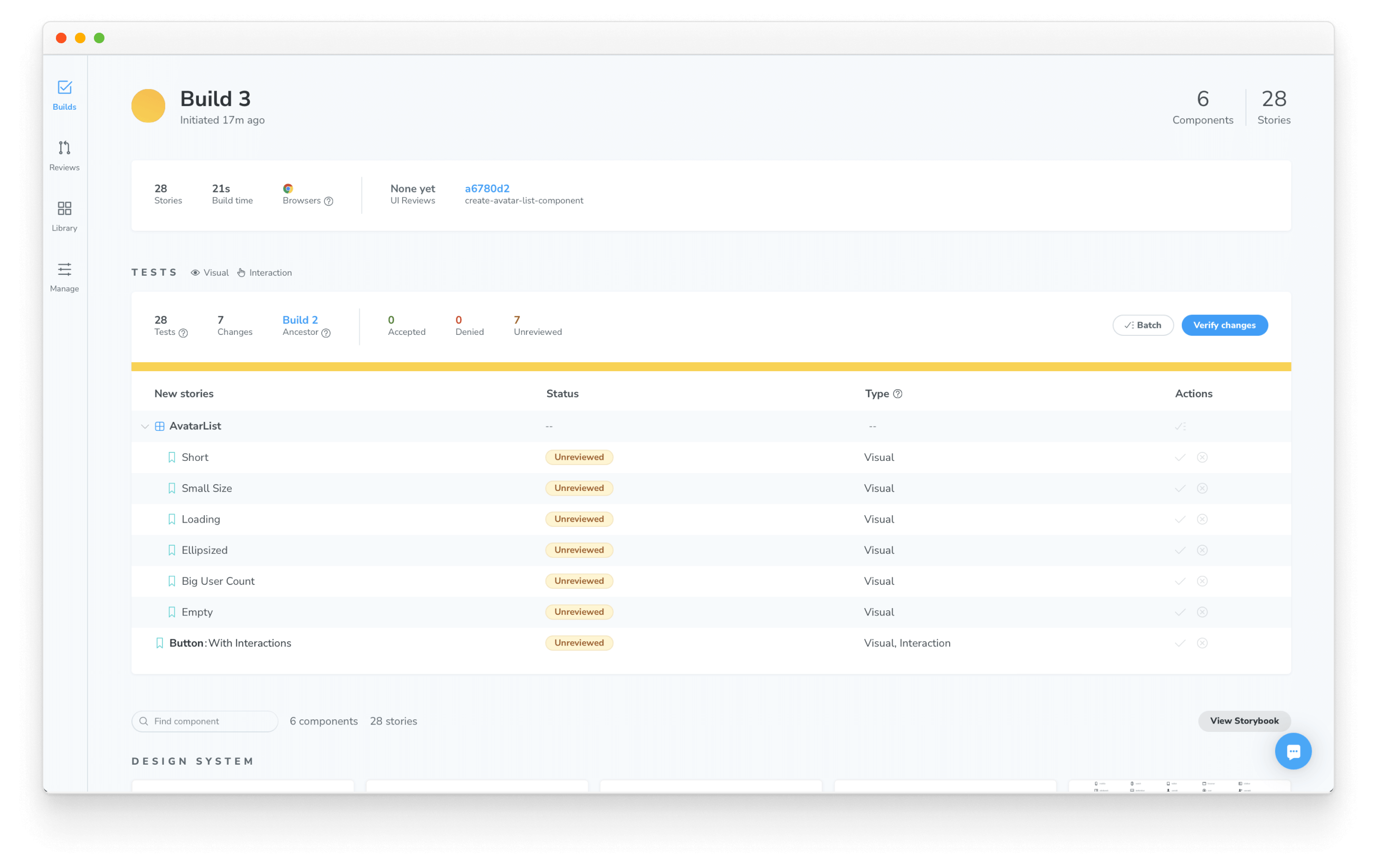
Test
Our test suite runs in the background every commit. AvatarList is a simple presentational component, so unit tests aren’t necessary. But if we look at the PR check, our visual testing tool Chromatic has already detected changes that need reviewing.
Since AvatarList is new, there aren’t visual tests for it yet. We’ll need to add baselines for each story. Accept the “new stories” in Chromatic to expand visual test coverage.
Once you’re done, the build will pass in Chromatic.
Which, in turn, updates the PR check in GitHub.
The tests were successfully updated. In the future, regressions will have a tough time sneaking into the design system.
Distribute
We have an open pull request that adds AvatarList to the design system. We've written our stories, the tests pass, and documentation exists. At last, we’re ready to update our design system package with Auto and npm.
Add the minor label to the PR. This tells Auto to update the minor version of the package on merge.
Now merge your PR, navigate to your package on npm, and hang tight for a few minutes while the package is updated.
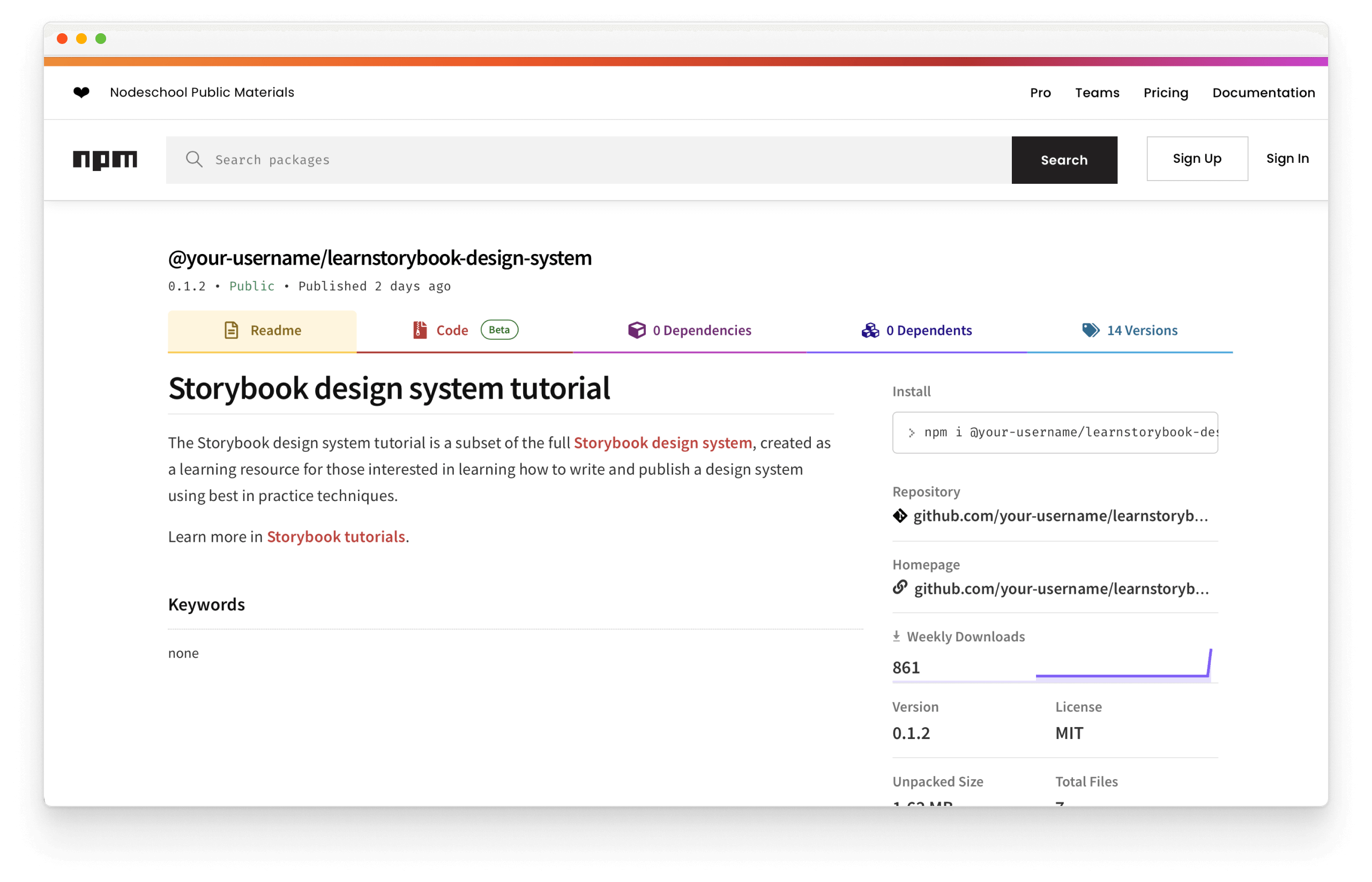
Success! Your design system package was updated from the comfort of GitHub. No need to touch the command line or fuss with npm. Update the learnstorybook-design-system dependency in the example app to start using AvatarList.
Your journey begins
Design Systems for Developers highlights the end-to-end workflow used by professional frontend teams to give you a headstart as you develop your own. As your design system grows, add, rearrange, and extend these tools to fit your team’s needs.
Chapter 9 concludes with the complete sample code, helpful resources, and frequently asked questions from developers.