Document for stakeholders
Professional frontend teams measure design system success by adoption. To get the full work-saving benefits of a design system, components must be widely circulated. Otherwise, what’s the point?
In this chapter, we’ll create a design system “user manual” to help stakeholders reuse components in their apps. Along the way, we’ll uncover UI documentation best practices used by teams at Shopify, Microsoft, Auth0, and the UK government.
Documentation is exhausting
It’s obvious – documentation is invaluable for collaborative UI development. It helps teams learn how and when to use common UI components. But why does it take so much effort?
If you’ve ever created documentation, you probably sunk time into non-documentation tasks like site infrastructure or wrangling technical writers. And even if you find time to publish those docs, it’s grueling to maintain them while developing new features.
Most documentation go out of date the moment they’re created. Outdated docs undermine trust in the design system components, which results in developers opting to create new components instead of reusing what exists.
Requirements
Creating and maintaining documentation can be challenging, so it's important to minimize any obstacles. Here’s what they should do:
- 🔄 Stay up to date by using the latest production code
- ✍️ Facilitate writing using familiar writing tools like Markdown
- ⚡️ Reduce maintenance time so teams can focus on writing
- 📐 Provide boilerplate so developers don’t rewrite common patterns
- 🎨 Offer customizability for particularly complex use cases and components
As Storybook users, we have a head start because component variations are already recorded as stories–-a form of documentation. A story showcases how a component is supposed to work given different inputs (props). Stories are easy to write and are self-updating because they use the production components. What’s more, stories can be regression tested using the tools in the previous chapter!
When you write stories you get component prop documentation and usage examples for free! – Justin Bennett, Engineer at Artsy
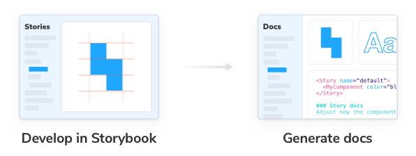
Write stories, generate docs
With the Storybook Docs addon, we can generate rich documentation from existing stories to reduce maintenance time and get out of the box defaults. Like the addons we've covered in the build chapter (Controls and Actions), the Docs addon is also included and configured with each Storybook install, so we can focus on writing good documentation.
Each time you open your Storybook, you should see a new entry added to the sidebar named “Docs”:
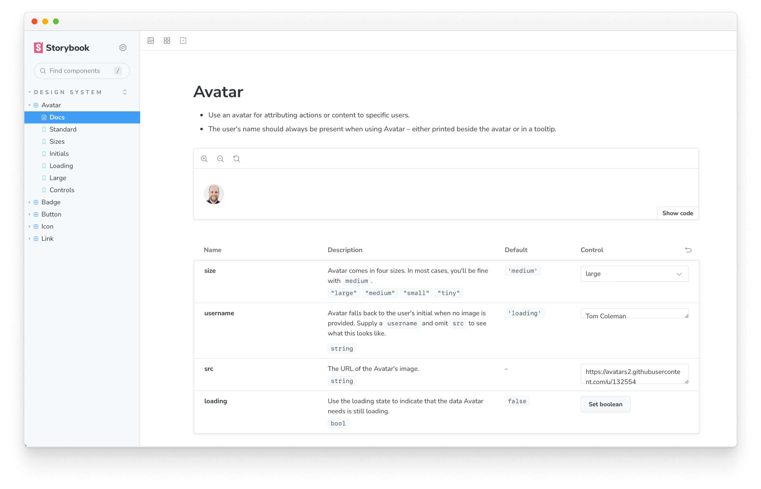
Behind the scenes, Storybook populated the sidebar with a “Docs” entry for each component story that was configured via the tags metadata property, creating an auto-generated documentation page with the most frequently used pieces like interactive previews, source code viewers, and an args table. You’ll find similar features in the design system documentation of Shopify and Auth0. All in less than 2 minutes.
Generate documentation
So far, we've made a lot of progress with little effort, ensuring that our design system stays up to date codewise. Yet, the documentation still lacks a human touch. We need to configure it and give other developers more context (why, when, and how). Start by adding a tags property to the Avatar component story in src/Avatar/Avatar.stories.jsx:
import { Avatar } from './Avatar';

export default {
  title: 'Design System/Avatar',
  component: Avatar,
+ tags: ['autodocs'],
  /*
   * More on Storybook argTypes at:
   * https://storybook.js.org/docs/react/api/argtypes
   */
  argTypes: {
    size: {
      control: {
        type: 'select',
      },
      options: ['tiny', 'small', 'medium', 'large'],
    },
  },
};
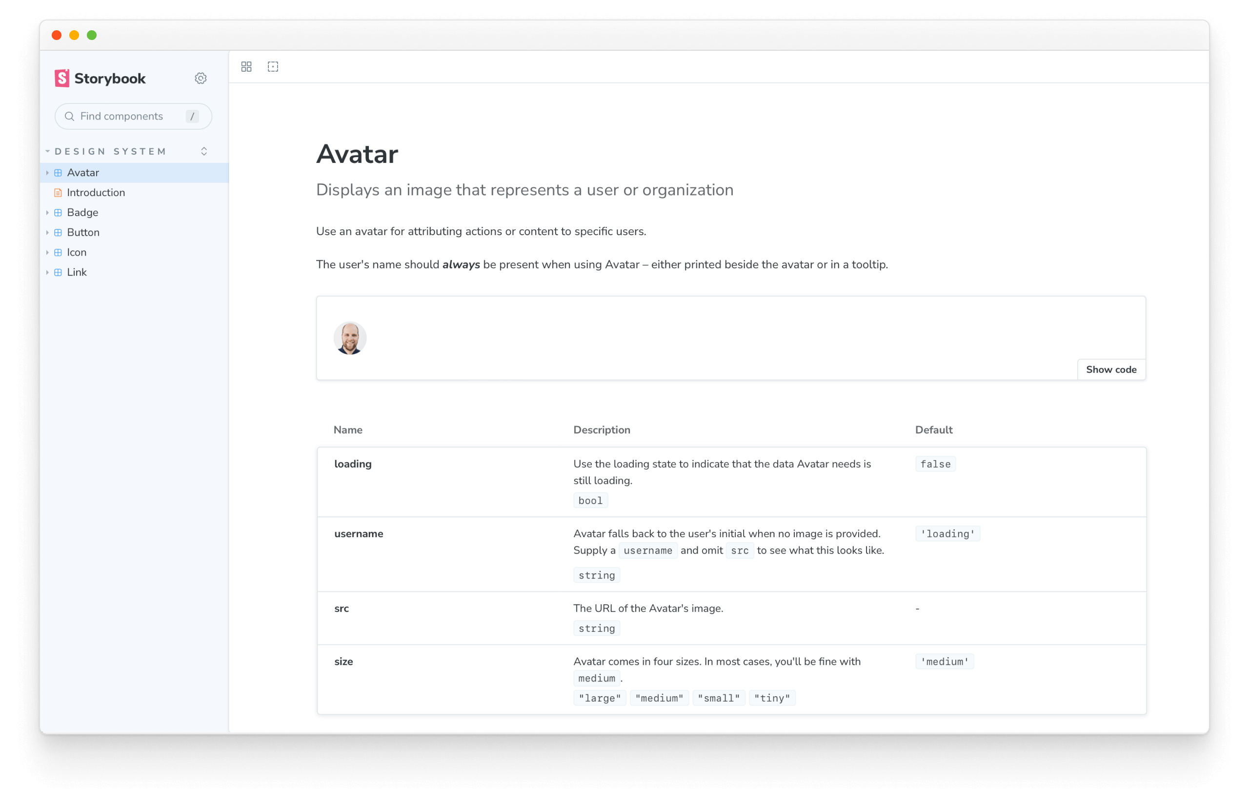
Next, let's add some additional metadata that explains what the component does. In our case, we'll add a subtitle that describes what the Avatar is used for:
import { Avatar } from './Avatar';

export default {
  title: 'Design System/Avatar',
  component: Avatar,
  tags: ['autodocs'],
+ parameters: {
+   docs: {
+      subtitle: 'Displays an image that represents a user or organization',
+    },
+ },
  /*
   * More on Storybook argTypes at:
   * https://storybook.js.org/docs/react/api/argtypes
   */
  argTypes: {
    size: {
      control: {
        type: 'select',
      },
      options: ['tiny', 'small', 'medium', 'large'],
    },
  },
};
You should now have the minimum viable documentation for the Avatar component, generated automatically by Storybook's args table and default values obtained from component's propTypes and JSdoc taking the first step in reducing maintenance time and ensuring that the documentation stays up to date.
However, we're not done yet. Since we're building documentation for other stakeholders, including non-technical ones as designers or consumers of the design system, we cannot assume that they know what each story represents. Let's add some descriptive text for the stories in src/Avatar/Avatar.stories.jsx:
import { Avatar } from './Avatar';

export default {
  title: 'Design System/Avatar',
  component: Avatar,
  tags: ['autodocs'],
  parameters: {
    componentSubtitle:
      'Displays an image that represents a user or organization',
  },
  /*
   * More on Storybook argTypes at:
   * https://storybook.js.org/docs/react/api/argtypes
   */
  argTypes: {
    size: {
      control: {
        type: 'select',
      },
      options: ['tiny', 'small', 'medium', 'large'],
    },
  },
};

export const Standard = {
  args: {
    size: 'large',
    username: 'Tom Coleman',
    src: 'https://avatars2.githubusercontent.com/u/132554',
  },
};

/**
 * 4 sizes are supported.
 */
export const Sizes = {
  args: {
    username: 'Tom Coleman',
    src: 'https://avatars2.githubusercontent.com/u/132554',
  },
  render: (args) => (
    <>
      <Avatar {...args} size='large' />
      <Avatar {...args} size='medium' />
      <Avatar {...args} size='small' />
      <Avatar {...args} size='tiny' />
    </>
  ),
};

/**
 * Shows the user's initials as a fallback when no image is provided.
 */
export const Initials = {
  render: (args) => (
    <>
      <Avatar username='Tom Coleman' />
      <Avatar username='Dominic Nguyen' />
      <Avatar username='Varun Vachhar' />
      <Avatar username='Michael Shilman' />
    </>
  ),
};

/**
 * Shows a loading indicator.
 */
export const Loading = {
  args: {
    loading: true,
  },
  render: (args) => (
    <>
      <Avatar {...args} size='large' />
      <Avatar {...args} size='medium' />
      <Avatar {...args} size='small' />
      <Avatar {...args} size='tiny' />
    </>
  ),
};

/**
 * Shows the user's avatar when provided with a `src` prop or in various states and sizes.
 */
export const Large = {
  render: () => (
    <>
      <Avatar loading size='large' />
      <Avatar size='large' username='Tom Coleman' />
      <Avatar
        size='large'
        username='Tom Coleman'
        src='https://avatars2.githubusercontent.com/u/132554'
      />
    </>
  ),
};

/**
 * Avatar component using Controls
 */
export const Controls = {
  args: {
    loading: false,
    size: 'tiny',
    username: 'Dominic Nguyen',
    src: 'https://avatars.githubusercontent.com/u/263385',
  },
};
You should now see this:
Supercharge documentation with Markdown/MDX
Each component has unique documentation requirements, which can be challenging to address. We utilized Storybook's automatic documentation feature with the Docs addon to simplify this process. This enabled us to create comprehensive documentation while adhering to industry best practices, without incurring any additional expenses. Moving forward, we can further enhance our documentation process by identifying any potential challenges or issues that may arise when working with our components.
Markdown is a straightforward format for writing text. MDX allows you to use interactive code (JSX) inside of Markdown. Storybook Docs uses MDX to give developers ultimate control over how documentation renders.
As part of the Storybook install workflow, MDX files are registered by default. Your .storybook/main.js should look like so:
/** @type { import('@storybook/react-vite').StorybookConfig } */
const config = {
  stories: ['../src/**/*.mdx', '../src/**/*.stories.@(js|jsx|ts|tsx)'],
  addons: [
    '@storybook/addon-links',
    '@storybook/addon-essentials',
    '@storybook/addon-interactions',
    '@storybook/addon-a11y',
    '@storybook/addon-coverage',
  ],
  framework: {
    name: '@storybook/react-vite',
    options: {},
  },
  docs: {
    autodocs: 'tag',
  },
};
export default config;
Create a new src/Avatar/Avatar.mdx file and supply some details. We’ll remove the tags and parameters from the Avatar.stories.jsx file and recreate our documentation in the mdx file.
import {
Canvas,
Controls,
Description,
Meta,
Subtitle,
Story,
} from '@storybook/blocks';
import * as AvatarStories from './Avatar.stories';
# Avatar
<Meta of={AvatarStories} />
<Subtitle>Displays an image that represents a user or organization</Subtitle>
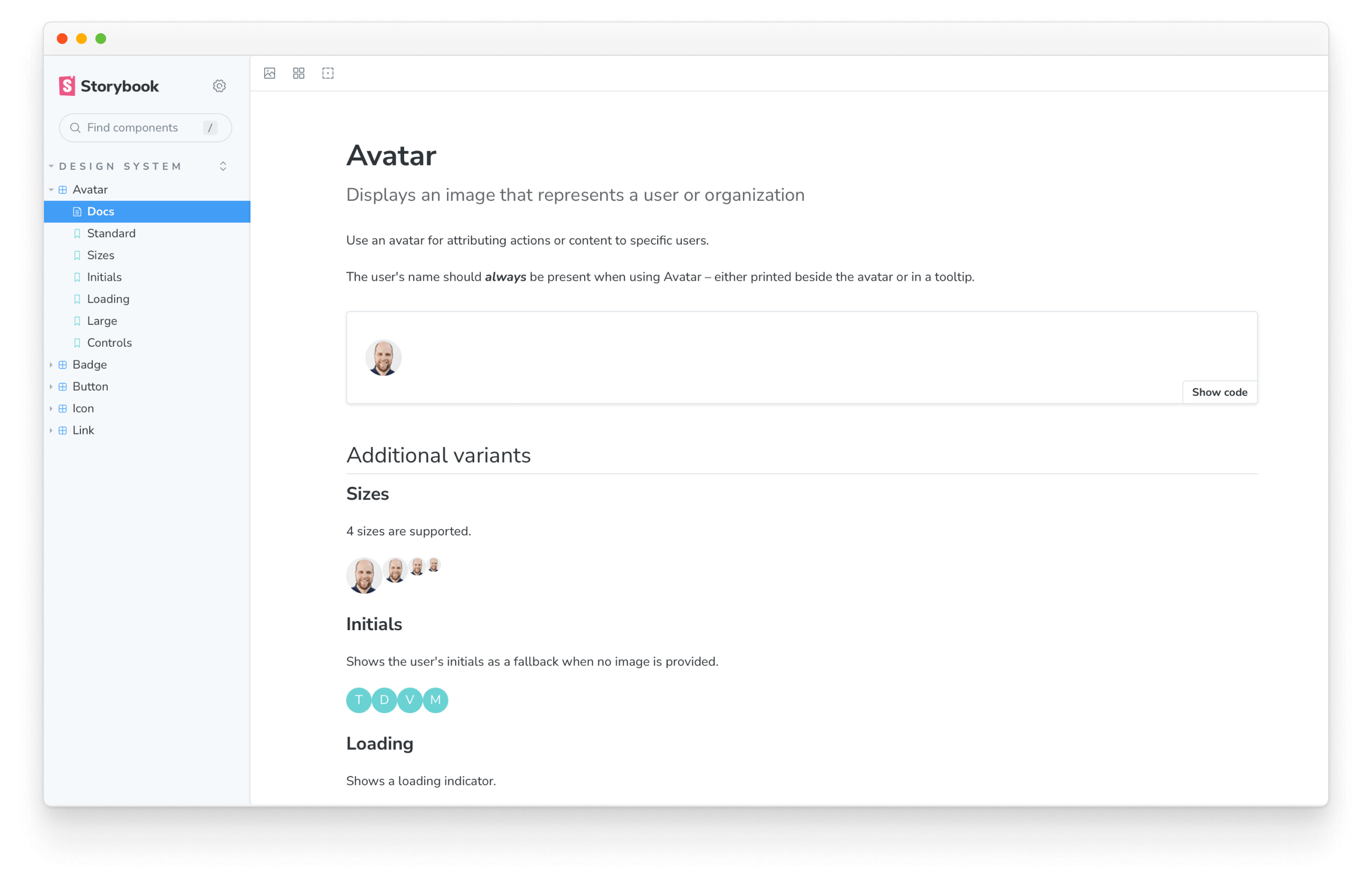
Use an avatar for attributing actions or content to specific users.
The user's name should _always_ be present when using Avatar – either printed beside the avatar or in a tooltip.
<Canvas>
<Story of={AvatarStories.Standard} />
</Canvas>
## Additional variants
### Sizes
<Description of={AvatarStories.Sizes} />
<Story of={AvatarStories.Sizes} />
### Initials
<Description of={AvatarStories.Initials} />
<Story of={AvatarStories.Initials} />
### Loading
<Description of={AvatarStories.Loading} />
<Story of={AvatarStories.Loading} />
### Playground
Interact with the component and see how it responds to the different input properties.
<Canvas>
<Story of={AvatarStories.Controls} />
</Canvas>
<Controls of={AvatarStories.Controls} />
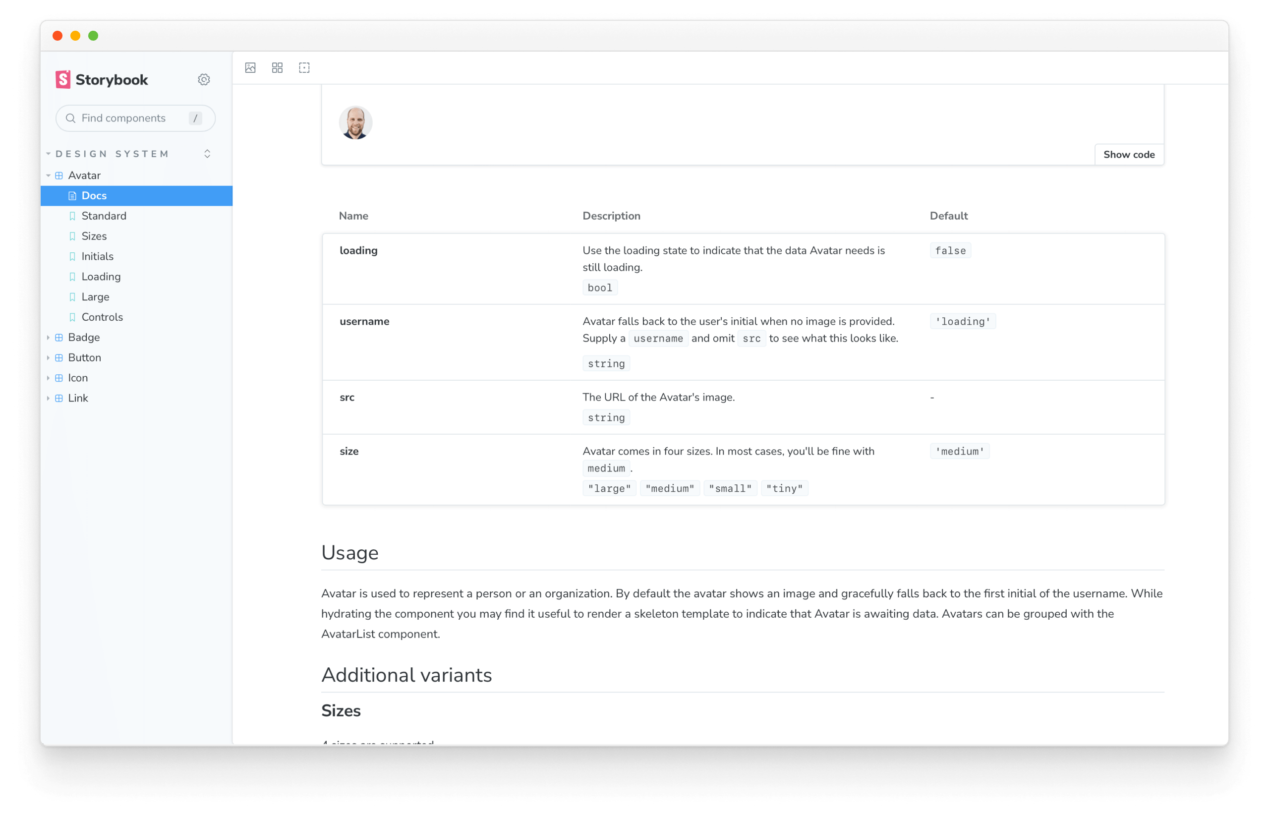
In Storybook, your Avatar component’s “Docs” entry should be replaced with our sparse MDX page.
Storybook Docs comes with “Doc Blocks”, readymade components like interactive previews, iconography, and more. By default, they’re used behind the scenes for the auto-generated documentation pages, and they can also be extracted for individual use. Our goal is to customize Avatar’s documentation without redoing everything ourselves so let’s reuse Doc Blocks where possible.
Let’s add the ArgTypes Doc Block to our MDX file. It will automatically generate a table of all the component’s properties and their types.
import {
+ ArgTypes,
  Canvas,
  Controls,
  Description,
  Meta,
  Subtitle,
  Story,
} from '@storybook/blocks';

{/* Same content as before */}

<Canvas>
  <Story of={AvatarStories.Standard} />
</Canvas>

+ <ArgTypes of={AvatarStories} />
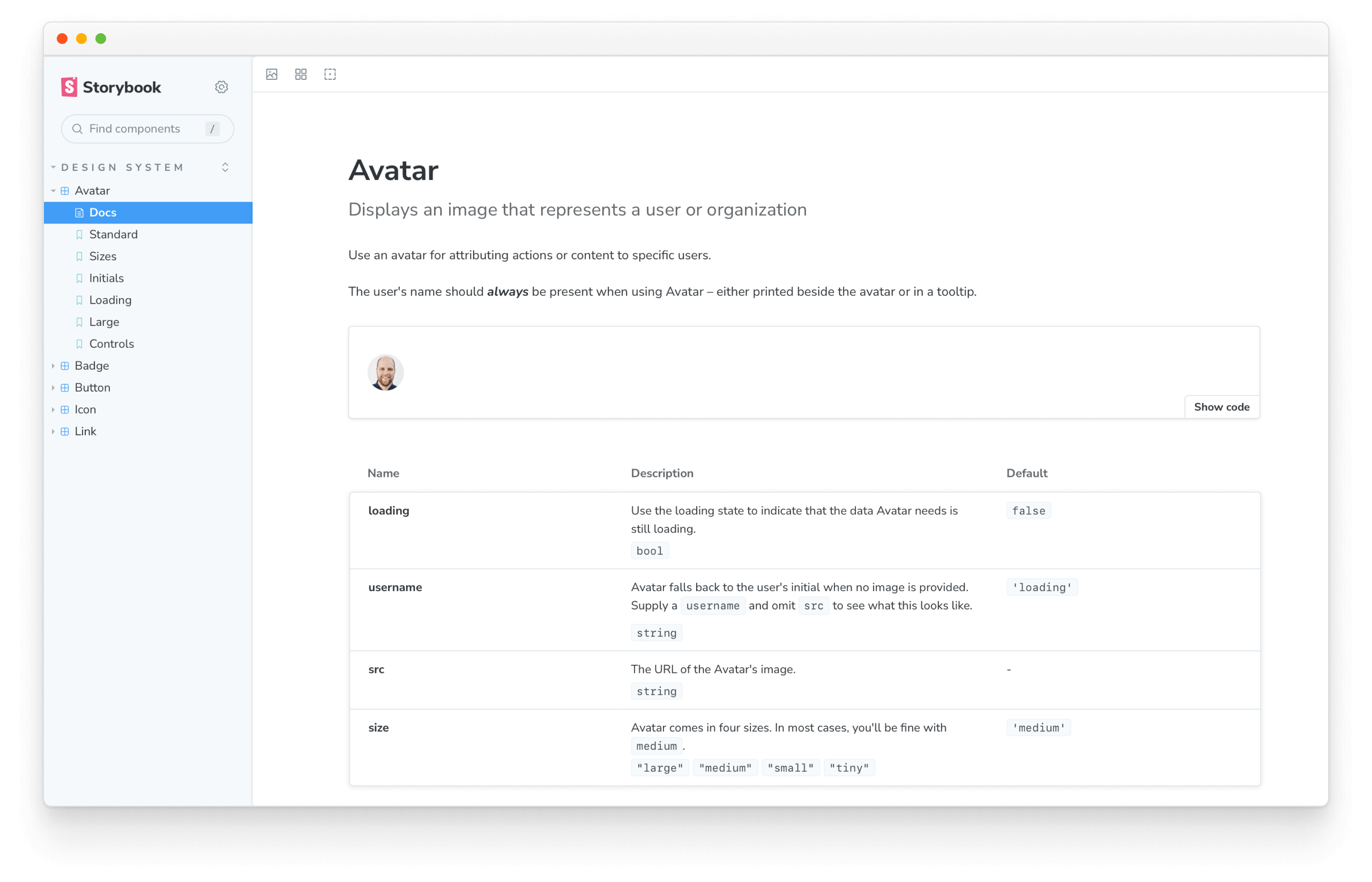
Nice! We’re back to where we started, but now with complete control over ordering and content. The benefits of automated doc generation persist because we’re using Doc Blocks.
Customize Avatar’s docs with a note about use cases. It gives developers context about how to take advantage of this component. We can just add markdown as we would in any other markdown document:
{/* Same content as before */}

<Canvas>
  <Story of={AvatarStories.Standard} />
</Canvas>

<ArgTypes of={AvatarStories} />

+ ## Usage

+ Avatar is used to represent a person or an organization. By default the avatar shows an image and gracefully falls back to the first initial of the username. While hydrating the component you may find it useful to render a skeleton template to indicate that Avatar is awaiting data. Avatars can be grouped with the AvatarList component.

{/* Same content as before */}
Custom pages
Every design system comes with a cover page. Storybook Docs allows you to create discrete pages using MDX.
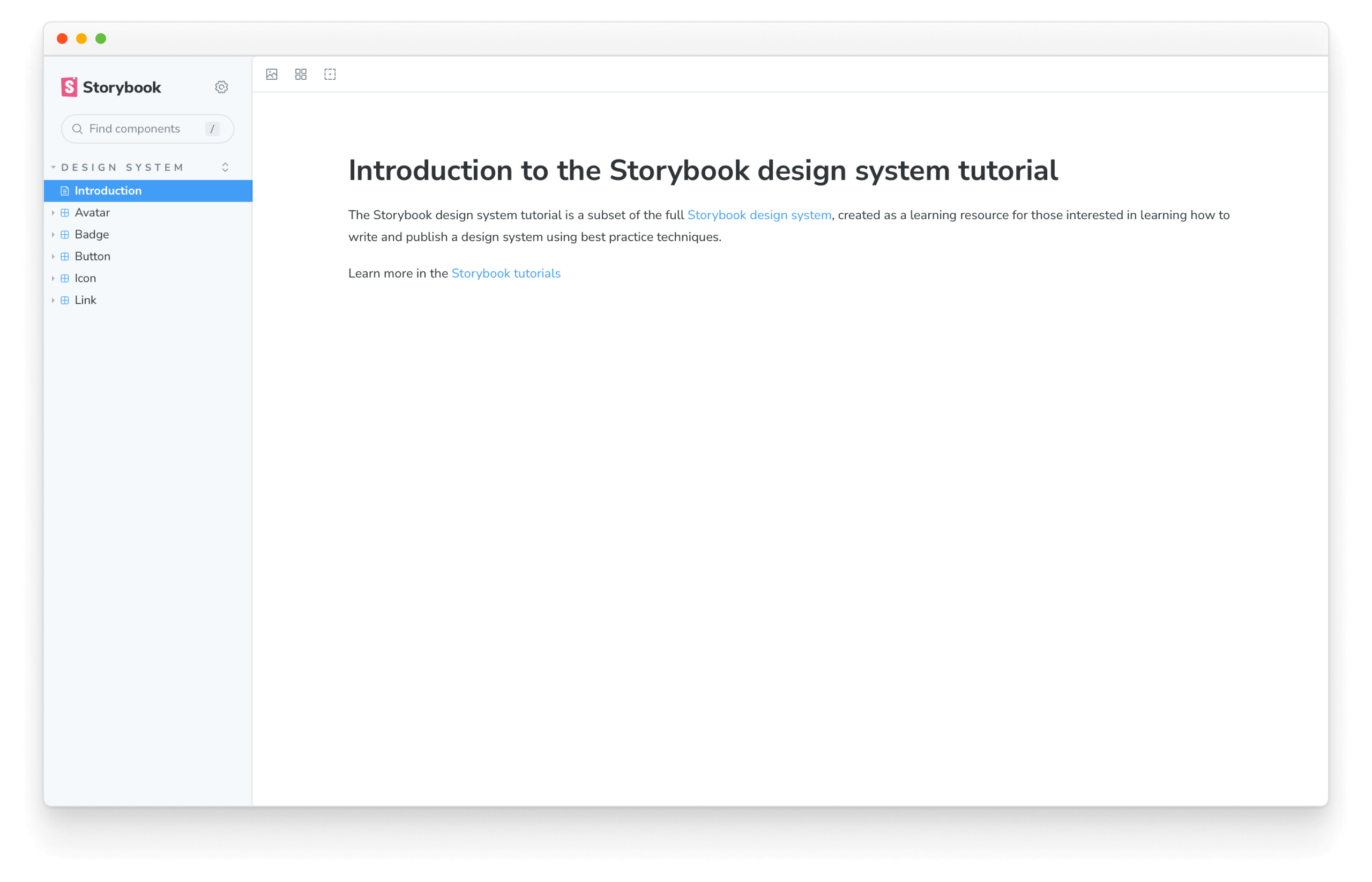
Create a new file src/Intro.mdx:
import { Meta } from '@storybook/blocks';

<Meta title='Design System/Introduction' />

# Introduction to the Storybook design system tutorial

The Storybook design system tutorial is a subset of the full [Storybook design system](https://github.com/storybookjs/design-system/), created as a learning resource for those interested in learning how to write and publish a design system using best practice techniques.

Learn more in the [Storybook tutorials](https://storybook.js.org/tutorials/)
The cover page we have created here is an example of "unattached documentation" that appears differently in the sidebar compared to other auto-generated documentation pages.
To get it to appear first, we have to tell Storybook to load the Introduction file in .storybook/main.js:
/** @type { import('@storybook/react-vite').StorybookConfig } */
const config = {
  stories: [
+   '../src/Intro.mdx',
    '../src/**/*.mdx',
    '../src/**/*.stories.@(js|jsx|ts|tsx)',
  ],
  addons: [
    '@storybook/addon-links',
    '@storybook/addon-essentials',
    '@storybook/addon-interactions',
    '@storybook/addon-a11y',
    '@storybook/addon-coverage',
  ],
  framework: {
    name: '@storybook/react-vite',
    options: {},
  },
  docs: {
    autodocs: 'tag',
  },
};
export default config;
Publishing documentation online
If you write documentation that no one reads, is that useful? No. It’s not enough to create high-quality learning material, and we need to surface that material to stakeholders and colleagues. Right now, our docs are buried in the repo, which means folks must run the design system’s Storybook locally to see the docs.
In a previous chapter, we published Storybook online for visual review. It’s easy to use the same mechanism to publish our component docs as well. Let’s add a new script to package.json to build our Storybook in docs mode:
{
  "scripts": {
    "build-storybook-docs": "storybook build  --docs"
  }
}
Save and commit.
Running build-storybook-docs in your command line or continuous integration tool will output a static site in the "docs" configuration. Set up a static site deployment tool Netlify or Vercel to deploy the docs site on every commit.
Import the design system in other apps
Up until now, we focused inward. First, on creating durable UI components. Then, on reviewing, testing, and documenting them. Now we’ll shift perspective outward to examine how teams consume design systems.
Chapter 7 walks through packaging the design system for use in other apps. Learn how to combine npm, the JavaScript package manager, with Auto, a time-saving release management tool.