Introduction to design systems
Design systems are exploding in popularity. From tech heavyweights like Airbnb to nimble startups, organizations of every shape are reusing UI patterns to save time and money. But there’s a chasm between the design systems created by BBC, Airbnb, IBM, or Microsoft and the design systems created by most developers.
Why do leading design systems teams use the tools and techniques they use? My co-author Tom and I researched the traits of successful design systems from the Storybook community to identify best practices.
This step-by-step guide reveals the automated tooling and careful workflows used in scaled production design systems. We’ll walk through assembling a design system from existing component libraries, then set up core services, libraries, and workflows.

What’s all the fuss about design systems anyways?
Let’s get something out of the way: the concept of a reusable user interface isn’t new. Styleguides, UI kits, and shareable widgets have existed for decades. Today, designers and developers are aligning towards the UI component construct. A UI component encapsulates the visual and functional properties of discrete user interface pieces. Think LEGO bricks.
Modern user interfaces are assembled from hundreds of modular UI components that are rearranged to deliver different user experiences.
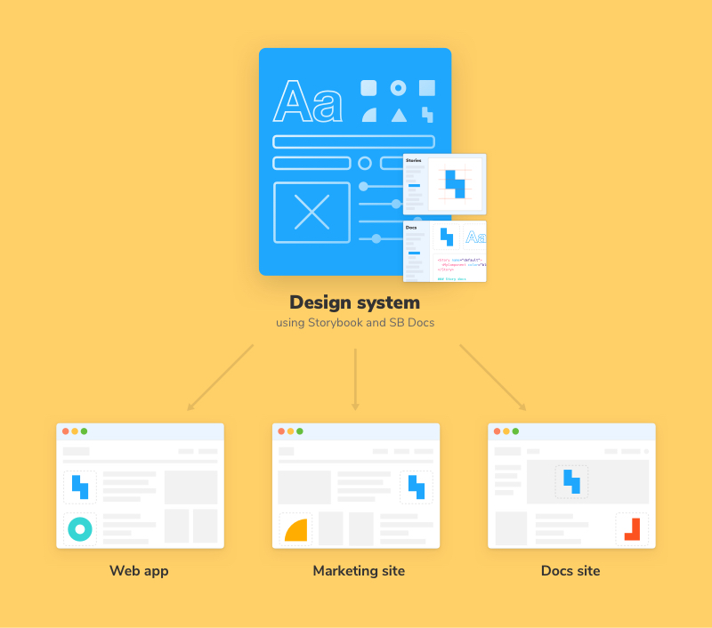
Design systems contain reusable UI components that help teams build complex, durable, and accessible user interfaces across projects. Since both designers and developers contribute to the UI components, the design system serves as a bridge between disciplines. It is also the “source of truth” for an organization’s common components.

Designers often talk about building design systems inside their tools. The holistic scope of a design system encompasses assets (Sketch, Figma, etc.), overarching design principles, contribution structure, governance, and more. There’s an abundance of designer-oriented guides that dive deep into these topics so we won’t rehash that here.
For developers, a few things are certain. Production design systems must include the UI components and the frontend infrastructure behind it all. There are three technical parts to a design system that we’ll talk about in this guide:
- 🏗 Common reusable UI components
- 🎨 Design tokens: Styling-specific variables such as brand colors and spacing
- 📕 Documentation site: Usage instructions, narrative, do’s and don'ts
The parts are packaged up, versioned, and distributed to consumer apps via a package manager.
Do you need a design system?
Despite the hype, a design system isn’t a silver bullet. If you work with a modest team on a single app, you’re better off with a directory of UI components instead of setting up the infrastructure to enable a design system. For small projects, the cost of maintenance, integration, and tooling far outweighs any productivity benefits you might see.
The economy of scale in a design system works in your favor when sharing UI components across many projects. If you find yourself pasting the same UI components in different apps or across teams, this guide is for you.
What we’re building
Storybook powers the design systems for BBC, Airbnb, IBM, GitHub, and hundreds more companies. The recommendations here are inspired by best practices and tools from the smartest teams. We’ll be building the following frontend stack:
Build components
- 📚 Storybook for UI component development and auto-generated docs
- ⚛️ React for declarative component-centric UI (via create-react-app)
- 💅 Emotion for component-scoped styling
- ✨ Prettier for automatic code formatting
Maintain the system
- 🚥 GitHub Actions for continuous integration
- 📐 ESLint for JavaScript linting
- ✅ Chromatic to catch visual bugs in components (by Storybook maintainers)
- 📦 npm for distributing the library
- 🛠 Auto for release management workflow
Storybook addons
- ♿ Accessibility to check for accessibility issues during development
- 💥 Actions to QA click and tap interactions
- 🎛 Controls to interactively adjust props to experiment with components
- 📕 Docs for automatic documentation generation from stories
- 🔍 Interactions for debugging component interactions
- 🏎 Test-runner for automated component testing

Understand the workflow
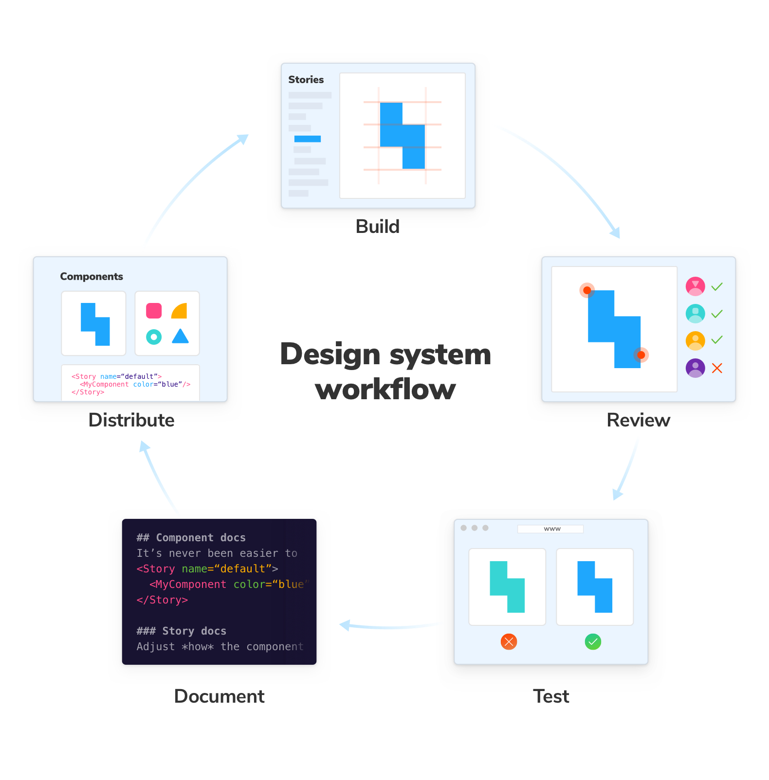
Design systems are an investment in frontend infrastructure. In addition to showcasing how to use the technology above, this guide also focuses on core workflows that promote adoption and simplify maintenance. Wherever possible, manual tasks will be automated. Below are the activities we’ll encounter.
Build UI components in isolation
Every design system is composed of UI components. We’ll use Storybook as a “workbench” to build UI components in isolation outside of our consumer apps. Then we’ll integrate timesaving addons that help you increase component durability (Actions, A11y, Controls, Interactions).
Review to reach consensus and gather feedback
UI development is a team sport that requires alignment between developers, designers, and other disciplines. We’ll publish work-in-progress UI components to loop stakeholders into the development process so we can ship faster.
Test to prevent UI bugs
Design systems are a single source of truth and a single point of failure. Minor UI bugs in basic components can snowball into company-wide incidents. We’ll automate tests to help you mitigate the inevitable bugs to ship durable, accessible UI components with confidence.
Document to accelerate adoption
Documentation is essential, but creating it is often a developer’s last priority. We’ll make it much easier for you to document UI components by auto-generating minimum viable docs which can be further customized.
Distribute the design system to consumer projects
Once you have well-documented UI components, you need to distribute them to other teams. We’ll cover packaging, publishing, and how to surface the design system in other Storybooks.
Storybook Design System
This guide’s example design system was inspired by Storybook’s own production design system. It is consumed by three sites and touched by tens of thousands of developers in the Storybook ecosystem.
In the next chapter, we’ll show you how to extract a design system from disparate component libraries.