Review with teams
In chapter 4, we’ll learn professional workflows for making design system improvements while mitigating inconsistencies. This chapter covers techniques for gathering UI feedback and reaching a consensus with your team. These production processes are used by folks at Auth0, Shopify, and Discovery Network.
Single source of truth or single point of failure
Previously, I wrote that design systems are a single point of failure for frontend teams. In essence, design systems are a dependency. If you change a design system component, that change propagates to dependent apps. The mechanism for distributing changes is unbiased--it ships both improvements and bugs.
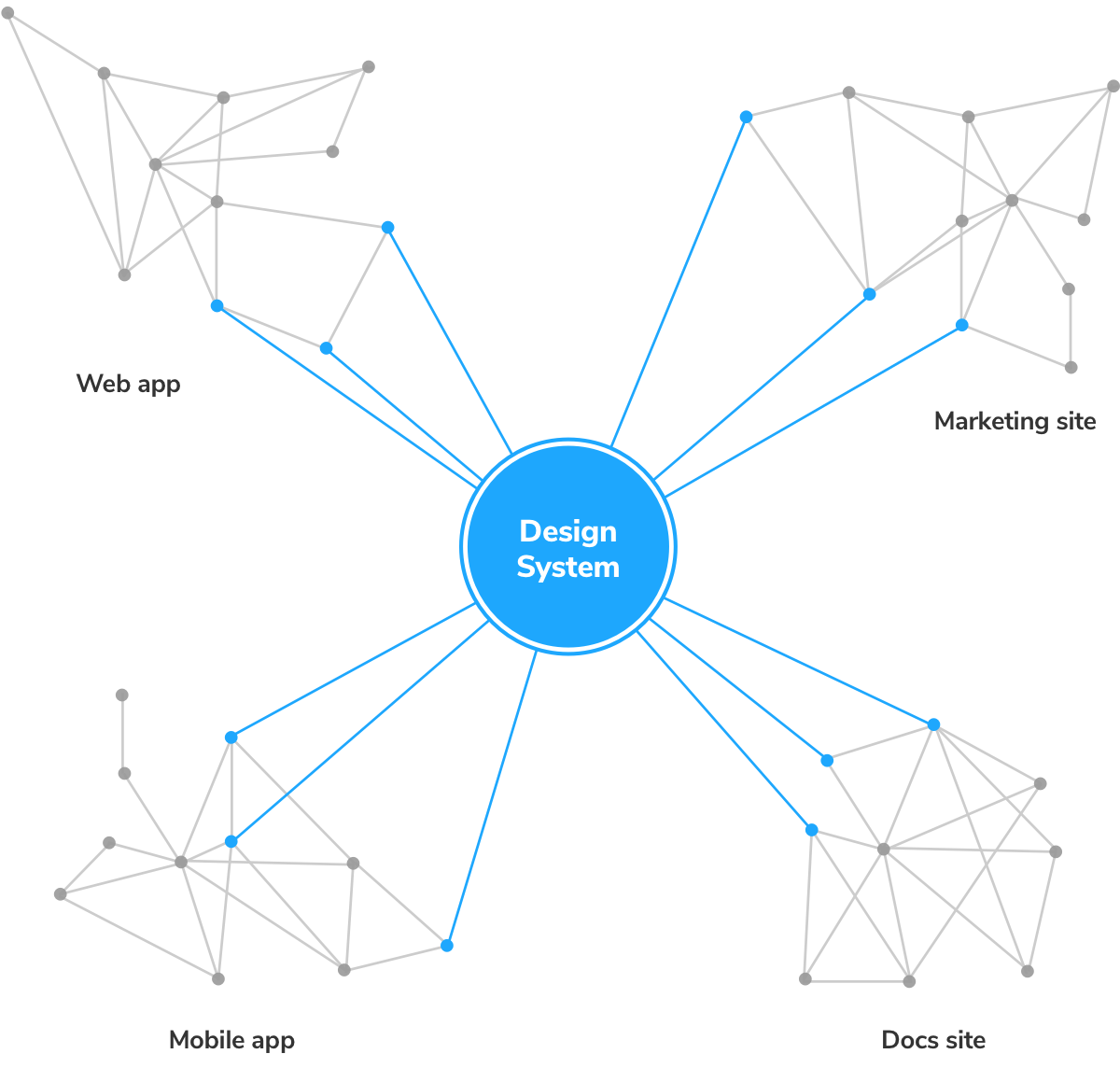
Bugs are an existential risk for design systems, so we’ll do everything to prevent them. Minor tweaks end up snowballing into innumerable regressions. Without an ongoing maintenance strategy, design systems wither.
“But it works on my machine?!” – everyone
Visual review UI components with your team
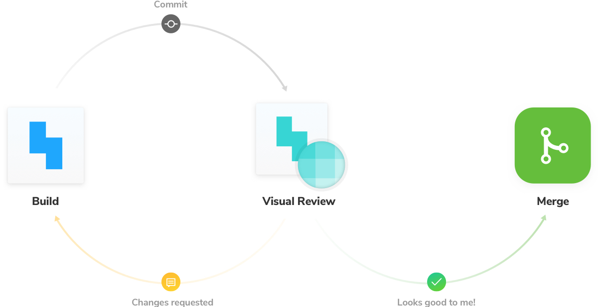
Visual review is the process of confirming the behavior and aesthetics of user interfaces. It happens both while you’re developing UI and during QA with the team.
Most developers are familiar with code review, the process of gathering code feedback from other developers to improve code quality. Since UI components express code graphically, visual review is necessary to collect UI/UX feedback.
Establish a universal reference point
Delete node_modules. Reinstall packages. Clear localstorage. Delete cookies. If these actions sound familiar, you know how tough it is to ensure teammates reference the latest code. When folks don’t have identical dev environments, it’s a nightmare to discern issues caused by the local environment from actual bugs.
Fortunately, as frontend developers, we have a common compile target: the browser. Savvy teams publish their Storybook online to serve as a universal reference point for visual review, sidestepping the inherent complications of local dev environments (it’s annoying to be tech support anyways).
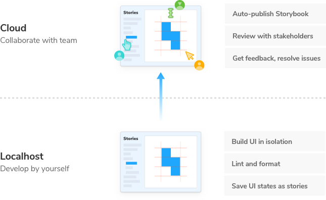
When living UI components are accessible via a URL, stakeholders can confirm UI look and feel from the comfort of their browsers. That means developers, designers, and PMs don’t have to fuss with a local development environment, pass screenshots around, or reference outdated UIs.
"Deploying Storybook each PR makes visual review easier and helps product owners think in components." –Norbert de Langen, Storybook core maintainer
Publish Storybook
We will demonstrate a visual review workflow with Chromatic, a free publishing service made by the Storybook maintainers. This allows you to deploy and host your Storybook safely and securely in the cloud, but it's also pretty straightforward to build Storybook as a static site and deploy it to other hosting services as well.
Get Chromatic
First, go to chromatic.com and sign up with your GitHub account.
From there, choose your design system repo. Behind the scenes, this will sync access permissions and instrument the PR checks.
Install the chromatic package via npm.
yarn add --dev chromatic
Once it's installed, run the following command to build and deploy your Storybook (you'll need to use the project-token that Chromatic supplies on the website):
npx chromatic --project-token=<project-token>

Browse your published Storybook by copying the provided link and pasting it in a new browser window. You’ll find that your local Storybook development environment is mirrored online.
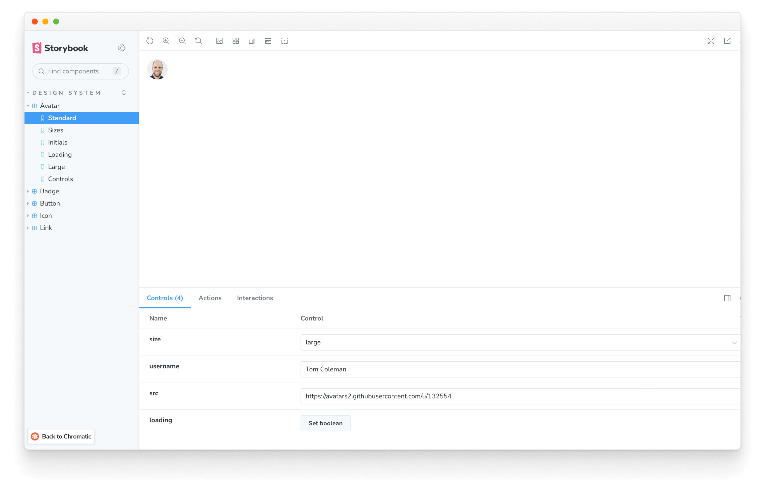
This makes it easy for your team to review the real rendered UI components just as you see them locally. And here's the confirmation you'll see in Chromatic.
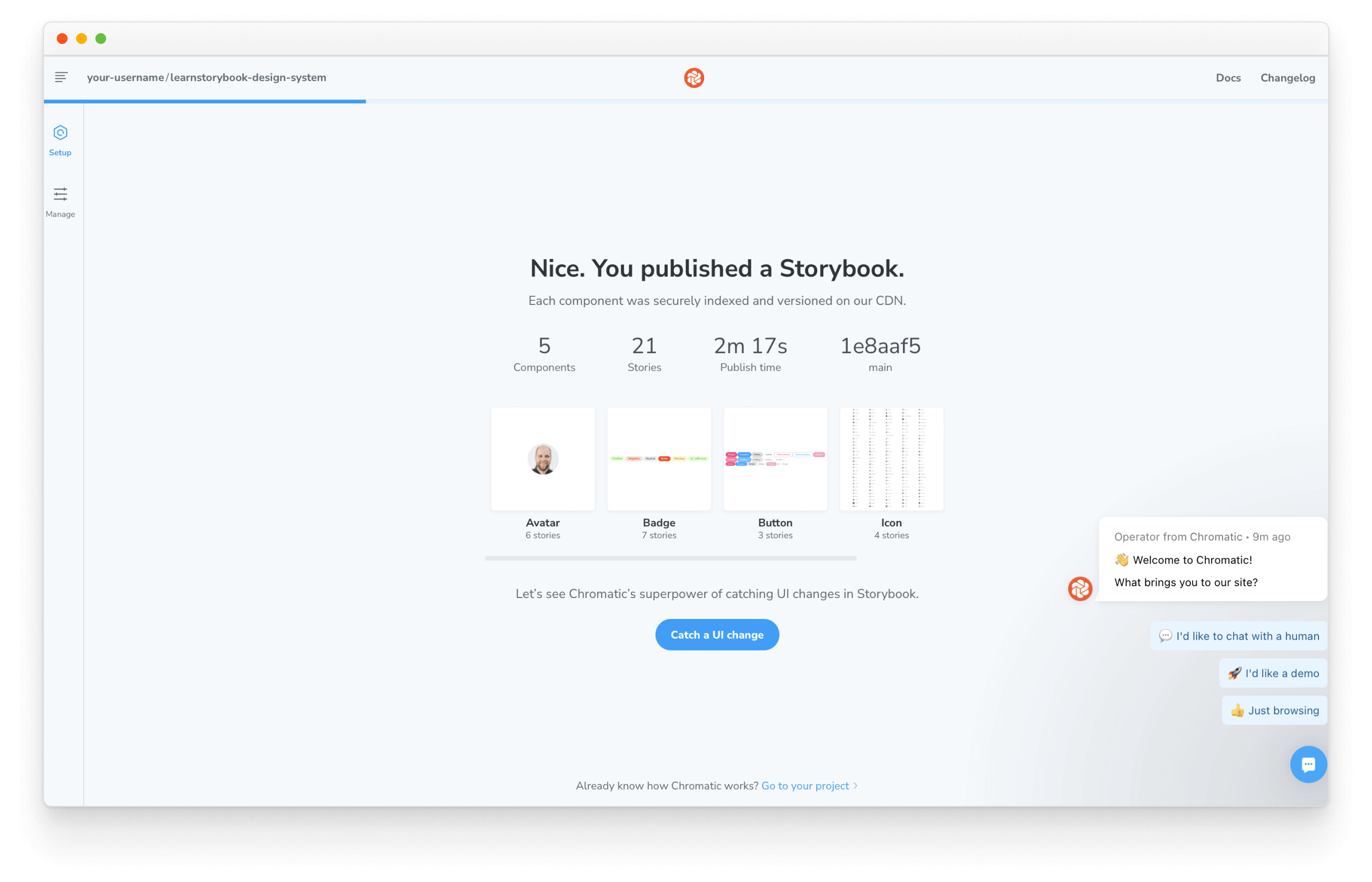
Congratulations! Now that you set up the infrastructure to publish Storybook let's improve it with continuous integration.
Continuous integration
Continuous integration is the defacto way to maintain modern web apps. It allows you to script behavior like tests, analysis, and deployment whenever you push code. We’ll borrow this technique to save ourselves from repetitive manual work.
We'll use GitHub Actions, which is free for our modest usage. The same principles apply to other CI services as well.
Add a .github directory at the top level. Then create another directory called workflows.
Create a file called chromatic.yml like the one below. It will allow us to script how our CI process behaves. We'll start small for now and continue to improve it as we progress:
# Name of our action
name: 'Chromatic'
# The event that will trigger the action
on: push

# What the action will do
jobs:
  test:
    # The operating system it will run on
    runs-on: ubuntu-latest
    # The list of steps that the action will go through
    steps:
      - uses: actions/checkout@v2
        with:
          #👇 Fetches all history so Chromatic can compare against previous builds
          fetch-depth: 0
      - uses: actions/setup-node@v3
        with:
          #👇 Sets the version of Node.js to use
          node-version: 16
      - run: yarn
        #👇 Adds Chromatic as a step in the workflow
      - uses: chromaui/action@v1
        # Options required for Chromatic's GitHub Action
        with:
          #👇 Chromatic projectToken, see https://storybook.js.org/tutorials/design-systems-for-developers/react/en/review/ to obtain it
          projectToken: ${{ secrets.CHROMATIC_PROJECT_TOKEN }}
          token: ${{ secrets.GITHUB_TOKEN }}
💡 For brevity purposes GitHub secrets weren't mentioned. Secrets are secure environment variables provided by GitHub so that you don't need to hard code the project-token.
Add the change with:
git add .
Commit it:
git commit -m "Storybook deployment with GitHub action"
Finally, push it to the remote repository with:
git push origin main
Success! We improved our infrastructure.
Request visual review from your team
Whenever a pull request contains UI changes, it’s useful to initiate a visual review process with stakeholders to reach a consensus on what’s being shipped to the user. That way, there are no unwanted surprises or expensive rework.
We’ll demo visual review by making a UI change on a new branch.
git checkout -b improve-button
First, tweak the Button component. “Make it pop” – our designers will love it.
// ...
const StyledButton = styled.button`
  border: 10px solid red;
  font-size: 20px;
`;
// ...
Commit the change and push it to your GitHub repo.
git commit -am "make Button pop"
git push -u origin improve-button
Navigate to GitHub.com and open a pull request for the improve-button branch. Once opened, the CI job to publish Storybook will run.
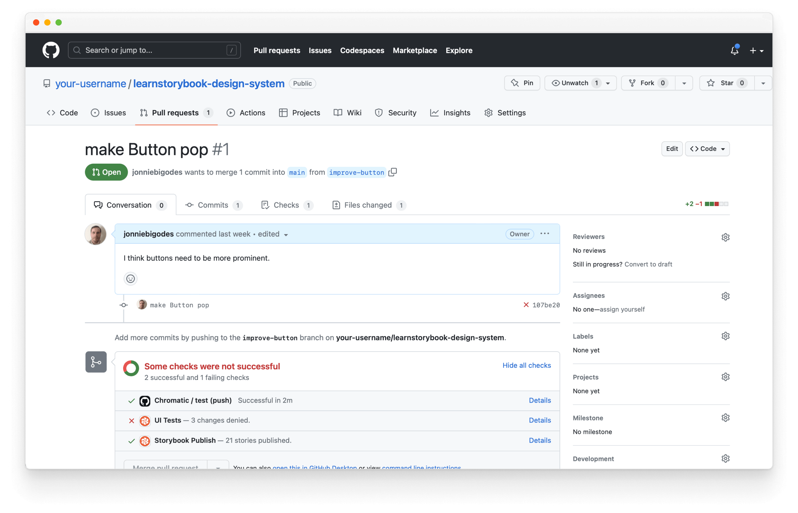
In your list of PR checks at the bottom of the page, click Storybook Publish to view the published Storybook with the new changes.
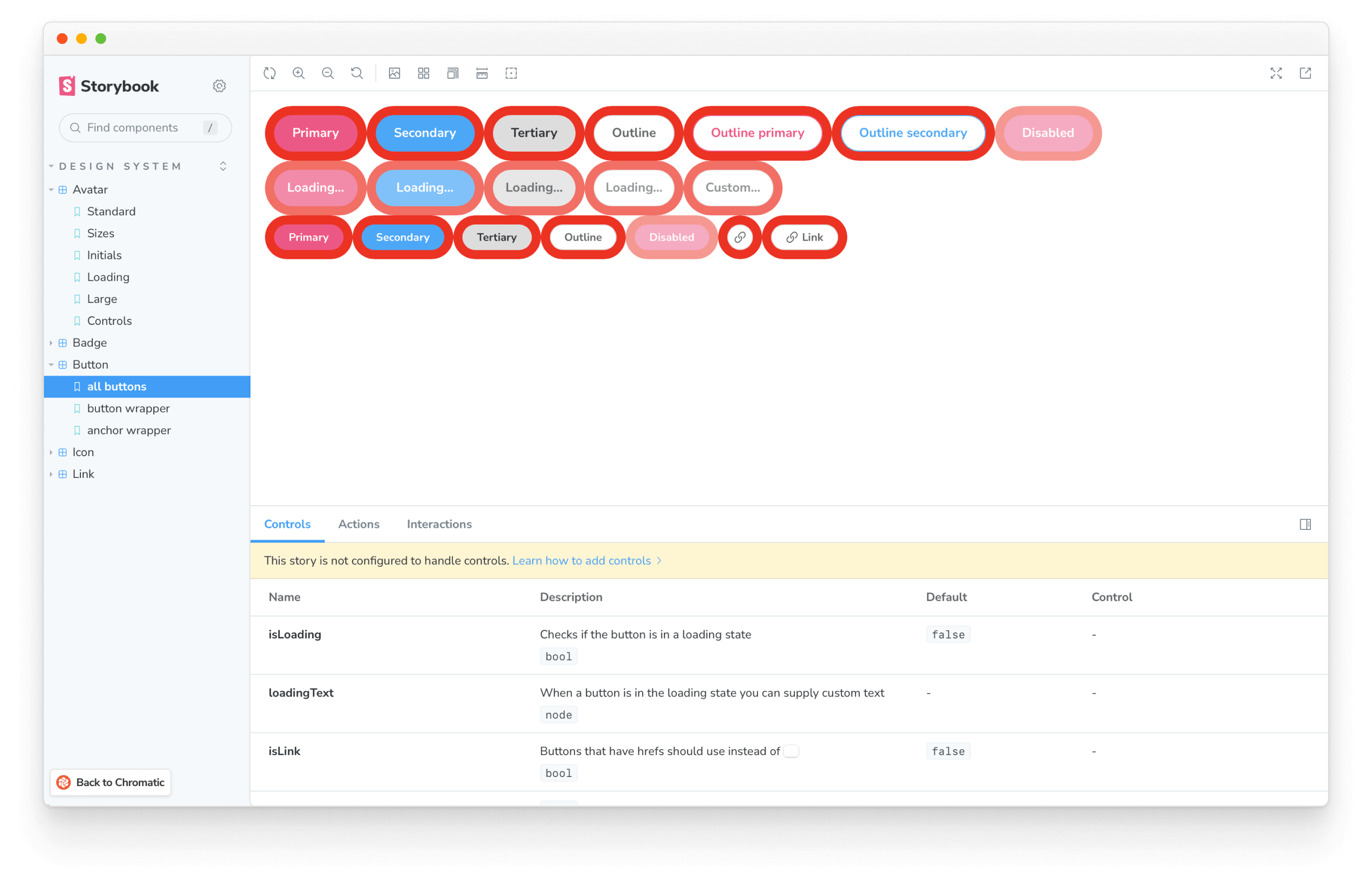
For each component and story that changed, copy the URL from the browser address bar and paste it wherever your team manages tasks (GitHub, Asana, Jira, etc.) to help teammates quickly review the relevant stories.
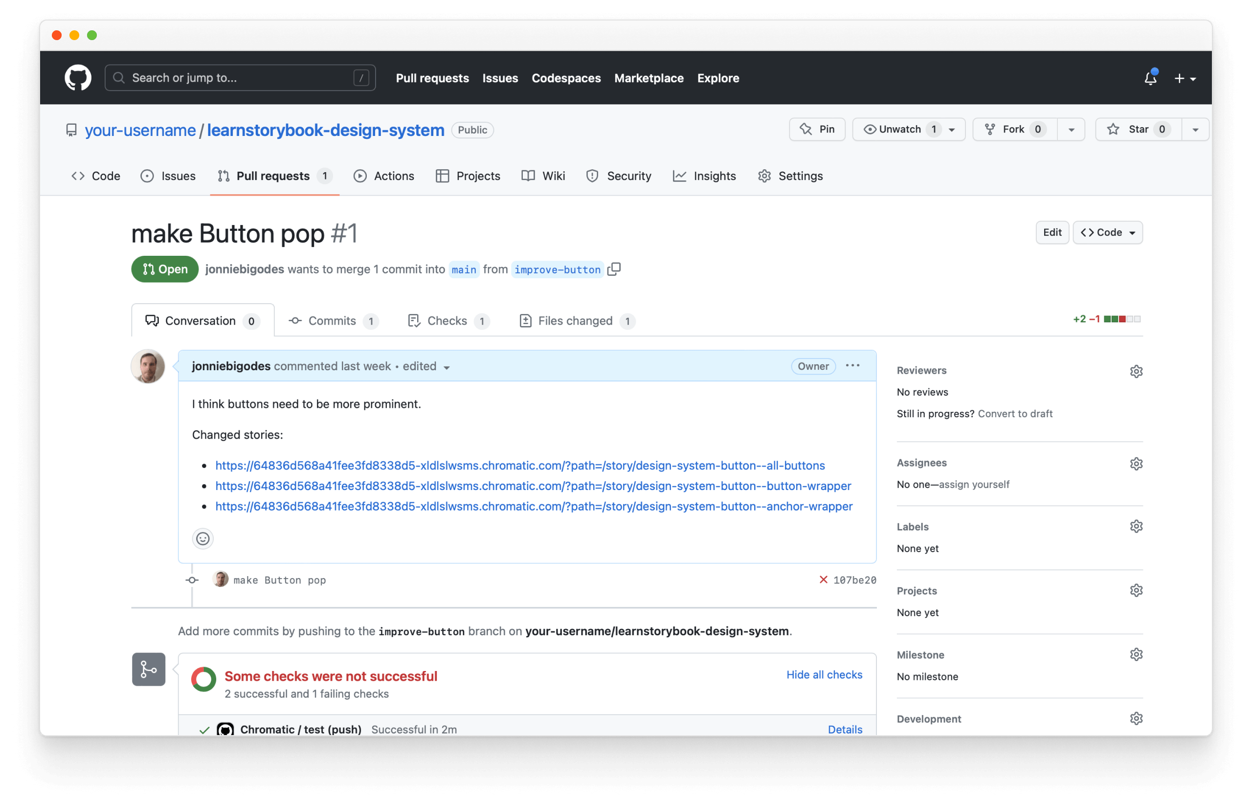
Assign the issue to your teammates and watch the feedback roll in.

In software development, most defects stem from miscommunication and not technology. Visual review helps teams gather continuous feedback during development to ship design systems faster.
Deploying a Storybook URL for every Pull Request has been something we’ve been doing for a while in Shopify’s design system, Polaris, and it’s been amazingly helpful. Ben Scott, Engineer at Shopify
Test your design system
Visual review is invaluable; however, reviewing hundreds of component stories by hand can take hours. Ideally, we want to see only the intentional changes (additions/improvements) and automatically catch unintentional regressions.
In chapter 5, we introduce testing strategies that reduce noise during visual review and ensure our components remain durable over time.