Test to maintain quality
In chapter 5, we automate design system testing to prevent UI bugs. This chapter dives into what characteristics of UI components warrant testing and potential pitfalls to avoid. We researched professional teams at Wave, BBC, and Salesforce to land on a test strategy that balances comprehensive coverage, straightforward setup, and low maintenance.
Fundamentals of UI component testing
Before we begin, let’s figure out what makes sense to test. Design systems are composed of UI components. Each UI component includes stories (permutations) that describe the intended look and feel given a set of inputs (props). Stories are then rendered by a browser or device for the end-user.
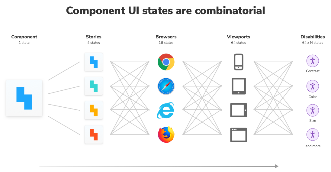
Whoa! As you can see, one component contains many states. Multiply the states by the number of design system components, and you can see why keeping track of them all is a Sisyphean task. In reality, it’s unsustainable to review each experience by hand, especially as the design system grows.
All the more reason to set up automated testing now to save work in the future.
Prepare to test
I surveyed 4 frontend teams about professional Storybook workflows in a previous article. They agreed on these best practices for writing stories to make testing easy and comprehensive.
Articulate supported component states as stories to clarify which combinations of inputs yield a given state. Ruthlessly omit unsupported states to reduce noise.
Render components consistently to mitigate variability that can be triggered by randomized (Math.random()) or relative (Date.now()) inputs.
“The best kind of stories allow you to visualize all of the states your component could experience in the wild” – Tim Hingston, Tech lead at Apollo GraphQL
Visual test appearance
Design systems contain presentational UI components, which are inherently visual. Visual tests validate the visual aspects of the rendered UI.
Visual tests capture an image of every UI component in a consistent browser environment. New screenshots are automatically compared to previously accepted baseline screenshots. When there are visual differences, you get notified.
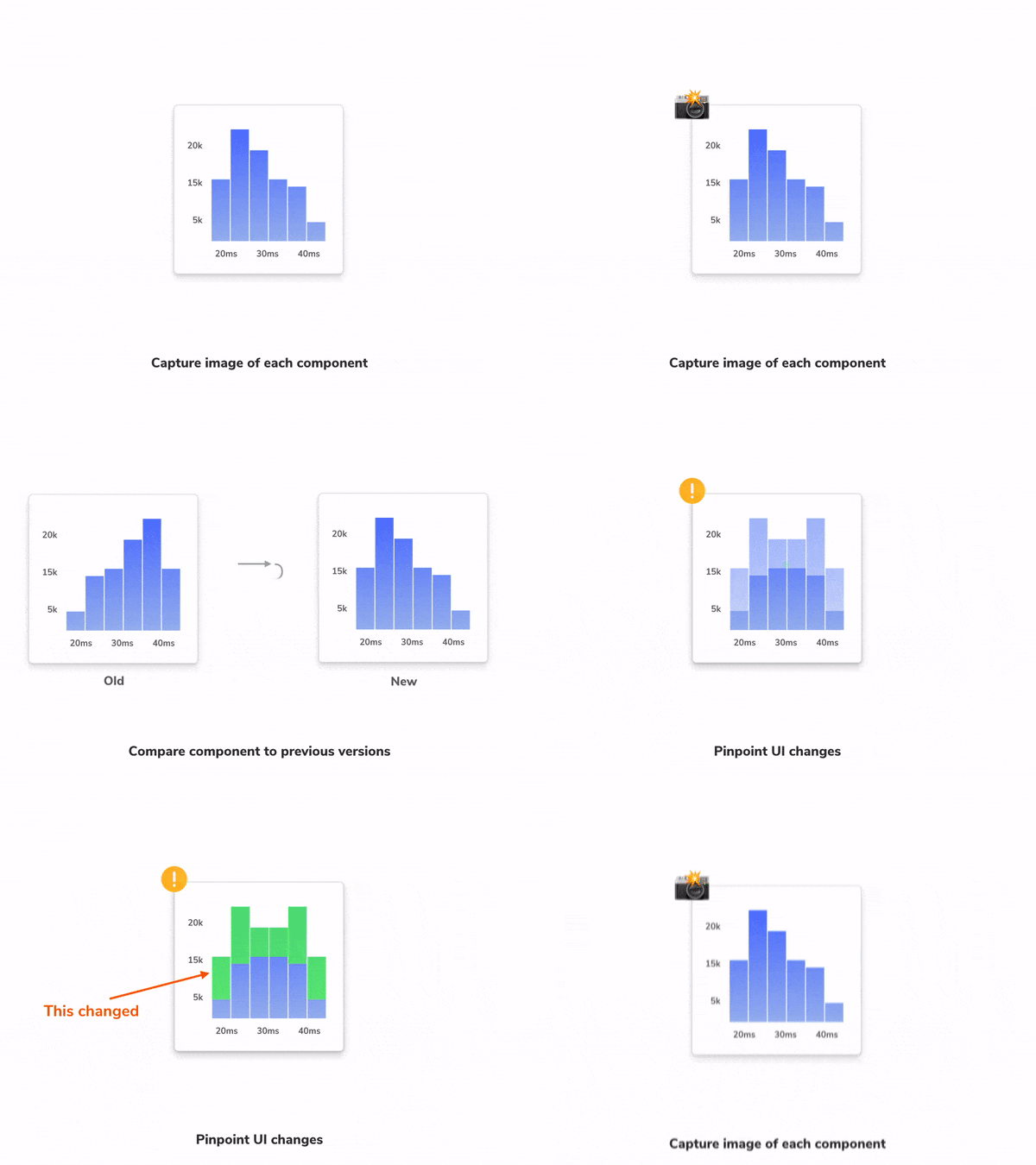
If you’re building a modern UI, visual testing saves your frontend team from time-consuming manual review and prevents expensive UI regressions.
In the previous chapter we learned how to publish Storybook using Chromatic. We added a bold red border around each Button component and then requested feedback from teammates.

Now let's see how visual testing works using Chromatic's built-in testing tools. When we created the pull request, Chromatic captured images for our changes and compared them to previous versions of the same components. Four changes were found:
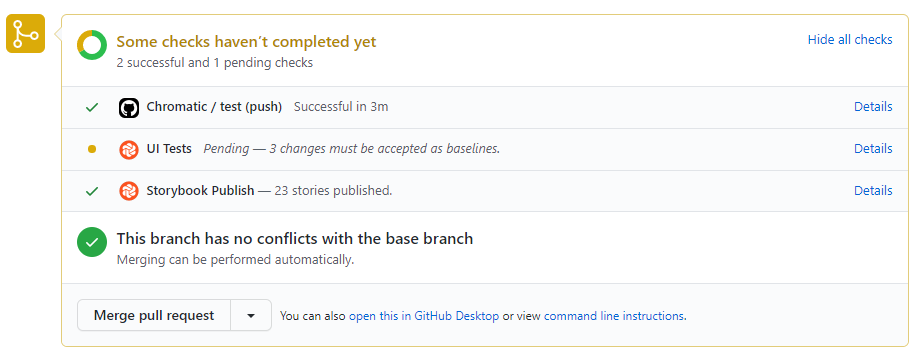
Click the 🟡 UI Tests check to review them.
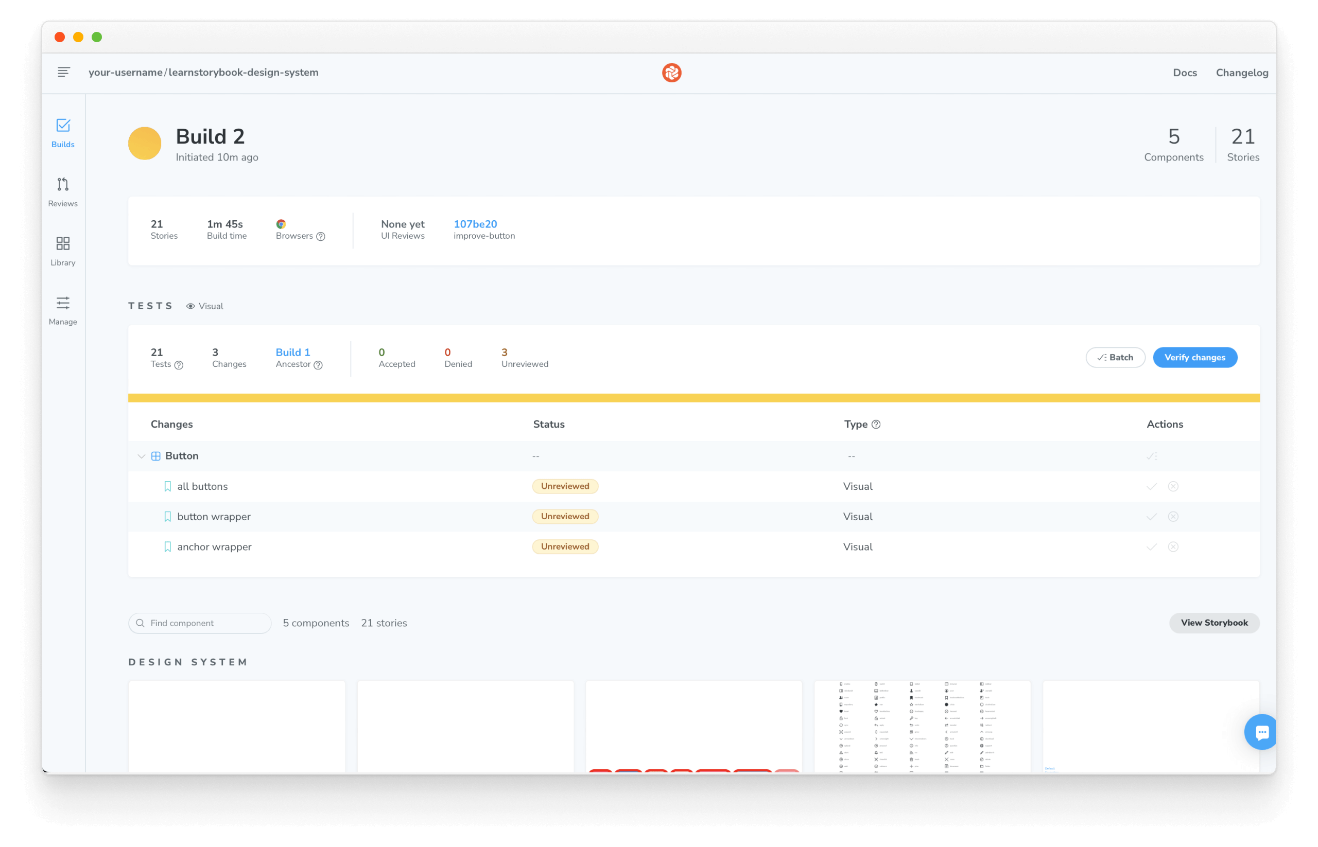
Review them to confirm whether they’re intentional (improvements) or unintentional (bugs). If you accept the changes, the test baselines will be updated. That means subsequent commits will be compared to the new baselines to detect bugs.
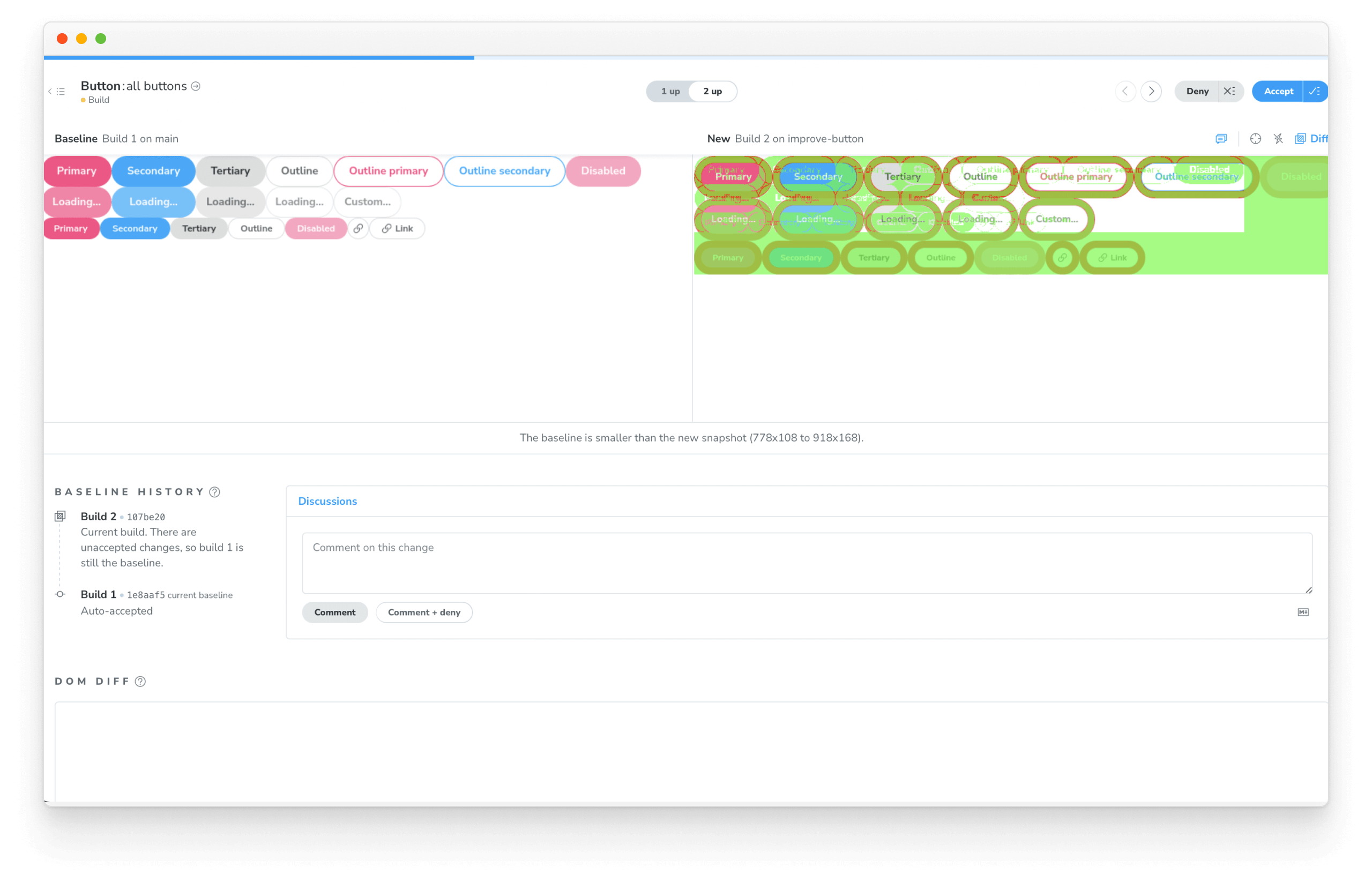
In the last chapter, our teammate did not want a red border around the Button's for some reason. Deny the changes to indicate that they need to be undone.
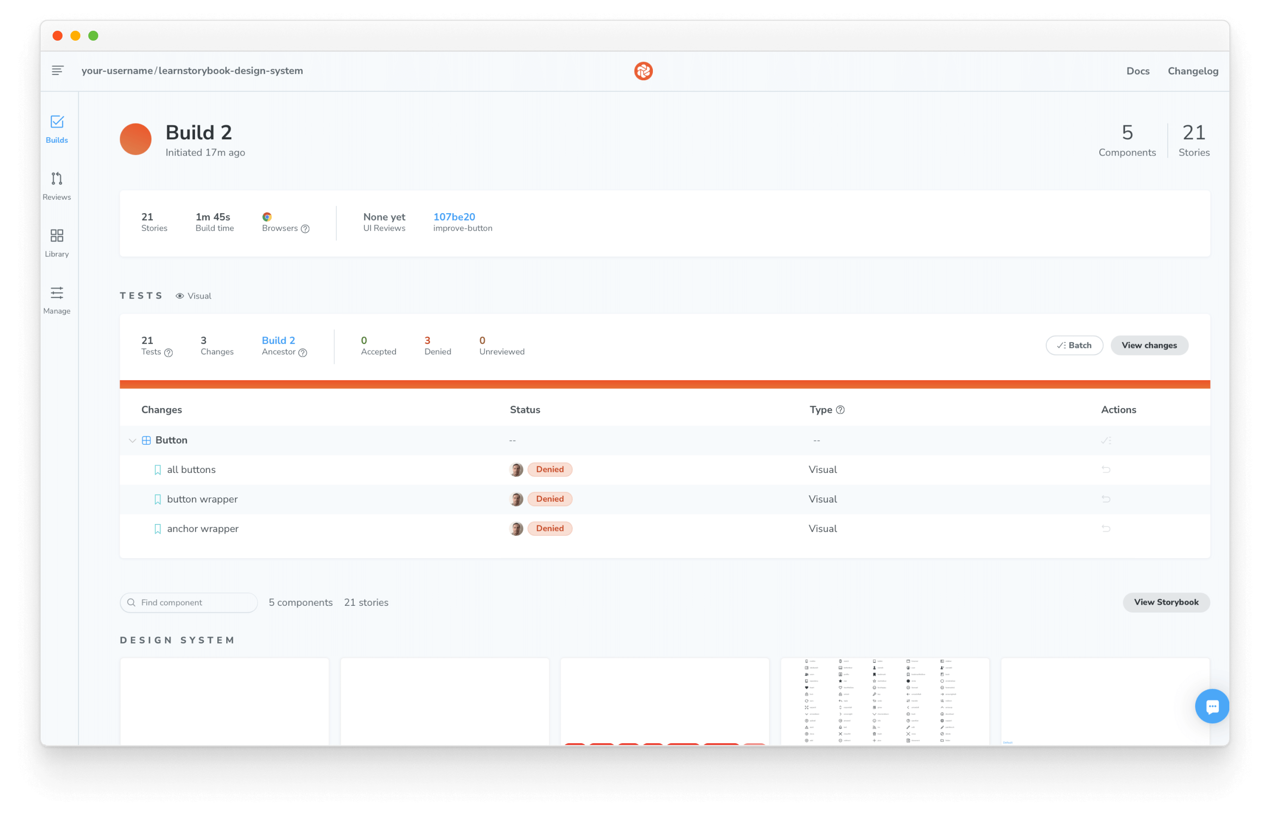
Undo the changes and commit again to pass your visual tests again.
Interaction tests
So far, we've seen how visual testing enabled us to spot-check appearance and catch UI regressions. But as we continue to develop our design system, our components will eventually become responsible for more than just rendering the UI. At some point, they'll handle state management or even fetch data. That's where testing component interactions will help us.
Interaction testing is a well-known pattern for verifying user behavior. You start by providing mocked data to set up your test, simulate user interactions with a testing library, and verify the UI changes. In Storybook, this happens in the browser, making it easier to debug failures because you're running tests in the same environment as you develop components: the browser.
To enable it, we're going to rely on Storybook's play function and instrumented testing libraries to set up our tests and then use the test-runner to verify that our component renders correctly.
Setup the test runner
Start by adding the necessary dependencies with:
yarn add --dev @storybook/test-runner
Next, add a new test task to your package.json scripts:
{
  "scripts": {
    "test-storybook": "test-storybook"
  }
}
Write an interaction test using the play function
Interaction tests are centered around how the UI handles user actions, either using the keyboard, mouse, or other input devices and checking whether UI visual elements are displayed and working correctly. Testing libraries like Jest provide helpful APIs for simulating human interactions and verifying the UI state. We'll use instrumented versions of these tools to write our tests. Therefore, maintaining a common syntax, but with additional telemetry to help us debug.
The test itself is defined inside a play function connected to a story. They're small snippets of code that run after the story renders.
Let's see how it works by updating the Button story and set up our first interaction test by adding the following:
import styled from '@emotion/styled';

import { Button } from './Button';
import { Icon } from '../Icon/Icon';
import { StoryLinkWrapper } from '../LinkWrapper';

+ import { expect, userEvent, within } from '@storybook/test';

export default {
  title: 'Design System/Button',
  component: Button,
};

// Other Button stories

/*
 * New story using the play function.
 * See https://storybook.js.org/docs/react/writing-stories/play-function
 * to learn more about the play function.
 */
+ export const WithInteractions = {
+   args: {
+     appearance: 'primary',
+     href: 'http://storybook.js.org',
+     ButtonWrapper: StoryLinkWrapper,
+     children: 'Button',
+   },
+   play: async ({ canvasElement }) => {
+     // Assigns canvas to the component root element
+     const canvas = within(canvasElement);
+     await userEvent.click(canvas.getByRole('link'));
+     expect(canvas.getByRole('link')).toHaveAttribute(
+       'href',
+       'http://storybook.js.org',
+     );
+   },
+ };
💡 The @storybook/test package replaces the @storybook/jest and @storybook/testing-library testing packages, offering a smaller bundle size and a more straightforward API based on the Vitest package.
When Storybook finishes rendering the story, it executes the steps defined inside the play function, interacting with the component, similar to how a user would do it. Click the Interactions panel. You'll see a detailed execution flow while also providing a convenient set of UI controls to pause, resume, rewind, and step through each interaction.
Automate tests with the test runner
We've seen how interaction tests with the play function helped us verify how a component responds when we interact with it. But as design systems evolve, manually verifying every change can quickly become unrealistic. Storybook test runner automates this process. It's a standalone utility—powered by Playwright—that runs parallel to your Storybook, executing all interaction tests and catching broken stories.
With Storybook running, open a new terminal window and run the test runner with:
yarn test-storybook --watch
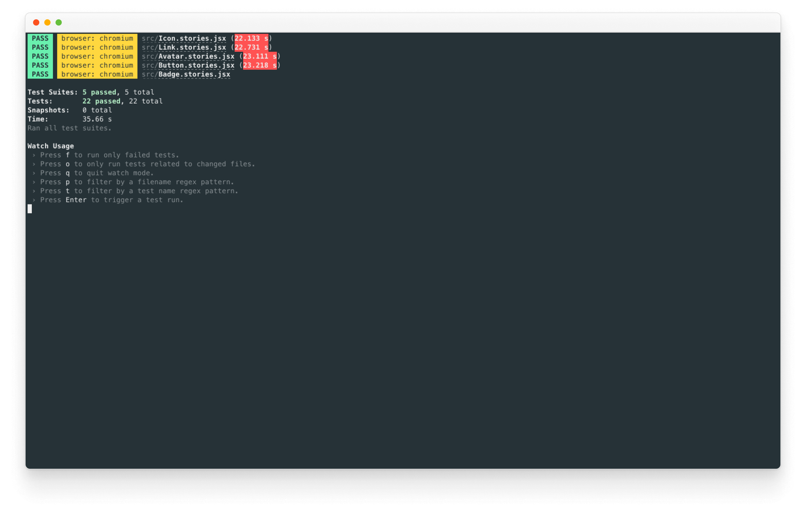
It will verify whether all our stories render without errors and that all assertions pass automatically during execution. What's more, if a test fails, it will provide us with a link that opens up the failing story in the browser.
Run interaction tests in CI
Interaction tests with the play function and automation with the test runner helped us simulate user interactions and verify the UI state of our components. However, running them locally can be a time-consuming and repetitive task, even as our design system continues to grow. Once again, that's where CI comes in. Let's see how to set it up with our existing CI workflow.
Update the existing workflow that we created in the previous chapter and enable interaction testing as follows:
# Name of our action
name: 'Chromatic'
# The event that will trigger the action
on: push

# What the action will do
jobs:
  # Run interaction tests
  interaction-tests:
    runs-on: ubuntu-latest
    steps:
      - uses: actions/checkout@v2
      - uses: actions/setup-node@v3
        with:
          #👇 Sets the version of Node.js to use
          node-version: 16
      - name: Install dependencies
        run: yarn
      - name: Install Playwright
        run: npx playwright install --with-deps
      - name: Build Storybook
        run: yarn build-storybook --quiet
      - name: Serve Storybook and run tests
        run: |
          npx concurrently -k -s first -n "SB,TEST" -c "magenta,blue" \
            "npx http-server storybook-static --port 6006 --silent" \
            "npx wait-on tcp:6006 && yarn test-storybook"
  visual-tests:
    # The operating system it will run on
    runs-on: ubuntu-latest
    # The list of steps that the action will go through
    steps:
      - uses: actions/checkout@v2
        with:
          #👇 Fetches all history so Chromatic can compare against previous builds
          fetch-depth: 0
      - uses: actions/setup-node@v3
        with:
          #👇 Sets the version of Node.js to use
          node-version: 16
      - run: yarn
        #👇 Adds Chromatic as a step in the workflow
      - uses: chromaui/action@v1
        # Options required for Chromatic's GitHub Action
        with:
          #👇 Chromatic projectToken, see https://storybook.js.org/tutorials/design-systems-for-developers/react/en/review/ to obtain it
          projectToken: ${{ secrets.CHROMATIC_PROJECT_TOKEN }}
          token: ${{ secrets.GITHUB_TOKEN }}
Our workflow will run when code is pushed to any branch of our design system repository, and it will have two jobs; one for interaction tests and one for visual tests. The interaction test job starts by building Storybook and then runs the test runner, notifying us of broken tests. The visual test job will function as before, running Chromatic to verify the visual state of our components.
Accessibility test
“Accessibility means all people, including those with disabilities, can understand, navigate, and interact with your app... Online [examples include] alternative ways to access content such as using the tab key and a screen reader to traverse a site.” writes developer Alex Wilson from T.Rowe Price.
Disabilities affect 15% of the population, according to the World Health Organization. Design systems have an outsized impact on accessibility because they contain the building blocks of user interfaces. Improving accessibility of just one component means every instance of that component across your company benefits.
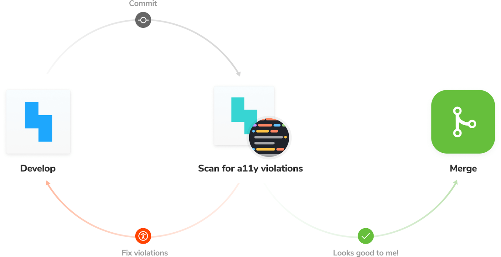
Get a headstart on inclusive UI with Storybook’s Accessibility addon, a real-time tool for verifying web accessibility standards (WCAG).
yarn add --dev @storybook/addon-a11y
Update your Storybook configuration to include the addon.
/** @type { import('@storybook/react-vite').StorybookConfig } */
const config = {
  stories: ['../src/**/*.mdx', '../src/**/*.stories.@(js|jsx|ts|tsx)'],
  addons: [
    '@storybook/addon-links',
    '@storybook/addon-essentials',
    '@storybook/addon-interactions',
+   '@storybook/addon-a11y',
  ],
  framework: {
    name: '@storybook/react-vite',
    options: {},
  },
  docs: {
    autodocs: 'tag',
  },
};
export default config;
Once all is set up, you’ll see a new “Accessibility” tab in the Storybook addons panel.
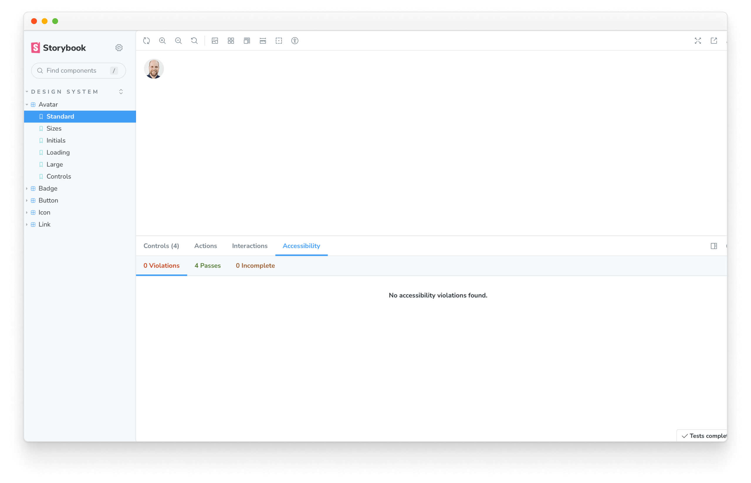
It shows you the accessibility levels of DOM elements (violations and passes). Click the “highlight results” checkbox to visualize violations in situ with the UI component.
From here, follow the addon’s accessibility recommendations.
Other testing strategies
Paradoxically, tests can save time but also bog down development velocity with maintenance. Be judicious about testing the right things – not everything. Even though software development has many test strategies, we discovered the hard way that some aren’t suited for design systems.
Code coverage tests
Code coverage tests measure how much of your codebase is covered by tests. They're a good way to ensure that your tests are actually testing something. However, they're not a good way to measure the quality of your tests, but they can be beneficial to verify that all the components and utilities provided by the design system are functioning as expected, helping to identify any potential gaps or issues in the design system's implementation. Storybook provides an addon to help us with this. Powered by Istanbul, the Storybook coverage addon generates a code coverage report for your Storybook stories. Let's see how.
Start by running the following command to install the coverage addon:
yarn add --dev @storybook/addon-coverage
Next, update your Storybook configuration to include the addon:
/** @type { import('@storybook/react-vite').StorybookConfig } */
const config = {
  stories: ['../src/**/*.mdx', '../src/**/*.stories.@(js|jsx|ts|tsx)'],
  addons: [
    '@storybook/addon-links',
    '@storybook/addon-essentials',
    '@storybook/addon-interactions',
    '@storybook/addon-a11y',
+   '@storybook/addon-coverage',
  ],
  framework: {
    name: '@storybook/react-vite',
    options: {},
  },
  docs: {
    autodocs: 'tag',
  },
};
export default config;
Finally, with Storybook running, start the test runner (in a separate terminal window) with the --coverage flag:
yarn test-storybook --coverage
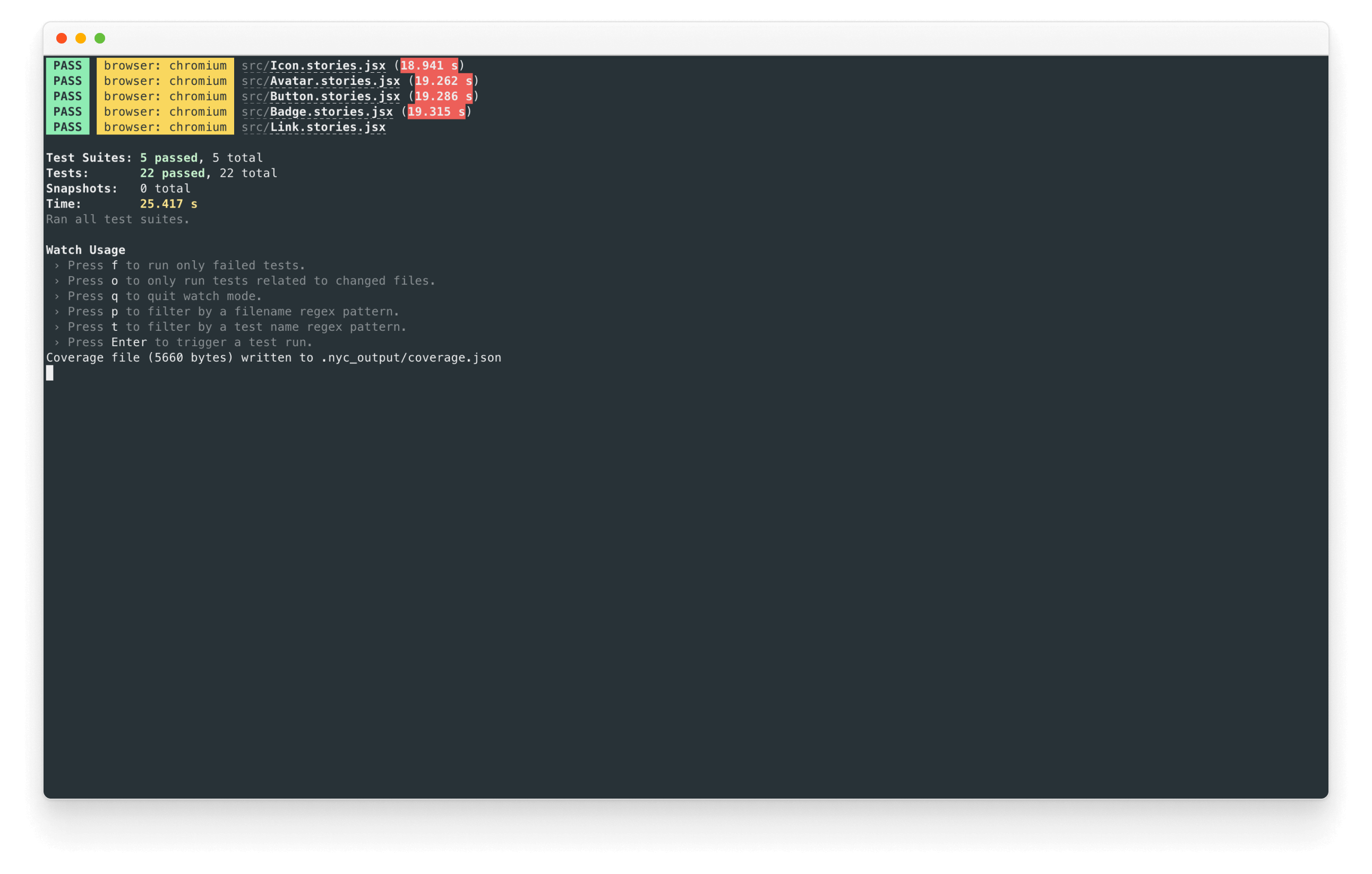
From here, follow the recommendations to improve your code coverage.
Snapshot tests (Jest)
This technique captures the code output of UI components and compares it to previous versions. Testing UI component markup ends up testing implementation details (code), not what the user experiences in the browser.
Diffing code snapshots are unpredictable and prone to false positives. At the component level, code snapshotting doesn’t account for global changes like design tokens, CSS, and 3rd party API updates (web fonts, Stripe forms, Google Maps, etc.). In practice, developers resort to “approving all” or ignoring snapshot tests altogether.
Most component snapshot tests are really just a worse version of screenshot tests. Test your outputs. Snapshot what gets rendered, not the underlying (volatile!) markup. – Mark Dalgliesh, Frontend infrastructure at SEEK, CSS modules creator
End-to-end tests (Selenium, Cypress)
End-to-end tests traverse the component DOM to simulate the user flow. They’re best suited for verifying app flows like the signup or checkout process. The more complex functionality, the more useful this testing strategy is.
Design systems contain atomic components with relatively simple functionality. Validating user flows is often overkill for this task because the tests are time-consuming to create and brittle to maintain. However, in rare situations, components may benefit from end-to-end tests. For instance, validating complex UIs like datepickers or self-contained payment forms.
Drive adoption with documentation
A design system is not complete with tests alone. Since design systems serve stakeholders from across the organization, we need to teach others how to get the most from our well-tested UI components.
In chapter 6, we’ll learn how to accelerate design system adoption with documentation. See why Storybook Docs is a secret weapon to create comprehensive docs with less work.