Build a simple component
We’ll build our UI following a Component-Driven Development (CDD) methodology. It’s a process that builds UIs from the “bottom up” starting with components and ending with screens. CDD helps you scale the amount of complexity you’re faced with as you build out the UI.
Task
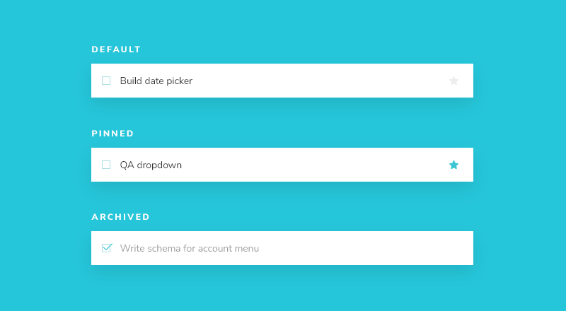
Task is the core component in our app. Each task displays slightly differently depending on exactly what state it’s in. We display a checked (or unchecked) checkbox, some information about the task, and a “pin” button, allowing us to move tasks up and down the list. Putting this together, we’ll need these props:
title– a string describing the taskstate- which list is the task currently in and is it checked off?
As we start to build Task, we first write our test states that correspond to the different types of tasks sketched above. Then we use Storybook to build the component in isolation using mocked data. We’ll “visual test” the component’s appearance given each state as we go.
This process is similar to Test-driven development (TDD) that we can call “Visual TDD”.
Get set up
Let's open .storybook/main.js and take a look
module.exports = {
  stories: ['../components/**/*.stories.?(ts|tsx|js|jsx)'],
  addons: [
    '@storybook/addon-ondevice-controls',
    '@storybook/addon-ondevice-actions',
  ],
};
If you check the stories property you'll see that Storybook is looking for stories in the components folder.
In Storybook for React Native, due to current limitations with the Metro bundler, we rely on the configuration in main.js to generate a file called storybook.requires, which is used to load all our stories and addons in our project. This file is automatically generated when you run yarn storybook to start your Storybook.
💡 You can also manually generate the storybook.requires file by running yarn storybook-generate. However, you shouldn't need to re-create this file unless you see that a story is not being loaded or notice that a change in your main.js config is not reflected in your Storybook. To learn more about how the storybook.requires file is generated, you can check out the withStorybook function in your metro.config.js file.
Now let’s create the task component and its accompanying story file: components/Task.jsx and components/Task.stories.jsx.
We’ll begin with a basic implementation of the Task, simply taking in the attributes we know we’ll need and the two actions you can take on a task (to move it between lists):
import { StyleSheet, TextInput, View } from 'react-native';
import { styles } from './styles';

export const Task = ({
  task: { id, title, state },
  onArchiveTask,
  onPinTask,
}) => {
  return (
    <View style={styles.listItem}>
      <TextInput value={title} editable={false} />
    </View>
  );
};
Now add the story file:
import { Task } from './Task';

export default {
  title: 'Task',
  component: Task,
  argTypes: {
    onPinTask: { action: 'onPinTask' },
    onArchiveTask: { action: 'onArchiveTask' },
  },
};

export const Default = {
  args: {
    task: {
      id: '1',
      title: 'Test Task',
      state: 'TASK_INBOX',
    },
  },
};

export const Pinned = {
  args: { task: { ...Default.args.task, state: 'TASK_PINNED' } },
};

export const Archived = {
  args: { task: { ...Default.args.task, state: 'TASK_ARCHIVED' } },
};
In our stories files we use a syntax called Component Story Format (CSF). This syntax makes it easier to write stories and is supported by the latest versions of Storybook.
There are two basic levels of organization in Storybook: the component and its child stories. Think of each story as a permutation of a component. You can have as many stories per component as you need.
- Component
- Story
- Story
- Story
To tell Storybook about the component we are documenting, we create a default export that contains:
component-- the component itselftitle-- how to refer to the component in the sidebar of the Storybook appargTypes-- allows us to specify the types of our args, here we use it to define actions which will log whenever that interaction takes place
To define our stories we export an object with an args property. Arguments or args for short, allow us to live-edit our components with the controls addon without restarting Storybook. Once an args value changes, so does the component.
When creating a story, we use a base task arg to build out the shape of the task the component expects. Typically modeled from what the actual data looks like. Again, export-ing this shape will enable us to reuse it in later stories, as we'll see.
Now that we've set up the basics lets re-run yarn storybook and see our changes. If you already have Storybook running you can also run yarn storybook-generate to regenerate the storybook.requires file.
You should see a UI that looks like this:
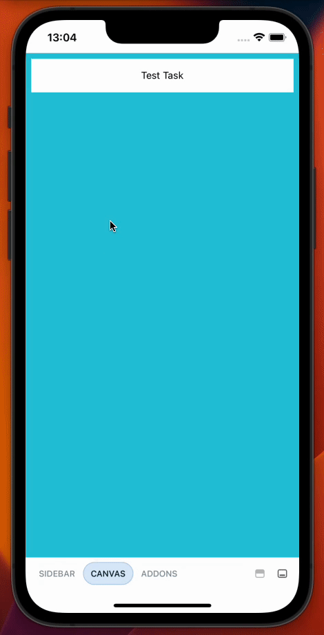
You can use the menu at the bottom of your screen to open the navigation menu and tap to swap between stories. Then you can tap away or drag down to dismiss the menu. You'll find addons by pressing the icon on the far right of the bottom bar.
Build out the states
Now we can start building out our component to match the designs.
The component is still basic at the moment. First write the code that achieves the design without going into too much detail:
import { MaterialIcons } from '@expo/vector-icons';
import { StyleSheet, TextInput, TouchableOpacity, View } from 'react-native';
import { styles } from './styles';

export const Task = ({
  task: { id, title, state },
  onArchiveTask,
  onPinTask,
}) => {
  return (
    <View style={styles.listItem}>
      <TouchableOpacity onPress={() => onArchiveTask(id)}>
        {state !== "TASK_ARCHIVED" ? (
          <MaterialIcons
            name="check-box-outline-blank"
            size={24}
            color="#26c6da"
          />
        ) : (
          <MaterialIcons name="check-box" size={24} color="#26c6da" />
        )}
      </TouchableOpacity>
      <TextInput
        placeholder="Input Title"
        value={title}
        editable={false}
        style={
          state === "TASK_ARCHIVED"
            ? styles.listItemInputTaskArchived
            : styles.listItemInputTask
        }
      />
      <TouchableOpacity onPress={() => onPinTask(id)}>
        <MaterialIcons
          name="star"
          size={24}
          color={state !== "TASK_PINNED" ? "#eee" : "#26c6da"}
        />
      </TouchableOpacity>
    </View>
  );
};
When you're done, it should look like this:
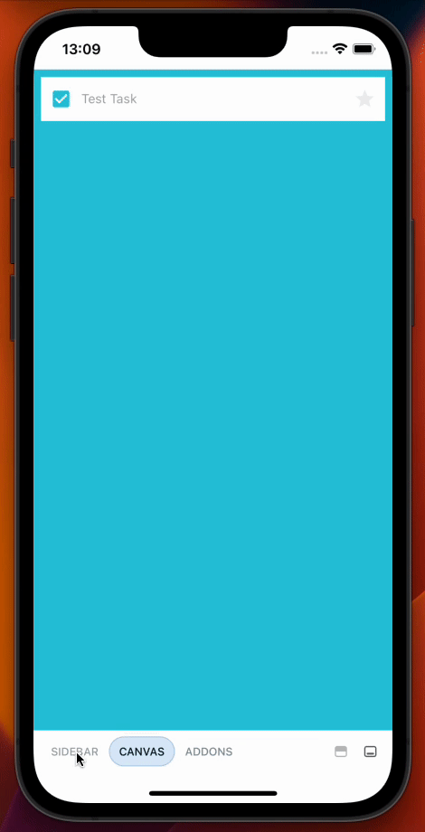
Component built!
We’ve now successfully built out a component without needing a server or running the entire application. The next step is to build out the remaining Taskbox components one by one in a similar fashion.
As you can see, getting started building components in isolation is easy and fast. We can expect to produce a higher-quality UI with fewer bugs and more polish because it’s possible to dig in and test every possible state.