Storybook for React Native tutorial
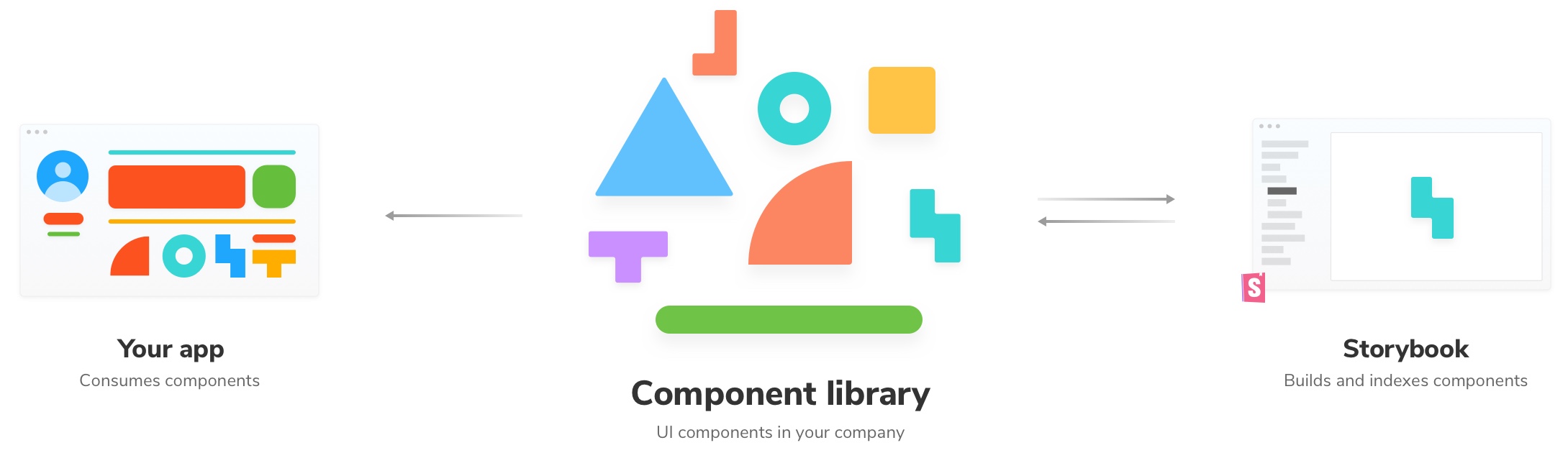
Storybook helps you build UI components isolated from the business logic and context of your app. This edition of the Intro to Storybook tutorial is for React Native; other editions exist for React, Vue, Angular, Svelte.
Set Up React Native Storybook
We’ll need to follow a few steps to get started. In this tutorial we'll be using this template where we've already setup a React Native app using Expo and added Storybook the project.
Before we get started, there are some things we’ll need to consider:
- To help you throughout the tutorial, you’ll need a phone or a simulator already configured to allow you to run the application. For more information see the Expo documentation on running on IOS and Android.
- This tutorial will be focused on iOS/Android. React Native can target other platforms that this tutorial won't cover.
- You’ll also need Node.js configured on your machine.
First download the template we've created for this tutorial.
npx degit chromaui/intro-storybook-react-native-template#main taskbox
Next, let's install the dependencies and run the app to make sure everything is working as expected.
cd taskbox
yarn install
Now you have the app lets run it to make sure everything is working as expected.
You can pick ios or android and run either and make sure the app is working.
# Run the application on iOS
yarn ios

# Run the application on Android
yarn android

# Run Storybook on iOS
yarn storybook:ios

# Run Storybook on Android
yarn storybook:android
💡 Throughout this tutorial, Yarn will be used. If you're following along this tutorial but don't have it configured, you can easily swap out the commands to match your package manager of choice (e.g., npm, pnpm).
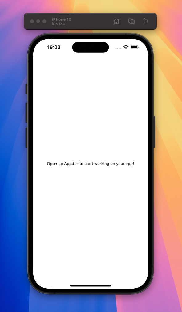
When running the application with yarn ios you should see this rendered on the device:
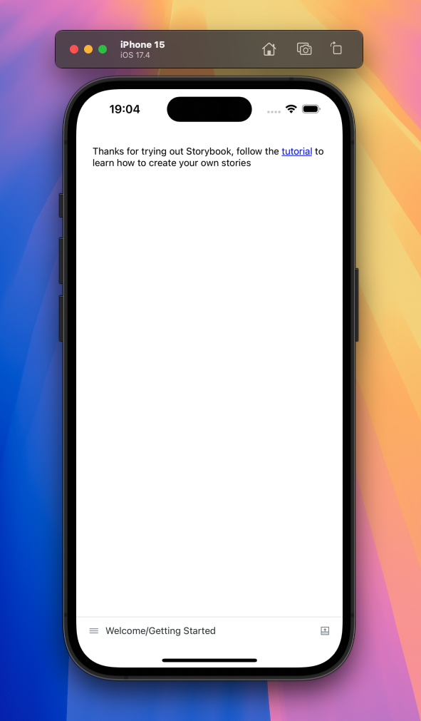
When running Storybook with yarn storybook:ios you should see this:
How it works
When initialized the template already provides the required configuration to help us get started developing our application with React Native. Before we start to build our UI from the ground up, let's take a moment and see how Storybook functions inside a React Native application and whats different.
Storybook in React Native is a component that you can render in your app, as opposed to other framework versions where Storybook runs on its own.
Because of this distinction we need a way to switch between the app and Storybook. To do this we use environment variables, and we'll go over that quickly now.
💡 See the Expo documentation for more details on how to use environment variables.
In our project there is a configuration file for Expo called app.config.js, this file is where we configure things like our app name and constants that we can use throughout the app.
In this file we set the storybookEnabled constant to the value of the environment variable STORYBOOK_ENABLED which we'll go over shortly.
export default ({ config }) => ({
  ...config,
  name: 'Storybook Tutorial Template',
  slug: 'storybook-tutorial-template',
  extra: {
    storybookEnabled: process.env.STORYBOOK_ENABLED,
  },
});
This lets us access the storybookEnabled variable in our app using the expo-constants package and we use this to determine whether we render Storybook or your app.
import Constants from 'expo-constants';

function App() {
  // ... removed for brevity
}

// Default to rendering your app
let AppEntryPoint = App;

// Render Storybook if storybookEnabled is true
if (Constants.expoConfig.extra.storybookEnabled === 'true') {
  AppEntryPoint = require('./.storybook').default;
}

export default AppEntryPoint;
In the package.json file, we see a few new Storybook scripts. We use these to pass that environment variable to our application, which swaps the entry point to the Storybook UI using cross-env to make sure this works on all platforms (Windows/macOS/Linux).
{
  "scripts": {
    "storybook": "cross-env STORYBOOK_ENABLED='true' expo start",
    "storybook:ios": "cross-env STORYBOOK_ENABLED='true' expo ios",
    "storybook:android": "cross-env STORYBOOK_ENABLED='true' expo android"
  }
}
This is where our STORYBOOK_ENABLED environment variable is set to true, which then tells our app to render Storybook instead of our app.
Commit changes
At this stage it's safe to add our files to a local repository. Run the following commands to initialize a local repository, add and commit the changes we've done so far.
git init
Followed by:
git add .
Then:
git commit -m "first commit"
And finally:
git branch -M main
Let's start building our first component!