Assemble a composite component
Last chapter we built our first component; this chapter extends what we learned to build TaskList, a list of Tasks. Let’s combine components together and see what happens when more complexity is introduced.
Tasklist
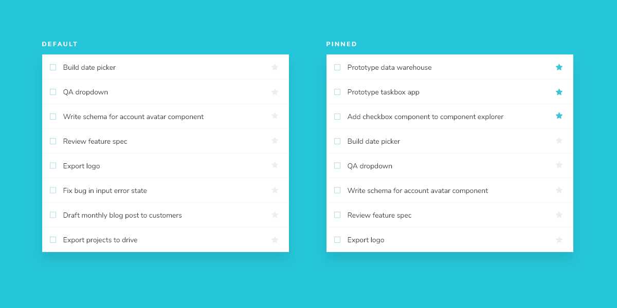
Taskbox emphasizes pinned tasks by positioning them above default tasks. This yields two variations of TaskList you need to create stories for: default items and default and pinned items.
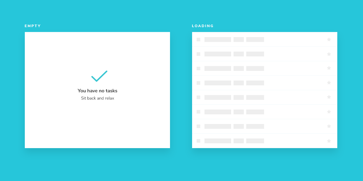
Since Task data can be sent asynchronously, we also need a loading state to render in the absence of a connection. In addition, an empty state is required when there are no tasks.
Get set up
A composite component isn’t much different than the basic components it contains. Create a TaskList component and an accompanying story file: components/TaskList.jsx and components/TaskList.stories.jsx.
Start with a rough implementation of the TaskList. You’ll need to import the Task component from earlier and pass in the attributes and actions as inputs.
import { Task } from './Task';
import { FlatList, StyleSheet, Text, View } from 'react-native';
import { styles } from './styles';

export const TaskList = ({ loading, tasks, onPinTask, onArchiveTask }) => {
  const events = {
    onPinTask,
    onArchiveTask,
  };

  if (loading) {
    return (
      <View style={styles.listItems}>
        <Text>loading</Text>
      </View>
    );
  }

  if (tasks.length === 0) {
    return (
      <View style={styles.listItems}>
        <Text>empty</Text>
      </View>
    );
  }

  return (
    <View style={styles.listItems}>
      <FlatList
        data={tasks}
        keyExtractor={(task) => task.id}
        renderItem={({ item }) => (
          <Task key={item.id} task={item} {...events} />
        )}
      />
    </View>
  );
};
Next create Tasklist’s test states in the story file.
import { TaskList } from './TaskList';
import { Default as TaskStory } from './Task.stories';
import { View } from 'react-native';

export default {
  component: TaskList,
  title: 'TaskList',
  decorators: [
    (Story) => (
      <View style={{ padding: 42, flex: 1 }}>
        <Story />
      </View>
    ),
  ],
  argTypes: {
    onPinTask: { action: 'onPinTask' },
    onArchiveTask: { action: 'onArchiveTask' },
  },
};

export const Default = {
  args: {
    // Shaping the stories through args composition.
    // The data was inherited from the Default story in Task.stories.js.
    tasks: [
      { ...TaskStory.args.task, id: '1', title: 'Task 1' },
      { ...TaskStory.args.task, id: '2', title: 'Task 2' },
      { ...TaskStory.args.task, id: '3', title: 'Task 3' },
      { ...TaskStory.args.task, id: '4', title: 'Task 4' },
      { ...TaskStory.args.task, id: '5', title: 'Task 5' },
      { ...TaskStory.args.task, id: '6', title: 'Task 6' },
    ],
  },
};

export const WithPinnedTasks = {
  args: {
    tasks: [
      ...Default.args.tasks.slice(0, 5),
      { id: '6', title: 'Task 6 (pinned)', state: 'TASK_PINNED' },
    ],
  },
};

export const Loading = {
  args: {
    tasks: [],
    loading: true,
  },
};

export const Empty = {
  args: {
    // Shaping the stories through args composition.
    // Inherited data coming from the Loading story.
    ...Loading.args,
    loading: false,
  },
};
Decorators are a way to provide arbitrary wrappers to stories. In this case we’re using a decorator to add padding around the list to make it easier to visually verify. They can also be used to wrap stories in “providers” –i.e. library components that set React context.
TaskStory.args.task supplies the shape of a Task that we created and exported from the Task.stories.js file. Similarly, the argTypes we added for onPinTask and onArchiveTask tell Storybook to provide actions (mocked callbacks) that the TaskList component needs.
If you don't see the new story immediately, try reloading the app. If that doesn't work, you can re-run yarn storybook-generate to regenerate the storybook.requires file.
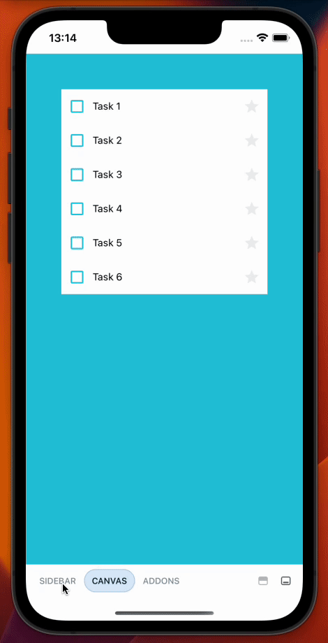
Now check Storybook for the new TaskList stories.
Build out the states
Our component is still rough but now we have an idea of the stories to work toward. You might be thinking that the listitems wrapper is overly simplistic. You're right – in most cases we wouldn’t create a new component just to add a wrapper. But the real complexity of TaskList component is revealed in the edge cases withPinnedTasks, loading, and empty.
For the loading case, we're going to create a new component that will display the loading animation.
Create a new file called LoadingRow.jsx with the following content:
import { useState, useEffect } from 'react';
import { Animated, Text, View, Easing, StyleSheet } from 'react-native';
import { styles } from './styles';

const GlowView = ({ style, children }) => {
  const [glowAnim] = useState(new Animated.Value(0.3));

  useEffect(() => {
    Animated.loop(
      Animated.sequence([
        Animated.timing(glowAnim, {
          toValue: 1,
          duration: 1500,
          easing: Easing.ease,
          useNativeDriver: true,
        }),
        Animated.timing(glowAnim, {
          toValue: 0.3,
          duration: 1500,
          easing: Easing.ease,
          useNativeDriver: true,
        }),
      ])
    ).start();
  }, []);

  return (
    <Animated.View
      style={{
        ...style,
        opacity: glowAnim,
      }}
    >
      {children}
    </Animated.View>
  );
};

export const LoadingRow = () => (
  <View style={styles.container}>
    <GlowView>
      <View style={styles.loadingItem}>
        <View style={styles.glowCheckbox} />
        <Text style={styles.glowText}>Loading</Text>
        <Text style={styles.glowText}>cool</Text>
        <Text style={styles.glowText}>state</Text>
      </View>
    </GlowView>
  </View>
);
And update TaskList.jsx to the following:
import { Task } from './Task';
import { FlatList, StyleSheet, Text, View } from 'react-native';
import { LoadingRow } from './LoadingRow';
import { MaterialIcons } from '@expo/vector-icons';
import { styles } from './styles';

export const TaskList = ({ loading, tasks, onPinTask, onArchiveTask }) => {
  const events = {
    onPinTask,
    onArchiveTask,
  };

  if (loading) {
    return (
      <View style={[styles.listItems, { justifyContent: "center" }]}>
        <LoadingRow />
        <LoadingRow />
        <LoadingRow />
        <LoadingRow />
        <LoadingRow />
        <LoadingRow />
      </View>
    );
  }

  if (tasks.length === 0) {
    return (
      <View style={styles.listItems}>
        <View style={styles.wrapperMessage}>
          <MaterialIcons name="check" size={64} color={"#2cc5d2"} />
          <Text style={styles.titleMessage}>You have no tasks</Text>
          <Text style={styles.subtitleMessage}>Sit back and relax</Text>
        </View>
      </View>
    );
  }

  const tasksInOrder = [
    ...tasks.filter((t) => t.state === 'TASK_PINNED'),
    ...tasks.filter((t) => t.state !== 'TASK_PINNED'),
  ];
  return (
    <View style={styles.listItems}>
      <FlatList
        data={tasksInOrder}
        keyExtractor={(task) => task.id}
        renderItem={({ item }) => (
          <Task key={item.id} task={item} {...events} />
        )}
      />
    </View>
  );
};
These changes result in the following UI:
Success! We accomplished what we set out to do. If we check our updated UI, we can quickly see that our pinned tasks are now featured at the top of the list, matching the intended design. In the next chapters, we'll expand on what we've learned and continue adding complexity to our application by applying these principles to more complex UIs.