Addons
Storybook boasts a robust system of addons with which you can enhance the developer experience for everybody in your team.
😍 You can see the list of officially-supported and strongly-supported community addons here.
We could write forever about configuring and using addons for all of your particular use-cases. For now, let's work towards integrating one of the most popular addons within Storybook's ecosystem: knobs.
Setting Up Knobs
Knobs is an amazing resource for designers and developers to experiment and play with components in a controlled environment without the need to code! You essentially provide dynamically defined fields with which a user manipulates the props being passed to the components in your stories. Here's what we're going to implement...
Installation
First, we will need to install all the necessary dependencies.
yarn add -D @storybook/addon-knobs @storybook/addon-ondevice-knobs
Register Knobs in your storybook/addons.js file.
import '@storybook/addon-actions/register';
import '@storybook/addon-knobs/register';
import '@storybook/addon-links/register';
And also in storybook/rn-addons.js.
import '@storybook/addon-ondevice-actions/register';
import '@storybook/addon-ondevice-knobs/register';
The order you list these addons will dictate the order in which they appear as tabs on your addon panel (for those that appear there).
That's it! Time to use it in a story.
Usage
Let's use the object knob type in the Task component.
First, import the withKnobs decorator and the object knob type to Task.stories.js:
import React from 'react';
import { storiesOf } from '@storybook/react';
import { action } from '@storybook/addon-actions';
import { withKnobs, object } from '@storybook/addon-knobs';
Next, within the stories of Task, pass withKnobs as a parameter to the addDecorator() function:
storiesOf('Task', module).addDecorator(withKnobs).add(/*...*/);
Lastly, integrate the object knob type within the "default" story:
storiesOf('Task', module)
  .addDecorator(withKnobs)
  .add('default', () => <Task task={object('task', { ...task })} {...actions} />)
  .add('pinned', () => <Task task={{ ...task, state: 'TASK_PINNED' }} {...actions} />)
  .add('archived', () => <Task task={{ ...task, state: 'TASK_ARCHIVED' }} {...actions} />);
Now a new "Knobs" tab should show up next to the "Action Logger" tab in the bottom pane.
As documented here, the object knob type accepts a label and a default object as parameters. The label is constant and shows up to the left of a text field in your addons panel. The object you've passed will be represented as an editable JSON blob. As long as you submit valid JSON, your component will adjust based upon the data being passed to the object!
Addons Evolve Your Storybook's Scope
Not only does your Storybook instance serve as a wonderful CDD environment, but now we're providing an interactive source of documentation. PropTypes are great, but a designer or somebody completely new to a component's code will be able to figure out its behavior very quickly via Storybook with the knobs addon implemented.
Using Knobs To Find Edge-Cases
Additionally, with easy access to editing passed data to a component, QA Engineers or preventative UI Engineers can now push a component to the limit! As an example, what happens to Task if our list item has a MASSIVE string?
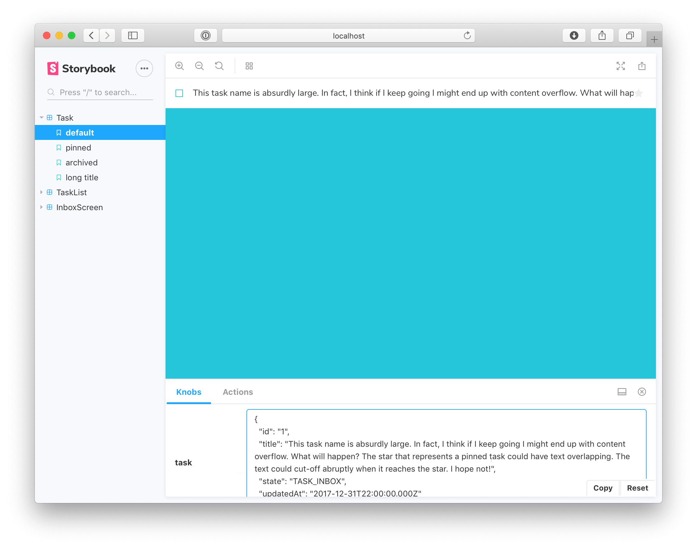 😥
😥
Thanks to quickly being able to try different inputs to a component we can find and fix such problems with relative ease! Let's fix the issue with overflowing by adding a style to Task.js:
// This is the input for our task title. It was changed to a simple text contrary to textinput,
// to illustrate how to see what's intended
<Text
  numberOfLines={1}
  ellipsizeMode="tail"
  style={
    state === 'TASK_ARCHIVED' ? styles.list_item_input_TASK_ARCHIVED : styles.list_item_input_TASK
  }
>
  {title}
</Text>
 👍
👍
Adding A New Story To Avoid Regressions
Of course we can always reproduce this problem by entering the same input into the knobs, but it's better to write a fixed story for this input. This will increase your regression testing and clearly outline the limits of the component(s) to the rest of your team.
Let's add a story for the long text case in Task.stories.js:
const longTitle = `This task's name is absurdly large. In fact, I think if I keep going I might end up with content overflow. What will happen? The star that represents a pinned task could have text overlapping. The text could cut-off abruptly when it reaches the star. I hope not!`;

storiesOf('Task', module)
  .add('default', () => <Task task={task} {...actions} />)
  .add('pinned', () => <Task task={{ ...task, state: 'TASK_PINNED' }} {...actions} />)
  .add('archived', () => <Task task={{ ...task, state: 'TASK_ARCHIVED' }} {...actions} />)
  .add('long title', () => <Task task={{ ...task, title: longTitle }} {...actions} />);
Now we've added the story, we can reproduce this edge-case with ease whenever we want to work on it:

Merge Changes
Don't forget to merge your changes with git!