Distribute UI across an organization
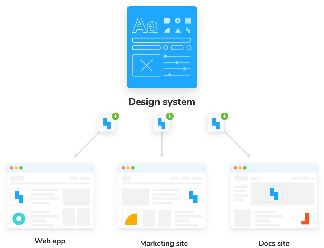
From an architectural perspective, design systems are yet another frontend dependency. They are no different from popular dependencies like moment or lodash. UI components are code, so we can rely on established techniques for code reuse.
This chapter walks through design system distribution from packaging UI components to importing them into other apps. We’ll also uncover time-saving techniques to streamline versioning and release.
Package the design system
Organizations have thousands of UI components spread across different apps. Previously, we extracted the most common components into our design system, and now we need to reintroduce those components back into the apps.
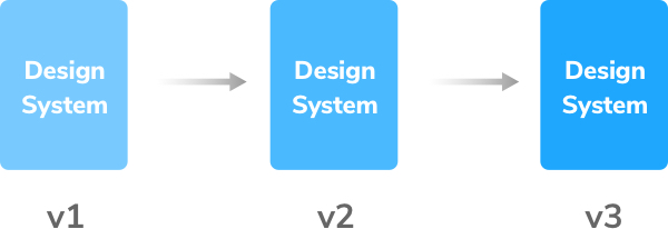
Our design system uses JavaScript package manager npm to handle distribution, versioning, and dependency management.
There are many valid methods for packaging design systems. Gander at design systems from Lonely Planet, Auth0, Salesforce, GitHub, and Microsoft to see a diversity in approaches. Some folks deliver each component as a separate package, and others ship all components in one package.
For nascent design systems, the most direct way is to publish a single versioned package that encapsulates:
- 🏗 Common UI components
- 🎨 Design tokens (a.k.a., style variables)
- 📕 Documentation
Prepare your design system for export
We have utilized a custom template for our development, testing, and documentation purposes. However, we need to improve its descriptive nature before publishing our design system. It's crucial to tidy up some initial artifacts and update the README.md with a detailed description of our design system.
# Storybook design system tutorial

The Storybook design system tutorial is a subset of the full [Storybook design system](https://github.com/storybookjs/design-system/), created as a learning resource for those interested in learning how to write and publish a design system using best in practice techniques.

Learn more in [Storybook tutorials](https://storybook.js.org/tutorials/).
Now, let's examine how we will build the package system. To compile our design system, we'll use Rollup, a JavaScript module bundler that combines small code fragments into bigger libraries or applications. The great thing is that the required settings and common entry points are already included in the src/index.js file and rollup.config.mjs, so there's no need to configure them ourselves.
// src/index.js

import * as styles from './shared/styles';
import * as global from './shared/global';
import * as animation from './shared/animation';
import * as icons from './shared/icons';

export { styles, global, animation, icons };

export * from './Avatar';
export * from './Badge';
export * from './Button';
export * from './Icon';
export * from './Link';
// rollup.config.mjs

import resolve from '@rollup/plugin-node-resolve';
import commonjs from '@rollup/plugin-commonjs';
import terser from '@rollup/plugin-terser';
import peerDepsExternal from 'rollup-plugin-peer-deps-external';
import { babel } from '@rollup/plugin-babel';

// This is required to read package.json file when
// using Native ES modules in Node.js
// https://rollupjs.org/command-line-interface/#importing-package-json
import { createRequire } from 'node:module';
const requireFile = createRequire(import.meta.url);
const packageJson = requireFile('./package.json');

export default [
  {
    input: 'src/index.js',
    output: [
      {
        file: packageJson.main,
        format: 'cjs',
        sourcemap: true,
      },
      {
        file: packageJson.module,
        format: 'esm',
        exports: 'named',
        sourcemap: true,
      },
    ],
    plugins: [
      peerDepsExternal(),
      resolve({
        extensions: ['.js', '.jsx'],
      }),
      commonjs(),
      terser(),
      babel({
        extensions: ['.js', '.jsx'],
        exclude: 'node_modules/**',
      }),
    ],
    external: ['react', 'react-dom', '@emotion/react', '@emotion/styled'],
  },
];
Now we can run yarn build to build our code into the dist directory -- we should add that directory to .gitignore too, so we don't accidentally commit it:
// ...
dist
Adding package metadata for publication
We'll need to make changes to our package.json to ensure our package consumers get all the necessary information. The easiest way to do it is simply running yarn init--a command that initializes the package for publication:
# Initializes a scoped package
yarn init --scope=@your-npm-username

yarn init v1.22.5
question name (learnstorybook-design-system): @your-npm-username/learnstorybook-design-system
question version (0.1.0):
question description (Learn Storybook design system):Storybook design systems tutorial
question entry point (dist/cjs/index.js):
question repository url (https://github.com/your-username/learnstorybook-design-system.git):
question author (your-npm-username <your-email-address@email-provider.com>):
question license (MIT):
question private: no
The command will ask us a set of questions, some of which will be prefilled with answers, others that we’ll have to think about. You’ll need to pick a unique name for the package on npm (you won’t be able to use learnstorybook-design-system -- a good choice is @your-npm-username/learnstorybook-design-system).
All in all, it will update package.json with new values as a result of those questions:
{
  "name": "@your-npm-username/learnstorybook-design-system",
  "description": "Storybook design systems tutorial",
  "version": "0.1.0",
  "license": "MIT",
  "main": "dist/cjs/index.js",
  "repository": "https://github.com/your-username/learnstorybook-design-system.git"
  // ...
}
Now that we’ve prepared our package, we can publish it to npm for the first time!
Release management with Auto
To publish releases to npm, we’ll use a process that also updates a changelog describing changes, sets a sensible version number, and creates git tag linking that version number to a commit in our repository. To help with all those things, we’ll use an open-source tool called Auto, designed for this very purpose. Auto is a command line tool we can use for various common tasks around release management. You can learn more about Auto on their documentation site.
Getting a GitHub and npm token
For the next few steps, Auto will talk to GitHub and npm. For that to work correctly, we’ll need a personal access token. You can get one of those on this page for GitHub. The token will need both repo and workflow scopes.
For npm, you can create a token at the URL: https://www.npmjs.com/settings/<your-username>/tokens.
You’ll need a token with “Read and Publish” permissions.
Let’s add that token to a file called .env in our project:
GH_TOKEN=<value you just got from GitHub>
NPM_TOKEN=<value you just got from npm>
By adding the file to .gitignore, we ensure that we don’t accidentally push this value to an open-source repository that all our users can see! This is crucial. If other maintainers need to publish the package locally (later we’ll set things up to auto-publish when a pull request is merged into the default branch), they should set up their own .env file following this process:
dist
.env
Create labels on GitHub
The first thing we need to do with Auto is to create a set of labels in GitHub. We’ll use these labels in the future when making changes to the package (see the next chapter), and that’ll allow auto to update the package version sensibly and create a changelog and release notes.
yarn auto create-labels
If you check on GitHub, you’ll now see a set of labels that auto would like us to use:
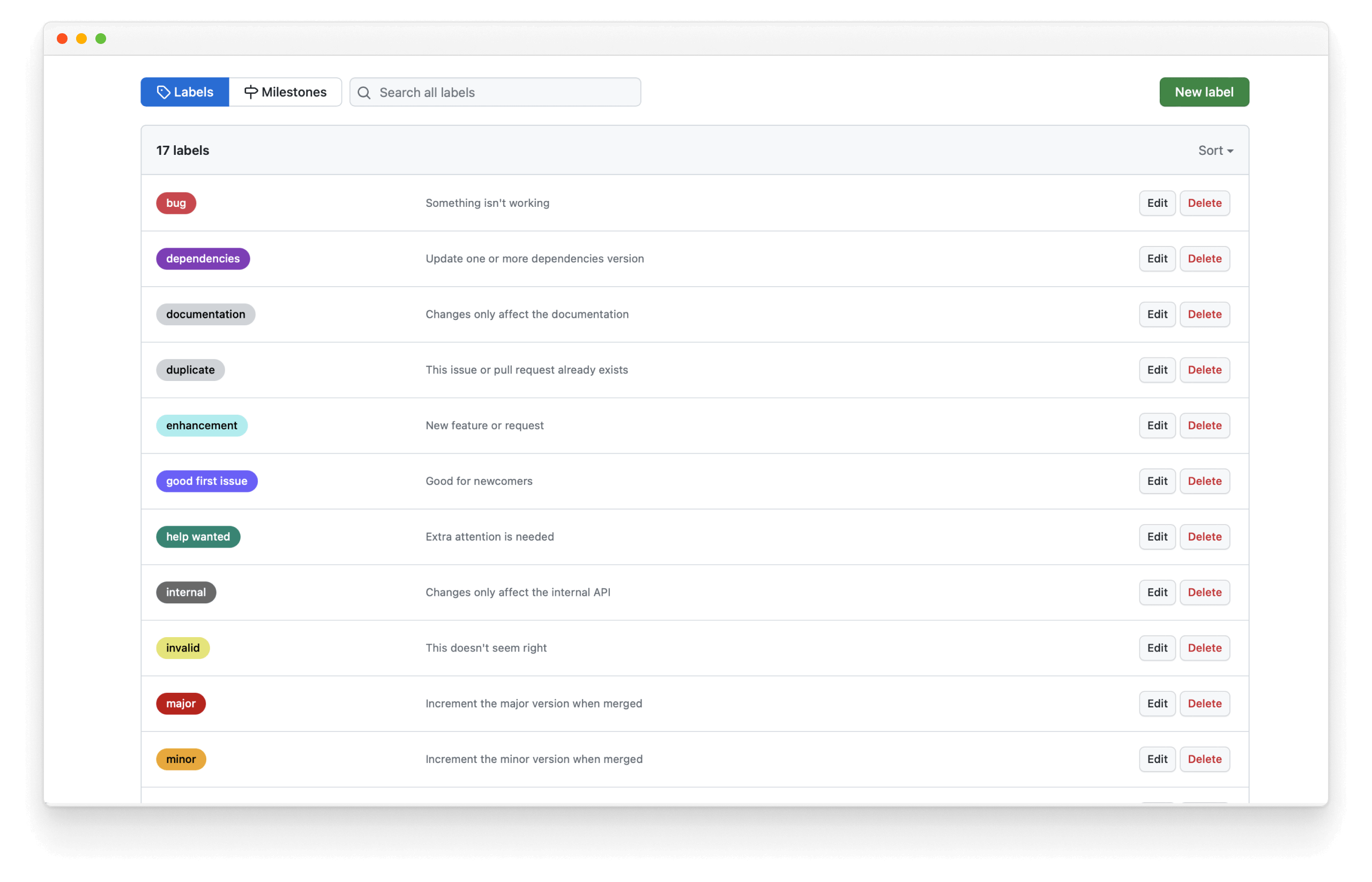
We should tag all future PRs with one of the labels: major, minor, patch, skip-release, prerelease, internal, documentation before merging them.
Publish our first release with Auto manually
In the future, we’ll calculate new version numbers with auto via scripts, but for the first release, let’s run the commands manually to understand what they do. Let’s generate our first changelog entry:
yarn auto changelog
It will generate a long changelog entry with every commit we’ve created so far (and a warning we’ve been pushing to the default branch, which we should stop doing soon).
Although it is helpful to have an auto-generated changelog, so you don’t miss things, it’s also a good idea to manually edit it and craft the message in the most useful way for users. In this case, the users don’t need to know about all the commits along the way. Let’s make a nice simple message for our first v0.1.0 version. First undo the commit that Auto just created (but keep the changes:
git reset HEAD^
Then we’ll update the changelog and commit it:
# v0.1.0 (Mon Jun 12 2023)

- Created first version of the design system, with `Avatar`, `Badge`, `Button`, `Icon` and `Link` components.

#### Authors: 1

- [your-username](https://github.com/your-username)
Let’s add that changelog to git. Note that we use [skip ci] to tell CI platforms to ignore these commits, else we end up in their build and publish loop.
git add CHANGELOG.md
git commit -m "Changelog for v0.1.0 [skip ci]"
Now we can publish:
npm --allow-same-version version 0.1.0 -m "Bump version to: %s [skip ci]"
npm publish --access=public
And use Auto to create a release on GitHub:
git push --follow-tags origin main
yarn release
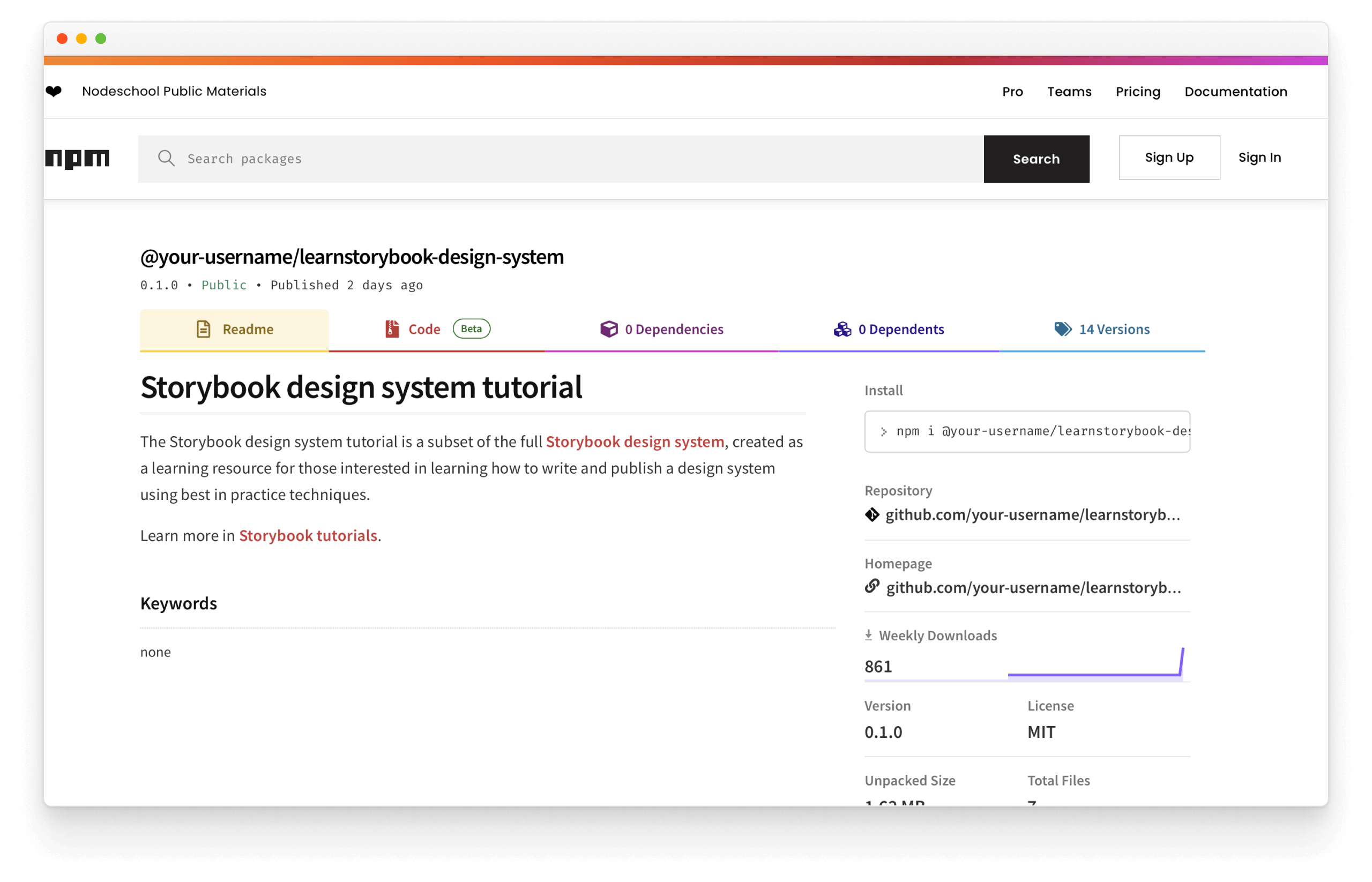
Yay! We’ve successfully published our package to npm and created a release on GitHub (with luck!).
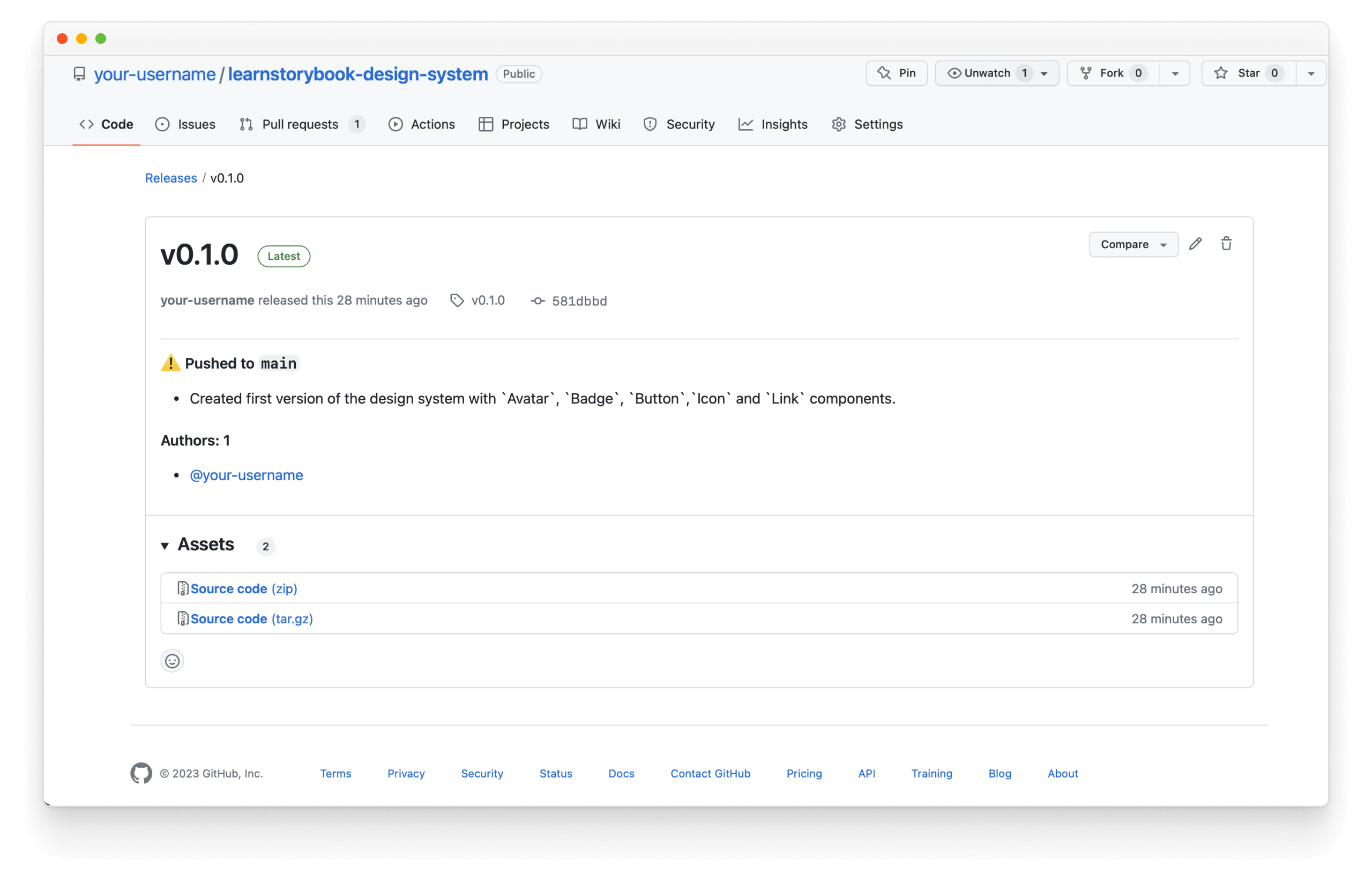
💡 Although we modified the initial release notes to make sense for the first version, auto automatically generates the release notes based on the commit messages for future releases.
Now, when we run yarn release, we’ll go through all the steps we ran above (except using the auto-generated changelog) in an automated fashion. All commits to the default branch will be published.
Congratulations! You set up the infrastructure to manually publish your design system releases. Now learn how to automate releases with continuous integration.
Publish releases automatically
We use GitHub Actions for continuous integration. But before proceeding, we need to securely store the GitHub and NPM tokens from earlier so that Actions can access them.
Add your tokens to GitHub Secrets
GitHub Secrets allow us to store sensitive information in our repository. In a browser window, open your GitHub repository.
Click the ⚙️ Settings tab then the Secrets and variables dropdown in the sidebar, followed by the Actions link. You'll see the following screen:
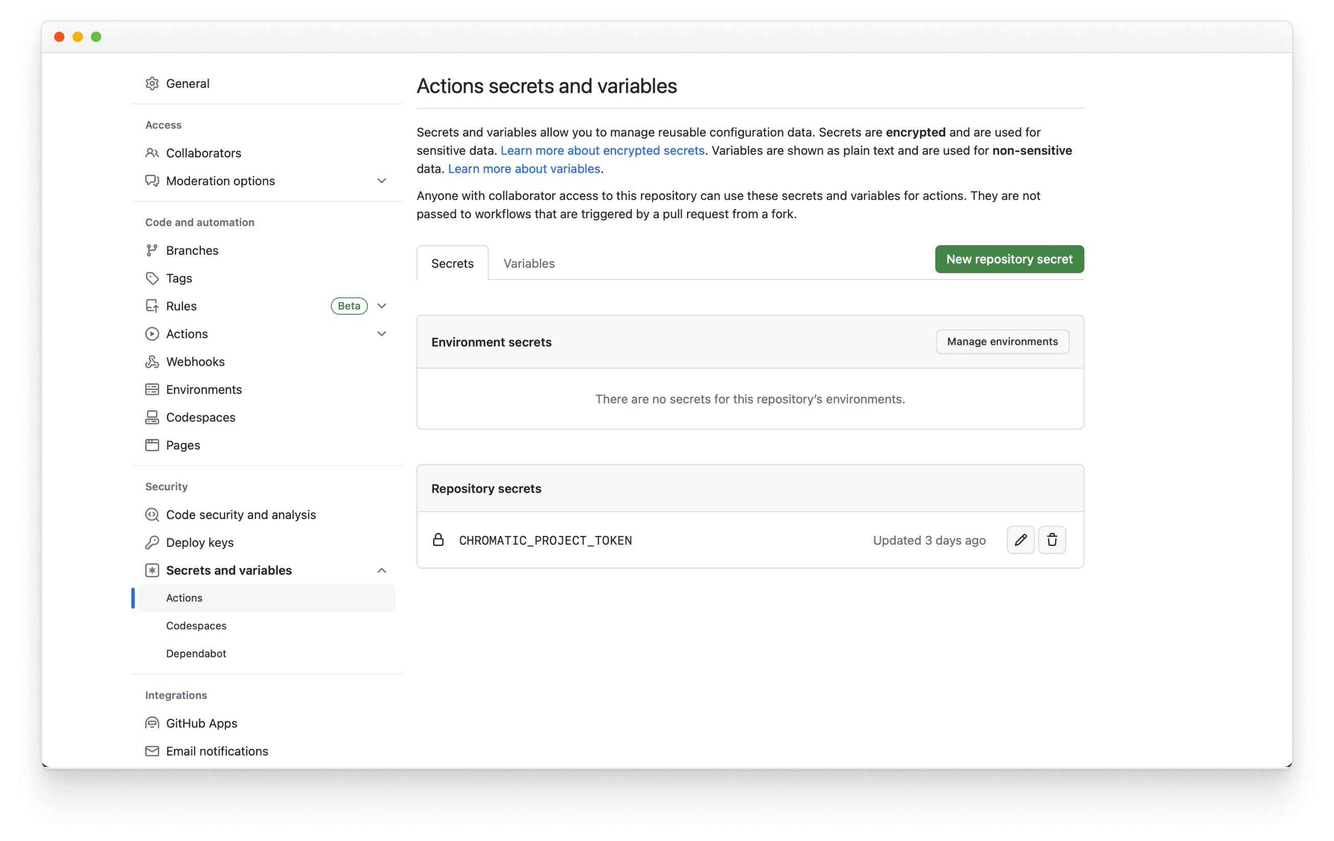
Click the New repository secret button. Use NPM_TOKEN for the name and paste the token you got from npm earlier in this chapter.
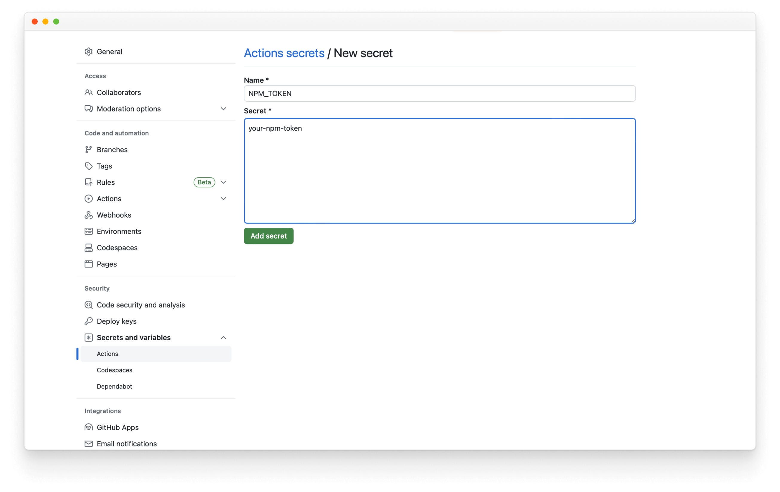
When you add the npm secret to your repository, you'll be able to access it as secrets.NPM_TOKEN. You don't need to set up another secret for your GitHub token. All GitHub users automatically get a secrets.GITHUB_TOKEN associated with their account.
Automate releases with GitHub Actions
Every time we merge a pull request, we want to publish the design system automatically. Create a new file called push.yml in the same folder we used earlier to publish Storybook and add the following:
# Name of our action
name: Release

# The event that will trigger the action
on:
  push:
    branches: [main]

# what the action will do
jobs:
  release:
    runs-on: ubuntu-latest
    if: "!contains(github.event.head_commit.message, 'ci skip') && !contains(github.event.head_commit.message, 'skip ci')"
    steps:
      - uses: actions/checkout@v2

      - name: Prepare repository
        run: git fetch --unshallow --tags
      - name: Use Node.js 16.x
        uses: actions/setup-node@v3
        with:
          node-version: 16
      - name: Install dependencies
        uses: bahmutov/npm-install@v1
      - name: Create Release
        env:
          GITHUB_TOKEN: ${{ secrets.GITHUB_TOKEN }}
          #👇 npm token, see https://storybook.js.org/tutorials/design-systems-for-developers/react/en/distribute/ to obtain it
          NPM_TOKEN: ${{ secrets.NPM_TOKEN }}
        run: |
          yarn release
Save and commit your changes to the remote repository.
Success! Now every time you merge a PR to the default branch, it will automatically publish a new version, incrementing the version number as appropriate due to the labels you’ve added.

Import the design system in an app
Now that our design system lives online installing the dependency and using the UI components is trivial.
Get the example app
Earlier in this tutorial, we standardized on a popular frontend stack that includes React and Emotion. That means our example app must also use React and Emotion to take full advantage of the design system.
💡 Although other techniques, such as Svelte or Web Components, can help distribute UI components without relying on a specific framework, we have focused on the most commonly used and extensively documented methods to ensure a quick start in this tutorial. Rest assured, we will explore other methods in upcoming updates.
The example application uses Storybook to facilitate Component-Driven Development, an application development methodology for building UIs from the bottom, starting with components ending with pages. We’ll run two Storybooks side-by-side during the demo: one for our example app and one for our design system.
Run the following commands in your command line to set up the example app:
# Clones the files locally
npx degit chromaui/learnstorybook-design-system-example-app example-app

cd example-app

# Install the dependencies
yarn install

## Start Storybook
yarn storybook
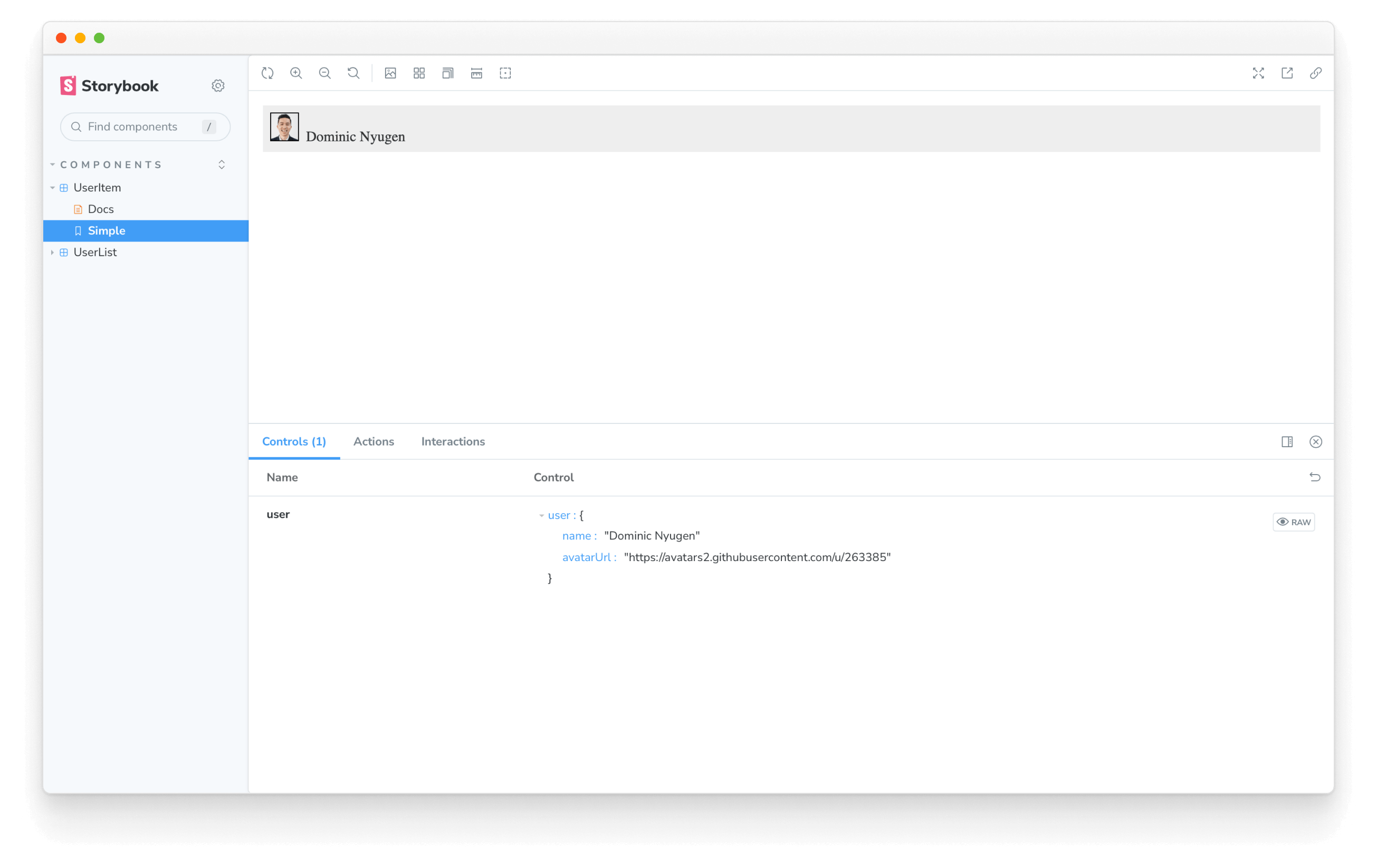
You should see the Storybook running with the stories for the simple components the app uses:
Integrating the design system
We have our design system's Storybook published. Let's add it to our example app. We can do that by updating example app’s .storybook/main.js to the following:
/** @type { import('@storybook/react-vite').StorybookConfig } */
const config = {
  stories: ['../src/**/*.mdx', '../src/**/*.stories.@(js|jsx|ts|tsx)'],
  addons: [
    '@storybook/addon-links',
    '@storybook/addon-essentials',
    '@storybook/addon-interactions',
  ],
  framework: {
    name: '@storybook/react-vite',
    options: {},
  },
  docs: {
    autodocs: 'tag',
  },
+ refs: {
+   "design-system": {
+     title: 'My design system',
+     //👇 The url provided by Chromatic when it was deployed
+     url: 'https://your-published-url.chromatic.com',
+   },
+ },
};
export default config;
refs key to .storybook/main.js, allows us to compose multiple Storybooks into one. This is helpful when working with big projects that might spread around multiple repositories or use different tech stacks.
You’ll now be able to browse the design system components and docs while developing the example app. Showcasing the design system during feature development increases the likelihood that developers will reuse existing components instead of wasting time inventing their own.
We have what we need, time to add our design system and start using it. Run the following command in your terminal:
yarn add @your-npm-username/learnstorybook-design-system
We'll need to use the same global styles defined in the design system, so we'll need to update .storybook/preview.jsx config file and add a global decorator.
import { Global } from '@emotion/react';

// The styles imported from the design system.
import { global as designSystemGlobal } from '@your-npm-username/learnstorybook-design-system';

const { GlobalStyle } = designSystemGlobal;

/** @type { import('@storybook/react').Preview } */
const preview = {
  /*
  * Adds a global decorator to include the imported styles from the design system.
  * More on Storybook decorators at:
  * https://storybook.js.org/docs/react/writing-stories/decorators#global-decorators
  */
  decorators: [
    (Story) => (
      <>
        <Global styles={GlobalStyle} />
        <Story />
      </>
    ),
  ],
  /*
  * More on Storybook parameters at:
  * https://storybook.js.org/docs/react/writing-stories/parameters#global-parameters
  */
  parameters: {
    actions: { argTypesRegex: "^on[A-Z].*" },
    controls: {
      matchers: {
        color: /(background|color)$/i,
        date: /Date$/,
      },
    },
  },
};

export default preview;
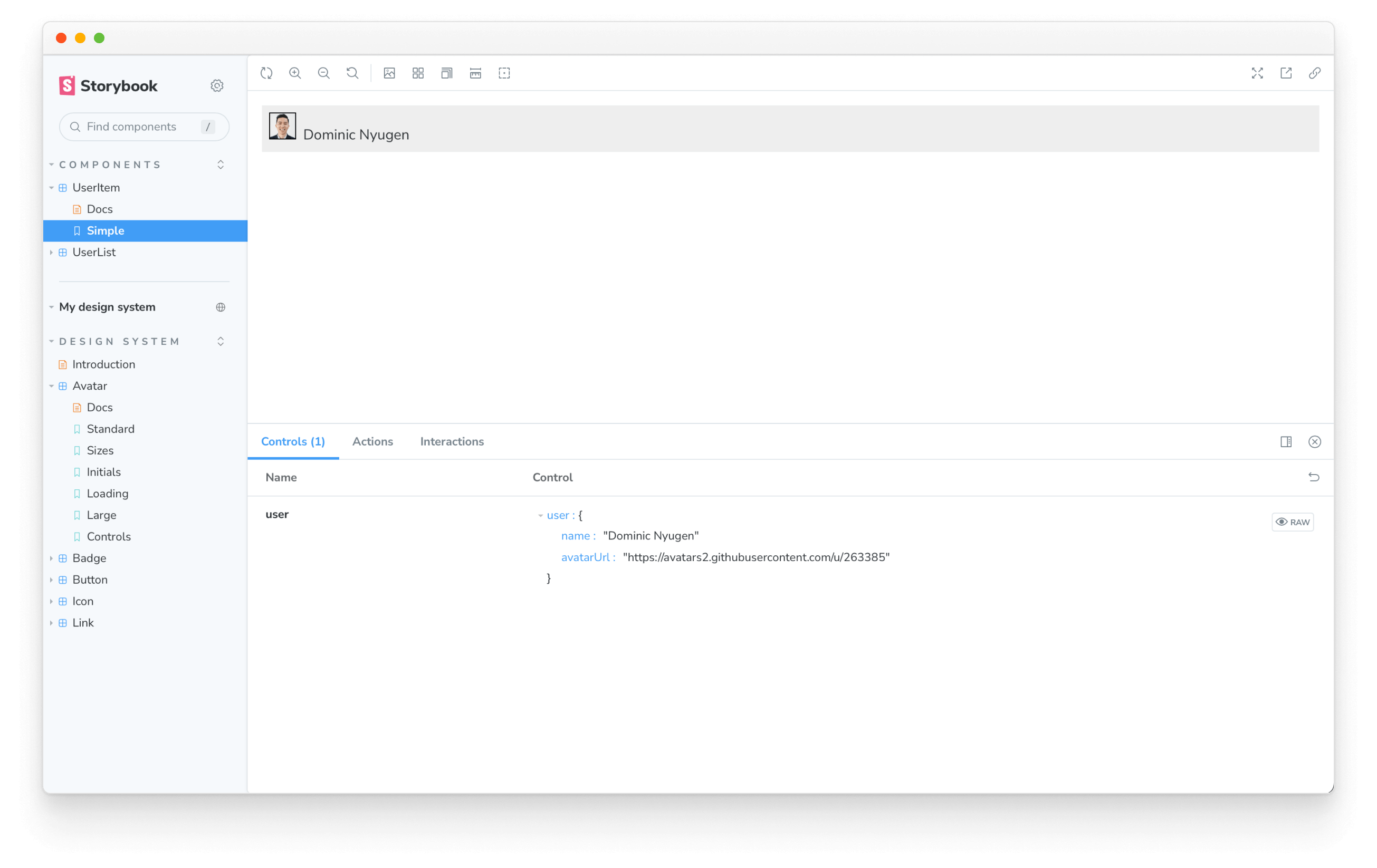
We’ll use the Avatar component from our design system in the example app’s UserItem component. UserItem should render information about a user, including a name and profile photo.
In your editor, open the UserItem component located in src/components/UserItem.js. Also, select UserItem in your Storybook to see the code changes we're about to make instantly with hot module reload.
Import the Avatar component.
import { Avatar } from '@your-npm-username/learnstorybook-design-system';
We want to render the Avatar beside the username.
import PropTypes from 'prop-types';

import styled from '@emotion/styled';

+ import { Avatar } from '@your-npm-username/learnstorybook-design-system';

const Container = styled.div`
  background: #eee;
  margin-bottom: 1em;
  padding: 0.5em;
`;

- const Avatar = styled.img`
-   border: 1px solid black;
-   width: 30px;
-   height: 30px;
-   margin-right: 0.5em;
- `;

const Name = styled.span`
  color: #333;
  font-size: 16px;
`;

export default ({ user: { name, avatarUrl } }) => (
  <Container>
+   <Avatar username={name} src={avatarUrl} />
    <Name>{name}</Name>
  </Container>
);

UserItem.propTypes = {
  user: PropTypes.shape({
    name: PropTypes.string,
    avatarUrl: PropTypes.string,
  }),
};
Upon save, the UserItem component will update in Storybook to show the new Avatar component. Since UserItem is a part of the UserList component, you’ll also see the Avatar in UserList.
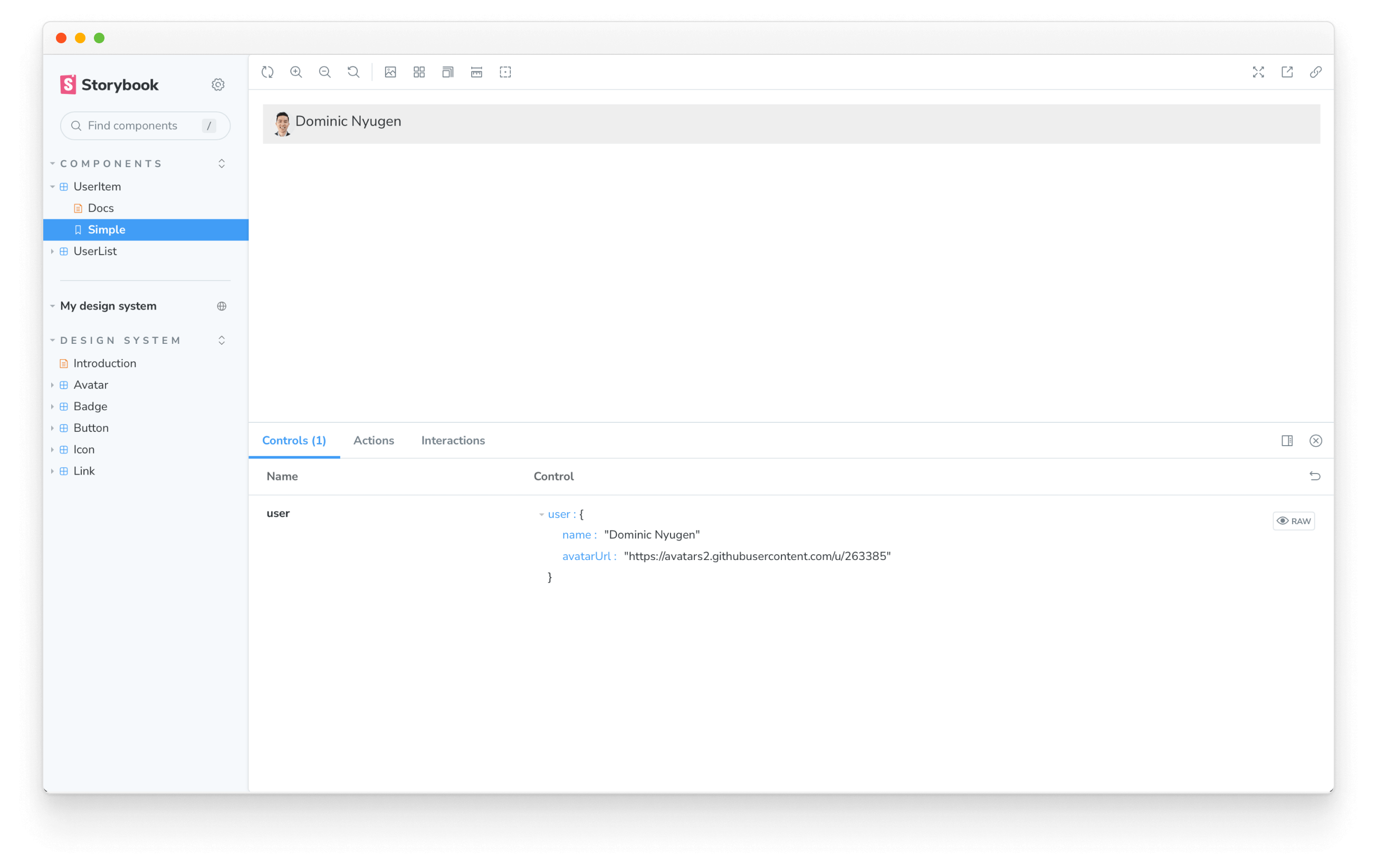
There you have it! You just imported a design system component into the example app. Whenever you publish an update to the Avatar component in the design system, that change will also be reflected in the example app when you update the package.
Master the design system workflow
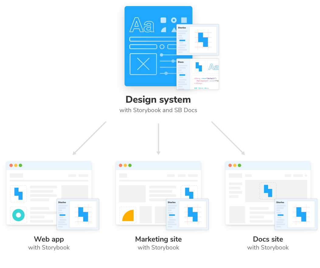
The design system workflow starts with developing UI components in Storybook and ends with distributing them to client apps. That’s not all though. Design systems must continually evolve to serve ever-changing product requirements, and our work has only just begun.
Chapter 8 illustrates the end-to-end design system workflow we created in this guide. We’ll see how UI changes ripple outward from the design system.