Decorators
A decorator is a way to wrap a story in extra “rendering” functionality. Many addons define decorators to augment your stories with extra rendering or gather details about how your story renders.
When writing stories, decorators are typically used to wrap stories with extra markup or context mocking.
Wrap stories with extra markup
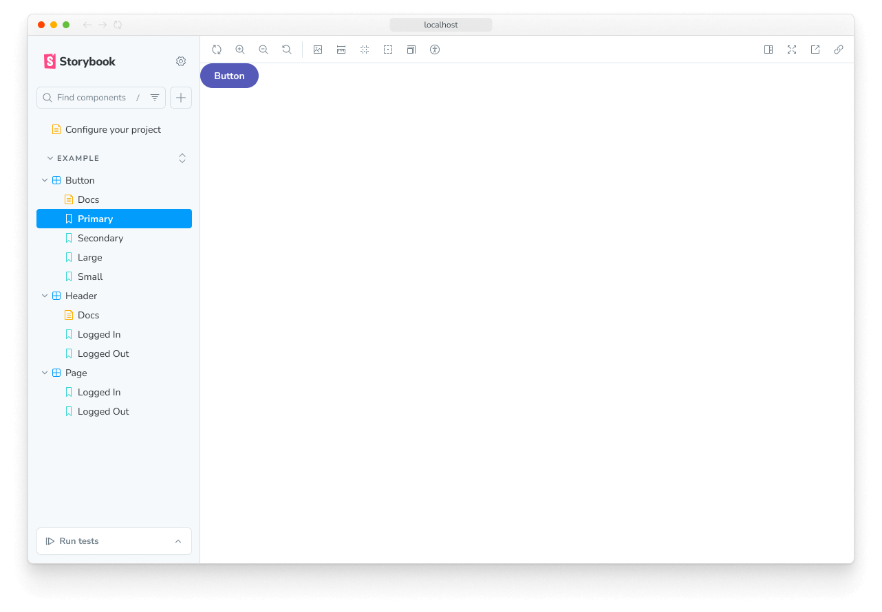
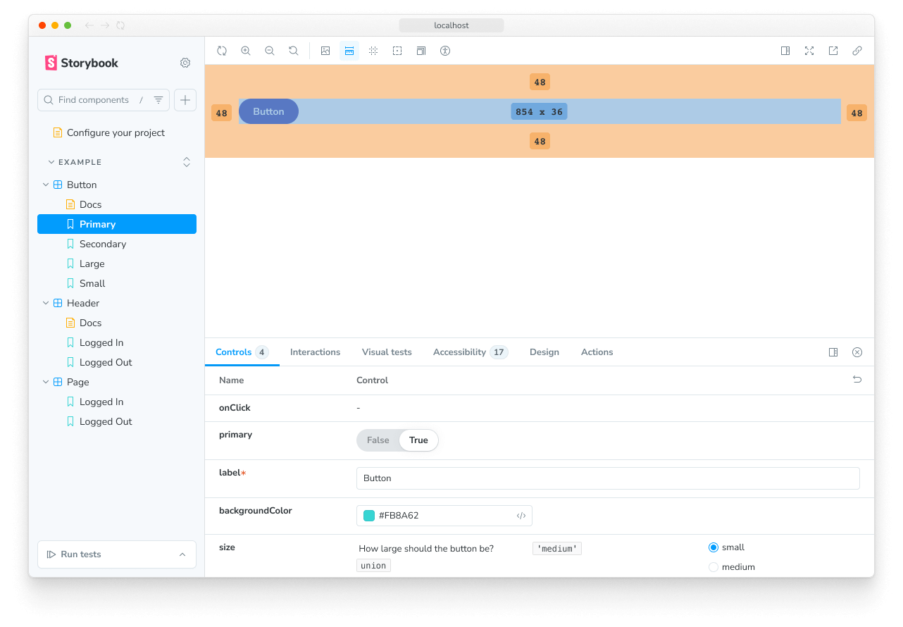
Some components require a “harness” to render in a useful way. For instance, if a component runs right up to its edges, you might want to space it inside Storybook. Use a decorator to add spacing for all stories of the component.

// Replace your-framework with the framework you are using, e.g. react-vite, nextjs, nextjs-vite, etc.
import type { Meta } from '@storybook/your-framework';

import { YourComponent } from './YourComponent';

const meta = {
  component: YourComponent,
  decorators: [
    (Story) => (
      <div style={{ margin: '3em' }}>
        {/* 👇 Decorators in Storybook also accept a function. Replace <Story/> with Story() to enable it  */}
        <Story />
      </div>
    ),
  ],
} satisfies Meta<typeof YourComponent>;

export default meta;
“Context” for mocking
The second argument to a decorator function is the story context which contains the properties:
args- the story arguments. You can use someargsin your decorators and drop them in the story implementation itself.argTypes- Storybook's argTypes allow you to customize and fine-tune your storiesargs.globals- Storybook-wide globals. In particular you can use the toolbars feature to allow you to change these values using Storybook’s UI.hooks- Storybook's API hooks (e.g.,useArgs,useGlobals). These are available in both decorators and story render functions. When using these hooks in a render function alongside framework hooks (e.g., React'suseState,useEffect), use Storybook's hook equivalents fromstorybook/preview-apiinstead to avoid errors on re-render.parameters- the story's static metadata, most commonly used to control Storybook's behavior of features and addons.viewMode- Storybook's current active window (e.g., canvas, docs).
This context can be used to adjust the behavior of your decorator based on the story's arguments or other metadata. For example, you could create a decorator that allows you to optionally apply a layout to the story, by defining parameters.pageLayout = 'page' (or 'page-mobile'):
:
import React from 'react';

// Replace your-framework with the framework you are using (e.g., react-vite, nextjs, nextjs-vite)
import type { Preview } from '@storybook/your-framework';

const preview: Preview = {
  decorators: [
    // 👇 Defining the decorator in the preview file applies it to all stories
    (Story, { parameters }) => {
      // 👇 Make it configurable by reading from parameters
      const { pageLayout } = parameters;
      switch (pageLayout) {
        case 'page':
          return (
            // Your page layout is probably a little more complex than this
            <div className="page-layout">
              <Story />
            </div>
          );
        case 'page-mobile':
          return (
            <div className="page-mobile-layout">
              <Story />
            </div>
          );
        default:
          // In the default case, don't apply a layout
          return <Story />;
      }
    },
  ],
};

export default preview;For another example, see the section on configuring the mock provider, which demonstrates how to use the same technique to change which theme is provided to the component.
Using decorators to provide data
If your components are “connected” and require side-loaded data to render, you can use decorators to provide that data in a mocked way without having to refactor your components to take that data as an arg. There are several techniques to achieve this. Depending on exactly how you are loading that data. Read more in the building pages in Storybook section.
Story decorators
To define a decorator for a single story, use the decorators key on a named export:
// Replace your-framework with the framework you are using, e.g. react-vite, nextjs, nextjs-vite, etc.
import type { Meta, StoryObj } from '@storybook/your-framework';

import { Button } from './Button';

const meta = {
  component: Button,
} satisfies Meta<typeof Button>;

export default meta;
type Story = StoryObj<typeof meta>;

export const Primary: Story = {
  decorators: [
    (Story) => (
      <div style={{ margin: '3em' }}>
        {/* 👇 Decorators in Storybook also accept a function. Replace <Story/> with Story() to enable it  */}
        <Story />
      </div>
    ),
  ],
};
It is useful to ensure that the story remains a “pure” rendering of the component under test and that any extra HTML or components are used only as decorators. In particular the Source Doc Block works best when you do this.
Component decorators
To define a decorator for all stories of a component, use the decorators key of the default CSF export:
// Replace your-framework with the framework you are using, e.g. react-vite, nextjs, nextjs-vite, etc.
import type { Meta } from '@storybook/your-framework';

import { Button } from './Button';

const meta = {
  component: Button,
  decorators: [
    (Story) => (
      <div style={{ margin: '3em' }}>
        {/* 👇 Decorators in Storybook also accept a function. Replace <Story/> with Story() to enable it  */}
        <Story />
      </div>
    ),
  ],
} satisfies Meta<typeof Button>;

export default meta;
Global decorators
We can also set a decorator for all stories via the decorators export of your .storybook/preview.js|ts file (this is the file where you configure all stories):
import React from 'react';

// Replace your-framework with the framework you are using, e.g. react-vite, nextjs, nextjs-vite, etc.
import type { Preview } from '@storybook/your-framework';

const preview: Preview = {
  decorators: [
    (Story) => (
      <div style={{ margin: '3em' }}>
        {/* 👇 Decorators in Storybook also accept a function. Replace <Story/> with Story() to enable it  */}
        <Story />
      </div>
    ),
  ],
};

export default preview;
Decorator inheritance
Like parameters, decorators can be defined globally, at the component level, and for a single story (as we’ve seen).
All decorators relevant to a story will run in the following order once the story renders:
- Global decorators, in the order they are defined
- Component decorators, in the order they are defined
- Story decorators, in the order they are defined, starting from the innermost decorator and working outwards and up the hierarchy in the same order
