Addons
Storybook has a robust ecosystem of addons that you can use to enhance the developer experience for everybody in your team. View them all here.
If you've been following this tutorial, you've already encountered multiple addons and set one up in the Testing chapter.
There are addons for every possible use case, and it would take forever to write about them all. Let's integrate one of the most popular addons: Controls.
What is Controls?
Controls allows designers and developers to easily explore component behavior by playing with its arguments. No code required. Controls creates an addon panel next to your stories, so you can edit their arguments live.
Fresh installs of Storybook include Controls out of the box. No extra configuration needed.
Addons unlock new Storybook workflows
Storybook is a wonderful component-driven development environment. The Controls addon evolves Storybook into an interactive documentation tool.
Using Controls to find edge cases
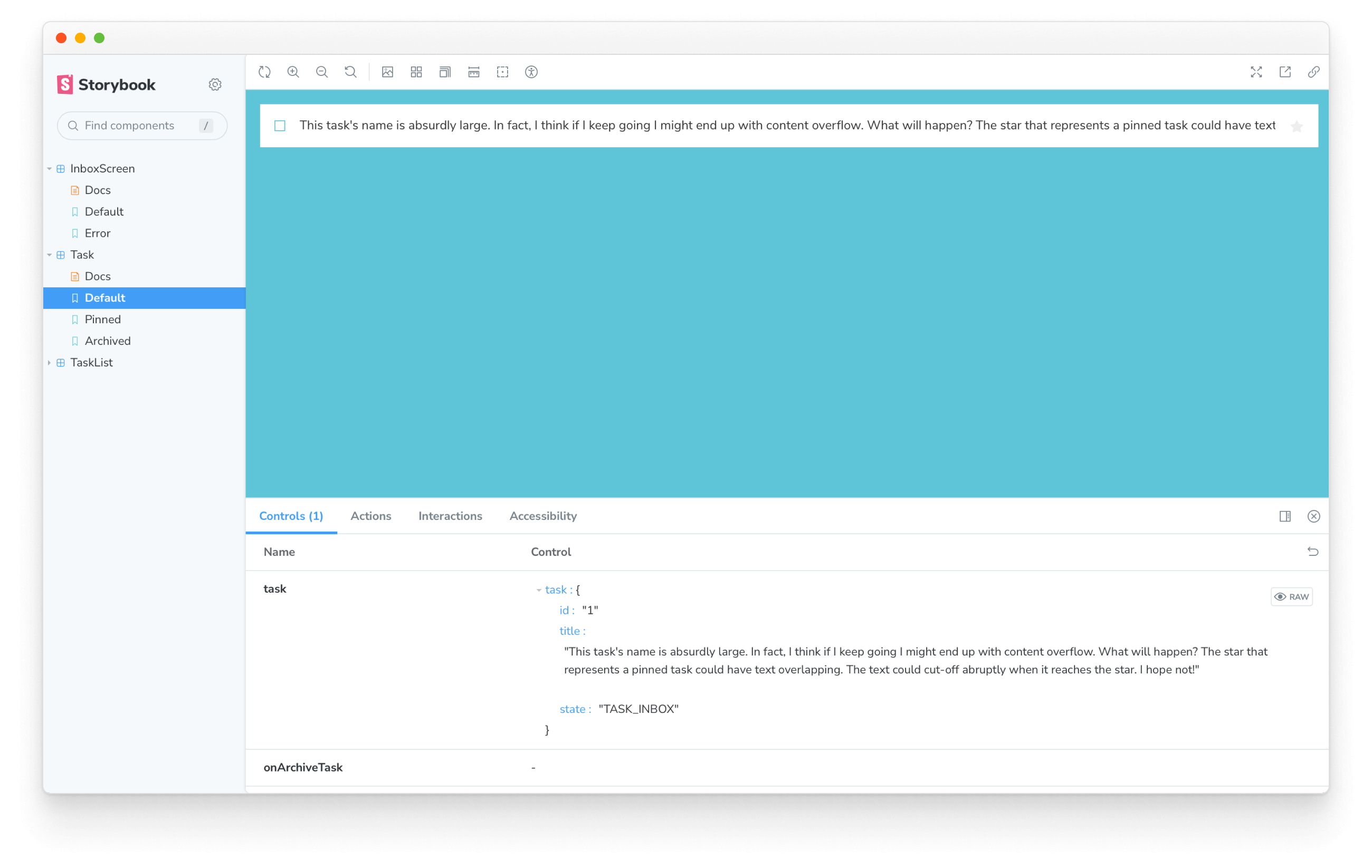
With Controls, QA Engineers, UI Engineers, or any other stakeholder can push the component to the limit! Considering the following example, what would happen to our Task if we added a MASSIVE string?

That's not right! It looks like the text overflows beyond the bounds of the Task component.
Controls allowed us to quickly verify different inputs to a component--in this case, a long string--and reduced the work required to discover UI problems.
Now let's fix the issue with overflowing by adding a style to Task.svelte:
<div class="list-item {task.state}">
  <label
    for={`checked-${task.id}`}
    class="checkbox"
    aria-label={`archiveTask-${task.id}`}
  >
    <input
      type="checkbox"
      checked={isChecked}
      disabled
      name={`checked-${task.id}`}
      id={`archiveTask-${task.id}`}
    />
    <!-- svelte-ignore a11y-click-events-have-key-events -->
    <span
      class="checkbox-custom"
      role="button"
      on:click={ArchiveTask}
      tabindex="-1"
      aria-label={`archiveTask-${task.id}`}
    />
  </label>
  <label for={`title-${task.id}`} aria-label={task.title} class="title">
    <input
      type="text"
      value={task.title}
      readonly
      name="title"
      id={`title-${task.id}`}
      placeholder="Input title"
+     style="text-overflow: ellipsis;"
    />
  </label>
  {#if task.state !== 'TASK_ARCHIVED'}
    <button
      class="pin-button"
      on:click|preventDefault={PinTask}
      id={`pinTask-${task.id}`}
      aria-label={`pinTask-${task.id}`}
    >
      <span class="icon-star" />
    </button>
  {/if}
</div>

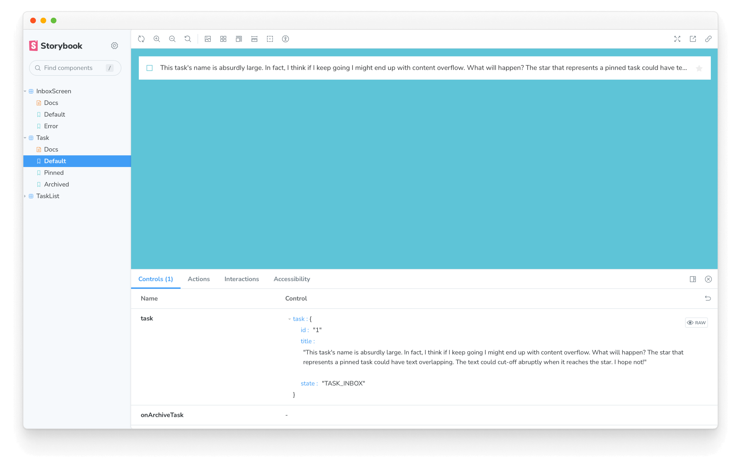
Problem solved! The text is now truncated when it reaches the boundary of the Task area using a handsome ellipsis.
Adding a new story to avoid regressions
In the future, we can manually reproduce this problem by entering the same string via Controls. But it's easier to write a story that showcases this edge case. That expands our regression test coverage and clearly outlines the limits of the component(s) for the rest of the team.
Add a new story for the long text case in Task.stories.js:
const longTitleString = `This task's name is absurdly large. In fact, I think if I keep going I might end up with content overflow. What will happen? The star that represents a pinned task could have text overlapping. The text could cut-off abruptly when it reaches the star. I hope not!`;

export const LongTitle = {
  args: {
    task: {
      ...Default.args.task,
      title: longTitleString,
    },
  },
};
Now we can reproduce and work on this edge case with ease.
If we are visual testing, we'll also be informed if the truncating solution breaks. Obscure edge cases are liable to be forgotten without test coverage!
💡 Controls is a great way to get non-developers playing with your components and stories. It can do much more than we've seen here; we recommend reading the official documentation to learn more about it. However, there are many more ways you can customize Storybook to fit your workflow with addons. In the create an addon guide we'll teach you that, by creating an addon that will help you supercharge your development workflow.
Merge Changes
Don't forget to merge your changes with git!