Accessibility testing with Storybook
26% of adults in the US have at least one disability. When you improve accessibility, it has an outsized impact on your current and future customers. It’s also a legal requirement.
The most accurate way to check accessibility is manually on real devices. But that requires specialized expertise and a lot of time, both of which are scarce on frontend teams.
That's why many companies now use a combination of automated and manual testing. Automation catches common accessibility issues with low effort from developers. Manual QA is reserved for trickier problems that require human attention.
There are plenty of resources that dive deep into accessibility principles, so we won't get into that here. Instead, we'll focus on how to automate accessibility testing with Storybook. It's a pragmatic approach to finding and fixing most issues you're likely to encounter.
Why automation?
Before we begin, let’s examine common types of disabilities: visual, hearing, mobility, cognition, speech, and neurological. These user disabilities yield app requirements like:
- ⌨ Keyboard navigation
- 🗣 Screen reader support
- 👆 Touch-friendly
- 🎨 High enough colour contrast
- ⚡️ Reduced motion
- 🔍 Zoom
In the past, you’d verify each of these requirements by checking every component across a combination of browsers, devices, and screen readers. But that’s impractical to do by hand because apps have dozens of components and are constantly updating the UI.
Automation speeds up your workflow
Automated tools audit the rendered DOM against a set of heuristics based on WCAG rules and other industry-accepted best practices. They act as the first line of QA to catch blatant accessibility violations.
For example, Axe, on average, finds 57% of WCAG issues automatically. That allows teams to focus their expert resources on the more complex issues that require manual review.
Many teams use the Axe library because it integrates with most existing test environments. For example, the Twilio Paste team uses the jest-axe integration. Whereas the Shopify Polaris & Adobe Spectrum teams use the Storybook addon version.
The Storybook addon runs checks in the browser (as opposed to jsdom for Jest) and can therefore catch issues such as low contrast. However, it does require you to manually verify each story.
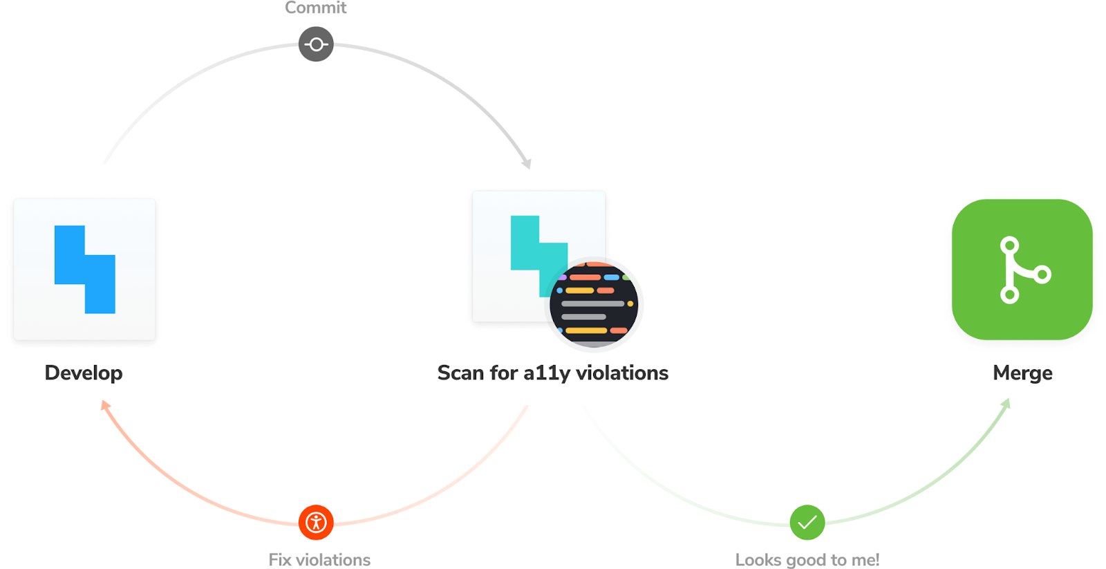
Accessibility testing workflow
By running these checks throughout the development process, you shorten the feedback loop and fix issues faster. Here’s what the workflow looks like:
- 👨🏽💻 During development: use Storybook to focus on one component at a time. Use the A11y addon to simulate vision defects and run an accessibility audit at the component level.
- ✅ For QA: integrate the Axe audit into your functional testing pipeline. Run checks on all components to catch regressions.
Let’s see this workflow in action.
Install the accessibility addon
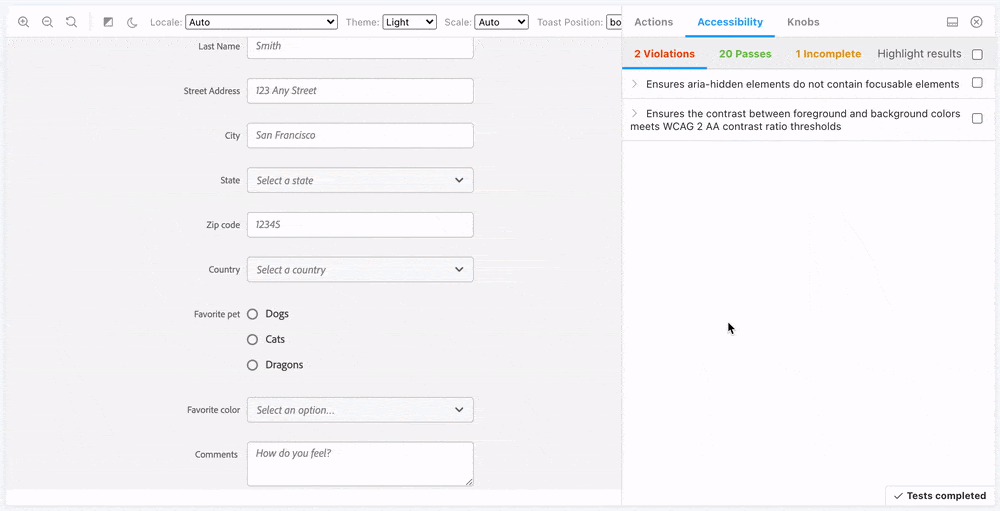
Storybook’s Accessibility runs Axe on the active story. It visualizes the test results in a panel and outlines all DOM nodes that have a violation.
To install the addon, run: yarn add --dev @storybook/addon-a11y. Then, add '@storybook/addon-a11y' to the addons array in your .storybook/main.js:
/** @type { import('@storybook/react-vite').StorybookConfig } */
const config = {
  stories: ['../src/**/*.stories.@(js|jsx|ts|tsx)'],
  staticDirs: ['../public'],
  addons: [
    '@storybook/addon-links',
    '@storybook/addon-essentials',
    '@storybook/addon-interactions',
+   '@storybook/addon-a11y',
  ],
  framework: {
    name: '@storybook/react-vite',
    options: {},
  },
};
export default config;
Testing accessibility as you code
We've already isolated the Task component and captured all its use cases as stories. During the development phase, you can cycle through these stories to spot accessibility issues.
import Task from './Task';

export default {
  component: Task,
  title: 'Task',
  argTypes: {
    onArchiveTask: { action: 'onArchiveTask' },
    onTogglePinTask: { action: 'onTogglePinTask' },
    onEditTitle: { action: 'onEditTitle' },
  },
};

export const Default = {
  args: {
    task: {
      id: '1',
      title: 'Buy milk',
      state: 'TASK_INBOX',
    },
  },
};

export const Pinned = {
  args: {
    task: {
      id: '2',
      title: 'QA dropdown',
      state: 'TASK_PINNED',
    },
  },
};

export const Archived = {
  args: {
    task: {
      id: '3',
      title: 'Write schema for account menu',
      state: 'TASK_ARCHIVED',
    },
  },
};

const longTitleString = `This task's name is absurdly large. In fact, I think if I keep going I might end up with content overflow. What will happen? The star that represents a pinned task could have text overlapping. The text could cut-off abruptly when it reaches the star. I hope not!`;

export const LongTitle = {
  args: {
    task: {
      id: '4',
      title: longTitleString,
      state: 'TASK_INBOX',
    },
  },
};
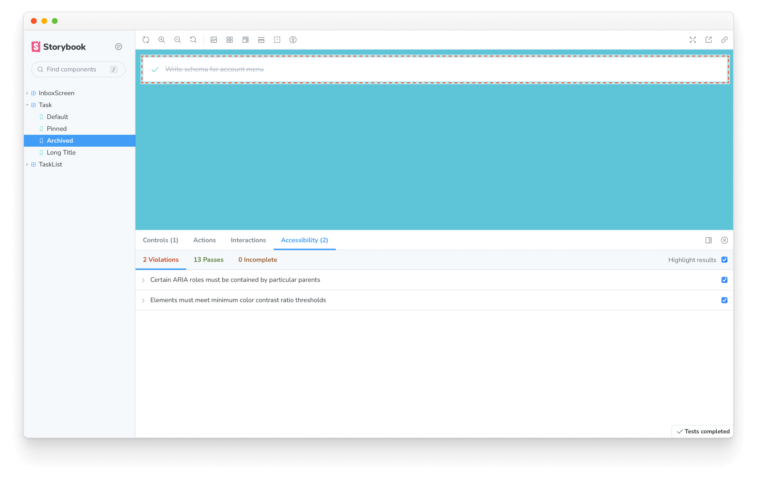
Notice how the addon found two violations. The first, “Elements must meet minimum color contrast ratio thresholds,” is specific to the archived state. Essentially what it means there isn't enough contrast between the task title and the background. We can quickly fix it by changing the text color to a darker gray in our application's CSS (located in src/index.css).
.list-item.TASK_ARCHIVED input[type="text"] {
- color: #a0aec0;
+ color: #4a5568;
  text-decoration: line-through;
}
The second violation, “Certain ARIA roles must be contained by particular parents” indicates incorrect DOM structure. The Task component renders just a <li> element. So we need to update our stories to wrap the component in an <ul> element.
import Task from './Task';

export default {
  component: Task,
  title: 'Task',
  argTypes: {
    onArchiveTask: { action: 'onArchiveTask' },
    onTogglePinTask: { action: 'onTogglePinTask' },
    onEditTitle: { action: 'onEditTitle' },
  },
};

/*
*👇 Wraps the component with a custom render function.
* See https://storybook.js.org/docs/api/csf
* to learn how to use render functions.
*/
export const Default = {
  render: (args) => (
    <ul>
      <Task {...args} />
    </ul>
  ),
  args: {
    task: {
      id: '1',
      title: 'Buy milk',
      state: 'TASK_INBOX',
    },
  },
};

export const Pinned = {
  render: (args) => (
    <ul>
      <Task {...args} />
    </ul>
  ),
  args: {
    task: {
      id: '2',
      title: 'QA dropdown',
      state: 'TASK_PINNED',
    },
  },
};

export const Archived = {
  render: (args) => (
    <ul>
      <Task {...args} />
    </ul>
  ),
  args: {
    task: {
      id: '3',
      title: 'Write schema for account menu',
      state: 'TASK_ARCHIVED',
    },
  },
};

const longTitleString = `This task's name is absurdly large. In fact, I think if I keep going I might end up with content overflow. What will happen? The star that represents a pinned task could have text overlapping. The text could cut-off abruptly when it reaches the star. I hope not!`;

export const LongTitle = {
  render: (args) => (
    <ul>
      <Task {...args} />
    </ul>
  ),
  args: {
    task: {
      id: '4',
      title: longTitleString,
      state: 'TASK_INBOX',
    },
  },
};
You can now repeat this process for all other components.
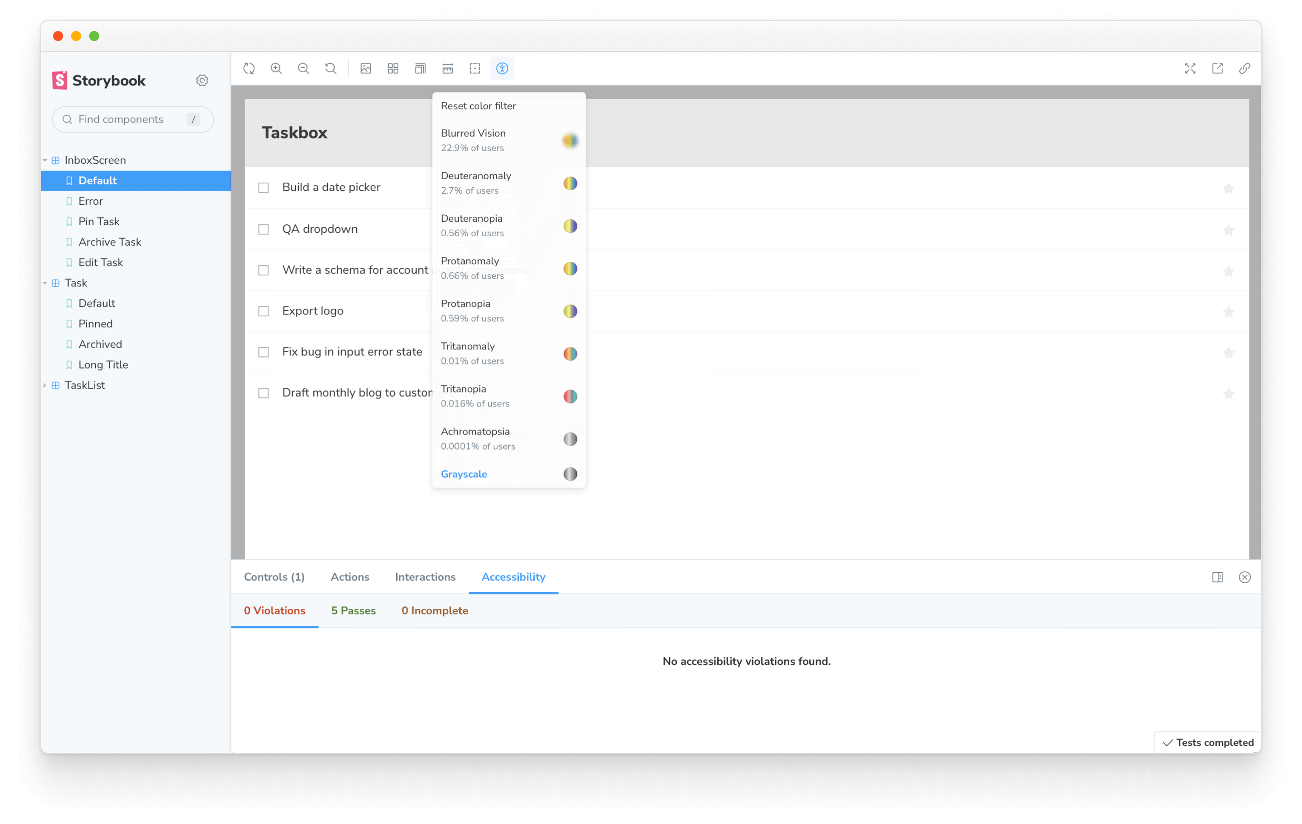
Integrating accessibility testing into Storybook streamlines your development workflow. You don’t have to jump between different tools while working on a component. Everything you need is right there in the browser. You can even simulate visual impairments such as deuteranomaly, protanomaly or tritanopia.
Catch regressions automatically with the test runner
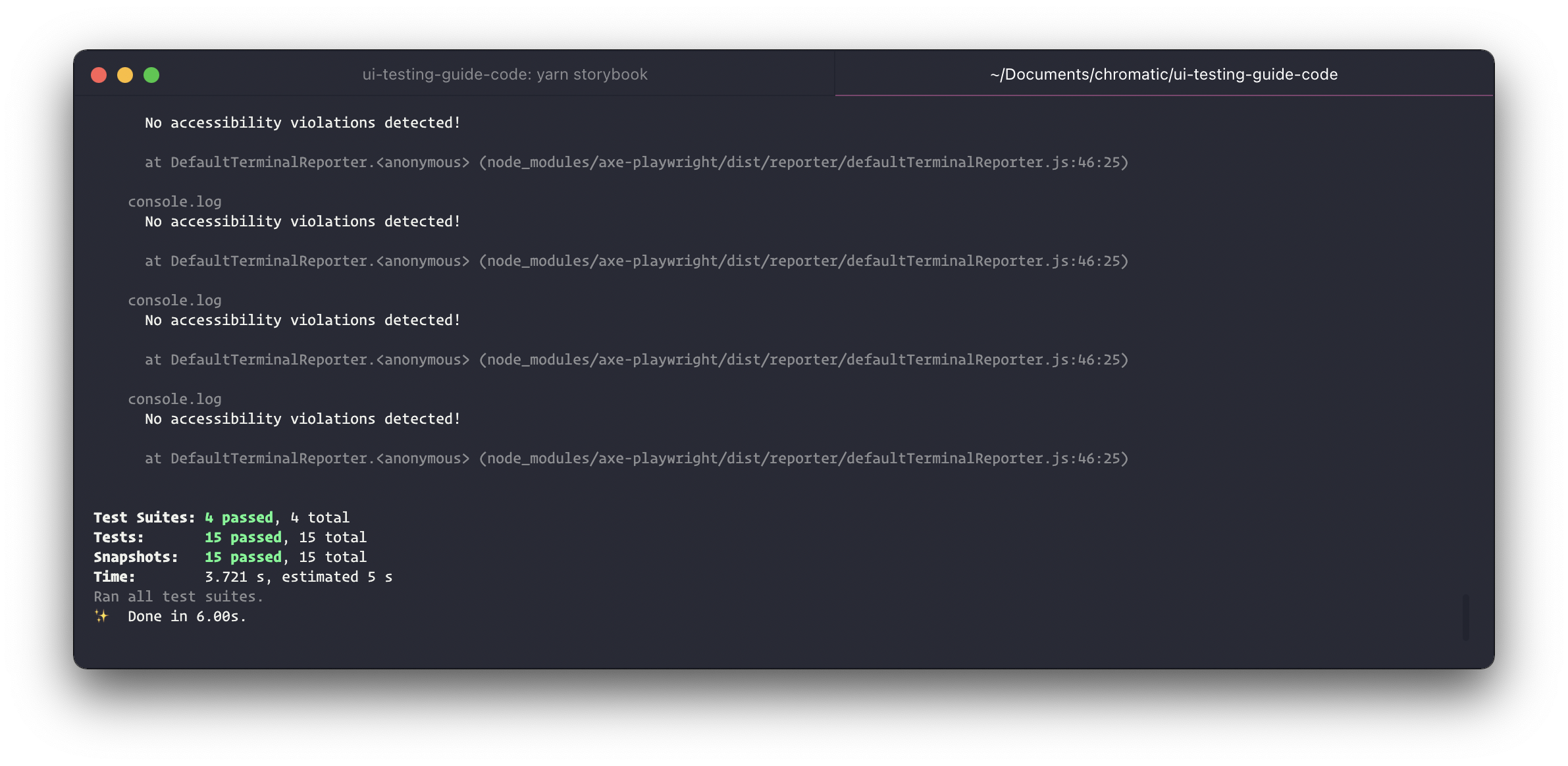
Often, changes to a component can unintentionally introduce new accessibility issues. To catch such regressions, you'll want to test all your stories before opening a pull request. However, the Accessibility addon only runs checks when you’re viewing a story. To test all stories at once we can use the Storybook test runner. It’s a standalone utility (powered by Jest and Playwright) that checks for rendering errors in stories.
Let’s go ahead and configure the test runner to run Axe. We’ll start by installing axe-playwright.
yarn add --dev axe-playwright
Add a new configuration file inside your Storybook directory with the following inside:
const { injectAxe, checkA11y } = require('axe-playwright');

module.exports = {
  async preVisit(page) {
    await injectAxe(page);
  },
  async postVisit(page) {
    await checkA11y(page, "#storybook-root", {
      detailedReport: true,
      detailedReportOptions: {
        html: true,
      },
    });
  },
};
preVisit and postVisit are convenient hooks that allow you to configure the test runner to perform additional tasks. We're using those hooks to inject Axe into a story, and then once it renders, run the accessibility test.
You’ll notice a few options passed into the checkA11y function. We’ve set up Axe to start at the story's root element and then traverse down the DOM tree to check for issues. It will also generate a detailed report based on the issues it encountered and output a list of HTML elements that violated accessibility rules.
To run the tests, start your Storybook in one terminal window with yarn storybook and the test runner in another with yarn test-storybook.
Catching integration issues
UIs are assembled by composing components and wiring them up to data and APIs. That's a lot of potential points of failure. Next up, we'll look at using Cypress to catch integration issues by testing all layers of your system in one go.