Visual testing in Storybook
It's tough to ship bug-free UIs. In the past, developers used unit and snapshot tests to scan for bugs in blobs of HTML. But those methods don't represent what the user actually sees, so bugs never went away.
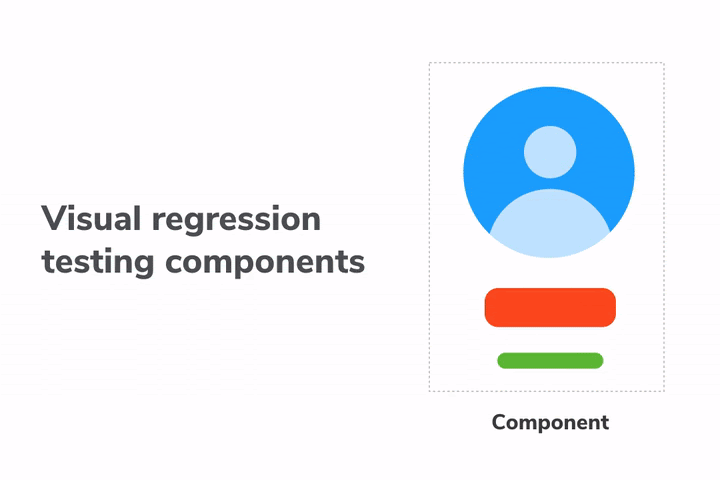
Visual testing catches bugs by capturing and comparing image snapshots in a real browser. It allows you to automate the process of checking if your UI looks right.
What are visual bugs?
Visual bugs are ubiquitous. Cut-off elements. Incorrect colors or font styles. Broken layouts. And missing error states.
Every company is now a software company. That means every company is responsible for maintaining a UI. But if you’re like me, you probably noticed that companies never seem to have enough people monitor every part of their UI all the time.
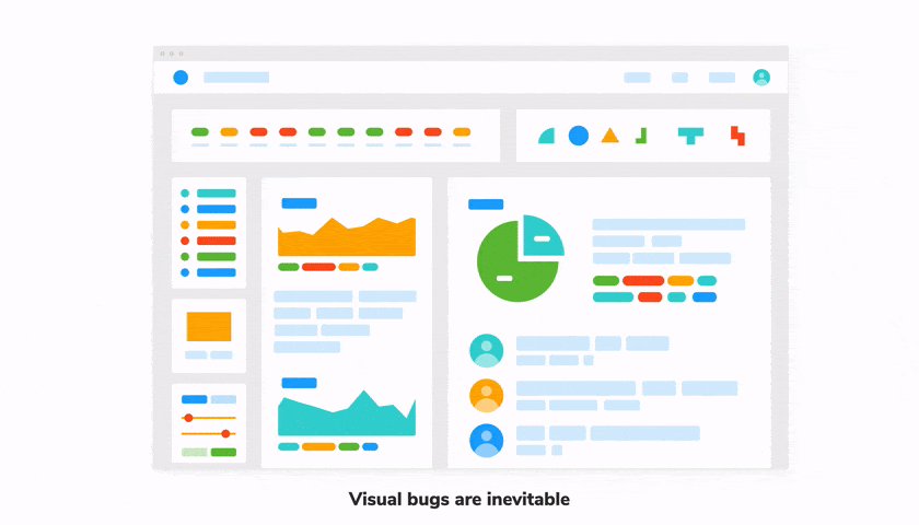
Visual bugs are the unintentional errors in your UIs appearance that make it look untrustworthy. They’re the regressions that are easy to eyeball but that common testing methods can’t catch.
Most tests are intended to verify logic, which makes sense: you run a function, get its output and check whether it's correct or not. Computers are great at verifying data. But what about how something looks?
Well, there are two layers to this problem.
1. Does it look right?
Take, for example, this Task component. It looks different depending on what state it’s in. We display a checked (or unchecked) checkbox, some information about the task, and a pin button. And of course, all the associated styling.

The first challenge is just to verify the component's appearance in all these scenarios. That requires a lot of fiddling with props & state to set up and test each case. Oh, and computers can’t really tell you if it matches the spec or not. You, the developer, have to visually inspect it.
2. Does it still look right?
You built it right the first time. It looks good in all states. But changes happen over the natural course of development. Bugs inevitably sneak in. This is especially true for interfaces. A minor CSS tweak can break a component or one of its states.
You can’t manually check the breadth of the UI every time you make a change. You need something more automated.
Visual testing
Visual testing allows you to tackle both these tasks with one unified workflow. It is the process of verifying the appearance of a component as you’re building it. And again as you iterate to ship new features.
Here's what the visual testing workflow looks like:
- 🏷 Isolate components. Use Storybook to focus on and test one component at a time.
- ✍🏽 Write out the test cases. Each state is reproduced using props and mock data.
- 🔍 Manually verify the appearance of each test case.
- 📸 Catch UI bugs automatically. Capture snapshots of each test case and use machine-based diffing to check for regressions.
The crux of visual testing is isolating the UI from the rest of the app (data, backend, APIs). That allows you to observe each state individually. You can then manually spot check and automatically regression test those states.
Let's go through each step in detail.
1. Isolate components
It’s much easier to pinpoint bugs by testing one component at a time and writing a test case for each of its states. The conventional approach is to build the component on the application page where it is first used. Which makes it hard to simulate and verify all these states. There’s a better way—Storybook.
Storybook is the industry-standard for building components in isolation. It’s used by Twitter, Slack, Airbnb, Shopify, Stripe, and Microsoft. It is packaged as a small standalone tool that lives alongside your app, giving you:
- 📥 A sandbox to render each component in isolation
- 🔭 Visualize all its states as stories
- 📑 Document props and usage guidelines for each component
- 🗃️ A directory of all your components to make discovery easier
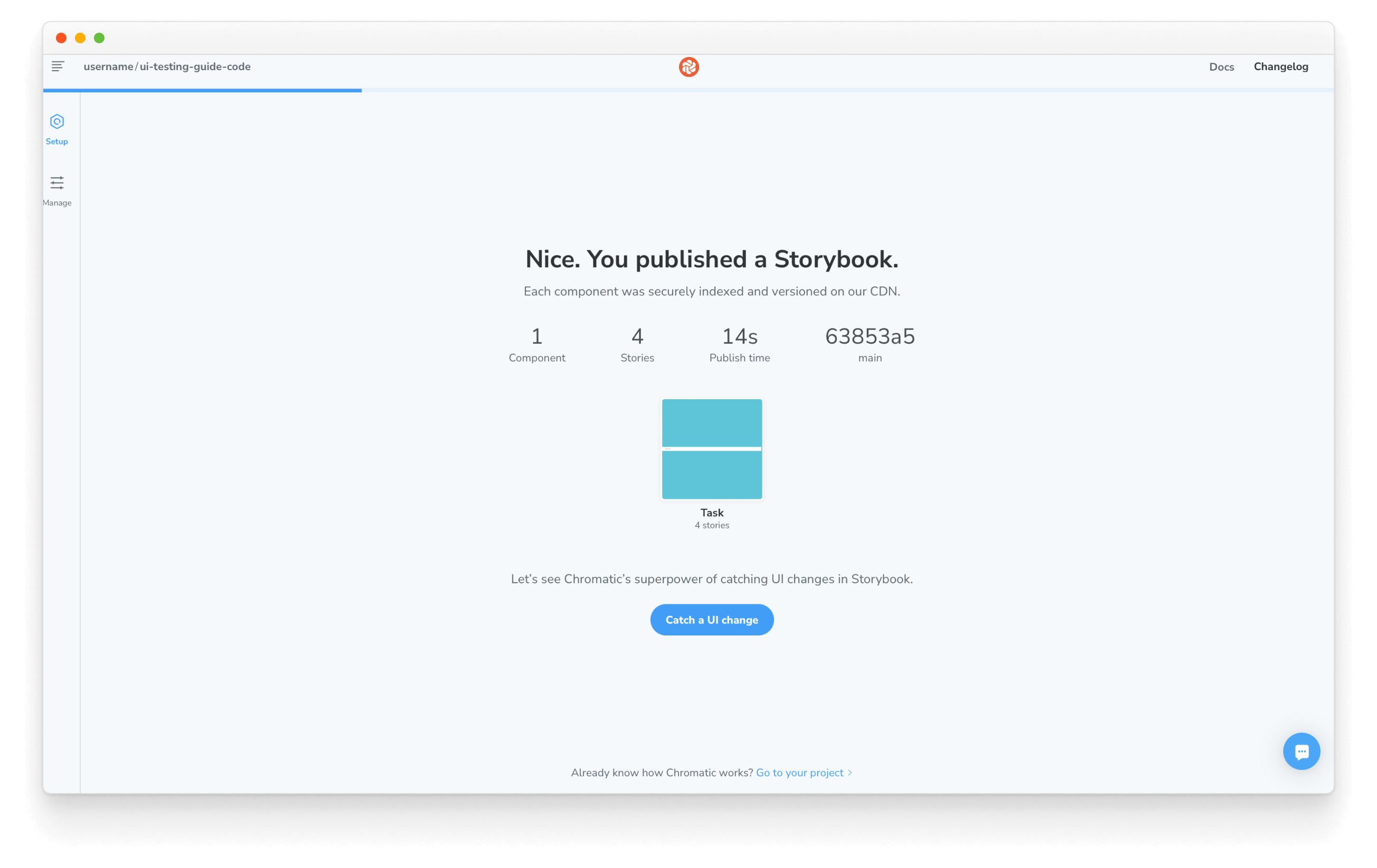
Let’s go back to that Task component. To isolate it means that we load up and render this one component by itself. For that, we need Storybook.
Set up Storybook
Our project is preconfigured to use Storybook. The config lives in the .storybook folder and all the necessary scripts have been added to package.json.
We can start by creating a story file for the Task component. This registers the component with Storybook and adds in one default test case.
import Task from './Task';

export default {
  component: Task,
  title: 'Task',
  argTypes: {
    onArchiveTask: { action: 'onArchiveTask' },
    onTogglePinTask: { action: 'onTogglePinTask' },
    onEditTitle: { action: 'onEditTitle' },
  },
};

export const Default = {
  args: {
    task: {
      id: '1',
      title: 'Buy milk',
      state: 'TASK_INBOX',
    },
  },
};
And finally, run the following command to start Storybook in development mode. You should see the Task component load up.
yarn storybook
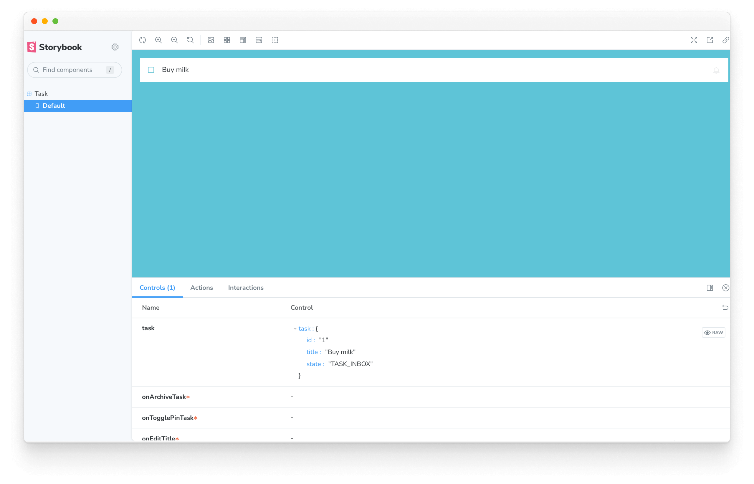
We're now ready to write out the test cases.
2. Write test cases
In Storybook, test cases are referred to as stories. A story captures a particular state of the component—the actual rendered state in the browser.
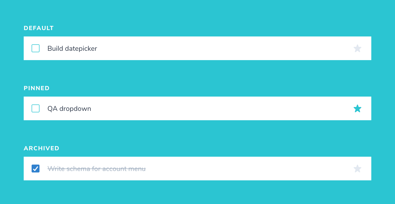
The Task component has three states—default, pinned and archived. We’ll add a story for each one.
import Task from './Task';

export default {
  component: Task,
  title: 'Task',
  argTypes: {
    onArchiveTask: { action: 'onArchiveTask' },
    onTogglePinTask: { action: 'onTogglePinTask' },
    onEditTitle: { action: 'onEditTitle' },
  },
};

export const Default = {
  args: {
    task: {
      id: '1',
      title: 'Buy milk',
      state: 'TASK_INBOX',
    },
  },
};

export const Pinned = {
  args: {
    task: {
      id: '2',
      title: 'QA dropdown',
      state: 'TASK_PINNED',
    },
  },
};

export const Archived = {
  args: {
    task: {
      id: '3',
      title: 'Write schema for account menu',
      state: 'TASK_ARCHIVED',
    },
  },
};
3. Verify
Verification is you evaluating how the component looks in Storybook. That is, does it match the design spec?
The usual development workflow is:
- Edit the code
- Get the component in the appropriate state
- Evaluate its appearance
And then repeat the whole cycle until you’ve verified all its states.
By writing a story for each state, you cut out that second step. You can go right from editing code to verifying all test cases. Thus, dramatically speeding up the whole process.
Writing out stories also surfaces scenarios that you wouldn't have considered had you developed it in a more ad-hoc way. For example, what happens if the user enters a really long task? Let's add in that story to find out.
const longTitleString = `This task's name is absurdly large. In fact, I think if I keep going I might end up with content overflow. What will happen? The star that represents a pinned task could have text overlapping. The text could cut-off abruptly when it reaches the star. I hope not!`;

export const LongTitle = {
  args: {
    task: {
      id: '4',
      title: longTitleString,
      state: 'TASK_INBOX',
    },
  },
};
Now that we've verified the appearance of each test case, we can move on to the next step. Catching regressions automatically. But first, commit your changes.
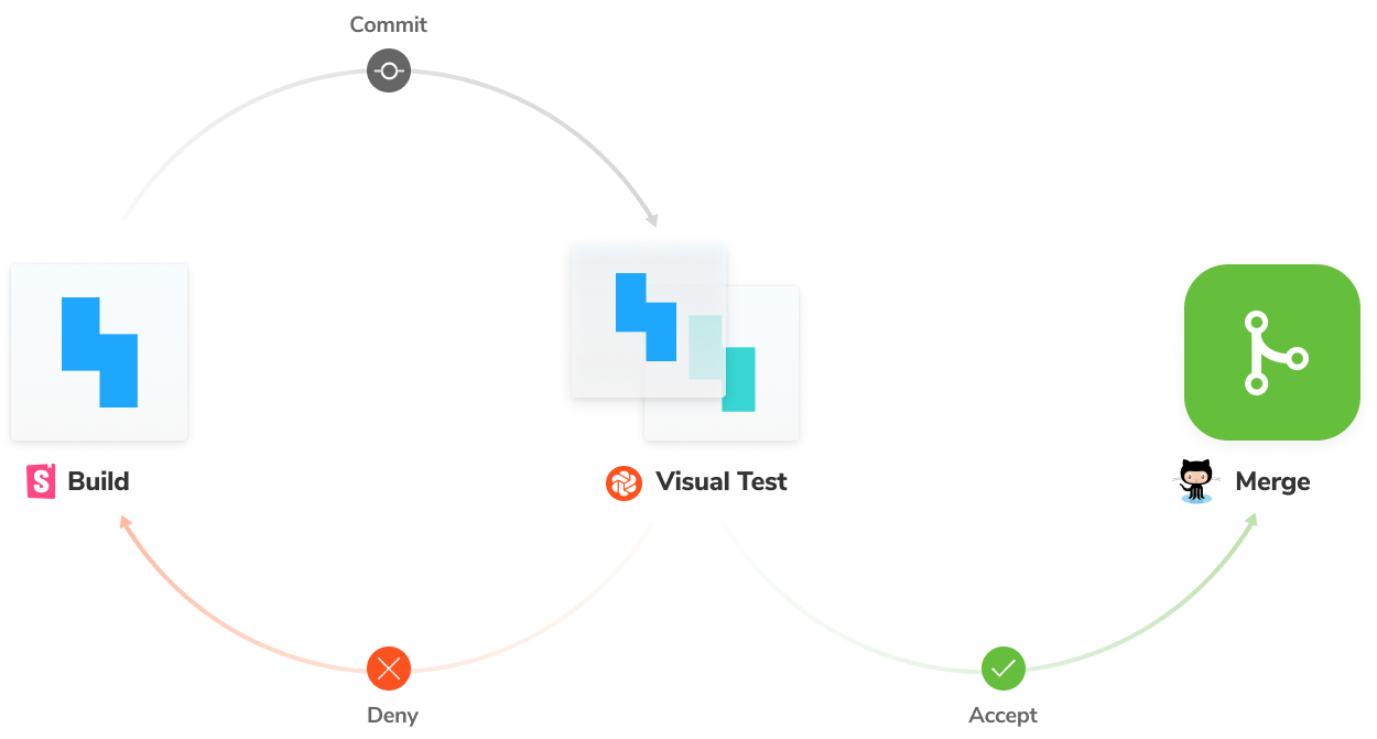
4. Catch regressions automatically
The Task component looks as we expect it to in all its use cases. But, how do we ensure that a stray line of CSS doesn’t break it in the future? It’s unrealistic to manually go through the entire directory of components whenever you make a change.
That’s why developers use a visual regression testing tool to automatically check for regressions. Auth0, Twilio, Adobe and Peloton use Chromatic (built by the Storybook team).
At this point, we know that the component is in a good state. Chromatic will capture an image snapshot of every story—as it appears in the browser. Then any time you make a change, a new snapshot is captured and compared to the previous one. You then review any visual differences found to decide if they are intentional updates or accidental bugs.
Set up Chromatic
Sign in and create a new project and grab your project-token.
Chromatic is built specifically for Storybook and requires no configuration. Running the command below will trigger it to capture a snapshot of each story (using a cloud browser).
npx chromatic --project-token=<project-token>
The first run will be set as the baseline i.e., the starting point. And each story has its own baseline.
Run tests
On each commit, new snapshots are captured and compared against existing baselines to detect UI changes. Let’s see that check in action.
First, make a tweak to the UI. We’re going to change the pinned icon and the text styling. Update the Task component, then make a commit and rerun Chromatic.
import PropTypes from 'prop-types';

export default function Task({
  task: { id, title, state },
  onArchiveTask,
  onTogglePinTask,
  onEditTitle,
}) {
  return (
    <div
      className={`list-item ${state}`}
      role="listitem"
      aria-label={`task-${id}`}
    >
      <label
        htmlFor="checked"
        aria-label={`archiveTask-${id}`}
        className="checkbox"
      >
        <input
          type="checkbox"
          disabled={true}
          name="checked"
          id={`archiveTask-${id}`}
          checked={state === "TASK_ARCHIVED"}
        />
        <span
          className="checkbox-custom"
          onClick={() => onArchiveTask("ARCHIVE_TASK", id)}
          role="button"
          aria-label={`archiveButton-${id}`}
        />
      </label>

      <label htmlFor="title" aria-label={title} className="title">
        <input
          type="text"
          value={title}
          name="title"
          placeholder="Input title"
          style={{ textOverflow: "ellipsis" }}
          onChange={(e) => onEditTitle(e.target.value, id)}
        />
      </label>

      {state !== "TASK_ARCHIVED" && (
        <button
          className="pin-button"
          onClick={() => onTogglePinTask(state, id)}
          id={`pinTask-${id}`}
          aria-label={state === "TASK_PINNED" ? "unpin" : "pin"}
          key={`pinTask-${id}`}
        >
+         <span className={`icon-star`} />
        </button>
      )}
    </div>
  );
}

Task.propTypes = {
  /** Composition of the task */
  task: PropTypes.shape({
    /** Id of the task */
    id: PropTypes.string.isRequired,
    /** Title of the task */
    title: PropTypes.string.isRequired,
    /** Current state of the task */
    state: PropTypes.string.isRequired,
  }),
  /** Event to change the task to archived */
  onArchiveTask: PropTypes.func.isRequired,
  /** Event to change the task to pinned */
  onTogglePinTask: PropTypes.func.isRequired,
  /** Event to change the task title */
  onEditTitle: PropTypes.func.isRequired,
};
You’ll now be presented with a diff.
Regression testing ensures that we don’t introduce changes by accident. But it’s still up to you to decide whether changes are intentional or not.
✅ If the changes are intentional, press accept. The new snapshot will now be set as the baseline.
❌ If the changes are unintentional, press deny. The build will fail. Fix the code and run Chromatic again.
In our case, the changes were intentional. Go ahead and click accept for all stories. The whole workflow is illustrated below.
Stopping one bug from turning into many
A bit of leaky CSS or one broken component can snowball into multiple issues. These bugs are particularly frustrating to debug. In the next chapter, we'll build upon these concepts to learn how to catch such cascading problems.