
IconGallery
Watch a video tutorial
The IconGallery block enables you to easily document React icon components associated with your project, displayed in a neat grid.
Documenting icons
To document a set of icons, use the IconGallery block to display them in a grid. Each icon is wrapped in an IconItem block, enabling you to specify its properties, such as the name and the icon itself.
import { Meta, IconGallery, IconItem } from '@storybook/blocks';
import { Icon as IconExample } from './Icon';
<Meta title="Iconography" />
# Iconography
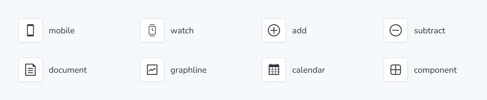
<IconGallery>
<IconItem name="mobile">
<IconExample name="mobile" />
</IconItem>
<IconItem name="user">
<IconExample name="user" />
</IconItem>
<IconItem name="browser">
<IconExample name="browser" />
</IconItem>
<IconItem name="component">
<IconExample name="component" />
</IconItem>
<IconItem name="calendar">
<IconExample name="calendar" />
</IconItem>
<IconItem name="paintbrush">
<IconExample name="paintbrush" />
</IconItem>
<IconItem name="add">
<IconExample name="add" />
</IconItem>
<IconItem name="subtract">
<IconExample name="subtract" />
</IconItem>
<IconItem name="document">
<IconExample name="document" />
</IconItem>
<IconItem name="graphline">
<IconExample name="graphline" />
</IconItem>
</IconGallery>Automate icon documentation
If you're working on a project that contains a large number of icons that you want to document, you can extend the IconGallery block, wrap IconItem in a loop, and iterate over the icons you want to document, including their properties. For example:
import { Meta, IconGallery, IconItem } from '@storybook/blocks';

import { Icon as IconExample } from './Icon';
import * as icons from './icons';

# Iconography

<IconGallery>
  {Object.keys(icons).map((icon) => (
    <IconItem name={icon}>
      <IconExample icon={icon} />
    </IconItem>
  ))}
</IconGallery>
IconGallery
import { IconGallery } from '@storybook/blocks';IconGallery is configured with the following props:
children
Type: React.ReactNode
IconGallery expects only IconItem children.
IconItem
import { IconItem } from '@storybook/blocks';IconItem is configured with the following props:
name
(Required)
Type: string
Sets the name of the icon.
children
Type: React.ReactNode
Provides the icon to be displayed.