
Design integrations
Storybook integrates with design tools to speed up your development workflow. That helps you debug inconsistencies earlier in the design process, discover existing components to reuse, and compare designs to stories.
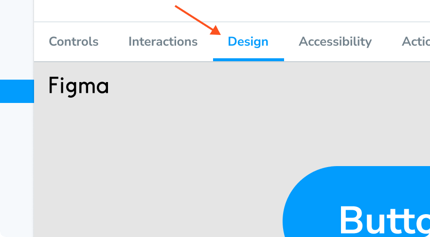
Figma
Figma is a collaborative UI design tool that allows multiple people to work on the same design simultaneously in the browser. There are two ways to integrate Storybook and Figma.
Embed Storybook in Figma with the plugin
Storybook Connect is a Figma plugin that allows you to embed component stories in Figma. It’s powered by Storybook embeds and Chromatic, a publishing tool created by the Storybook team.
Install plugin
Before we begin, you must have a Storybook published to Chromatic. It provides the index, versions, and access control that back the plugin.
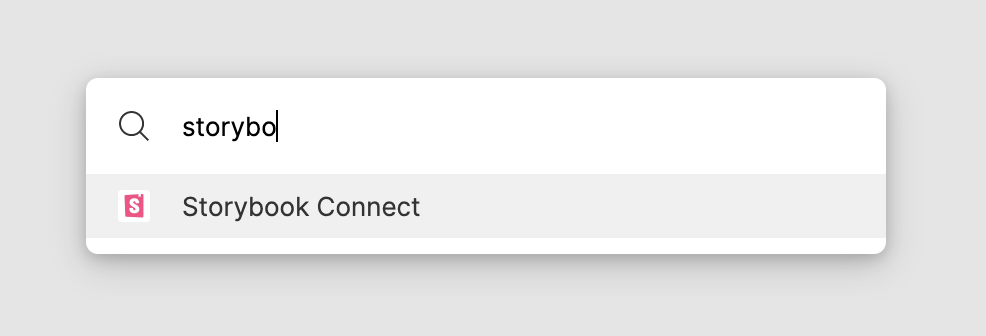
Go to Storybook Connect to install the plugin.
In Figma, open the command palette (in Mac OS, use Command + /, in Windows use Control + /) and type Storybook Connect to enable it.
Follow the instructions to connect and authenticate with Chromatic.
Link stories to Figma components
Link stories to Figma components, variants, and instances.
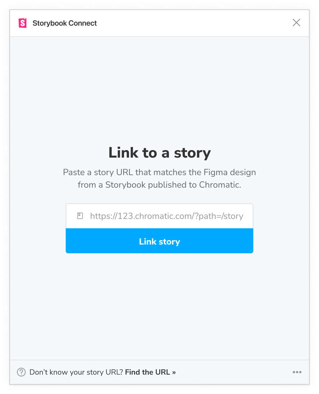
Go to a story in a Storybook published on Chromatic. Make sure it’s on the branch you want to link. Then copy the URL to the story.
In Figma, select the component, open the plugin, and paste the URL.
Chromatic will automatically update your linked stories to reflect the most recent Storybook published on the branch you linked. That means the link persists even as you push new code.
The plugin does not support linking stories to Figma layers.
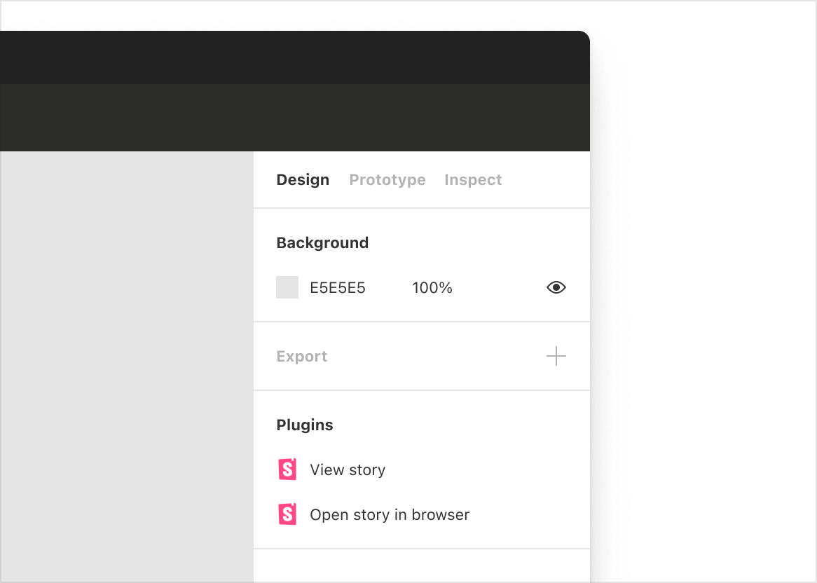
View stories in Figma
Once they're connected, you'll be able to view the story by clicking the link in the sidebar. Click "View story". Alternatively, open the plugin by using the command palette (in Mac OS, use Command + /, in Windows, use Control + /), then type Storybook Connect.
Embed Figma in Storybook with the addon
Designs addon allows you to embed Figma files and prototypes in Storybook.
Install design addon
Run the following command to install the addon.
npx storybook@latest add @storybook/addon-designsThe CLI's add command automates the addon's installation and setup. To install it manually, see our documentation on how to install addons.
Link Figma components to stories
In Figma, open the file you want to embed in Storybook. You can embed files, prototypes, components, and frames.
-
Embed a file or prototype, click the "Share" button to generate a unique URL for the file then click "Copy link".
-
Embed a component or frame check "Link to selected frame" in the Share dialog. Or right click on the frame and go to "Copy/Paste as" » "Copy link".
In Storybook, add a new parameter named design to your story and paste the Figma URL. For example:
// Replace your-framework with the framework you are using, e.g. react-vite, nextjs, nextjs-vite, etc.
import type { Meta, StoryObj } from '@storybook/your-framework';
import { MyComponent } from './MyComponent';
// More on default export: https://storybook.js.org/docs/writing-stories/#default-export
const meta = {
component: MyComponent,
} satisfies Meta<typeof MyComponent>;
export default meta;
type Story = StoryObj<typeof meta>;
export const Example: Story = {
parameters: {
design: {
type: 'figma',
url: 'https://www.figma.com/file/Sample-File',
},
},
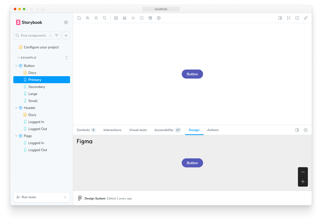
};View designs in Storybook
Click the "Design" tab in the addon panel to view the embedded Figma design.
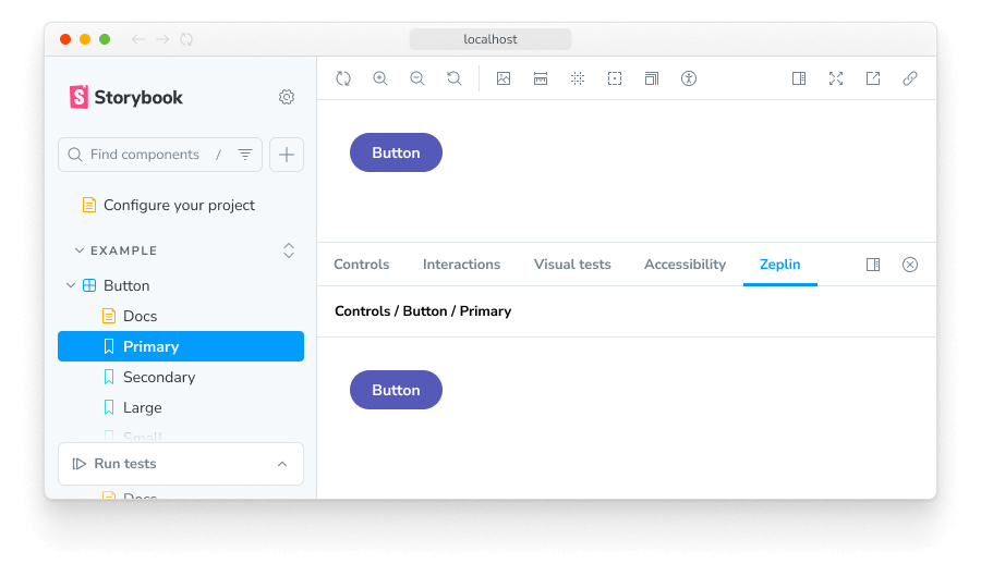
Zeplin
Zeplin is a design tool that generates styleguides from Sketch, Figma, and Adobe XD.
Use the Zeplin addon to connect Storybook. The addon displays designs from Zeplin alongside the currently selected story. It includes convenient tooling to overlay the design image atop the live component.
Zeplin's native app also supports links to published Storybooks.
Zeroheight
Zeroheight is a collaborative styleguide generator for design systems. It showcases design, code, brand, and copywriting documentation in one place. Users can easily edit that documentation with a WYSIWYG editor.
Zeroheight integrates with Storybook, enabling you to embed stories alongside your design specs.
UXPin
UXPin is an interactive design tool that uses production code to generate prototypes.
UXPin allows you to use interactive stories to design user flows.
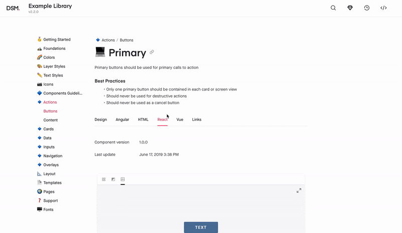
InVision Design System Manager
InVision DSM is a design system documentation tool. It helps design teams consolidate UX principles, user interface design, and design tokens in a shared workspace.
InVision allows you to embed Storybook in your design system documentation.
Adobe XD
Adobe XD is a UI and UX design tool for creating wireframes, interactive designs, and prototypes.
Integrate Adobe XD with Storybook using the design addon. You can embed design specs alongside stories by following these instructions.
Build your own integration
Extend and customize Storybook by building an integration. Integrate with lower-level Storybook APIs or bootstrap an addon to customize Storybook's UI and behavior.