
Tags
Tags allow you to control which stories are included in your Storybook, enabling many different uses of the same total set of stories. For example, you can use tags to include/exclude tests from the test runner. For more complex use cases, see the recipes section, below.
Built-in tags
The following tags are available in every Storybook project:
| Tag | Applied by default? | Description |
|---|---|---|
dev | Yes | Stories tagged with dev are rendered in Storybook's sidebar. |
manifest | Yes | Stories and docs tagged with manifest are included in the component or docs manifests (Currently React-only). |
test | Yes | Stories tagged with test are included in test runner or Vitest addon runs. |
autodocs | No | Stories tagged with autodocs are included in the docs page. If a CSF file does not contain at least one story tagged with autodocs, that component will not generate a docs page. |
play-fn | No | Applied automatically to stories with a play function defined. |
test-fn | No | Applied automatically to tests defined using the experimental .test method on CSF Factories. |
The dev, manifest, and test tags are automatically, implicitly applied to every story in your Storybook project.
Custom tags
You're not limited to the built-in tags. Custom tags enable a flexible layer of categorization on top of Storybook's sidebar hierarchy. Sample uses might include:
- Status, such as
experimental,new,stable, ordeprecated - User persona, such as
admin,user, ordeveloper - Component/code ownership
There are two ways to create a custom tag:
- Apply it to a story, component (meta), or project (
.storybook/preview.*) as described below. - Define it in your Storybook configuration file (
.storybook/main.*) to provide more configuration options, like default filter selection.
For example, to define an "experimental" tag that is excluded by default in the sidebar, you can add this to your Storybook config:
// Replace your-framework with the framework you are using, e.g. react-vite, nextjs, vue3-vite, etc.
import type { StorybookConfig } from '@storybook/your-framework';

const config: StorybookConfig = {
  framework: '@storybook/your-framework',
  stories: ['../src/**/*.mdx', '../src/**/*.stories.@(js|jsx|mjs|ts|tsx)'],
  tags: {
    // 👇 Define a custom tag named "experimental"
    experimental: {
      defaultFilterSelection: 'exclude', // Or 'include'
    },
  },
};

export default config;
If defaultFilterSelection is set to include, stories with this tag are selected as included in the filter menu. If set to exclude, stories with this tag are selected as excluded, and must be explicitly included by selecting the tag in the sidebar filter menu. If not set, the tag has no default selection.
You can also use the tags configuration to alter the configuration of built-in tags.
Applying tags
A tag can be any static (i.e. not created dynamically) string, either the built-in tags or custom tags of your own design. To apply tags to a story, assign an array of strings to the tags property. Tags may be applied at the project, component (meta), or story levels.
For example, to apply the autodocs tag to all stories in your project, you can use .storybook/preview.*:
// Replace your-framework with the framework you are using, e.g. react-vite, nextjs, vue3-vite, etc.
import type { Preview } from '@storybook/your-framework';

const preview: Preview = {
  /*
   * All stories in your project will have these tags applied:
   * - autodocs
   * - dev (implicit default)
   * - test (implicit default)
   */
  tags: ['autodocs'],
};

export default preview;
Within a component stories file, you apply tags like so:
// Replace your-framework with the framework you are using, e.g. react-vite, nextjs, vue3-vite, etc.
import type { Meta, StoryObj } from '@storybook/your-framework';

import { Button } from './Button';

const meta = {
  component: Button,
  /*
   * All stories in this file will have these tags applied:
   * - autodocs
   * - dev (implicit default, inherited from preview)
   * - test (implicit default, inherited from preview)
   */
  tags: ['autodocs'],
} satisfies Meta<typeof Button>;

export default meta;
type Story = StoryObj<typeof meta>;

export const ExperimentalFeatureStory: Story = {
  /*
   * This particular story will have these tags applied:
   * - experimental
   * - autodocs (inherited from meta)
   * - dev (inherited from meta)
   * - test (inherited from meta)
   */
  tags: ['experimental'],
};
Removing tags
To remove a tag from a story, prefix it with !. For example:
// Replace your-framework with the framework you are using, e.g. react-vite, nextjs, etc.
import type { Meta, StoryObj } from '@storybook/your-framework';

import { Button } from './Button';

const meta = {
  component: Button,
  // 👇 Applies to all stories in this file
  tags: ['stable'],
} satisfies Meta<typeof Button>;

export default meta;
type Story = StoryObj<typeof meta>;

export const ExperimentalFeatureStory: Story = {
  //👇 For this particular story, remove the inherited `stable` tag and apply the `experimental` tag
  tags: ['!stable', 'experimental'],
};
Tags can be removed for all stories in your project (in .storybook/preview.*), all stories for a component (in the CSF file meta), or a single story (as above).
Filtering the sidebar by tags
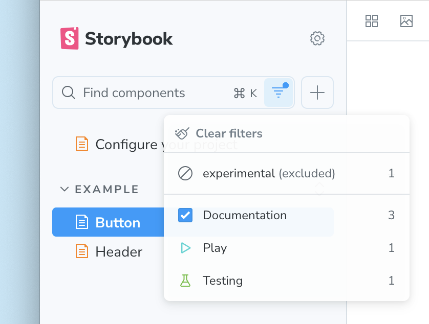
Both built-in and custom tags are available as filters in Storybook's sidebar. Selecting a tag in the filter causes the sidebar to only show stories with that tag. Selecting multiple tags shows stories that contain any of those tags.
Pressing the Exclude button for a tag in the filter menu excludes stories with that tag from the sidebar. You can exclude multiple tags, and stories with any of those tags will be excluded. You can also mix inclusion and exclusion.
When no tags are selected, all stories are shown.
In this example, the experimental tag has been excluded and the Documentation tag (autodocs) has been included, so only stories tagged with autodocs but not experimental are shown.
Filtering by tags is a powerful way to focus on a subset of stories, especially in large Storybook projects. When searching, the filter is applied first, so search results are limited to the currently filtered tags.
Recipes
Docs-only stories
It can sometimes be helpful to provide example stories for documentation purposes, but you want to keep the sidebar navigation more focused on stories useful for development. By enabling the autodocs tag and removing the dev tag, a story becomes docs-only: appearing only in the docs page and not in Storybook's sidebar.
// Replace your-framework with the framework you are using, e.g. react-vite, nextjs, vue3-vite, etc.
import type { Meta } from '@storybook/your-framework';

import { Button } from './Button';

const meta = {
  component: Button,
  /*
   * All stories in this file will:
   * - Be included in the docs page
   * - Not appear in Storybook's sidebar
   */
  tags: ['autodocs', '!dev'],
} satisfies Meta<typeof Button>;
export default meta;
Combo stories, still tested individually
For a component with many variants, like a Button, a grid of those variants all together can be a helpful way to visualize it. But you may wish to test the variants individually. You can accomplish this with tags like so:
// Replace your-framework with the framework you are using, e.g. react-vite, nextjs, nextjs-vite, etc.
import type { Meta, StoryObj } from '@storybook/your-framework';

import { Button } from './Button';

const meta = {
  component: Button,
} satisfies Meta<typeof Button>;
export default meta;

type Story = StoryObj<typeof meta>;

export const Variant1: Story = {
  // 👇 This story will not appear in Storybook's sidebar or docs page
  tags: ['!dev', '!autodocs'],
  args: { variant: 1 },
};

export const Variant2: Story = {
  // 👇 This story will not appear in Storybook's sidebar or docs page
  tags: ['!dev', '!autodocs'],
  args: { variant: 2 },
};

export const Combo: Story = {
  // 👇 This story should not be tested, but will appear in the sidebar and docs page
  tags: ['!test'],
  render: () => (
    <>
      <Button variant={1} />
      <Button variant={2} />
    </>
  ),
};
Test cases that don't clutter the sidebar
(⚠️ Experimental: While this API is available for all tags, the built-in _test tag is experimental)
If you're using the experimental .test method on CSF Factories, you can alter the default behavior of the _test tag to exclude tests from the sidebar by default. This reduces clutter in the sidebar while still allowing you to run tests for all stories, or adjust the filter to show tests when needed.
// Replace your-framework with the framework you are using, e.g. react-vite, nextjs, vue3-vite, etc.
import type { StorybookConfig } from '@storybook/your-framework';

const config: StorybookConfig = {
  framework: '@storybook/your-framework',
  stories: ['../src/**/*.mdx', '../src/**/*.stories.@(js|jsx|mjs|ts|tsx)'],
  tags: {
    // 👇 Adjust the default configuration of this tag
    _test: {
      defaultFilterSelection: 'exclude',
    },
  },
};

export default config;