
Story
Stories are Storybook's fundamental building blocks.
In Storybook Docs, you can render any of your stories from your CSF files in the context of an MDX file with all annotations (parameters, args, loaders, decorators, play function) applied using the Story block.
Typically you want to use the Canvas block to render a story with a surrounding border and the source block, but you can use the Story block to render just the story.
import { Meta, Story } from '@storybook/addon-docs/blocks';
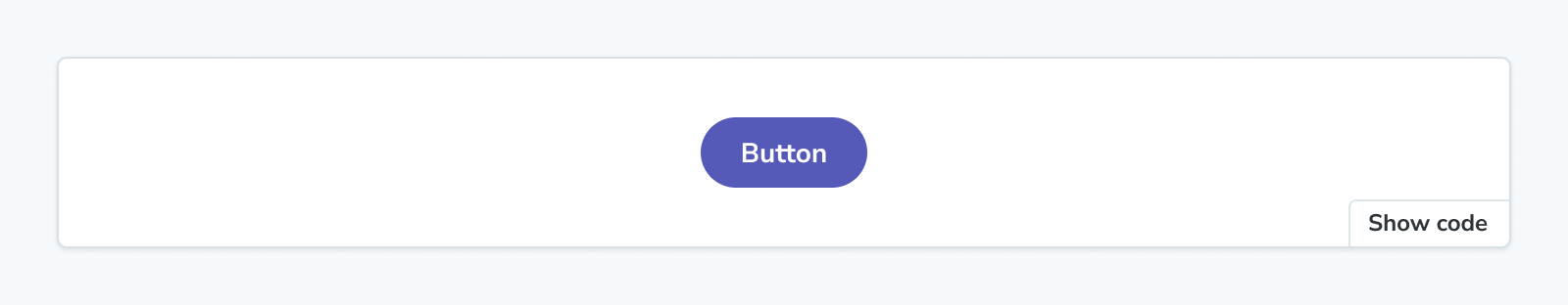
import * as ButtonStories from './Button.stories';
<Meta of={ButtonStories} />
<Story of={ButtonStories.Primary} />Story
import { Story } from '@storybook/addon-docs/blocks';Configuring with props and parameters
ℹ️ Like most blocks, the Story block is configured with props in MDX. Many of those props derive their default value from a corresponding parameter in the block's namespace, parameters.docs.story.
The following autoplay configurations are equivalent:
// Replace your-framework with the framework you are using, e.g. react-vite, nextjs, vue3-vite, etc.
import type { Meta, StoryObj } from '@storybook/your-framework';

import { Button } from './Button';

const meta = {
  component: Button,
} satisfies Meta<typeof Button>;

export default meta;
type Story = StoryObj<typeof meta>;

export const Basic: Story = {
  parameters: {
    docs: {
      story: { autoplay: true },
    },
  },
};<Story of={ButtonStories.Basic} autoplay />The example above applied the parameter at the story level, but it could also be applied at the component (or meta) level or project level.
autoplay
Type: boolean
Default: parameters.docs.story.autoplay
Determines whether a story's play function runs.
Because all stories render simultaneously in docs entries, play functions can perform arbitrary actions that can interact with each other (such as stealing focus or scrolling the screen). For that reason, by default, stories do not run play functions in docs mode.
However, if you know your play function is “safe” to run in docs, you can use this prop to run it automatically.
If a story uses mount in its play function, it will not render in docs unless autoplay is set to true.
height
Type: string
Default: parameters.docs.story.height
Set a minimum height (note for an iframe this is the actual height) when rendering a story in an iframe or inline. This overrides parameters.docs.story.iframeHeight for iframes.
inline
Type: boolean
Default: parameters.docs.story.inline or true (for supported frameworks)
Determines whether the story is rendered inline (in the same browser frame as the other docs content) or in an iframe.
Setting the inline option to false will prevent the associated controls from updating the story within the documentation page. This is a known limitation of the current implementation and will be addressed in a future release.
meta
Type: CSF file exports
Specifies the CSF file to which the story is associated.
You can render a story from a CSF file that you haven’t attached to the MDX file (via Meta) by using the meta prop. Pass the full set of exports from the CSF file (not the default export!).
import { Meta, Story } from '@storybook/addon-docs/blocks';
import * as ButtonStories from './Button.stories';
import * as HeaderStories from './Header.stories';

<Meta of={ButtonStories} />

{/* Although this MDX file is largely concerned with Button,
it can render Header stories too */}
<Story of={HeaderStories.LoggedIn} meta={HeaderStories} />
of
Type: Story export
Specifies which story is rendered by the Story block. If no of is defined and the MDX file is attached, the primary (first) story will be rendered.