
Stories for multiple components
It's useful to write stories that render two or more components at once if those components are designed to work together. For example, ButtonGroup, List, and Page components.
Subcomponents
When the components you're documenting have a parent-child relationship, you can use the subcomponents property to document them together. This is especially useful when the child component is not meant to be used on its own, but only as part of the parent component.
Here's an example with List and ListItem components:
import * as React from 'react';
// Replace your-framework with the framework you are using, e.g. react-vite, nextjs, nextjs-vite, etc.
import type { Meta, StoryObj } from '@storybook/your-framework';
import { List } from './List';
import { ListItem } from './ListItem';
const meta = {
component: List,
subcomponents: { ListItem }, //👈 Adds the ListItem component as a subcomponent
} satisfies Meta<typeof List>;
export default meta;
type Story = StoryObj<typeof meta>;
export const Empty: Story = {};
export const OneItem: Story = {
render: (args) => (
<List {...args}>
<ListItem />
</List>
),
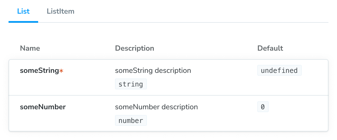
};Note that by adding a subcomponents property to the meta (or default export), we get an extra panel on the ArgTypes and Controls tables, listing the props of ListItem:
Subcomponents are only intended for documentation purposes and have some limitations:
- The argTypes of subcomponents are inferred (for the renderers that support that feature) and cannot be manually defined or overridden.
- The table for each documented subcomponent does not include controls to change the value of the props, because controls always apply to the main component's args.
Let's talk about some techniques you can use to mitigate the above, which are especially useful in more complicated situations.
Reusing story definitions
We can also reduce repetition in our stories by reusing story definitions. Here, we can reuse the ListItem stories' args in the story for List:
import * as React from 'react';

// Replace your-framework with the framework you are using, e.g. react-vite, nextjs, nextjs-vite, etc.
import type { Meta, StoryObj } from '@storybook/your-framework';

import { List } from './List';
import { ListItem } from './ListItem';

//👇 We're importing the necessary stories from ListItem
import { Selected, Unselected } from './ListItem.stories';

const meta = {
  component: List,
} satisfies Meta<typeof List>;

export default meta;
type Story = StoryObj<typeof meta>;

export const ManyItems: Story = {
  render: (args) => (
    <List {...args}>
      <ListItem {...Selected.args} />
      <ListItem {...Unselected.args} />
      <ListItem {...Unselected.args} />
    </List>
  ),
};
By rendering the Unchecked story with its args, we are able to reuse the input data from the ListItem stories in the List.
However, we still aren’t using args to control the ListItem stories, which means we cannot change them with controls and we cannot reuse them in other, more complex component stories.
Using children as an arg
One way we improve that situation is by pulling the rendered subcomponent out into a children arg:
// Replace your-framework with the framework you are using, e.g. react-vite, nextjs, nextjs-vite, etc.
import type { Meta, StoryObj } from '@storybook/your-framework';

import { List } from './List';

//👇 Instead of importing ListItem, we import the stories
import { Unchecked } from './ListItem.stories';

const meta = {
  component: List,
} satisfies Meta<typeof List>;

export default meta;
type Story = StoryObj<typeof meta>;

export const OneItem: Story = {
  args: {
    children: <Unchecked {...Unchecked.args} />,
  },
};
Now that children is an arg, we can potentially reuse it in another story.
However, there are some caveats when using this approach that you should be aware of.
The children arg, just like all args, needs to be JSON serializable. To avoid errors with your Storybook, you should:
- Avoid using empty values
- Use mapping if you want to adjust the value with controls
- Use caution with components that include third party libraries
We're currently working on improving the overall experience for the children arg and allow you to edit children arg in a control and allow you to use other types of components in the near future. But for now you need to factor in this caveat when you're implementing your stories.
Creating a Template Component
Another option that is more “data”-based is to create a special “story-generating” template component:
// Replace your-framework with the framework you are using, e.g. react-vite, nextjs, nextjs-vite, etc.
import type { Meta, StoryObj } from '@storybook/your-framework';

import { List } from './List';
import { ListItem } from './ListItem';

//👇 Imports a specific story from ListItem stories
import { Unchecked } from './ListItem.stories';

const meta = {
  component: List,
} satisfies Meta<typeof List>;

export default meta;
type Story = StoryObj<typeof meta>;

//👇 The ListTemplate construct will be spread to the existing stories.
const ListTemplate: Story = {
  render: ({ items, ...args }) => {
    return (
      <List>
        {items.map((item) => (
          <ListItem {...item} />
        ))}
      </List>
    );
  },
};

export const Empty = {
  ...ListTemplate,
  args: {
    items: [],
  },
};

export const OneItem = {
  ...ListTemplate,
  args: {
    items: [{ ...Unchecked.args }],
  },
};
This approach requires more setup, but it means you can reuse the args to each story in a composite component. It also means you can alter the args to the component with the Controls panel.