
What's a story?
A story captures the rendered state of a UI component. Developers write multiple stories per component that describe all the “interesting” states a component can support.
When you installed Storybook, the CLI created example components that demonstrate the types of components you can build with Storybook: Button, Header, and Page.
Each example component has a set of stories that show the states it supports. You can browse the stories in the UI and see the code behind them in files that end with .stories.js|ts. The stories are written in Component Story Format (CSF), an ES6 modules-based standard for writing component examples.
Let’s start with the Button component. A story is an object that describes how to render the component in question. Here’s how to render Button in the “primary” state and export a story called Primary.
// Replace your-framework with the framework you are using, e.g. react-vite, nextjs, nextjs-vite, etc.
import type { Meta, StoryObj } from '@storybook/your-framework';

import { Button } from './Button';

const meta = {
  component: Button,
} satisfies Meta<typeof Button>;

export default meta;
type Story = StoryObj<typeof meta>;

export const Primary: Story = {
  args: {
    primary: true,
    label: 'Button',
  },
};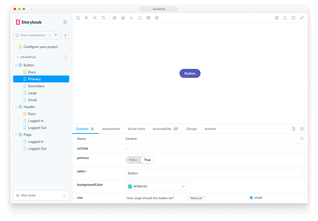
View the rendered Button by clicking on it in the Storybook sidebar. Note how the values specified in args are used to render the component and match those represented in the Controls panel. Using args in your stories has additional benefits:
Button's callbacks are logged into the Actions panel. Click to try it.Button's arguments are dynamically editable in the Controls panel. Adjust the controls.
Working with stories
Storybook makes it easy to work on one component in one state (aka a story) at a time. When you edit a component's code or its stories, Storybook will instantly re-render in the browser. No need to refresh manually.
Create a new story
If you're working on a component that does not yet have any stories, you can click the ➕ button in the sidebar to search for your component and have a basic story created for you.
You can also create a story file for your new story. We recommend copy/pasting an existing story file next to the component source file, then adjusting it for your component.
If you're working on a component that already has other stories, you can use the Controls panel to adjust the value of a control and then save those changes as a new story.
Or, if you prefer, edit the story file's code to add a new named export for your story:
Edit a story
Using the Controls panel, update a control's value for a story. You can then save the changes to the story and the story file's code will be updated for you.
Of course, you can always update the story's code directly too:
Stories are also helpful for checking that the UI continues to look correct as you make changes. The Button component has four stories that show it in different use cases. View those stories now to confirm that your change to Primary didn’t introduce unintentional bugs in the other stories.
Checking component’s stories as you develop helps prevent accidental regressions. Tools that integrate with Storybook can automate this for you.
Now that we’ve seen the basic anatomy of a story let’s see how we use Storybook’s UI to develop stories.