
Automatic documentation and Storybook
Storybook Autodocs is a powerful tool that can help you quickly generate comprehensive documentation for your UI components. By leveraging Autodocs, you're transforming your stories into living documentation which can be further extended with MDX and Doc Blocks to provide a clear and concise understanding of your components' functionality.
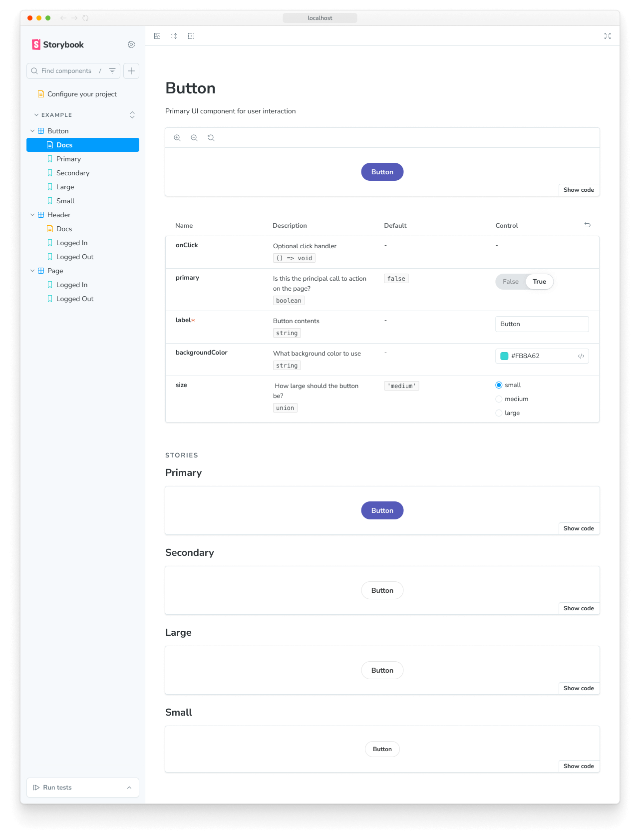
Storybook infers the relevant metadata (e.g., args, argTypes, parameters) and automatically generates a documentation page with this information positioned at the root-level of your component tree in the sidebar.
Set up automated documentation
Autodocs is configured through tags. If a CSF file contains at least one story tagged with autodocs, then a documentation page will be generated for that component.
To enable automatic documentation for all stories in a project, add it to tags in your .storybook/preview.js|ts file:
// Replace your-framework with the framework you are using, e.g. react-vite, nextjs, vue3-vite, etc.
import type { Preview } from '@storybook/your-framework';

const preview: Preview = {
  //👇 Enables auto-generated documentation for all stories
  tags: ['autodocs'],
};

export default preview;
You can also enable it at the component (or story) level:
// Replace your-framework with the framework you are using, e.g. react-vite, nextjs, vue3-vite, etc.
import type { Meta } from '@storybook/your-framework';

import { Button } from './Button';

const meta = {
  component: Button,
  //👇 Enables auto-generated documentation for this component and includes all stories in this file
  tags: ['autodocs'],
} satisfies Meta<typeof Button>;
export default meta;
You can disable auto docs for a particular component by removing the tag:
// Replace your-framework with the framework you are using, e.g. react-vite, nextjs, vue3-vite, etc.
import type { Meta } from '@storybook/your-framework';

import { Page } from './Page';

const meta = {
  component: Page,
  // 👇 Disable auto-generated documentation for this component
  tags: ['!autodocs'],
} satisfies Meta<typeof Page>;
export default meta;
Similarly, you can exclude a particular story from the auto docs page, by removing the tag:
// Replace your-framework with the framework you are using, e.g. react-vite, nextjs, vue3-vite, etc.
import type { Meta, StoryObj } from '@storybook/your-framework';

import { Button } from './Button';

const meta = {
  component: Button,
  //👇 Enables auto-generated documentation for this component and includes all stories in this file
  tags: ['autodocs'],
} satisfies Meta<typeof Button>;
export default meta;

type Story = StoryObj<typeof meta>;

export const UndocumentedStory: Story = {
  // 👇 Removes this story from auto-generated documentation
  tags: ['!autodocs'],
};
Configure
In addition to enabling the feature with tags, you can extend your Storybook configuration file (i.e., .storybook/main.js|ts|cjs) and provide additional options to control how documentation gets created. Listed below are the available options and examples of how to use them.
// Replace your-framework with the framework you are using, e.g. react-vite, nextjs, vue3-vite, etc.
import type { StorybookConfig } from '@storybook/your-framework';

const config: StorybookConfig = {
  framework: '@storybook/your-framework',
  stories: ['../src/**/*.mdx', '../src/**/*.stories.@(js|jsx|mjs|ts|tsx)'],
  addons: ['@storybook/addon-docs'],
  docs: {
    //👇 See the table below for the list of supported options
    defaultName: 'Documentation',
    docsMode: true,
  },
};

export default config;| Option | Description |
|---|---|
defaultName | Renames the auto-generated documentation page Default: docs: { defaultName: 'Docs' } |
docsMode | Toggles the documentation mode, which only shows documentation pages in the sidebar Default: docs: { docsMode: false } |
Write a custom template
To replace the default documentation template used by Storybook, you can extend your UI configuration file (i.e., .storybook/preview.js|ts) and introduce a docs parameter. This parameter accepts a page function that returns a React component, which you can use to generate the required template. For example:
import * as React from 'react';

// Replace your-framework with the framework you are using, e.g. react-vite, nextjs, vue3-vite, etc.
import type { Preview } from '@storybook/your-framework';
import {
  Title,
  Subtitle,
  Description,
  Primary,
  Controls,
  Stories,
} from '@storybook/addon-docs/blocks';

const preview: Preview = {
  parameters: {
    controls: {
      matchers: {
        color: /(background|color)$/i,
        date: /Date$/,
      },
    },
    docs: {
      page: () => (
        <>
          <Title />
          <Subtitle />
          <Description />
          <Primary />
          <Controls />
          <Stories />
        </>
      ),
    },
  },
};

export default preview;Internally, Storybook uses a similar implementation to generate the default template. See the Doc Blocks API reference to learn more about how Doc Blocks work.
Going over the code snippet in more detail. When Storybook starts up, it will override the default template with the custom one composed of the following:
- A header with the component's metadata retrieved by the
Title,Subtitle, andDescriptionDoc Blocks. - The first story defined in the file via the
PrimaryDoc Block with a handy set of UI controls to zoom in and out of the component. - An interactive table with all the relevant
argsandargTypesdefined in the story via theControlsDoc Block. - A overview of the remaining stories via the
StoriesDoc Block.
With MDX
You can also use MDX to generate the documentation template. This is useful in non-React projects where JSX-handling is not configured. Normally, when you create an MDX file in your project, it is treated as normal documentation. To indicate that an MDX file is a documentation template, supply the isTemplate property to its Meta Doc Block. For example:
import { Meta, Title, Primary, Controls, Stories } from '@storybook/addon-docs/blocks';

{/*
  * 👇 The isTemplate property is required to tell Storybook that this is a template
  * See https://storybook.js.org/docs/api/doc-blocks/doc-block-meta
  * to learn how to use
*/}

<Meta isTemplate />

<Title />

# Default implementation

<Primary />

## Inputs

The component accepts the following inputs (props):

<Controls />

---

## Additional variations

Listed below are additional variations of the component.

<Stories />
Then you can use it in your .storybook/preview.js|ts or an individual story file by importing it:
// Replace your-framework with the framework you are using, e.g. react-vite, nextjs, vue3-vite, etc.
import type { Preview } from '@storybook/your-framework';

import DocumentationTemplate from './DocumentationTemplate.mdx';

const preview = {
  parameters: {
    docs: {
      page: DocumentationTemplate,
    },
  },
} satisfies Preview;

export default preview;If you only need to override the documentation page for a single component, we recommend creating an MDX file and referencing it directly via the <Meta of={} /> Doc Block.
Generate a table of contents
Storybook's auto-generated documentation pages can be quite long and difficult to navigate. To help with this, you can enable the table of contents feature to provide a quick overview of the documentation page and allow users to jump to a specific section. To enable it, extend your Storybook UI configuration file (i.e., .storybook/preview.js|ts) and provide a docs parameter with a toc property.
// Replace your-framework with the framework you are using, e.g. react-vite, nextjs, vue3-vite, etc.
import type { Preview } from '@storybook/your-framework';

const preview: Preview = {
  parameters: {
    docs: {
      toc: true, // 👈 Enables the table of contents
    },
  },
};

export default preview;
Configure the table of contents
By default, the table of contents on the documentation page will only show the h3 headings that are automatically generated. However, if you want to customize the table of contents, you can add more parameters to the toc property. The following options and examples of how to use them are available.
| Option | Description |
|---|---|
contentsSelector | Defines the container's CSS selector for search for the headings toc: { contentsSelector: '.sbdocs-content' } |
disable | Hides the table of contents for the documentation pages toc: { disable: true } |
headingSelector | Defines the list of headings to feature in the table of contents toc: { headingSelector: 'h1, h2, h3' } |
ignoreSelector | Configures the table of contents to ignore specific headings or stories. By default, the table of contents will ignore all content placed within Story blocks toc: { ignoreSelector: '.docs-story h2' } |
title | Defines a title caption for the table of contents. Accepts one of: string, null, React element toc: { title: 'Table of Contents' } |
unsafeTocbotOptions | Provides additional TocBot configuration options toc: { unsafeTocbotOptions: { orderedList: true } } |
The contentsSelector, headingSelector, and ignoreSelector properties allow additional customization. For more information on using them, see the Tocbot documentation.
// Replace your-framework with the framework you are using, e.g. react-vite, nextjs, vue3-vite, etc.
import type { Preview } from '@storybook/your-framework';

const preview: Preview = {
  parameters: {
    docs: {
      toc: {
        contentsSelector: '.sbdocs-content',
        headingSelector: 'h1, h2, h3',
        ignoreSelector: '#primary',
        title: 'Table of Contents',
        disable: false,
        unsafeTocbotOptions: {
          orderedList: false,
        },
      },
    },
  },
};

export default preview;
Component-level configuration
If you want to customize the table of contents for a specific story, you can include a toc property in the story's meta (or default export) and provide the required configuration. For example, if you need to hide the table of contents for a specific story, adjust your story as follows:
// Replace your-framework with the framework you are using, e.g. react-vite, nextjs, vue3-vite, etc.
import type { Meta } from '@storybook/your-framework';

import { MyComponent } from './MyComponent';

const meta = {
  component: MyComponent,
  tags: ['autodocs'],
  parameters: {
    docs: {
      toc: {
        disable: true, // 👈 Disables the table of contents
      },
    },
  },
} satisfies Meta<typeof MyComponent>;

export default meta;
Customize component documentation
Creating automated documentation with Storybook's Autodocs provides you with the starting point to build a sustainable documentation pattern. Nevertheless, it may not be suited for every case, and you may want to extend it and provide additional information. We recommend combining MDX alongside Storybook's Doc Blocks for such cases to author your documentation.
Advanced configuration
Documenting multiple components
Sometimes it's helpful to document multiple components together. For example, a component library’s ButtonGroup and Button components might not make sense without one another.
Autodocs allows you to document your "main" component, defined by the component property, as well as one or more subcomponents related to it.
import * as React from 'react';

// Replace your-framework with the framework you are using, e.g. react-vite, nextjs, nextjs-vite, etc.
import type { Meta, StoryObj } from '@storybook/your-framework';

import { List } from './List';
import { ListItem } from './ListItem';

const meta = {
  component: List,
  subcomponents: { ListItem }, //👈 Adds the ListItem component as a subcomponent
} satisfies Meta<typeof List>;
export default meta;

type Story = StoryObj<typeof meta>;

export const Empty: Story = {};

export const OneItem: Story = {
  render: (args) => (
    <List {...args}>
      <ListItem />
    </List>
  ),
};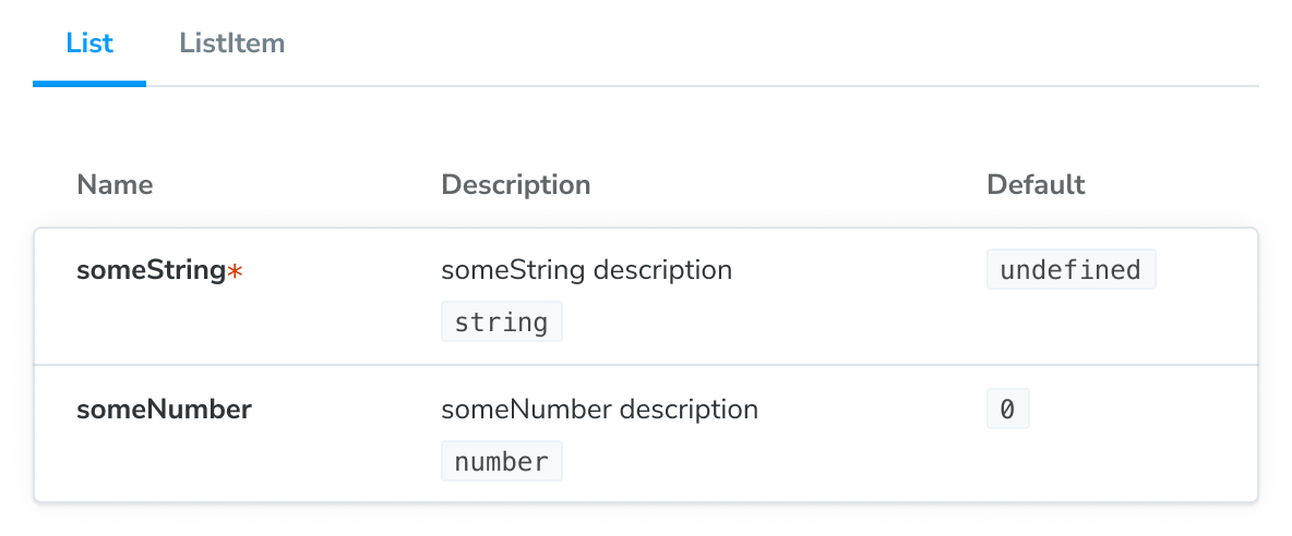
The main component and its subcomponents will show up in a tabbed version of the ArgTypes doc block. The tab titles will correspond to the keys of the subcomponents object.
If you want to organize your documentation differently for component groups, we recommend using MDX. It gives you complete control over how your components are displayed and supports any configuration.
Customize the Docs Container
The Docs Container is the component that wraps up the documentation page. It's responsible for rendering the documentation page in Storybook's UI. You can customize it by creating your own component and updating your Storybook UI configuration file (i.e., .storybook/preview.js|ts) to reference it.
import * as React from 'react';

// Replace your-framework with the framework you are using, e.g. react-vite, nextjs, vue3-vite, etc.
import type { Preview } from '@storybook/your-framework';
import { DocsContainer } from '@storybook/addon-docs/blocks';

const ExampleContainer = ({ children, ...props }) => {
  return <DocsContainer {...props}>{children}</DocsContainer>;
};

const preview: Preview = {
  parameters: {
    controls: {
      matchers: {
        color: /(background|color)$/i,
        date: /Date$/,
      },
    },
    docs: {
      container: ExampleContainer,
    },
  },
};

export default preview;
Override the default theme
By default, Storybook provides two themes for the UI: light and dark. If you need to customize the theme used by the documentation to match the existing one, you can update your Storybook UI configuration file (i.e., .storybook/preview.js|ts) and apply it.
// Replace your-framework with the framework you are using, e.g. react-vite, nextjs, vue3-vite, etc.
import type { Preview } from '@storybook/your-framework';
import { themes, ensure } from 'storybook/theming';

const preview: Preview = {
  parameters: {
    controls: {
      matchers: {
        color: /(background|color)$/i,
        date: /Date$/,
      },
    },
    docs: {
      theme: ensure(themes.dark), // The replacement theme to use
    },
  },
};

export default preview;
Working with custom MDX components
Out of the box, Storybook has a set of components that you can use to customize your documentation page. If you're working with a design system or component library and wish to add them to your documentation page, you can override the MDXProvider component inherited from @mdx-js/react with your own. However, there's a caveat to this, the component replacement will only have an impact if you're writing documentation using Markdown syntax (e.g., # for headings). Native HTML elements, such as <h1>, will not be replaced with your custom implementation.
import * as React from 'react';
import { MDXProvider } from '@mdx-js/react';

// Replace your-framework with the framework you are using, e.g. react-vite, nextjs, vue3-vite, etc.
import type { Preview } from '@storybook/your-framework';
import { DocsContainer } from '@storybook/addon-docs/blocks';

import * as DesignSystem from 'your-design-system';

export const MyDocsContainer = (props) => (
  <MDXProvider
    components={{
      h1: DesignSystem.H1,
      h2: DesignSystem.H2,
    }}
  >
    <DocsContainer {...props} />
  </MDXProvider>
);

const preview: Preview = {
  parameters: {
    controls: {
      matchers: {
        color: /(background|color)$/i,
        date: /Date$/,
      },
    },
    docs: {
      container: MyDocsContainer,
    },
  },
};

export default preview;This is not a Storybook issue but a detail of how MDX works. From their migration guide:
“We now ‘sandbox’ components, for lack of a better name. It means that when you pass a component for h1, it does get used for # hi but not for <h1>hi</h1>”
Addon options
The docs addon accepts options to customize the behavior of the documentation page. You can add them to your Storybook UI configuration file (i.e., .storybook/main.js|ts), as part of registering the addon. The following options are available:
| Option | Description |
|---|---|
csfPluginOptions | Provides additional configuration for Storybook's CSF plugin. Can be disabled with null. |
mdxPluginOptions | Provides additional configuration options and plugin configuration for MDX documentation. |
This example demonstrates how to apply these options.
// Replace your-framework with the framework you are using, e.g. react-vite, nextjs, vue3-vite, etc.
import type { StorybookConfig } from '@storybook/your-framework';

const config: StorybookConfig = {
  framework: '@storybook/your-framework',
  stories: ['../src/**/*.mdx', '../src/**/*.stories.@(js|jsx|mjs|ts|tsx)'],
  addons: [
    {
      name: '@storybook/addon-docs',
      options: {
        csfPluginOptions: null,
        mdxPluginOptions: {
          mdxCompileOptions: {
            remarkPlugins: [],
          },
        },
      },
    },
  ],
};

export default config;
Troubleshooting
The table of contents doesn't render as expected
When using Autodocs's table of contents, you may encounter situations where it appears differently than expected. To help you resolve these problems, we have compiled a list of possible scenarios that may cause issues.
With simple documentation pages
If you have a documentation page with only one matching heading and create a table of contents for it, the table of contents will not be hidden by default. A potential solution for this issue would be to add a second heading or turn it off entirely.
With small screens
If the screen width is less than 1200px, the table of contents will be hidden by default. Currently, there's no built-in solution for this issue that doesn't impact the documentation page's style compatibility.
With MDX
If you're writing unattached documentation using MDX, you cannot customize the table of contents primarily due to the lack of support for defining parameters based on the current implementation. As a result, the table of contents will always revert to the default configuration provided globally.
The auto-generated documentation is not showing up in a monorepo setup
Out of the box, Storybook's Autodocs feature is built to generate documentation for your stories automatically. Nevertheless, if you're working with a monorepo setup (e.g., Yarn Workspaces, pnpm Workspaces), you may run into issues where part of the documentation may not be generated for you. To help you troubleshoot those issues, we've prepared some recommendations that might help you.
Update your import statements to reference the component directly instead of the package's root. For example:
// Replace your-framework with the framework you are using, e.g. react-vite, nextjs, vue3-vite, etc.
import type { Meta } from '@storybook/your-framework';

// ❌ Don't use the package's index file to import the component.
// import { MyComponent } from '@component-package';

// ✅ Use the component's export to import it directly.
import { MyComponent } from '@component-package/src/MyComponent';

const meta = {
  /* 👇 The title prop is optional.
   * See https://storybook.js.org/docs/configure/#configure-story-loading
   * to learn how to generate automatic titles
   */
  title: 'MyComponent',
  component: MyComponent,
} satisfies Meta<typeof MyComponent>;

export default meta;
Additionally, if you're developing using TypeScript, you may need to update Storybook's configuration file (i.e., .storybook/main.js|ts) to include the following:
// Replace your-framework with the framework you are using, e.g. react-vite, nextjs, vue3-vite, etc.
import type { StorybookConfig } from '@storybook/your-framework';

const config: StorybookConfig = {
  framework: '@storybook/your-framework',
  stories: ['../src/**/*.mdx', '../src/**/*.stories.@(js|jsx|mjs|ts|tsx)'],
  typescript: {
    // Overrides the default Typescript configuration to allow multi-package components to be documented via Autodocs.
    reactDocgen: 'react-docgen',
    check: false,
  },
};

export default config;
If you're still encountering issues, we recommend reaching out to the community using the default communication channels (e.g., GitHub discussions).
The controls are not updating the story within the auto-generated documentation
If you turned off inline rendering for your stories via the inline configuration option, you would run into a situation where the associated controls are not updating the story within the documentation page. This is a known limitation of the current implementation and will be addressed in a future release.
Learn more about Storybook documentation
- Autodocs for creating documentation for your stories
- MDX for customizing your documentation
- Doc Blocks for authoring your documentation
- Publishing docs to automate the process of publishing your documentation