
Interaction tests
In Storybook, interaction tests are built as part of a story. That story renders the component with the necessary props and context to place it in an initial state. You then use a play function to simulate user behavior like clicks, typing, and submitting a form and then assert on the end result.
You can preview and debug your interaction tests using the Interactions panel in the Storybook UI. They can be automated using the Vitest addon, allowing you to run tests for your project in Storybook, terminal, or CI environments.
Writing interaction tests
Every story you write can be render tested. A render test is a simple version of an interaction test that only tests the ability of a component to render successfully in a given state. That works fine for relatively simple, static components like a Button. But for more complex, interactive components, you can go farther.
You can simulate user behavior and assert on functional aspects like DOM structure or function calls using the play function. When a component is tested, the play function is ran and any assertions within it are validated.
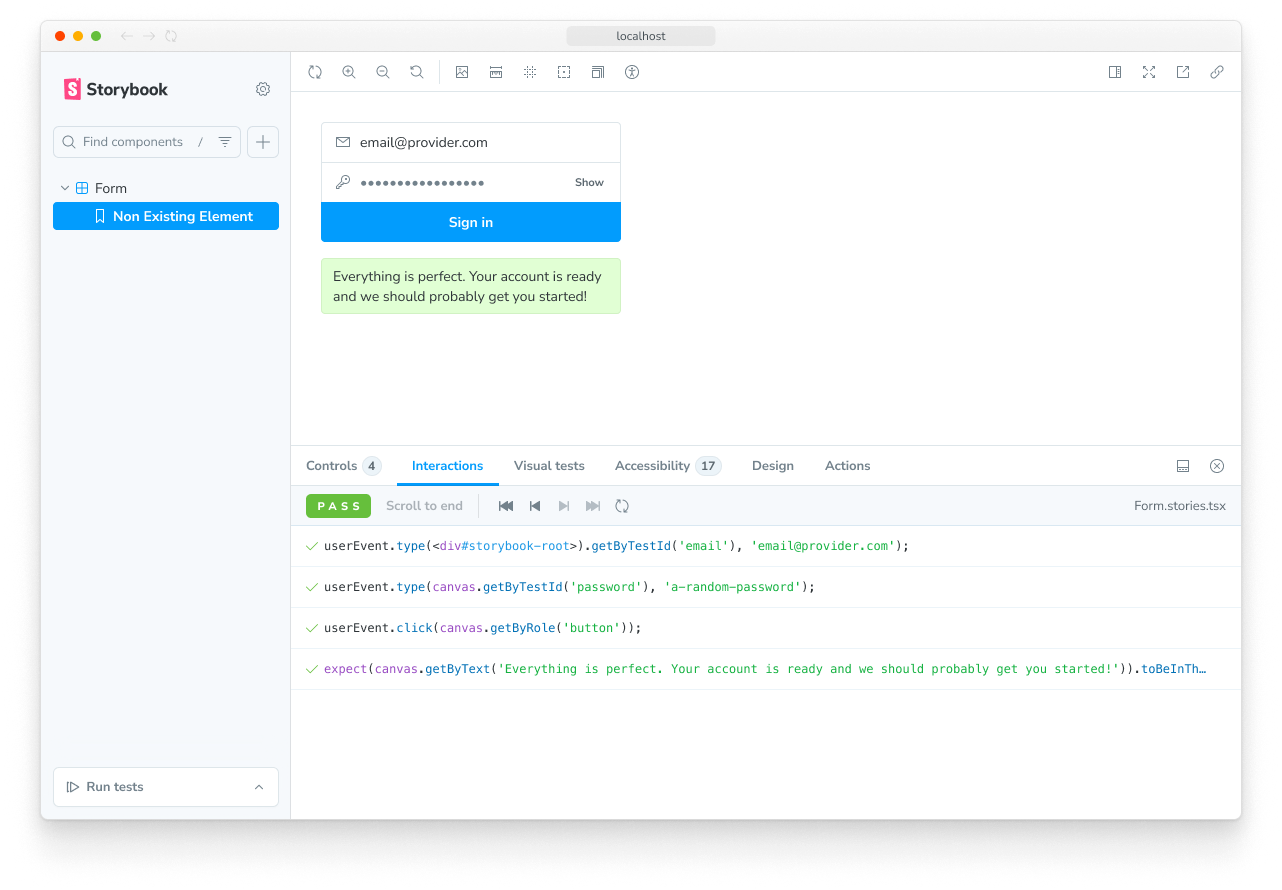
In this example, the EmptyForm story tests the render of the LoginForm component and the FilledForm story tests the form submission:
// Replace your-framework with the framework you are using, e.g. react-vite, nextjs, nextjs-vite, etc.
import type { Meta, StoryObj } from '@storybook/your-framework';

import { expect } from 'storybook/test';

import { LoginForm } from './LoginForm';

const meta = {
  component: LoginForm,
} satisfies Meta<typeof LoginForm>;
export default meta;

type Story = StoryObj<typeof meta>;

export const EmptyForm: Story = {};

export const FilledForm: Story = {
  play: async ({ canvas, userEvent }) => {
    // 👇 Simulate interactions with the component
    await userEvent.type(canvas.getByTestId('email'), 'email@provider.com');

    await userEvent.type(canvas.getByTestId('password'), 'a-random-password');

    // See https://storybook.js.org/docs/essentials/actions#automatically-matching-args to learn how to setup logging in the Actions panel
    await userEvent.click(canvas.getByRole('button'));

    // 👇 Assert DOM structure
    await expect(
      canvas.getByText(
        'Everything is perfect. Your account is ready and we should probably get you started!'
      )
    ).toBeInTheDocument();
  },
};
There’s a lot going on in that code sample, so let’s walk through the APIs one-by-one.
Querying the canvas
canvas is a queryable element containing the story under test, which is provided as a parameter of your play function. You can use canvas to find specific elements to interact with or assert on. All query methods come directly from Testing Library and take the form of <type><subject>.
The available types are summarized in this table and fully documented in the Testing Library docs:
| Type of Query | 0 Matches | 1 Match | >1 Matches | Awaited |
|---|---|---|---|---|
| Single Element | ||||
getBy... | Throw error | Return element | Throw error | No |
queryBy... | Return null | Return element | Throw error | No |
findBy... | Throw error | Return element | Throw error | Yes |
| Multiple Elements | ||||
getAllBy... | Throw error | Return array | Return array | No |
queryAllBy... | Return [] | Return array | Return array | No |
findAllBy... | Throw error | Return array | Return array | Yes |
The subjects are listed here, with links to their full Testing Library documentation:
ByRole— Find elements by their accessible roleByLabelText— Find elements by their associated label textByPlaceholderText— Find elements by their placeholder valueByText— Find elements by the text they containByDisplayValue— Findinput,textarea, orselectelements by their current valueByAltText— Find elements with the givenaltattribute valueByTitle— Find elements with the giventitleattribute valueByTestId— Find elements with the givendata-testidattribute value
Note the order of this list! We (and Testing Libary) highly encourage you to query for elements in a way that resembles the way a real person would interact with your UI. For example, finding elements by their accessible role helps ensure that the most people can use your component. While using data-testid should be a last resort, only after trying every other approach.
Putting that altogether, some typical queries might look like:
// Find the first element with a role of button with the accessible name "Submit"
await canvas.findByRole('button', { name: 'Submit' });

// Get the first element with the text "An example heading"
canvas.getByText('An example heading');

// Get all elements with the role of listitem
canvas.getAllByRole('listitem');
Simulating behavior with userEvent
After querying for elements, you will likely need to interact with them to test your component’s behavior. For this we use the userEvent utility, which is provided as a parameter of your play function. This utility simulates user interactions with the component, such as clicking buttons, typing in inputs, and selecting options.
There are many methods available on userEvent, which are detailed in the user-event documentation. This table will highlight some of the commonly-used methods.
| Method | Description |
|---|---|
click | Clicks the element, calling a click() functionawait userEvent.click(<element>) |
dblClick | Clicks the element twiceawait userEvent.dblClick(<element>) |
hover | Hovers an elementawait userEvent.hover(<element>) |
unhover | Unhovers out of elementawait userEvent.unhover(<element>) |
tab | Presses the tab keyawait userEvent.tab() |
type | Writes text inside inputs or textareasawait userEvent.type(<element>, 'Some text'); |
keyboard | Simulates keyboard eventsawait userEvent.keyboard('{Shift}'); |
selectOptions | Selects the specified option(s) of a select elementawait userEvent.selectOptions(<element>, ['1','2']); |
deselectOptions | Removes the selection from a specific option of a select elementawait userEvent.deselectOptions(<element>, '1'); |
clear | Selects the text inside inputs or textareas and deletes itawait userEvent.clear(<element>); |
userEvent methods should always be awaited inside of the play function. This ensures they can be properly logged and debugged in the Interactions panel.
Asserting with expect
Finally, after querying for elements and simulating behavior, you can make assertions on the result which are validated when running the test. For this we use the expect utility, which is available via the storybook/test module:
import { expect } from 'storybook/test';The expect utility here combines the methods available in Vitest’s expect as well as those from @testing-library/jest-dom (which, despite the name, also work in Vitest tests). There are many, many methods available. This table will highlight some of the commonly-used methods.
| Method | Description |
|---|---|
toBeInTheDocument() | Checks if the element is in the DOMawait expect(<element>).toBeInTheDocument() |
toBeVisible() | Checks if the element is visible to the userawait expect(<element>).toBeVisible() |
toBeDisabled() | Checks if an element is disabledawait expect(<element>).toBeDisabled() |
toHaveBeenCalled() | Checks that a spied function was calledawait expect(<function-spy>).toHaveBeenCalled() |
toHaveBeenCalledWith() | Checks that a spied function was called with specific parametersawait expect(<function-spy>).toHaveBeenCalledWith('example') |
expect calls should always be awaited inside of the play function. This ensures they can be properly logged and debugged in the Interactions panel.
Spying on functions with fn
When your component calls a function, you can spy on that function to make assertions on its behavior using the fn utility from Vitest, available via the storybook/test module:
import { fn } from 'storybook/test'Most of the time, you will use fn as an arg value when writing your story, then access that arg in your test:
// Replace your-framework with the name of your framework (e.g. react-vite, vue3-vite, etc.)
import type { Meta, StoryObj } from '@storybook/your-framework';
import { fn, expect } from 'storybook/test';

import { LoginForm } from './LoginForm';

const meta = {
  component: LoginForm,
  args: {
    // 👇 Use `fn` to spy on the onSubmit arg
    onSubmit: fn(),
  },
} satisfies Meta<typeof LoginForm>;
export default meta;

type Story = StoryObj<typeof meta>;

export const FilledForm: Story = {
  play: async ({ args, canvas, userEvent }) => {
    await userEvent.type(canvas.getByLabelText('Email'), 'email@provider.com');
    await userEvent.type(canvas.getByLabelText('Password'), 'a-random-password');
    await userEvent.click(canvas.getByRole('button', { name: 'Log in' }));

    // 👇 Now we can assert that the onSubmit arg was called
    await expect(args.onSubmit).toHaveBeenCalled();
  },
};
Run code before the component gets rendered
You can execute code before rendering by using the mount function in the play method.
Here's an example of using the mockdate package to mock the Date, a useful way to make your story render in a consistent state.
import MockDate from 'mockdate';

// ...rest of story file

export const ChristmasUI: Story = {
  async play({ mount }) {
    MockDate.set('2024-12-25');
    // 👇 Render the component with the mocked date
    await mount();
    // ...rest of test
  },
};There are two requirements to use the mount function:
- You must destructure the mount property from the
context(the argument passed to your play function). This makes sure that Storybook does not start rendering the story before the play function begins. - Your Storybook framework or builder must be configured to transpile to ES2017 or newer. This is because destructuring statements and async/await usages are otherwise transpiled away, which prevents Storybook from recognizing your usage of
mount.
Create mock data before rendering
You can also use mount to create mock data that you want to pass to the component. To do so, first create your data in the play function and then call the mount function with a component configured with that data. In this example, we create a mock note and pass its id to the Page component, which we call mount with.
// Replace your-framework with the framework you are using, e.g., react-vite, nextjs, nextjs-vite, etc.
import type { Meta, StoryObj } from '@storybook/your-framework';

// 👇 Must include the `.mock` portion of filename to have mocks typed correctly
import db from '#lib/db.mock';
import { Page } from './Page';

const meta = { component: Page } satisfies Meta<typeof Page>;
export default meta;

type Story = StoryObj<typeof meta>;

export const Default: Story = {
  play: async ({ mount, args, userEvent }) => {
    const note = await db.note.create({
      data: { title: 'Mount inside of play' },
    });

    const canvas = await mount(
      // 👇 Pass data that is created inside of the play function to the component
      //   For example, a just-generated UUID
      <Page {...args} params={{ id: String(note.id) }} />
    );

    await userEvent.click(await canvas.findByRole('menuitem', { name: /login to add/i }));
  },
  argTypes: {
    // 👇 Make the params prop un-controllable, as the value is always overriden in the play function.
    params: { control: { disable: true } },
  },
};When you call mount() with no arguments, the component is rendered using the story’s render function, whether the implicit default or the explicit custom definition.
When you mount a specific component inside the mount function like in the example above, the story’s render function will be ignored. This is why you must forward the args to the component.
Run code before each story in a file
Sometimes you might need to run the same code before each story in a file. For instance, you might need to set up the initial state of the component or modules. You can do this by adding an asynchronous beforeEach function to the component meta.
You can return a cleanup function from the beforeEach function, which will run after each story, when the story is remounted or navigated away from.
Generally, you should reset component and module state in the preview file's beforeAll or beforeEach functions, to ensure it applies to your entire project. However, if a component's needs are particularly unique, you can use the returned cleanup function in the component meta beforeEach to reset the state as needed.
// Replace your-framework with the framework you are using, e.g. react-vite, nextjs, vue3-vite, etc.
import type { Meta, StoryObj } from '@storybook/your-framework';

import MockDate from 'mockdate';

// 👇 Must include the `.mock` portion of filename to have mocks typed correctly
import { getUserFromSession } from '#api/session.mock';
import { Page } from './Page';

const meta = {
  component: Page,
  // 👇 Set the value of Date for every story in the file
  async beforeEach() {
    MockDate.set('2024-02-14');

    // 👇 Reset the Date after each story
    return () => {
      MockDate.reset();
    };
  },
} satisfies Meta<typeof Page>;
export default meta;

type Story = StoryObj<typeof meta>;

export const Default: Story = {
  async play({ canvas }) {
    // ... This will run with the mocked Date
  },
};
Set up or reset state for all tests
When you alter a component's state, it's important to reset that state before rendering another story to maintain isolation between tests.
There are two options for resetting state, beforeAll and beforeEach.
beforeAll
The beforeAll function in the preview file (.storybook/preview.js|ts) will run once before any stories in the project and will not re-run between stories. Beyond its initial run when kicking off a test run, it will not run again unless the preview file is updated. This is a good place to bootstrap your project or run any setup that your entire project depends on, as in the example below.
You can return a cleanup function from the beforeAll function, which will run before re-running the beforeAll function or during the teardown process in the test runner.
// Replace your-framework with the framework you are using, e.g. react-vite, nextjs, vue3-vite, etc.
import { Preview } from '@storybook/your-framework';

import { init } from '../project-bootstrap';

const preview: Preview = {
  async beforeAll() {
    await init();
  },
};

export default preview;
beforeEach
Unlike beforeAll, which runs only once, the beforeEach function in the preview file (.storybook/preview.js|ts) will run before each story in the project. This is best used for resetting state or modules that are used by all or most of your stories. In the example below, we use it to reset the mocked Date.
You can return a cleanup function from the beforeEach function, which will run after each story, when the story is remounted or navigated away from.
// Replace your-framework with the framework you are using, e.g. react-vite, nextjs, vue3-vite, etc.
import { Preview } from '@storybook/your-framework';
import MockDate from 'mockdate';

const preview: Preview = {
  async beforeEach() {
    MockDate.reset();
  },
};

export default preview;It is not necessary to restore fn() mocks, as Storybook will already do that automatically before rendering a story. See the parameters.test.restoreMocks API for more information.
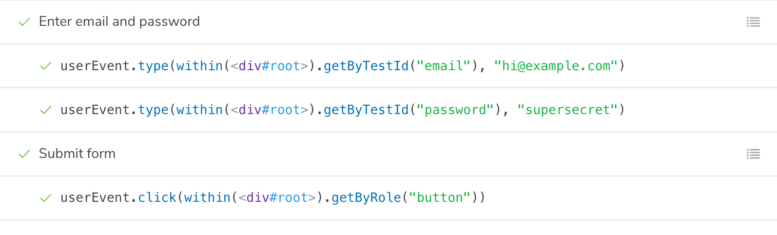
Group interactions with the step function
For complex flows, it can be worthwhile to group sets of related interactions together using the step function. This allows you to provide a custom label that describes a set of interactions:
// ...rest of story file

export const Submitted: Story = {
  play: async ({ args, canvas, step }) => {
    await step('Enter email and password', async () => {
      await userEvent.type(canvas.getByTestId('email'), 'hi@example.com');
      await userEvent.type(canvas.getByTestId('password'), 'supersecret');
    });

    await step('Submit form', async () => {
      await userEvent.click(canvas.getByRole('button'));
    });
  },
};
This will show your interactions nested in a collapsible group:
Mocked modules
If your component depends on modules that are imported into the component file, you can mock those modules to control and assert on their behavior. This is detailed in the mocking modules guide. You can then import the mocked module (which has all of the helpful methods of a Vitest mocked function) into your story and use it to assert on the behavior of your component:
// Replace your-framework with svelte-vite or sveltekit
import type { Meta, StoryObj } from '@storybook/your-framework';

import { expect } from 'storybook/test';

// 👇 Must include the `.mock` portion of filename to have mocks typed correctly
import { saveNote } from '#app/actions.mock';
import { createNotes } from '#mocks/notes';

import NoteUI from './note-ui.svelte';

const meta = {
  title: 'Mocked/NoteUI',
  component: NoteUI,
} satisfies Meta<typeof NoteUI>;
export default meta;

type Story = StoryObj<typeof meta>;

const notes = createNotes();

export const SaveFlow: Story = {
  name: 'Save Flow ▶',
  args: {
    isEditing: true,
    note: notes[0],
  },
  play: async ({ canvas, userEvent }) => {
    const saveButton = canvas.getByRole('menuitem', { name: /done/i });
    await userEvent.click(saveButton);
    // 👇 This is the mock function, so you can assert its behavior
    await expect(saveNote).toHaveBeenCalled();
  },
};
Running interaction tests
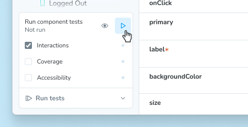
If you're using the Vitest addon, you can run your interaction tests in these ways:
In the Storybook UI, you can run interaction tests by clicking the Run component tests button in the expanded testing widget in the sidebar or by opening the context menu (three dots) on a story or folder and selecting Run component tests.
If you're using the test-runner, you can run your interaction tests in the terminal or in CI environments.
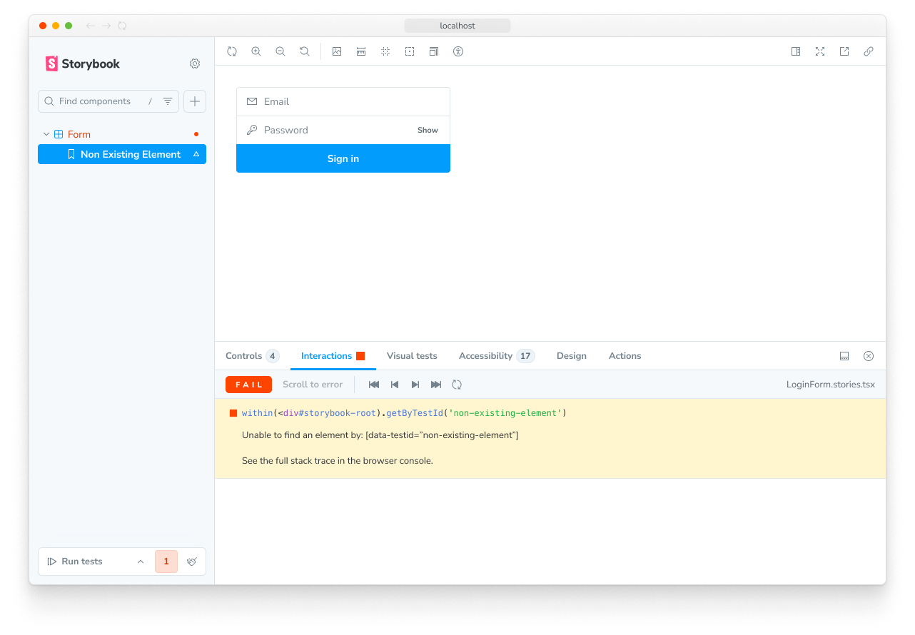
Debugging interaction tests
If you check the Interactions panel, you'll see the step-by-step flow defined in your play function for each story. It also offers a handy set of UI controls to pause, resume, rewind, and step through each interaction.
Any test failures will also show up here, making it easy to quickly pinpoint the exact point of failure. In this example, the logic is missing to set the submitted state after pressing the Log in button.
Permalinks for reproductions
Because Storybook is a webapp, anyone with the URL can reproduce the failure with the same detailed information without any additional environment configuration or tooling required.
Streamline interaction testing further by automatically publishing Storybook in pull requests. That gives teams a universal reference point to test and debug stories.
Automate with CI
When you run your tests with the Vitest addon, automating those tests is as simple as running your tests in your CI environment. Please see the testing in CI guide for more information.
If you cannot use the Vitest addon, you can still run your tests in CI using the test-runner.
Troubleshooting
What’s the difference between interaction tests and visual tests?
Interaction tests can be expensive to maintain when applied wholesale to every component. We recommend combining them with other methods like visual testing for comprehensive coverage with less maintenance work.
What's the difference between interaction tests and using Vitest + Testing Library alone?
Interaction tests integrate Vitest and Testing Library into Storybook. The biggest benefit is the ability to view the component you're testing in a real browser. That helps you debug visually, instead of getting a dump of the (fake) DOM in the command line or hitting the limitations of how JSDOM mocks browser functionality. It's also more convenient to keep stories and tests together in one file than having them spread across files.
More testing resources
- Vitest addon for running tests in Storybook
- Accessibility testing for accessibility
- Visual testing for appearance
- Snapshot testing for rendering errors and warnings
- Test coverage for measuring code coverage
- CI for running tests in your CI/CD pipeline
- End-to-end testing for simulating real user scenarios
- Unit testing for functionality
- Test runner to automate test execution