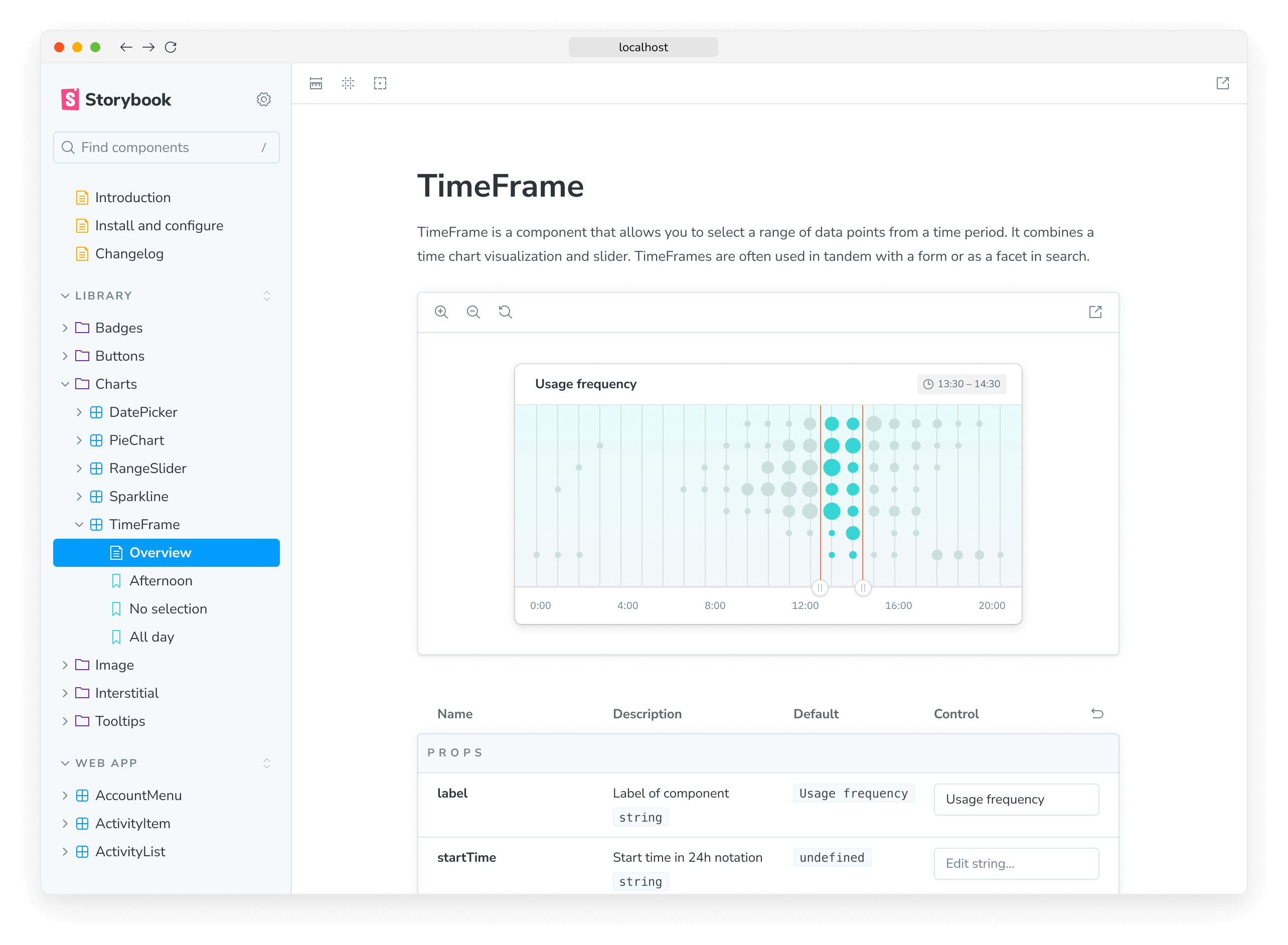
How to document components
When you write component stories during development, you also create basic documentation to revisit later.
Storybook gives you tools to expand this essential documentation with prose and layout that feature your components and stories prominently. That allows you to create UI library usage guidelines, design system sites, and more.

If you're including Storybook in your project for the first time, we provide you with a documentation page ("Autodocs" for short), positioned near your stories. It's a baseline template automatically generated, listing your existing stories and relevant metadata.
Additionally, you can customize this template if needed or create free-form pages for each component using MDX. In both cases, you’ll use Doc Blocks as the building blocks to create full-featured documentation.
Docs is autoconfigured to work out of the box in most use cases. In some cases, you may need or want to tweak the configuration. Read more about it here.
